Course Description
This course is designed to provide an exploration of visual merchandising by considering the product presentation in the retail environment. This course explores the theoretical and practical use of in-store environments, lighting, special effects, fixtures and product placement as a form of visual communication intended to convey a specific message about the fashion brand and to influence the consumer. Topics include the creation of specialty and department store displays, the design of visuals for walls and windows, professional presentation techniques, and the effects of color, music and lighting on consumer behavior.
By taking this course, Yelissa is well prepared for not only the laborious and artistic work of a visual merchandiser, but also any work needing innovative, analytical, and thorough workers.
The following projects helped Yelissa gain and present these skills.
Color Theory Assignments
Time to get to Mixing! For this assignment, students needed to demonstrate their understanding of color theory by hand mixing primary colors with black and white to create the following pieces:
Here are the four components for this assignment :
Press the tabs to see how Yelissa did each piece!
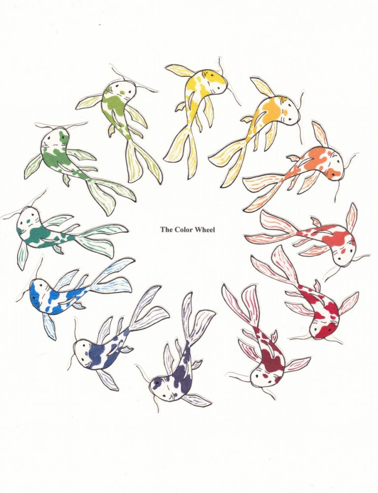
Koi Pond Color Wheel
This color wheel was inspired by the elegance and beauty of the Koi fish. These fish symbolize good fortune and prosperity making it a perfect motif for my first portfolio work.
Koi fish do not naturally come in the various colors they are known for. They are breed to create a range of hues. The same can be said for creating most of the colors of the color wheel. By carefully combining the most natural hues (red, blue, and yellow), I created Secondary and Tertiary colors while staying true to the simplicity and grace of the Koi fish.
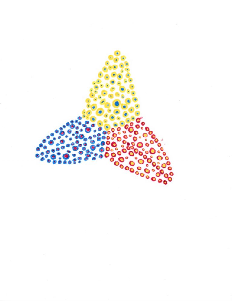
Primary Color Relationship
This piece shows the relationship between the primary colors red, blue, and yellow. Yelissa created this piece by using the very tip of her round paint brush to carefully paint small circles in the shape of abstract triangles. For the yellow circles, she added a blue dots in the middle which made some circles look a bit more green. The red circles had yellow added to them making them appear orange at times. As for the blue circles, they at times looked purples because they had red added to the center.
If someone were to look at this piece from afar, instead of looking like red, blue, and yellow it would give the illusion of being orange, green, and purple. This illusion shows how easily these three primary colors make other colors.
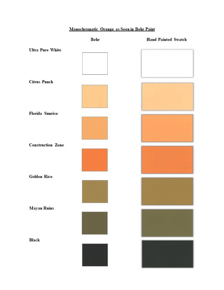
Colored Monochromatic Swatches: Orange
For this assignment, students had the opportunity to use the color of their choice to create a monochromatic color scheme. The most popular colors throughout the student projects were blue and red since the paint swatches were readily available. Yelissa, on the other hand, decided to use orange not only because it is a beautiful and bright color, but also she was curious about how it would look when mixed with black.
Yelissa started first by mixing in white a bit at a time. She painted several rectangles to have a better match with the paint swatches she would be matching to. As expected, the colors got lighter, less vibrant, turning into tints of orange.
Things started getting interesting as Yelissa added black to the pure hue. This vibrant orange hue turned from brown to green the more she mixed in black. Yelissa noticed when the hand painted orange shades were put in order they looked extremely similar to an orange fruit drying out.
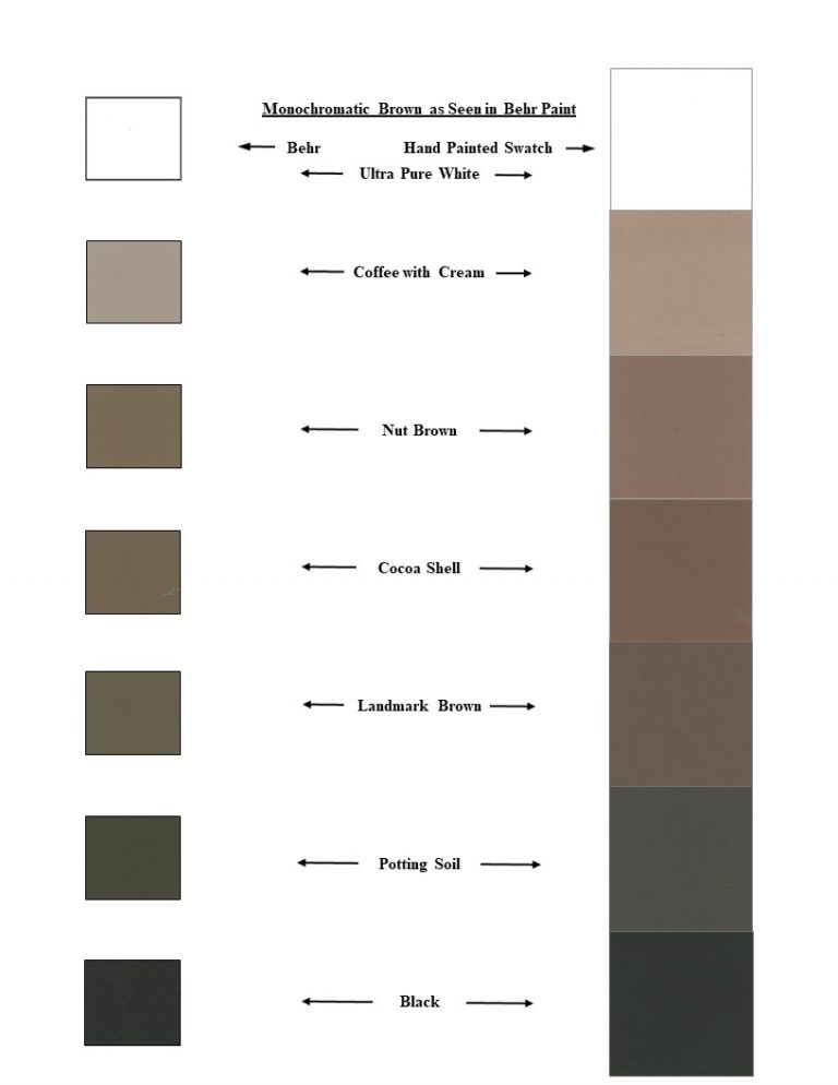
Brown Monochromatic Swatches
For the brown monochromatic swatches, things went more as Yelissa expected. She made sure to paint the black, brown, and white swatches first to not disturb their purity. Once she started adding white to the brown paint, the hue started turning lighter, becoming less vibrant. When Yelissa started adding black to a fresh puddle of brown paint, it became more shaded the more black she added.
Design Strategies
Creating visual displays or any piece of art means knowing how to use the elements and principles of design. To test our comprehension of these strategies, students used them to compare a store retail display and a famous art pieces.

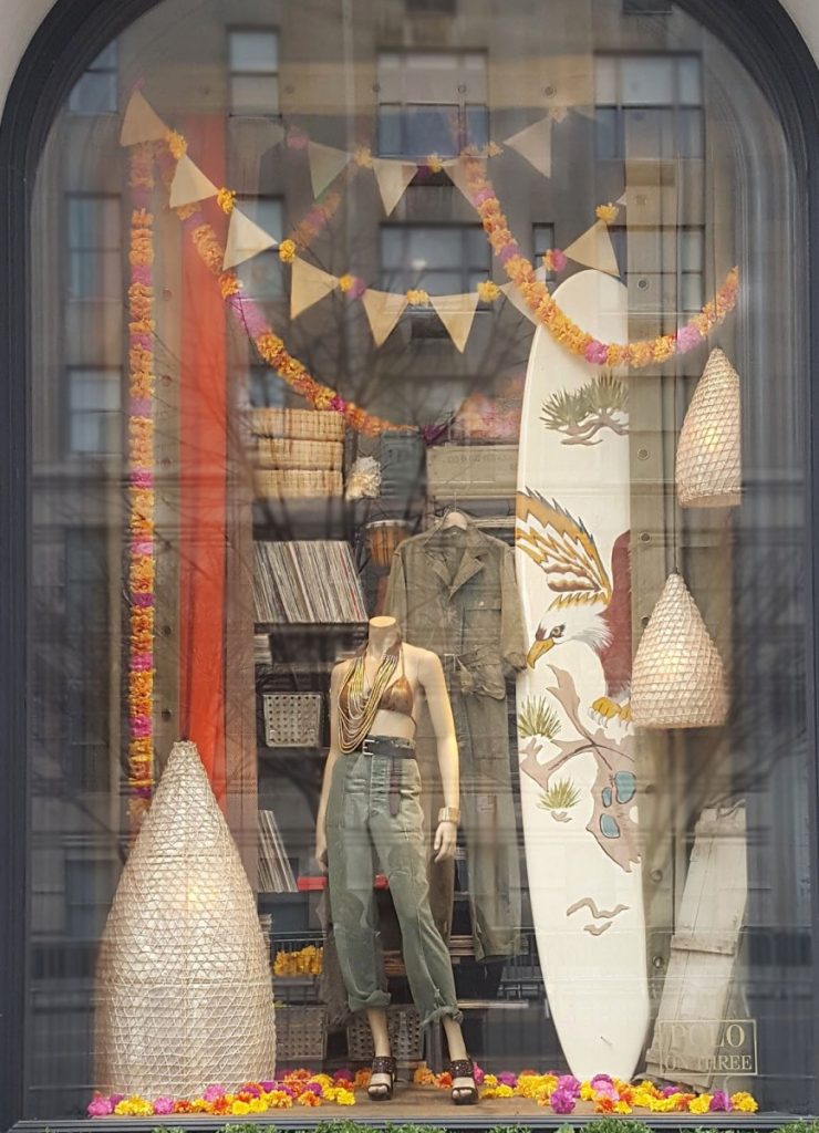
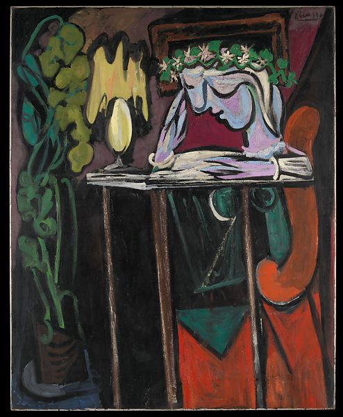
After spending hours on Madison avenue looking for the right window display for this assignment, Yelissa saw Ralph Lauren’s Spring 2017 window display. Orange, pink, army green, and cream were the first things to catch her attention. The mannequin placed right in the center, surrounded by leis petals to highlight the mannequins femininity.
Yelissa decided to compare the window display with the “Reading at a Table” a painting by Pablo Picasso. Though seemingly different, Yelissa noticed the main subjects of each compositions were women, their beauty, and femininity.
With the quote below in mind, Yelissa Started her assignment.
“If the principles of design are the instructions, the elements are the tools.”
–Meg Reid
The Press Kit
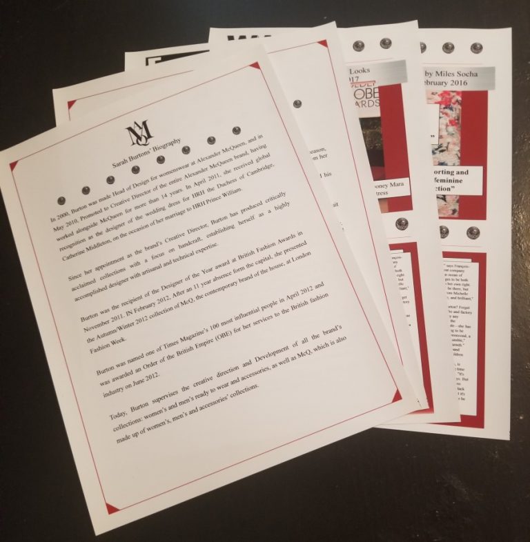
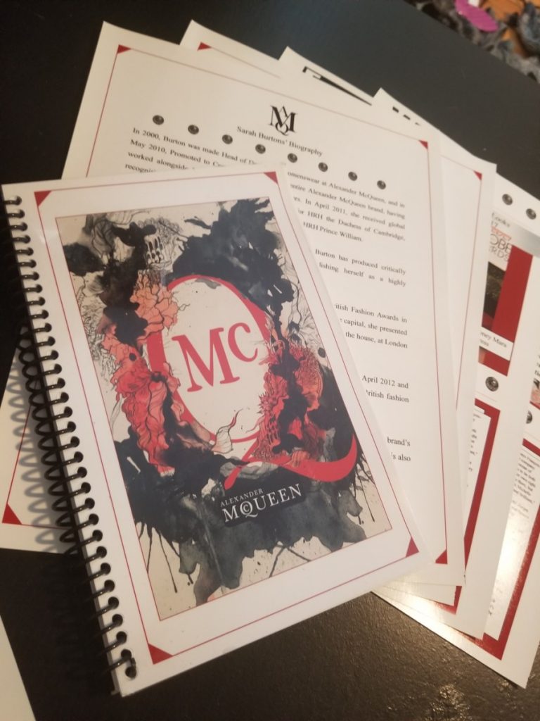
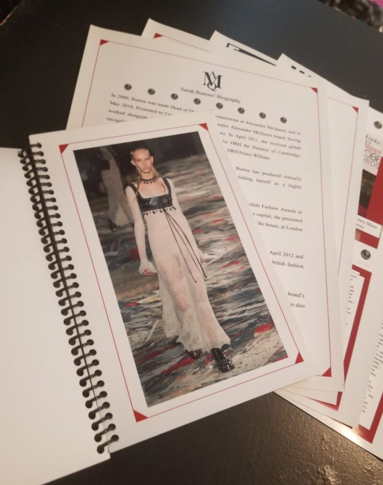
Making a press release requires visual presentation skills and analysis similar to visual merchandiser. Using the presentation techniques learned in class, students created press releases for recent designer collections. Packaging, invitations, creative director bio, and articles analysing the finale ready for the likes of Vogue needed to be inside the kit.
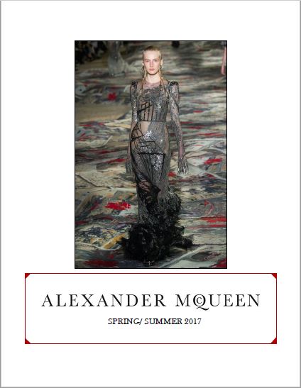
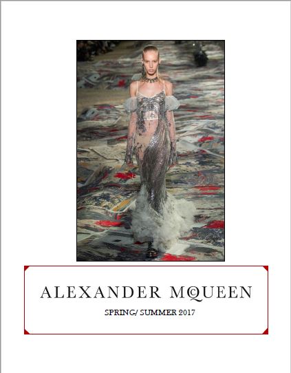
For the press kit assignment, Yelissa chose Alexander McQueen’s Spring 2017 collection. Yelissa believed Sarah Burton, the brands creative director, had a way of making clothing look like a dream yet so edgy! The pring 2017 colection was no exception. Yelissa researched the collection heavily, watching the show several times, reading every article until she (almost) became one of the people behind creating such beauty! Here’ s the result of Yelissa’s hard work:
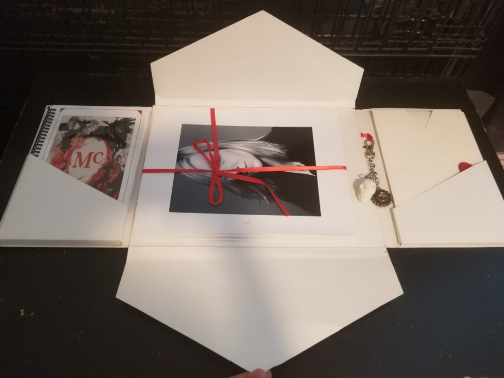
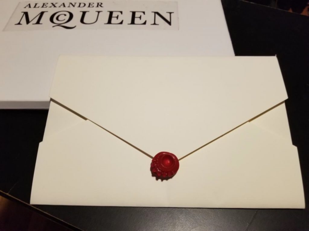
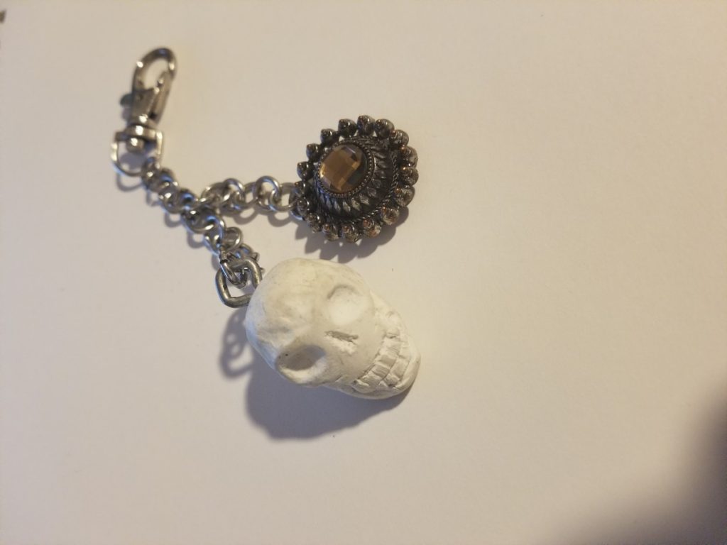
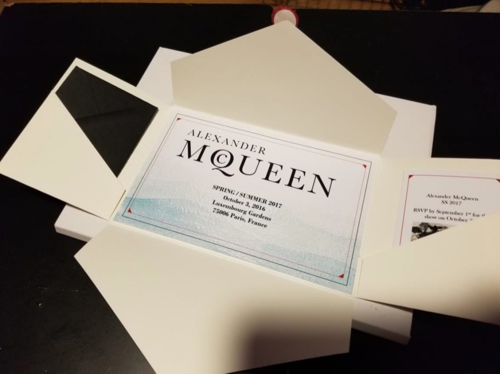
To correctly portray the brand, Yelissa Handmade the:
- Folder to mimic the invite
- Wax closing for the invite
- Skull and key chain
- Page designs for the biography, company history, etc.

