Course Description
This course is an introduction to the study of product development from concept to consumer. Students learn how research is conducted in the fashion industry and how it is ultimately reflected in garment design. Trend cycles, consumer behavior, social, political and economic influences are discussed as influences on trend development.
By taking thsi course, Yelissa demonstrates the abilty take customers into consideration when creating a product.
The term assignment for this class is below:
Collection Development
For this assignment, students broke into groups to create a product from idea to “conception”. This meant finding out who is the target market, designing the product, who are competitors with similar products, the fabrics used, the cost for making the product, and the retail price.
After brainstorming, Yelissa’s group decided to create fall and winter coat brand called Haute & Hoot. The brands mission was to add a bit of laughter to life.
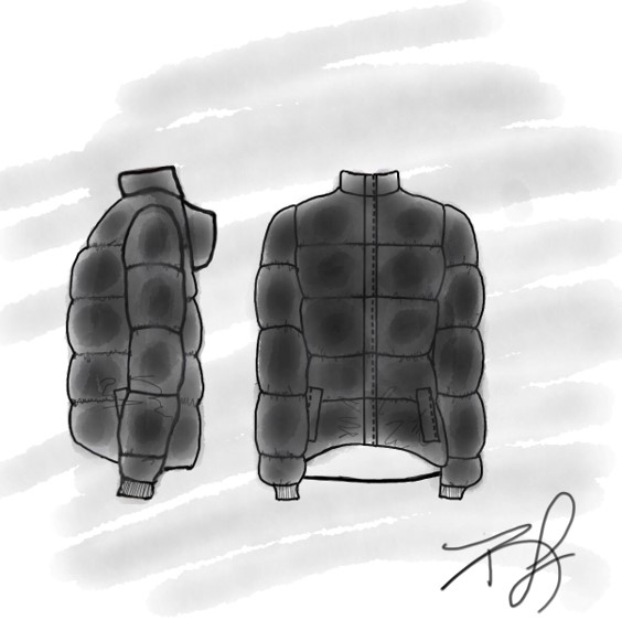 Crop Bubble Puffer Coat
 The Faux Fur Coat "Super Cozy"
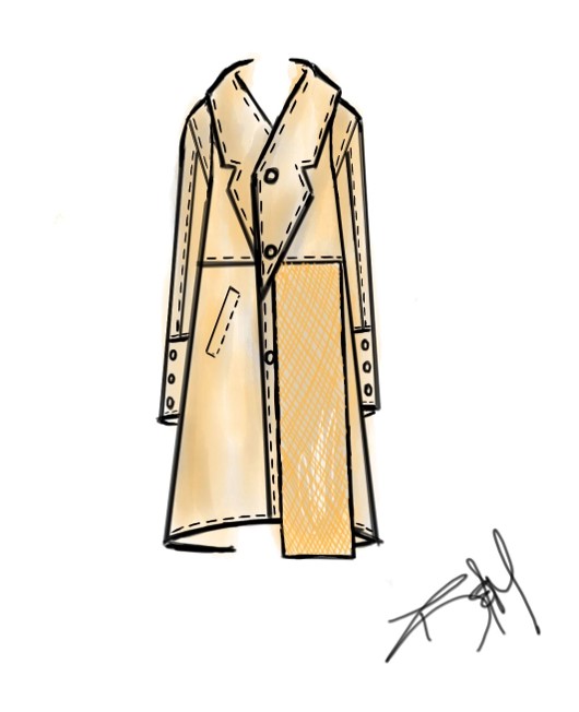 The Deconstructed Trench Coat
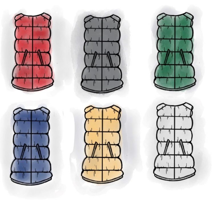 Inner Shells
Haute & Hoot coats were designed for students in their 20’s who like to be fashionable, warm, and incorporate a bit of laughter into their day. The coats were all designed as 3 in 1 coats: An outer shell and inner shell that can be worn together or separate. To allow customers to control the amount of warmth they want with their cute outer shells, Haute & Hoot offers inner shells named Cozy (warm), Toasty (warmer), and Fuego (warmest). Recommended outer and inner shell combinations have fun names like “The Oven” and “Roasting by the Fire” to help brighten up the wearers day.
Each outer shell is made using different materials such as Nylon, Primaloft, and Silnylon while the inner shells are made of different amounts of Primaloft. To make the coats ( meaning outer and inner shells), the cost is between $30 – $100 retailing at $75 to $215.