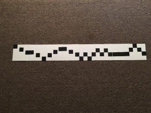
From Project#2, I learned the balance between positive and negative shape does really matters in a composition.
- Leaving too much negative space will make your composition unbalanced.
- You need a strong pattern to make the composition better.
- Low visual weight = low contrast


