My personal style and influences

Image

My Illustrative style usually consists of Pretty girls and Fantasy themes. I’ve spent most of my life being influenced by Japanese Animation and comics. Through this medium, I like to create beautiful or fun images that sometimes tell a little story.

My Illustrations:


Artist #1

Yoshihiko Umakoshi

He’s a freelance animator who also does character design. He  uses a stylized anime/manga style with slender forms. He designs expressive faces and uses thick lines with heavy shading.

His work:


Artist #2

Ilya Kuvshinov

Ilya Kuvshinov is a Russian illustrator and comic artist based in Japan. He’s the art lead for Game Insight, a Lithuania-based mobile, and social game developer. He uses a semi-realistic anime/manga art style that looks somewhat photorealistic. His art usually consists of beautiful women.

His work:


Lance Webley Artist Heroes

My illustrations or style falls into the themes of weird, horror, and abstract. I’m interested in semi-realistic, detailed, emotions, and a controlled messy look. Experimenting with the mediums I like is fun and it help me create the look I’m going for. The medium I enjoy the most is watercolor, gouache, ink, and graphite. The top artists that has given and continue to give me inspiration over the years is Bill Sienkienwicz, Alex Ross, Allen Williams, James Gurney, and Junji Ito.

Some of my illustrations:

Bill Sienkiewicz

Mostly known as a comic book artist for Marvel and DC comics. He also worked on the graphic novel Stray Toasters. He did advertising campaigns for Nike and MTV. Posters for The Green Mile, Halloween, Dark Knight, The Grinch, Unforgiven, Resident Evil, and the 2006 Winter Olympics.

As of now he is freelancing.

What I like about his art is that it looks and feels different from other artists I usually looked at. The abstract forms in the foreground and backgrounds. Exaggerated proportions that looks accurate. Different textures through scratches, splatters, and even using bleach. The mixture of hard lines and soft tones of color creates strong contrast. He does all these things while keeping the realism skill he was known for in his early stages of his career. He mostly uses gouache and ink.

Bill Sienkiewicz work:


Alex Ross

An illustrator/comic book artist that worked for DC and Marvel for decades. He is known for his work on Kingdom Come, Uncle Sam, Star Wars, and other variety of DC and Marvel’s works. He has done work for Universal Studio’s Monsters. Some posters he worked on was Unbreakable, Glass, The Iron Giant, and even the Academy Awards. Ross was chosen by Apple Corps LTD to be commissioned as the first artist in over 30 years to paint the Fab Four. He also worked on some books as an author. For example, a book called Marvelocity is by Ross and it features work he has done for Marvel. Comic Buyer’s Guide Award for Favorite Painter was eventually retired because Alex Ross won the award so many times.

Alex Ross has mastered his craft. His work is very consistent. He is known for his American realism and rendering. The way he handles contrast with lighting and darks without using any ink and the way he layers paint is impressive. The accuracy on how he renders different textures and backgrounds is also great whether its smoke, motion blur, lasers, burns, buildings, water, fire, and reflective material. His renders make super heroes look more heroic as if they were real and he renders his comic panels as if he was making a single piece. From what I’ve seen Ross does all the work himself. The pencils and renders. Backgrounds and all the characters. What I like about his work is that the pencil phase has most of the end result done which makes the painting portion much easier. Plus, he does his paintings with gouache which is a medium I’m trying to get better with.

Some of his work:

If you have $10,000 – $30,000 to spare you can buy some of his original art.


James Gurney

A freelance illustrator. The author and illustrator of Dinotopias, Color and Light, and Imaginative Realism. Well known for his realistic illustrations of dinosaurs and ancient civilization. He coauthored The Artist’s Guide to Sketching, worked as a background painter for the animated film Fire and Ice. Did assignments for National Geographic magazine, painting reconstructions of Moche, Kushite, and Etruscan civilizations. WorLucasfilm, DreamWorks Animation SKG, Sony Imageworks, Blue Sky Entertainment, Rhythm and Hues, Disney. For his work he has been featured in a variety of magazines and museums in the country. For fun, self-promotion, and to teach others Gurney has a active youtube channel that he keeps up with.

People wondered how Gurney can illustrate dinosaurs realistically when they don’t exist, as if they were alive today. How can he understand color and light so well. Gurney is a dedicated plein air (outdoor) painter and sketcher, believing that making studies directly from observation fuels his imagination. He does these paintings mostly using gouache, casein, and other mediums that he carrys with him. I enjoy watching his videos of these paintings because they do help me paint better. His life drawing painting reminds of the impressionist style and that’s the style I want to achieve with gouache. When Gurney has to create a bigger and precise piece he does use oil. These two paragraphs doesn’t justify the work Gurney puts in. I encourage anybody that reads this to check more of Gurneys content especially his blogs and videos on techniques. For example, he developed his characteristic realistic renderings of fantastic scenes, often using posed models and handmade maquettes for reference. He goes over how to make these maquettes and how he makes a scene with them.

Some of Gurney’s work:

Junji Ito

Horror manga artist and writer. The creator of Uzumaki, Gyo, the Tomie series, and short horror stories published as collections. His horror stories has animation adaptations. Uzamaki and Tomie has live-action film adaptation (Tomie has a lot). He recently did a manga adaptation of Mary Shelley’s Frankenstein, he recieved a Eisner Award for it. He was working on Silent Hills with Hideo Kojima before it got cancelled.

As a horror fan when I discovered Junji and read some of his short stories I just wanted to read more. The stories were written well, but the build up to a creature reveal, a plot twist, and the character reactions to the horrific scenarios they are a part of. Junji draws accurate proportion figures with minimal detail, but if a character seems gloomy or suspicious they start to get more detail and looks different. Humans in his stories gets the horror treatment either internally and/or physically. Distorted grotesque features, deformed limbs, things coming out of their body parts, unusual expressions, and other things that’s hard to describe. Junji does a great job showing these physical features through his inking. 

Some of Junji Ito’s work:


Inoue Takehiko

Another manga writer and artist. He has illustrated the mangas Real, Slam Dunk, and one of my favorite mangas Vagabond. He also has his own illustration book out. He has done work for the game Lost Odyssy (my favorite rpg).

I really enjoy the look and style of historical Japanese culture (also China and Korea) and seeing it in a manga is very cool (Vagabond) Takehiko semi-realistic style was different from the other manga I was reading. More accurate human forms and anatomy. His landscapes is great too. It really made the setting in the past more convincing. Takehiko handled folding in clothes well too. 

Personal Style

I feel that I have a similar style of photo with peter. However, he is a great photographer and I do my best to use a similar style with how the tree will affect the background photo. On the left is work of Peter Mckinnon and on the right is my photos.


Savannah’s Style and Influencers

Ross O’Donovan a.k.a RubberNinja

Role: Animator, Character Designer

Specialties: Animation, Character Design

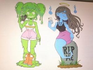
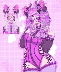
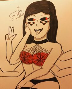
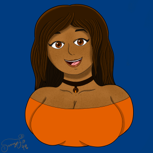
Ross O’Donovan is an animator well-known for working for the YouTube channels Game Grumps. He draws and animated a lot of monster girls, which is which is a theme that I have recently been trying out. I love how his characters are mostly curvy and they a drawn in almost like a  “pin up” style.


Remon a.k.a Remuchii

Role: Freelance Illustrator and Animator

Specialties: Character Design, Animation, Background Design

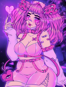
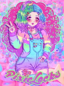
Remuchii’s style screams pastel goth and creepy cute. There are always bright colors in her work. What I love about her style is not only how she illustrates curvy characters, but how she displays body positivity for every body type. I believe  like we need body positivity to be shown more in the art industry.


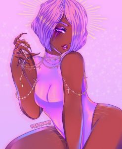
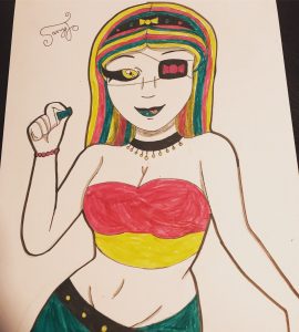
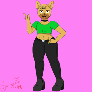
These two are my main influencers because my style  consists of characters with different body types and a lot of bright colors. I would say that recently, my style is also consisting of a few monster girls as well. I feel like it’s a theme that I should touch on a little more because it’s interesting.


Bradford’s Partial Stalking List

Coralie Jubénot | Character Designer & Portrait Artist

Her portrait illustrations make me cry. She captures a character well without needing to be super elaborate with her work. She works heavily from freelance, but has also contributed her work to subscription boxes for novels.

Adam Ellis | (Web) Comic Artist

Mr. Funnyman no longer works for Buzzfeed, but that is how I first found him. His ability to tell a story in short panels is what I hope to achieve for my own Salty Comics 😀

Babs Tarr | Illustrator and Comic Book Artist

Babs a Queen. That is all. Her most notable Clients: DC, Marvel, Image Comics, Hasbro, and Disney

And my works! I play (and replay) games when I have time and have been reading a lot of fantasy novels recently. Those 2 hobbies aid in bringing me inspiration for what subjects to draw and practice from.


Orel Jeffrey

My personal style is mixed because of various influences throughout my life from standard comic books to Japanese animation and manga. I like to live through my drawing expressing emotions and abilities through the medium. Emitting that emotion through drawing my artwork can be dark, sometimes violent and  even on the other extreme comedic value. I like my work to be striking and convey everything in a glance. I even in some cases like to twist the vibe and aesthetic of character  


I was just introduced to him, but N.Steven Harris because a dynamic range character posturing, his skill in his proportion of the human body is amazing.i am vigorously practicing to that down pat. He is also good at background work, which I do not usually attempt but I am inspired now.

Iamtheartistiam. He i admire his work because of the style he brings to well known characters. They usually have more menacing looks to them which I really like. I tend to lean alot to things that carry a dark vibe.

Above these are iamteartistiam works.

These are mine.


Mshindo Kuumba has a sense of surrealism that I like. Which are very striking, and ideally I always hope to accomplish every piece. Some of his   pieces have very unique conceptual ideas. I do try my best to have inventive or at least very innovative ideas.

these are mine

Henry Zeng


Shigenori Soejima has a semi-realistic manga style. His lines are usually light but his coloring does a majority of the heavy lifting. Each character has a distinct look and a distinct personality. He usually bases his characters off people has met in real life and those experiences lend to the creation process. When I create characters I try to think a lot about how they should act, some experiences the character might have gone through. Usually I end up using my person experiences in many of the characters I have created.

Jen Zee is the art director at Supergiant Games and her style translates over to every game made at Supergiant making them instantly recognizable. She tends to use mythological and historical themes with a hint of futuristic elements. When I design my characters I usually think about different time periods and type to incorporate it into my characters.

Rachel Kim ✕ Artist Inspirations

  • #1 Robin Yao
    portfoliotwitterinstagram
    role: Freelance Illustrator
    speciality: character design, backgrounds
    I admire how they have such clean lines. Despite having a small color palette, they can create a certain mood with their pieces.
    work experience: Titmouse (background designer), Macy’s (visual graphic illustrator), National Development Research Institute (art consultant)their illustrations:


  • #2 Brett Lee
    portfoliotwitter
    role: Freelance Illustrator
    speciality: fanart, character design, composition
    Simple/no backgrounds, which is something that makes me feel a little better about not being a strength of mine (although I would like to improve it). Love their composition and simple colors.
    work experience: n/a
    their illustrations:
  • #3 Sara Kipin
    portfoliotwitterinstagramtumblr
    role
    : Freelance Illustrator
    speciality: character design, narrative illustration
    I love their battle between simplicity and detailed. Their ability to tell a story in their illustrative pieces is something I aspire to do.
    work experience: Color Design (Thundercats ROAR), Book Illustration (Between the Water & the Woods, NYT), Storyboard Artist (Marvel’s Spiderman, Samurai Jack), Nickelodeon Intern
    their illustrations:
  • #4 Killian Ng
    portfolio – twitterinstagram
    role: Freelance Illustrator
    speciality: background, comics, illustrations, fanart
    I usually enjoy their more simplistic approach than their painterly talents, but regardless of how I feel, both show a great grasp of anatomy and perspective.
    work experience: colorist (Legend of Korra, Ruins of the Empire, Lost Pets, Turf Wars, Friends for Life), book cover illustrations (Adventure Time, Wayward), backgrounds (Dot, The Arcana)
    their illustrations:
  • my illustrations:

This is a spreadsheet of artists that I admire (regardless of location). I will slowly update it as life goes on.

My Artist Research #1 Qing Han_Nicole Harripersad

 My Artist #1

Name: Qing han AKA Qinni

ROLE: Illustrator

Markets they specialize in: Illustrations/ Commissioned Art

Specific Themes: Space, Zodiac, Underwater Art. Most of her certain pieces consist of the colors blue, purple, and white. With stars.

Work they have commissioned that interested you: Sailor Moon Commision pieces 

SOCIAL: https://www.instagram.com/qinniart/


Fact: Qing H an, or Qinni was an artist whose art was based on illustration. She was an inspiration to me and she inspired me to paint a lot more. Her art work is mostly galaxy themed along with underwater themed art, her method of materials were copic markers, pens, watercolor paints, and gouache. I’ve been messaging Qing since 2013 and we would talk little by little. I would message her a lot on instagram about art tips and what materials to buy and art critics. Unfortunately on February 11, 2020, I found out that my favorite artist who I’ve looked up to since freshman year of high school has passed away due to cancer. It broke my heart because her art was the reason I started to get into watercolor art. She’s an amazing artist and I will never forget her art tips or her art.