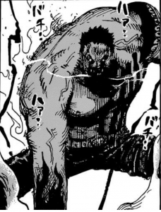
I feel that this illustration has a strong use of value tones and organization. The artist is Echiro Oda the manganka for One Piece. The way he uses vale on this panel in particular is how he makes it look so intense. The darks on his pants, face, and arms make the grey emphasize how big his body is and the whites on the background and his breath also add to the intensity. You focus on his body because its grey but the gradual increase in darkness makes this picture a geat example of value.
COMD 2313 Illustration 1, SP2018
A City Tech OpenLab Course Site


The use of 3 tones here to organize this image is done extremely well. Good choice