

COMD 2313 Illustration 1, SP2017
Just another City Tech OpenLab site
The OpenLab is an open-source, digital platform designed to support teaching and learning at City Tech (New York City College of Technology), and to promote student and faculty engagement in the intellectual and social life of the college community.


Klever nice work!
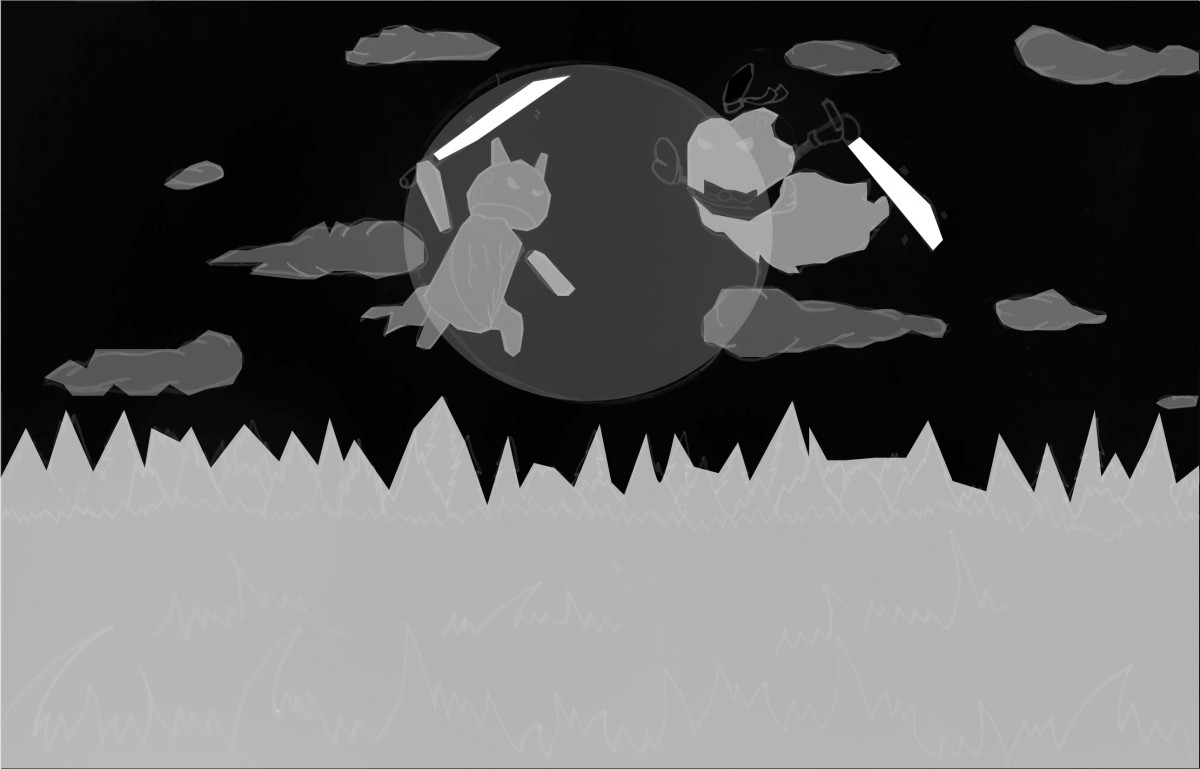
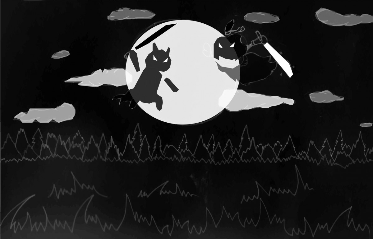
This looks really good. I think it would be stronger if you cropped a little closer in on the most important part of the image, the epic fight scene! All that background feels extra.
Also lets make sure the 2 characters (phone companies?) are clear… I see you are incorporating logo into character… make sure that reads well.
Regarding value – you need to combine 2 and 3 I think… but right now the values feel very arbitrary. They aren’t guiding the viewer, though the last one has some nice contrast. READ the post on VALUE and Perspective I just uploaded to RESOURCES. see if that helps.