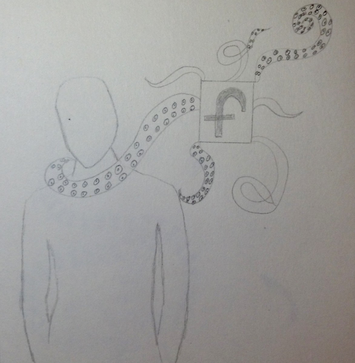
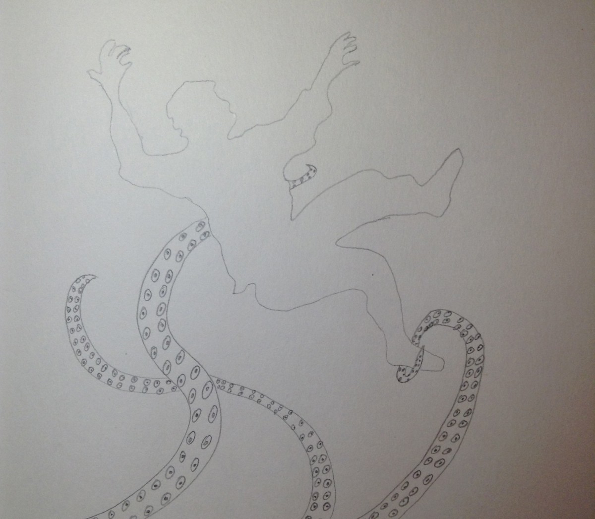
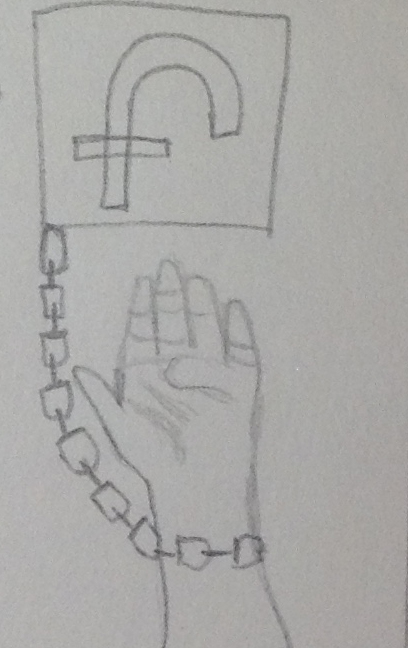
My article is about “HOW FACEBOOK MAKES US UNHAPPY”, from the newyorker.com. For my sketches I was trying to do a combination of a Sea animal (the octopus) and a person. In my #1 and #2 sketch facebook is like the octopus, taking people happiness. Also, for my #3 sketch I had a different idea, that shows how facebook is a prison for all the users of facebook.
#2
#3


Pamela –
There are really strong concepts. You’ve taken a direct and metaphor driven approach to the editorials.
I like all 3! But, I think the strongest conceptually are 1 and 2. 3 is too literal.
1 is very interesting… but how can you COMBINE the animal and the icon better? Look for animal reference and give yourself some creative freedom to create this creature.
2- I like the silhouettes gesture but its not clear that this is about FB… I’m sure you can fix that though with a little more thought. – go a step further into visual metaphor. You could add a visual element in the background or use value carefully to give us the right interpretation of the image without being too literal.
Good work!