
GLOBAL WARMING BABY HARP SEAL BEING DROWNED CRUSHED AMID MELTING ICE
GLOBAL WARMING BABY HARP SEAL BEING DROWNED CRUSHED AMID MELTING ICE
The OpenLab is an open-source, digital platform designed to support teaching and learning at City Tech (New York City College of Technology), and to promote student and faculty engagement in the intellectual and social life of the college community.


Gabriela –
Nice work on these editorial sketches! REALLY STRONG!
Both ideas have potential…
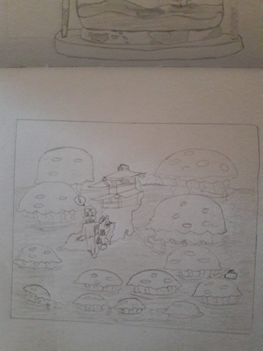
I love #1 – The whole thing really works… I think if you worked on the structure of the drawing it could be a WONDERFUL editorial illustration. The basic shape of that hourglass (think back to foundations drawing class) has big flaws. Those ellipses aren’t working and the wood is not even and straight. Take the time to get reference and draw the BEST hourglass you are capable of. Thats what will take this illustration to the next level.
The second one has real potential as well… but its not strong as #1 … lets go with that one for now. Save the other idea for a future piece of art.
Don’t be too literal. Focus on Clarity of Concept and strong Metaphor.
Good work!
Thank you professor, about the hour glass on the wood that’s the map of the world to represent earth, so you think I should take that out and draw a different hour glass?
Gabriela I don’t think you NEED it to communicate the idea – but the map is a nice design element. It should read as secondary to everything else though. Consider that when you do your value studies ok?
BUT the Hourglass is central to the main idea. It right now has some serious issues with the quality of the drawing. Those must be corrected. SO its NOT about the map. The map is like the cherry on top of the ice cream sundae. You have to focus on getting the sundae right! 🙂
RE DRAW that hourglass LOOKING at an hourglass and take the time to get a nice realistic rendering. You can do it! The ellipses that make up the base and top of the glass are way off. Try watching some you tube videos of how to draw a glass or a bottle realistically – that should help. If you find a good one, share it in our resources!