Assignment 2: Object Staging part 1

Assignment 2: Object Staging

Part 1 Brainstorm, and Thumbnails and Rough Sketches 

Description

For the first stage of this three part assignment, you will create a concept based on one of your objects from the Inked Object Exercise. Your concept must meet the following parameters:


  • Your original object must be visible and central to the new concept.


  • The composition must feature a simple setting with only the props necessary to communicate your concept.


  • The owner of your object must be incompetent, unreliable, eccentric, otherwise not quite normal.


  • You must describe the owner without any visible figures (including the owner).


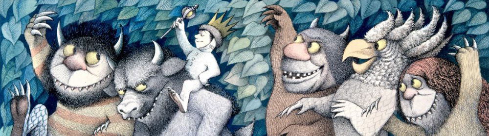
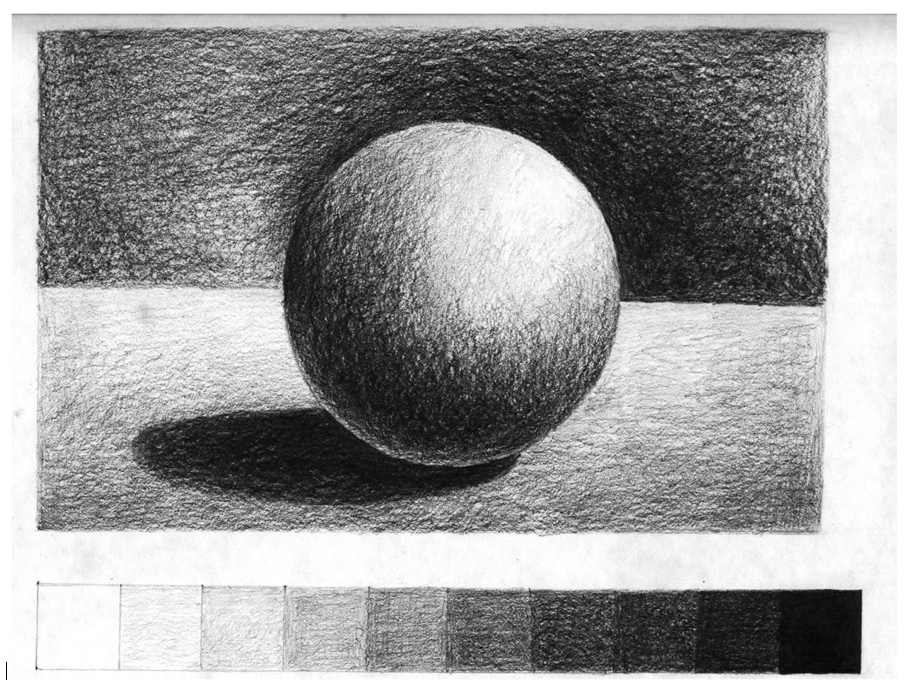
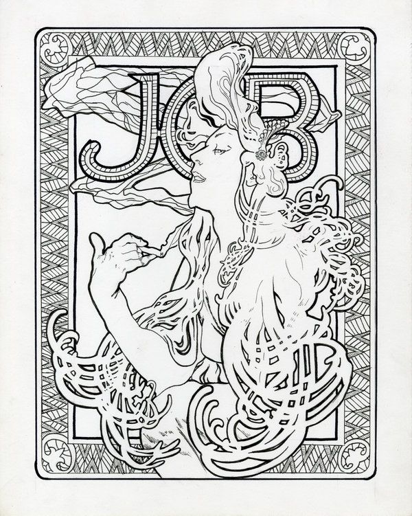
To gain a better understanding of the assignment, please review the student examples.


For this stage, you’ll brainstorm on the object using the IDEATION Method viewed in class.


Then Sketch a minimum of 20 thumbnails for review. Next class you’ll create a pencil rough and value roughs, in preparation for the final inked illustration.


Specifications

  • Image size: 7″ x 9″ vertical format or 9″ x 7″ horizontal format

Directions

  1. To create a concept, write down all your thoughts about the use of your object. Creating a backstory about the owner can help. Is your owner male, female, young or old? Once you understand your owner, the props that you choose will be consistent. You think differently than everyone else, so don’t censor yourself. Allow your thoughts to run freely.


  1. Loosely and quickly sketch several of your concepts in your sketchbook.


  1. Choose the strongest sketch, and draw thumbnails to compose and stage your concept. What props do you need to communicate the concept? Which setting, environment, and time of day will best support the concept?


Tip:
Keep your composition simple. Use only the props necessary to communicate the concept.
Purpose

The purpose of this assignment is to practice creating concepts, thumbnails, and learn illustration process.

Tools

  • Tracing paper and Sketchbook for thumbnails
  • Pencils
  • Ruler

Due Date

  • The 20 thumbnails are due next week.


Exercise 1: Value Scales & Rendered Form and 3 Value Studies

Exercise 1:  Using a soft graphite pencil, create a value scale as pictured below, then try rendering a simple form to represent lighting and dimensionality using only value. Lastly try shading 3 different value studies for Assignment 1.


First: In your sketchbook do a drawing with a Value Scale of a sphere. 

Create a simple value scale such as the one at the bottom of the study below. Find a cube and a sphere to light and draw. Do a value study from observation. Set up a simple form and a light source. Try to “turn the form” or create volume by using the values in the scale you created.


  • Be sure to use the full range of values.
  • Allow 30 minutes for the drawing and 30 minutes for the value scale. Take your time.


NEXT:

USING your Value Scale as reference.  Create 3 different Value Studies of Assignment 1.

If you are UNPREPARED FOR CLASS and clan’t shade your OWN WORK… here is a value shading Exercise to get you started.


POST to OPENLAB When Complete

Collective Arts Brewing – Deadline to submit: September 30, 2017

Class-  Here is a chance to get some professional exposure for your work and earn some money from it!  And you thought this was JUST an assignment!


We are looking for the best new and emerging artists around the globe to be part of our Series 9 Call for Art. This year marks an important milestone for Collective Arts. Our beer can be found coast-to-coast in Canada, and in the USA we are available in New York, Massachusetts, Connecticut, Maine, New Hampshire and Vermont. Collective Arts will be launching in Chicago and Nashville this fall and our beers can be found in Australia! We want to show the world YOUR work as we continue to grow. 

Deadline: September 30, 11:59PM.


Week 3 Sketches

MORE Studies from Reference towards FINAL ILLUSTRATION

Fill your 4 pages by drawing careful studies design elements that factor into your final art. For each of you this will be different. The important part here is that you SKETCH FROM REFERENCE.  For each design element try several sketches and points of view.  Consider these studies towards the final art piece.


Just a reminder, here are your Sketchbook Requirements : 

For this course students are required to keep an ongoing sketchbook which will be utilized a minimum of 1 hour, 30 min per page, for a total of 4 timed sketchbook pages per week.

  • Students can not to tear out pages and pages must be dated. Students may of course draw MORE than the required 4 pages. Sketchbooks will be reviewed weekly as part of peer critique.
  • This Sketchbook will have the specific purpose of being a PROCESS journal.

Assignment 1 Product Illustration

DUE 9/26 FINAL Pencil Drawing

SUBMISSION REQUIREMENTS:

All Final Drawings must be UPLOADED to OPENLAB for GRADING in the following manner:

Write a new post and use the following naming protocol:

  • Firstname Lastname, Assignment One

  • Tag it in the Category ASSIGNMENT ONE.

  • In the body of the post tell us the name of the illustration, for  example:

  • Illustration for Celestial Seasoning Tea, Mint Magic.

  • UPLOAD a HIGH QUALITY (White Balanced and Cropped) SCAN of the image at 150 DPI.

  • Finally, Bring your DRAWING into class along with 3 photocopies at 50% size for WORK IN CLASS next week.


MORE DETAILED INSTRUCTIONS & Helpful Hints:

Preparing your Chosen Concept Sketch:

  • SCAN your concept sketch.
  • If you are making any edits to this sketch, draw your edits and scan those.
  • USING Adobe PS cut and paste together the final mock up.
  • PRINT your concept sketch. IT MUST BE PRINTED TO THE SIZE OF THE FINAL ART. THIS MEANS LARGER THAN IT WILL APPEAR ON THE PRODUCT.
  • A good rule of thumb is to draw your illustration 50% larger than it will appear in print.
  • You may need to print the image out in sections and tape it together!

TRANSFER your concept sketch carefully onto the FINAL WORKING SURFACE using the SARAL Transfer Paper.

  • Be sure to do this neatly! Use masking tape and blank paper to prevent unwanted marks on the border of your illustration.
  • Be sure to tape the illustration down carefully so that it doesn’t creep causing the image to warp.
  • Don’t press TOO hard…you should still be able to erase your marks.

FINALIZE your concept sketch onto the FINAL WORKING SURFACE.

  • Don’t press TOO hard…you should still be able to erase your marks.
  • Don’t shade. You’ll fill in areas of value later in the process.
  • Don’t INK. Your Art Director may still request changes.
  • This drawing should be done at your highest level of skill.
  • Be sure you are carefully considering your focal points and image hierarchy. (This may be achieved with value but should be planned as you draw.)


Label Specs

Featured

Hello class-

As each of you is designing your concept sketches it is very important that you keep in mind the project specs (i.e. size, shape, colors requirement, and resolution) of the final art work.


So the art created for a beer can like the one below would be different than that created for a beer bottle or a wine label.


PLEASE keep in mind that you should feel free to be creative with this.  A label might have a rectangular or square shape, but it DOES NOT HAVE TO.  Not that the ones below do not. So when deciding on the overall shape, do what will make for the better and more unique overall illustration.   The only rule is that it MUST BE FUNCTIONAL.  If you are not sure, use a photocopier and cut out your concept sketch and test it out on an actual bottle or box.

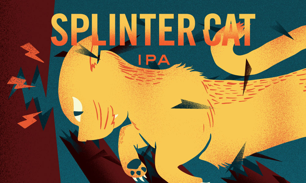
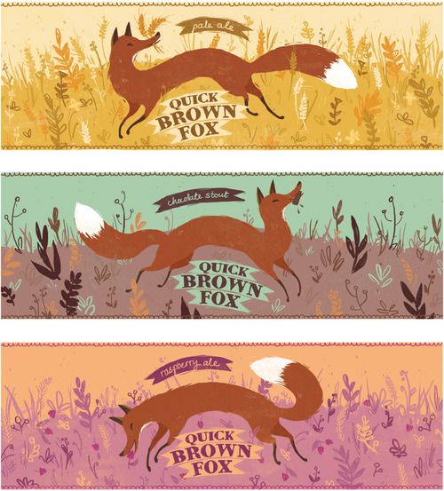
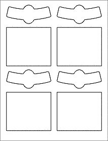
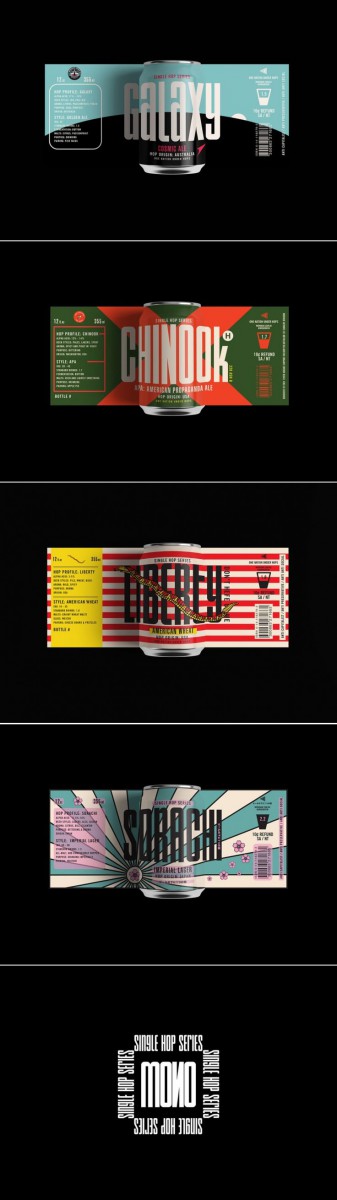
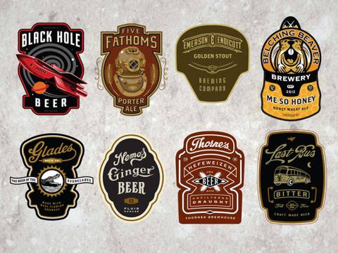
I’m including below some TYPICAL label templates as a helpful tool.  They are meant to print on 8.5 x 11 paper.  You don’t HAVE to use them.  Look at creative illustrated packaging for inspiration.  And really as long as it could actually work, the sky is the limit!
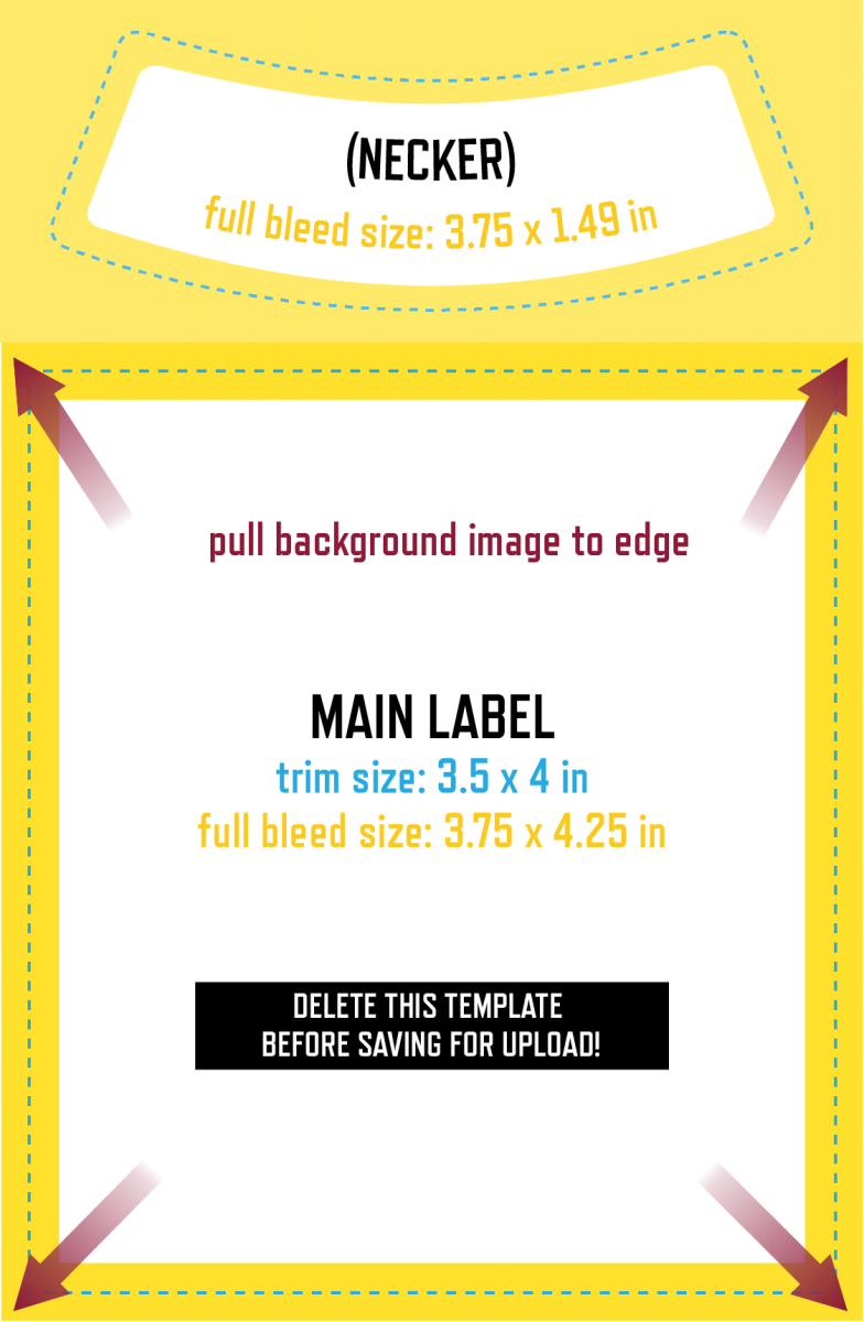
To get an idea of sizes: TYPICALLY a rectangular Wine Labels like these (theres also the little wrap around necker which you can choose to design or not!) are around 3.5″ x 4″


But you can also choose to design a wrap around image like these …

AND AGAIN… IT’S UP TO YOU. YOU DON”T have to conform to these shapes unless you choose to.  But be sure no matter what you choose your design will WORK.

Beer labels are typically 2.5″ x 3.5″ for the most basic, and 7.375″ x 3.125″ for a wrap around.  And again… this is your call. Wrap arounds will provide you a little more room to illustrate, but do what will work best with your design.


As for illustrated cans… which offer a larger space to play with, copy the proportions of the examples below as I was unable to find a template for you.  And again, prioritize making some really creative and well illustrated images over conforming to the examples!


WEEK TWO SKETCHES

Studies from Reference

Last week you sketched things that might be in your final art… Now go deeper!   This time fill your 4 pages by drawing careful studies design elements that may be in your final.

This could be a wave pattern or a skull from several different views, a crowd scene or a few studies of monsters – for each of you it will be different. The important part here is that you SKETCH FROM REFERENCE.  For each design element try several sketches and points of view.  Consider these studies towards the final art piece.


Just a reminder, here are your Sketchbook Requirements : 

For this course students are required to keep an ongoing sketchbook which will be utilized a minimum of 1 hour, 30 min per page, for a total of 4 timed sketchbook pages per week.

  • Students can not to tear out pages and pages must be dated. Students may of course draw MORE than the required 4 pages. Sketchbooks will be reviewed weekly as part of peer critique.
  • This Sketchbook will have the specific purpose of being a PROCESS journal.


WEEK ONE Sketches

This week’s sketchbook theme is… Meet the Artist!


Page 1: #meettheartist

Create a meet the artist page for yourself in your Sketchbook! Look on Instagram or fb for #meettheartist and then design one to introduce yourself.  You may use any media and style you feel is appropriate!  You may choose to include any information about yourself you wish.

Pages 2-4:  Get to know me: Self Portraiture through Objects

Choose objects which are meaningful to you and draw them In Site, NOT floating on the page.  Draw 3 pages of Contour Drawings from Observation.

Post your drawings when complete.

GO TO: CLASS SITE

DASHBOARD > POSTS > ADD NEW >

Write your post. Add a Descriptive title.

Choose CATEGORY (bottom right side): Week 1 Sketches

PUBLISH

Welcome to Illustration1!

Featured

Hello!

Welcome to Illustration 1!  Our goal in this course will be to give you the professional tools used by illustrators working in the field today.  As well as to cultivate your personal vision s an illustrator.

On this site you will have access to materials presented in class, your weekly assignment pages, and additional helpful resources.  Here you will also post your assignment images to share with your classmates.  Carefully read the directions below on how to post to this site and to your ePortfolio.


Uploading Instructions

Upload scans of your assignments from this semester in the Projects Category on this site and also in your ePortfolio.  Be sure to give your project a clear title.  On our class site, write a brief description of the project, and be sure to reference the title.  Also be sure to include in your post the Process Work.  A complete project must include all Process Work as well as the finalized art.  Your descriptions should include what your goal was for the project as well as, what you learned from making it, and what was challenging to do.  Of course you may write other comments as well. For instance, you may ask questions for other students to answers.

How to Post to our class: On this class site, go to Post located on the left > Give your artwork a title in the subject line > Write a brief description of the artwork in the Comments space > Just above your title click on the Add Media icon (it looks like a camera on top of a music note) and browse for your file > Click Insert > Click Drawings in the list of Categories on the right > Click Publish at the top right.

Your desicription should include what you feel the aim of the drawing was, what you learned from making it, and what was challenging to do.  Of course you may include other thoughts as well.

How to Post to your ePortfolio:  Go to Dashboard > New Page > Pages > Add New > Locate “Parent” in the Page Attributes > choose “Academics” from the pull-down menu. In the Title area of your ePorfolio, be sure to write the name of our class (Foundation Drawing) or our course code (ADV1103).  Also be sure to Publish, and invite me to join your ePortfolio.  In settings, be sure to state either “Public” or “Private>visible to City Tech members.”  Otherwise no one will be able to see what you’ve posted.

To take the photo, find a spot with even light so that you will have no shadows or strange light gradations across the drawing.  Frame the drawing so there is a small even frame on all sides.  Optimize the file, or reduce it to 72 dpi, with a file size no more than 1MB (about 8-9 inches on one side). Rotate it if necessary to it uploads right-side-up. If you have access to any photo-correcting program, see if you can increase the contrast so that delicate drawing lines are visible.