Class Info: Spring April 9
- Registration for Spring 24 – ongoing
- Gradebook – Posted grades for project 2 and textures.
- I graded your presentation
- College Resources
- https://www.pinterest.co.uk/danforsterstudio/scripts/.
Contents
Topic
- Continue: Color/ Textures/Legibility
- Let’s look at this PDF Faded image in InDesign
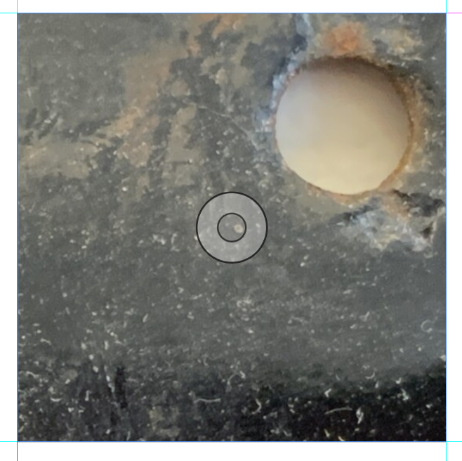
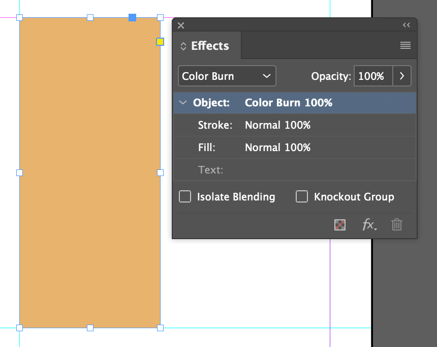
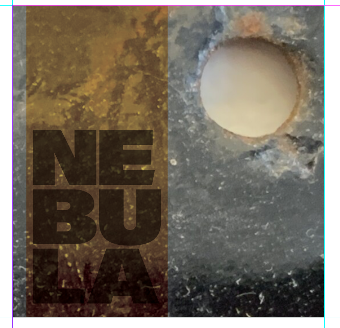
Ways of Improving Legibility with color continuity (Part 2–Following a Color Theme)- manipulate the color of a particular image
- fade portions of imagery or typography (to achieve contrast)
- add bars of solid colors to reduce busy background
- others
- For this example> I created a vertical rectangle, manipulated its transparency and effect


DURING CLASS
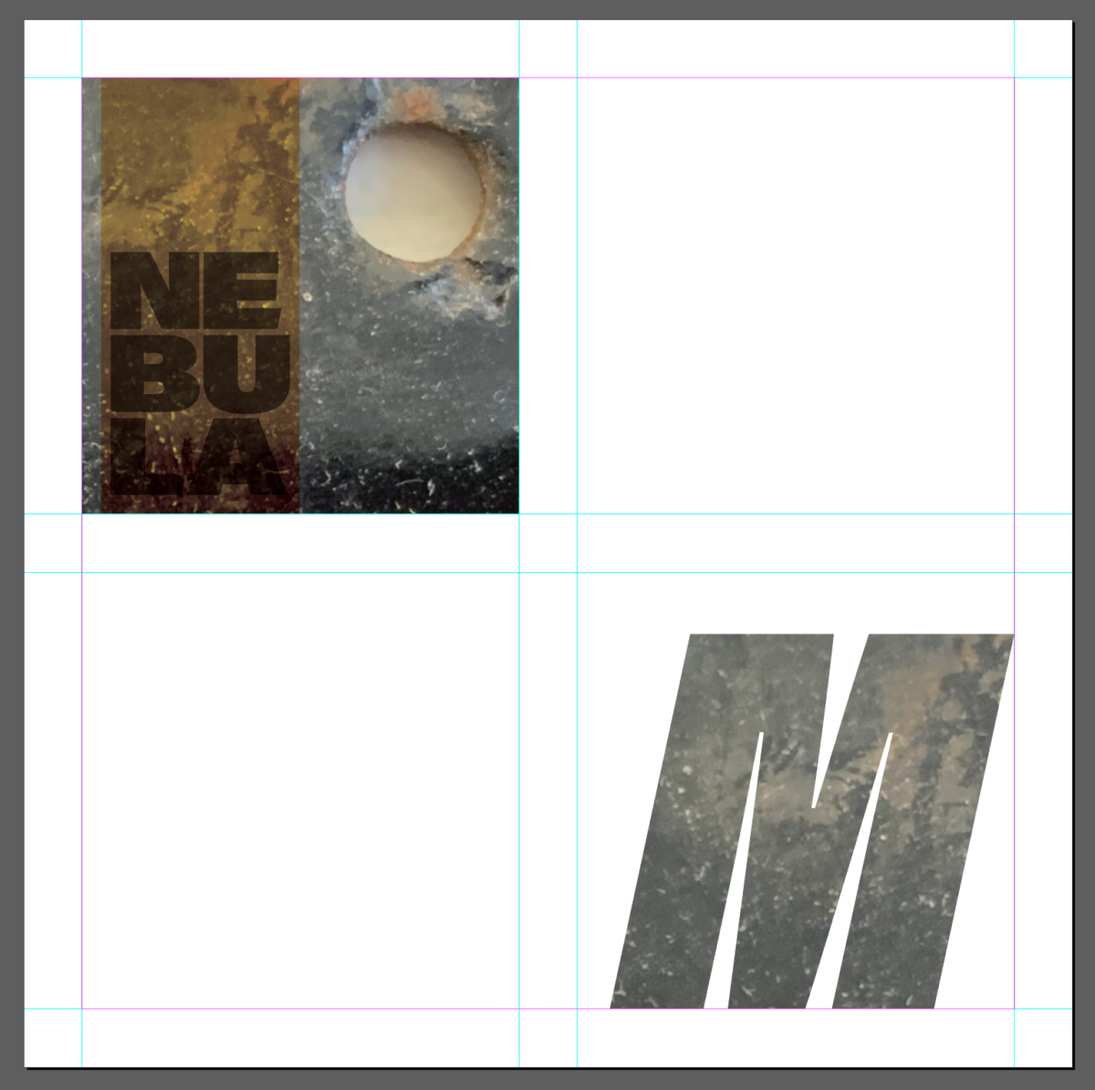
Add a second page to the file that we used during last class
On top left square:
Choose a texture, add a solid shape. Manipulate effects and transparency to achieve a legible composition (this will be different from the one done on previous class)
Leave two squares blank
Then add image inside a letter
Other DEMOS
How to add an image inside a letter INDESIGN
One-on-ones: Returning page 1 with corrections (which was due before class today).
A look ahead…
INTRO TO PROJECT 3
- Visual Hierarchy: Giving levels of importance to the difference elements that are part of a design.
- Examine this PDF with Visual Hierarchy Progression. Every page uses the exact same text, but the hierarchy changes once we start applying different principles (For example a basic change in type size can make a difference in the way the viewer looks at the design)
Objectives
- Learn about visual hierarchy and how these design principles can improve or change the way we see and read.
- space
- type size
- spacial zones (areas defined by grid)
- color
- alignment
- added elements (lines)
- variations in type (bold)
- dynamic compositions (diagonals)
- others
Intro to Project 3
Intro to project 3 | Part 1. Posters Series and Social Media Posts
For a fictional art exhibit (Theme to come).
We will Design a series of posters (which will be the actual contents of the show) and Social Media Posts (which will advertise the exhibit). This is the last project for the semester, and will incorporate all the previously typographic information discussed in class (typeface selection, alignment, tracking, kerning learning, color and typography, the grid, visual hierarchy, and motion ).
ASSIGNMENT
Complete both pages type and color as specified above
SAVE InDesign file
EXPORT AS PDF (all pages)
Name file: Lastname_colorandwords_all.pdf
Place in Dropbox
This will be a graded stand alone assignment
Graphic Assignments are always due the day before class at 11:30 pm, and must be placed in class drive (COMD1127 DROP BOX link) unless indicated otherwise. Assignments uploaded during class on the day that they are due are marked as late.
Participation Activities (Scavenger Hunts, Type Talks and Type Challenges) are due during class or the day before class at 11:30 pm if indicated by the instructor.


Leave a Reply