On this day I went to the Society of Illustrators at 128 E 63rd St, New York, NY 10065 with the rest of my class. It was a memorable day, although I went there about 2 weeks before this I got to see something I never seen before. And these are the questions we had to answer for the summary of this trip.
1) COMD: Write about an exhibit, artist, or specific work of art that exemplifies illustration as communications design
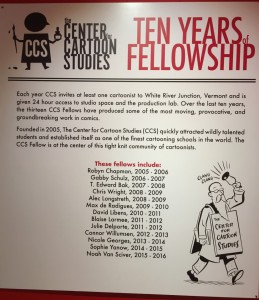
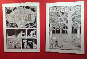
I think the Center Cartoon Studies exhibition caught my attention the most, at first I was instantly stopped at these cartoonish gallery when I first got on the second floor, I have a heart of a child and that is part of the reason why I liked it so much. “Basewood” by Alec Longestereth has made a really fitting choice of setting. it shows the wondering man in the woods trying to figure out where he is. At the first glance it really rememded me of the old school cartoon storyline, and “tintin adventure” one of the story it reminded me of, the story board it self mostly focus on story plot progression not much of a dialogue driven concept. In communicaton design it is really about using clever imagery to catch viewers attention and these big framed storyboard did just that.
2) Storytelling: Write about an exhibit, artist, or specific work of art that serves as a good example of illustration as a storytelling
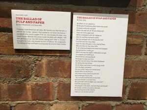
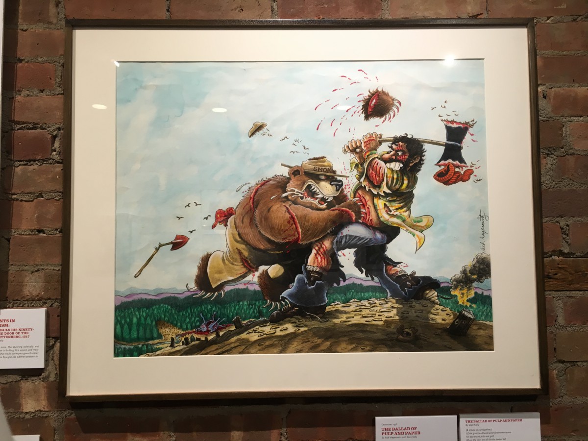
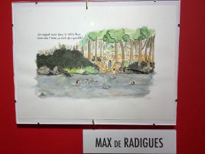
The work I liked as a story telling point of view is “The Ballad of Pulp and Paper” as he stated in his discripition of the work he said “Paul existed to cut down the forest . I wondered what would happen if he ran into Smokey the bear, who save the forests.” Is these kind of imagination that creates good story. On the photo it clearly shows The bear and the man are having a hell of a fight. and it is very graphic in a cartoon way. The picture from above kind of gives people the feeling of empty either towards the man or towards the animal. The story telling aspact can be seen as them battling out each other and only this one moment is captured, but it is enough for people to see what is happening. This truly describes “A picture is worth a thousand words” well.
3) Review: After visiting the whole museum, list 3 overarching themes that appear to tie together the works featured here today (for example, satire, absurdity, perspective). Describe each theme by citing specific visual examples across collections (insert pictures/captions here) or analyzing the exhibition choices, or even the layout of the museum.
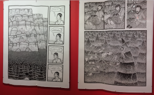
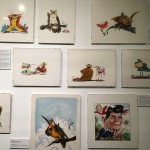
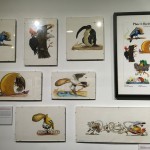
For me the 3 of the overarching theme would be Storytelling, humor/ black comedy along with unique imagination. Of all the work I’ve seen in this gallery I can safely say there are some really intresting art works. It will make some people want to know whats next? and maybe even giggle a little.
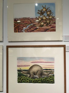
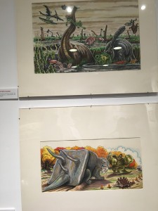
These work are very clearly illustrated for people to understand, Some has even idea of unknown creatures. When it comes to humor those Dinosaurs and birds are really funny.
The humor of these kind of art work attracted more attention when it comes to regular design that look good. So I think the Humor aspect are really a critical design technique for them.
