The making of the logo
It was a fun experience coming up with these kind of concept, at first I wanted to do something with my last name, it is Sun. I like this name and I admire this name I have. Sun is the center or our solar system. To do something that can visualize these 3 letters are some really great opportunities.
Sketches #1
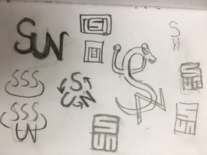
I was trying to come up with these S U N shapes that can end up next to each other but I wasnt really sure what to do and something like that hot spring logo it turns into 3 S’s. so I move on to other Ideas.
Sketches #2
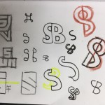
In this sketch I further continued the idea of combining the S U and N trying to make them linked to each other, however I thought when the S and U are uppercase letters I need to make N uppercase as well. So I decide not to go with these SUN combination. I thought of the S and B of my initials. But this S and B is a good idea I tried to make them look like they are out of a same letter but its kinda hard. So it almost turned into S and P.
Final logo #1
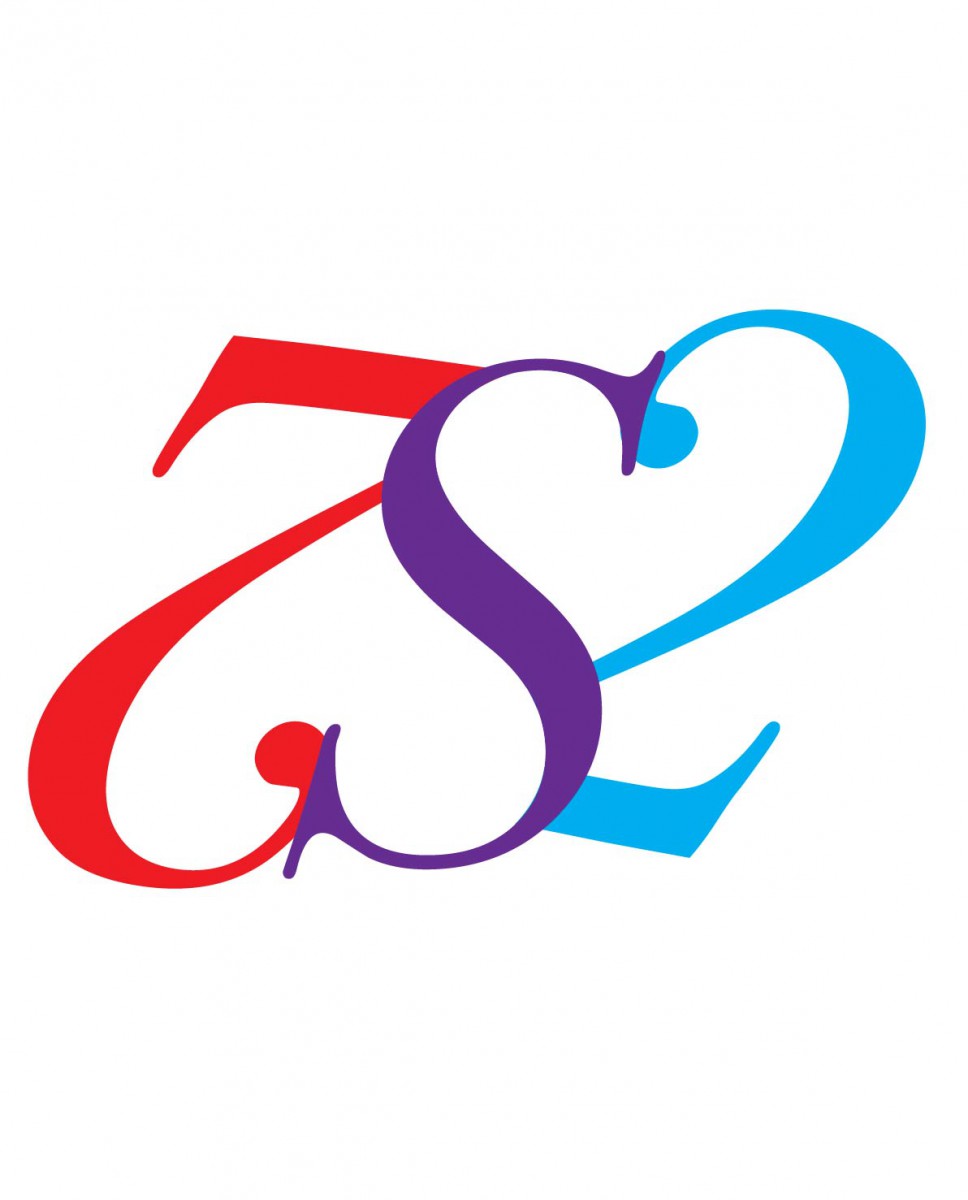
This is my Bodoni logo design. it was originally from two of the 2 numbers and going like a yin yan sign so it turned out to look like a 7 2 at first their serif are touching but I decied to do something with the S just because of my name Sunny, or my last name as Sun. There is something that is more interesting if you look close enough.
Yes it resembles two hearts, it is almost equal. It changes the gradient we can see from a warm color to cold color.
Final logo # 2
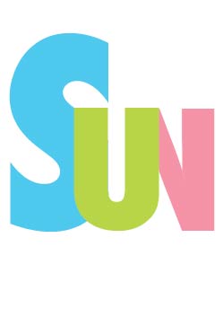
I decided to do something with the UN from my last name and it came out to look like a weird W (I linked them together) But when I connect the S with the U it makes me feel like its a ok design. not good but OK. I also made them Bright color because I want this to bring out some kind of positive vibes. The font is Futura
This is also the final logo I want to use. it represents “Sun” well. although when we first look at something that is related to sun we will think about a big hot fireball. but this is also sun however throughout these colors we can tell this is something that is kids friendly.
I got the inspiration from The CNN type design, I loved it as you can see the UN are connected like how they connected CNN. I didn’t like the lines in the middle so I did not put that into my work. other reasons are because there are a lot of design are like this by putting the lines in the middle they can immediately assume I copied their idea. This is a design I did because I did not like my other ideas, due to the over complexity of it. I though something as easy as this can be a nice design as well.

