COMD 4900 Internship
From my last meeting with my advisor, she picked her favorite one and thought it was perfect. In a future week, I will be assigned to do a photoshoot for the clothing label and then edit it as well for that week.
This week I was assigned to create a mass amount of logotypes that will be used for their spring collection. I had to create 2 different logotypes, one with the brand’s name, and the other with just the brand’s initials.
I was given no references and told to create every kind of aesthetic possible. I spent a lot of time researching other fashion brand logotypes so I could gain a general direction and vision in my head.
I cannot go into exact details done due to my NDA but in broad terms, I made a mass amount of logo design using different colors, fonts, and font treatments. I as well made unique fonts by taking visually pleasing and boring fonts to then add or remove things from the font. I used photoshop when creating unique fonts by using the paint or shape or eraser tool to take away or/and add to the already made fonts.
Throughout the experience, I realized that creating unique fonts for when working logotypes for a fashion brand is better than just using already made fonts. It adds to the clothing brand’s uniqueness and helps give the brand a more personal identity.
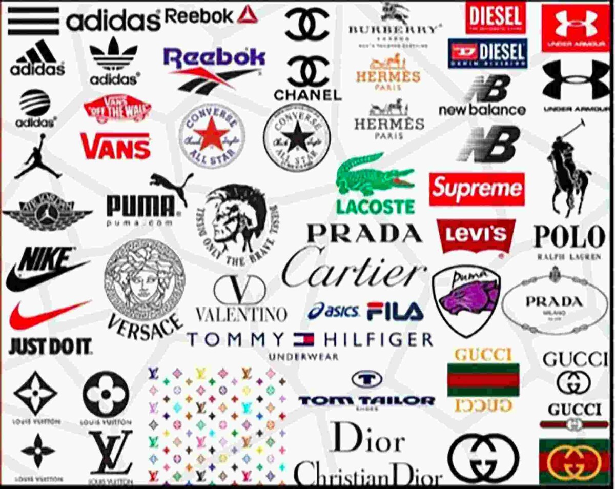
I was not given references for this project so I had to spend a lot of time researching different brands and categorizing their logos by certain brand type aesthetic. This was so I could get a better understanding of how brands will have similar or different logotypes depending on the type aesthetic or target audience. There were a lot of categories I used like future, modern, formal, hipster, hypewear, techwear, vintage, designer, and avant-garde. This then allowed me to see the similarities and differences to create a logotype that resembled the brand’s aesthetic. I was told the brand aesthetic was a timeless vibe, their brand message is for their brand to be timeless and for all their products to still be in style and hip 20 to 30 years from now.
With the brand’s message I came to the conclusion the brand’s aesthetic is to have a basic modern look that resembles vintage brands meaning brands that have been around for 20 years plus. Looking at all the brands I categorized in vintage, I realized they all have a basic very clean-looking logotype. I realized that the type of aesthetic they use has shown to be successful and timeless since their brands became powerhouses in the fashion world and have been here for decades.
This then allowed me to have a better visual in my head of a logotype I was designing and creating. As Well as to have good information to say to my advisor to back up my methodology.
www.digitalesvg.com/product/fashion-logo-bundle-svg-fashion-brand


