Beginning creating logotypes (# 05)

COMD 4900 Internship

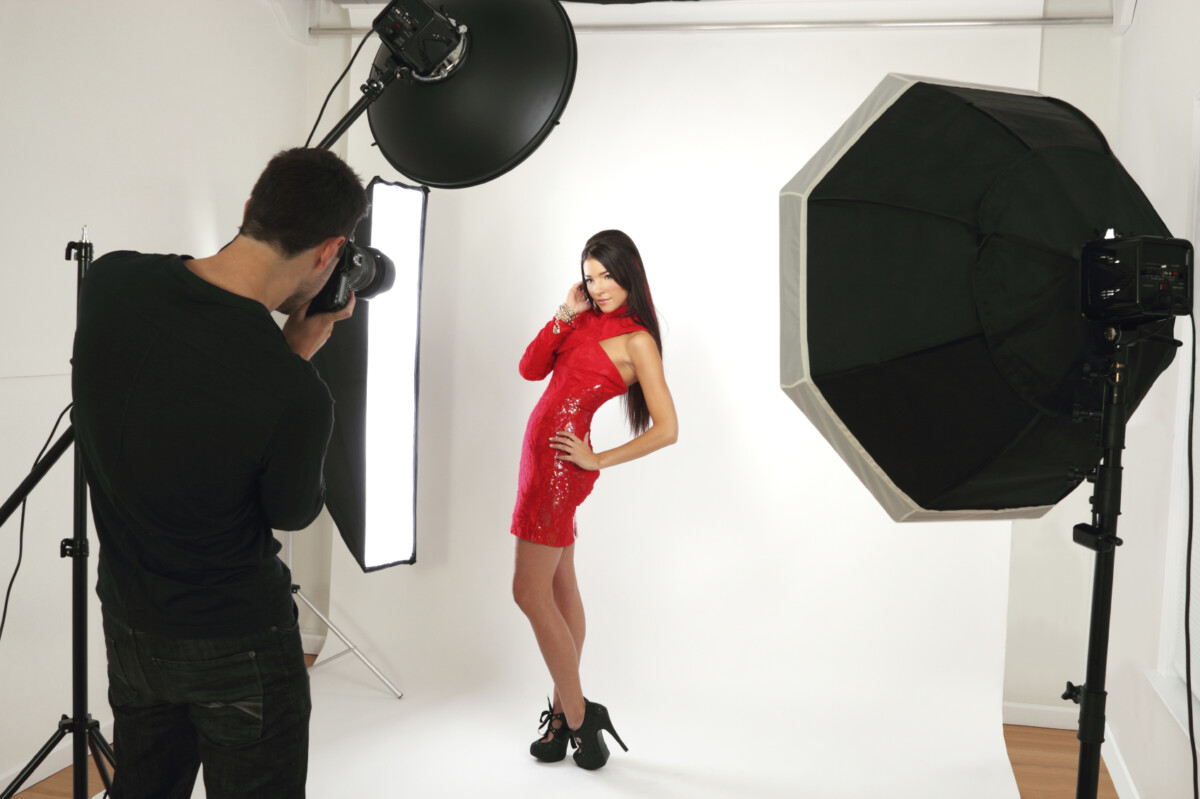
From my last meeting with my advisor, she picked her favorite one and thought it was perfect. In a future week, I will be assigned to do a photoshoot for the clothing label and then edit it as well for that week. 

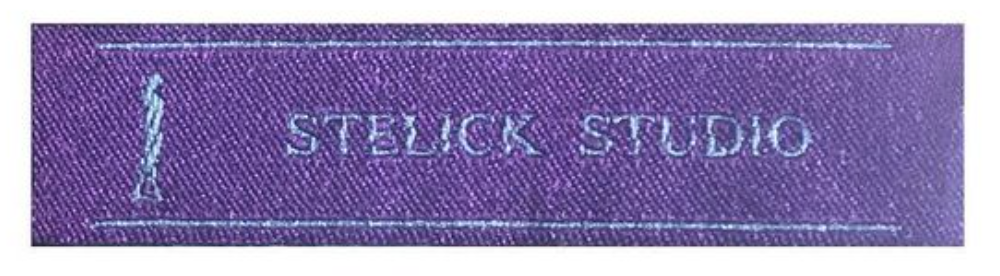
This week I was assigned to create a mass amount of logotypes that will be used for their spring collection. I had to create 2 different logotypes, one with the brand’s name, and the other with just the brand’s initials. 

I was given no references and told to create every kind of aesthetic possible. I spent a lot of time researching other fashion brand logotypes so I could gain a general direction and vision in my head.

I cannot go into exact details done due to my NDA but in broad terms, I made a mass amount of logo design using different colors, fonts, and font treatments. I as well made unique fonts by taking visually pleasing and boring fonts to then add or remove things from the font. I used photoshop when creating unique fonts by using the paint or shape or eraser tool to take away or/and add to the already made fonts.  

Throughout the experience, I realized that creating unique fonts for when working logotypes for a fashion brand is better than just using already made fonts. It adds to the clothing brand’s uniqueness and helps give the brand a more personal identity.

I was not given references for this project so I had to spend a lot of time researching different brands and categorizing their logos by certain brand type aesthetic. This was so I could get a better understanding of how brands will have similar or different logotypes depending on the type aesthetic or target audience. There were a lot of categories I used like future, modern, formal, hipster, hypewear, techwear, vintage, designer, and avant-garde. This then allowed me to see the similarities and differences to create a logotype that resembled the brand’s aesthetic. I was told the brand aesthetic was a timeless vibe, their brand message is for their brand to be timeless and for all their products to still be in style and hip 20 to 30 years from now. 

With the brand’s message I came to the conclusion the brand’s aesthetic is to have a basic modern look that resembles vintage brands meaning brands that have been around for 20 years plus. Looking at all the brands I categorized in vintage, I realized they all have a basic very clean-looking logotype. I realized that the type of aesthetic they use has shown to be successful and timeless since their brands became powerhouses in the fashion world and have been here for decades. 

This then allowed me to have a better visual in my head of a logotype I was designing and creating. As Well as to have good information to say to my advisor to back up my methodology.

www.digitalesvg.com/product/fashion-logo-bundle-svg-fashion-brand

Creating Clothing labels (#03)

This week, I was assigned to create a mass amount of designs for clothing labels. My employer wanted me to update their original clothing label to a more simple and elegant design. I created a mass amount of labels with different font and color choices. The clothing label size is small, so only the brand name can be placed on the label.

Their original label was the brand’s name (Stelick Studio) with a model on the left size of it. I attached a photo so you can get a clearer understanding. The brand requested a more simple and elegant look, so I got rid of what I thought was not necessary and played with the font, font effects, font size,  font color, background, and background color. I can not go into detail explaining exactly how and what I did due to my NDA. I created 30 different variants, and am presenting them at my next meeting.

Photo taken by me on phone.

Getting introduced to the Brand (# 02)

In my first week working with the brand as their intern, I went to the brand’s studio to meet the rest of the team and to be the photographer for a photoshoot. It was also my first time being in a brand briefing where we’d discussed what and how I would be doing. I learned each week, I will have a weekly project that consists of making graphic designs with references given to know the style they would look or will be photographing then editing photos for photoshoots.

Before going to the studio, the days prior I was nervous and scared because I didn’t know what to expect. But once entering the studio and meeting the team face to face, I realized that there was nothing to be worried about as long as I do what I am supposed to do.

The photoshoot went well and was very professional. It was a little challenging at times when photographing because I couldn’t make the subject look how I thought it would look best in the photograph. I had to listen and execute the photos exactly how my advisor was requesting during the shoot. Now for the rest of the week, I have to edit the photos to make them look their best.

www.savageuniversal.com/blog/studio-vs-outdoor-photography/

Looking for the internship (# 01)

A couple of weeks prior to the semester starting, I was looking on multiple job websites in hopes to find a graphic designer internship. Once the semester officially started, I then had applied to around 12 different internships. I was nervous and scared after a couple of days because I hadn’t gotten any replies and knew we needed to have an internship by the third week.

https://startupsventurecapital.com/what-the-heck-angellist-really-is-three-marketplace-functions-3f4235a29c5d


After a week and a half, I had gotten three emails back for internship positions. I then replied to all of them to hopefully get an interview as soon as possible. Only one had then emailed me back for a zoom interview. The one brand that replied was a small start-up fashion brand called Stelick Studio. They required someone who was a graphic designer who could as well take photography. I wanted to work in the fashion field as a graphic designer once graduated, so this was my dream internship. The moment I saw the email for the interview, I became very anxious because everything was riding on this interview. But at the same time, I was the most comfortable with this internship position because it required my photography and graphic design skills. I have been a freelance photographer since high school so I knew my portfolio was most prepared for this internship because it showed my best photography and graphic design skills. I also was confident prior to the interview because I was genuinely into fashion and knew how to talk about fashion.

The interview went splendidly because my advisor had liked that my portfolio had a little bit of everything in graphic design and photography styles. My advisor had liked how versatile my work was, and that I was genuinely into fashion. My advisor and I connected a lot more than we would of if I hadn’t known about fashion because our conversation was not forced.

A week and a half passed after the interview, and I got an email telling me I had gotten the internship. Instantly, I felt so good and that all the pressure I was facing was gone. I am assigned a weekly project that could be to create things graphically or to be the photographer at a photoshoot. It’s a learning experience and is preparing me for the field of work I will work in once graduating.

Ethics Entry 2

2a) From the reading, my perspective on my design work hasn’t changed but has enforced me that what I’m doing is correct and the right approach.

In the past for my design work, I have created everything by myself from scratch so there are no copyright or trademark problems. When using photographs, I always use images that are royalty-free so I don’t have to worry about infringement and can use them for anything. I purposely started to make this a habit so I can be more set to be a professional designer. Reading  SocialMediaExaminer’s “Copyright Fair Use and How it Works for Online Images” and AIGA’s “Use of Photography” showed me the importance of only using your own work because you won’t ever be considered a professional designer.

2b) From reading “Case Study on Fair Use and Fair Dealing: The Hope Poster Litigation”, I think Fairey’s use of the photo did fall under fair use since the final product was different than the original photograph. I think if the poster did not gain the attention it did, then there never would have never been a lawsuit filed. If he had come clean and not tried to cover it up by lying about the original reference then he would probably not need to comply with the AP. The cover-up being discovered is what ruined his chance of winning the lawsuit. 


Sources

• Crawford, Tad. “Use of Photography” AIGA,  AIGA Business_Ethics 47556770-Use-of-photography-1-MB.pdf

• Hawkins, Sara. “Copyright Fair Use and How it Works for Online Images” socialmediaexaminer, https://www.socialmediaexaminer.com/copyright-fair-use-and-how-it-works-for-online-images/ 

• Fisher, William. Case Study on Fair Use and Fair Dealing: The Hope Poster Litigation” Harvard Journal of Law and Technology,  Hope_Poster_Case_Study-1.pdf

Ethics Entry 1

1a) Ethics in the world of design is something that is very necessary to understand. It allows a person to keep a professional clean and honest design.

At my internship at Stelick Studio, the way I get my imagery is from actually taking the photos and then editing them. I have been given reference photos and designs in the past weeks so I can understand the brands’ visual representation style and aesthetic they want. The brand logo is given from the brand itself. In my first meeting at my internship, we went over the importance of everything having to be original, and nothing is taken from others. I was lectured on the importance of the brand has to keep its originality to stand out by being unique and ethical. I was taught that ethicality is very important in the fashion world because once customers and people, in general, find out the brand is not ethical meaning is disingenuous then no one will want to support it.

Reading AIGA’s “A Clients Guild to Design” helped me see how important ethicality is in design and what exactly are the standards a designer must uphold. Aswell learning the difference between what a designer is and what a professional designer is.

1b) My internship required me to sign an NDA (non-discourse agreement) which was my first time doing so. It was confusing and very technical in the writing, but after speaking to my advisor, I understood it a lot more. The NDA forced me to be broad with what and how I explain what I’m doing in my internship. I must always send my weekly journal part talking about the internship progress to my advisor to see if it is okay to post. I can say what I’m doing each week but I can’t go into specific detail talking about how I am doing each assignment. I can’t give details on how I’m designing it or what exactly I am taking photographs of at photoshoots.

Reading AIGA’s “Use of Photography” and “Guide to Copyright” helped me to see why some brands require you to sign an NDA. Aswell to learn the rules of copyrighting when working for someone else and is the importance of crediting photographers.

From reading SCRIBD example NDA, the advantages more so weigh out the disadvantages. An NDA allows the company to be able to protect its sensitive confidential information and allows the recipient to gain clarity and know exactly what is considered sensitive confidential information sot they do not disclose any if that information and avoid the consequences. Lastly, an NDA advantage is it preserves key business relationships. An NDA provides peace of mind in long-term business relationships where confidential information must flow between the parties. So, you know your confidential information is protected, and your business relationship is secure.

An NDA can as well have some disadvantages, more so towards the recipient and if they break the NDA. Breaking an NDA could cause legal actions between the two parties. Whoever is the prevailing party will be able to get their money back from attorney fees and costs. More so, the company will be the prevailing party, and the recipient will lose extra money and have to pay out of pocket when breaking an NDA. Another disadvantage of NDA is towards the recipient, and them not being able to talk about or show any of the work they are doing. The recipient will not be allowed to show their work on their portfolio until the DNA is no longer in effect. This can be a disadvantage because some NDA’s can last forever even after you have stopped working for that brand, meaning the work you created for them can never be shown to the world which will hinder your portfolio.

Sources

• Crawford, Tad. “Use of Photography” AIGA,  AIGA Business_Ethics 47556770-Use-of-photography-1-MB.pdf


• Crawford, Tad.  “Guide to Copyright” AIGA,  AIGA Business_Ethics 47556757-Guide-to-copyright-1-MB.pdf


• Stone, Joanne. Rigsby, Lana.  “A clients guide to design” AIGA,  AIGA Busines_Ethics 47556721-Client-s-guide-to-design-1-1-MB.pdf


• RocketLawyer.  “Non Disclosure Agreement” SCRIBD, https://www.scribd.com/document/91894008/Non-Disclosure-Agreement