
COMD 4900 Internship
At my last meeting, my advisor gave me feedback and told me the labels she had liked the most. From the 30 variants originally created, she gave me her top 10 favorites. With the feedback given to me on what she would like me to alter and improve for each label, this week I have been updating her top 1o favorite labels. I had to change the layout and placement for most of the labels because my advisor wanted the focal point to be somewhere else from where I had it in each label. I also changed the colorways a little for each by enriching or dulling the colors. I can not go into detail explaining what I did for each label due to my NDA.
In broad terms, I as well used different colors, fonts, and font treatments. Throughout the experience of it, I realized how important color is when it comes to making clothing labels. The background color can make or break the label by either helping or hindering the font of the text. You always want the text to pop and not be subtle because the text is what is most important on the label.
I had to also keep in mind while creating these label designs how they look in real life, the size of the text and quality of how their labels look in person is completely different from when designing. In previous weeks when meeting in person with my advisor, I was given their old clothing label so I can see how the print quality is. I realized that these labels are not printed but woven meaning it is being stitched and not printed. This made me then realize that the design required a font with a weight to it but not too much weight because they wanted the label to resemble their logo as much as possible.
My advisor gave me a couple of references of other clothing labels she liked so I can get a clearer visual of the aesthetic my advisor wants the labels to have.
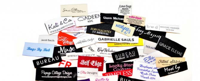
www.linxcorp.us/woven-clothing-labels/

