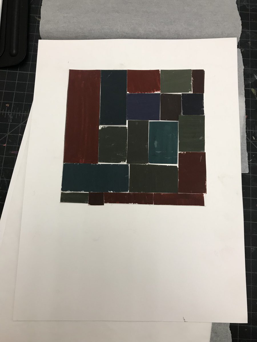
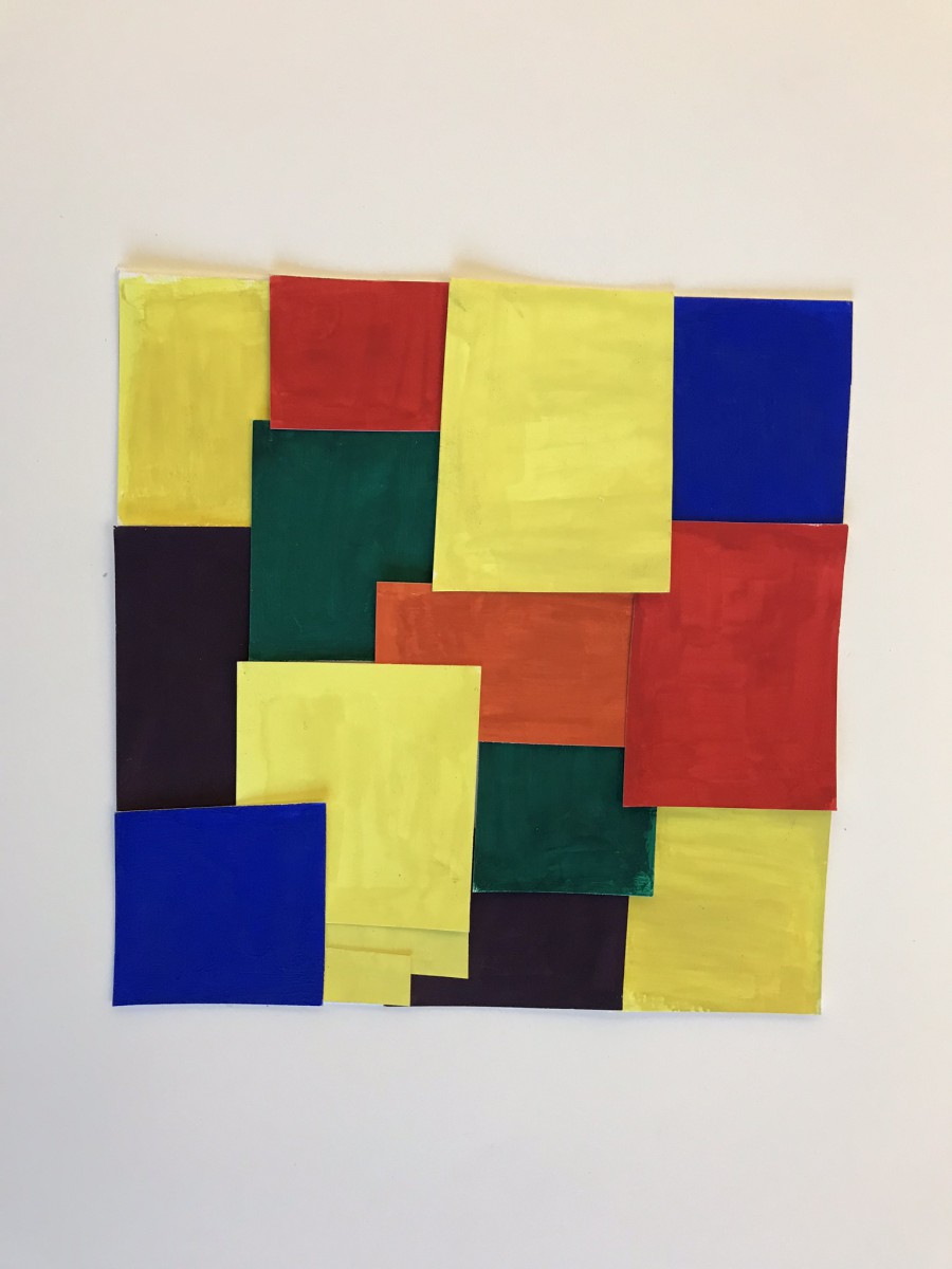
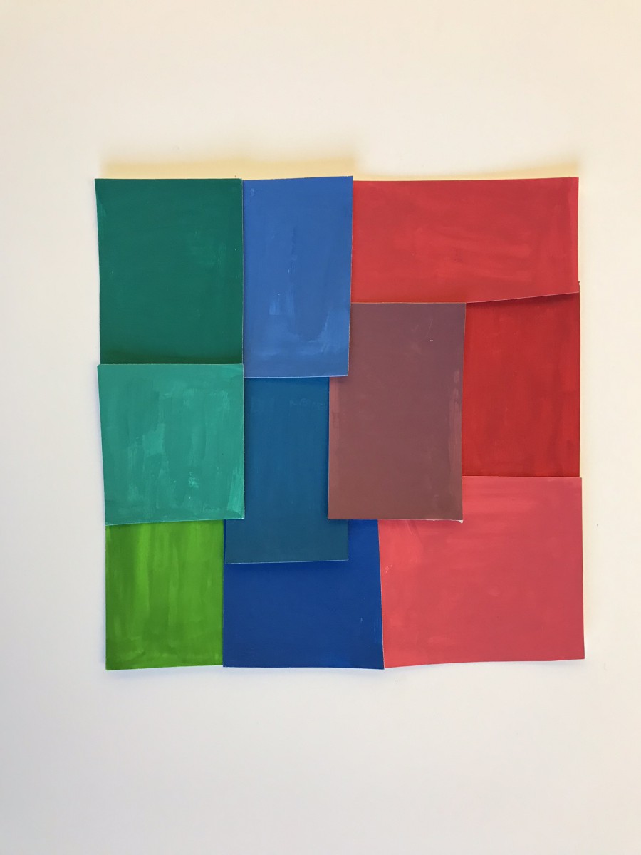
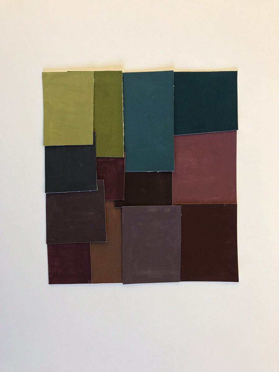
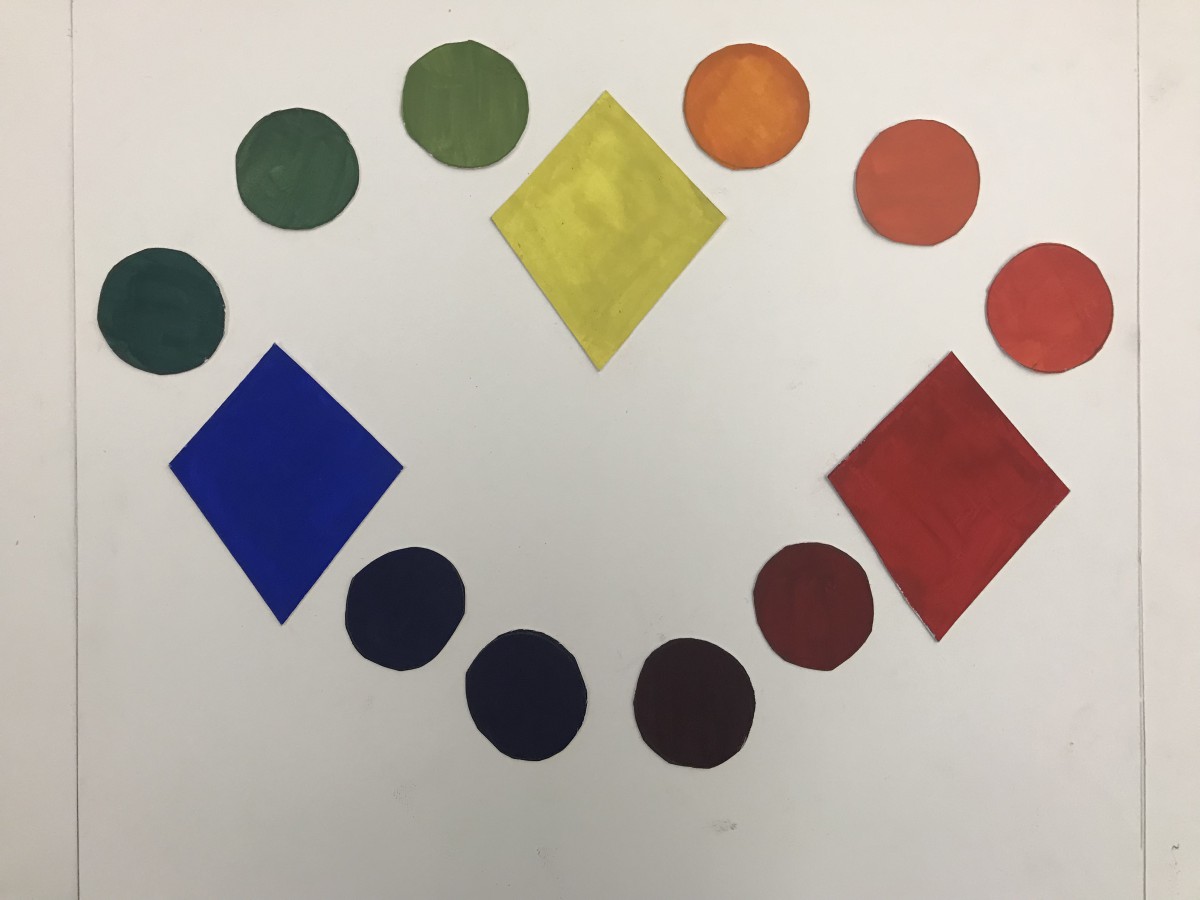
Chromatic Greys
Muted
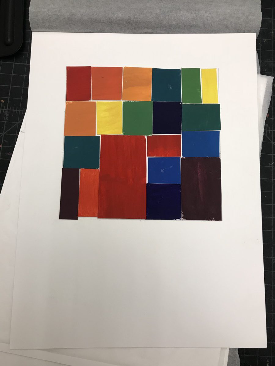
Prismatic
Hours Worked: 3
Fall 2017 | COMD1100_LC08 | Prof. Spevack
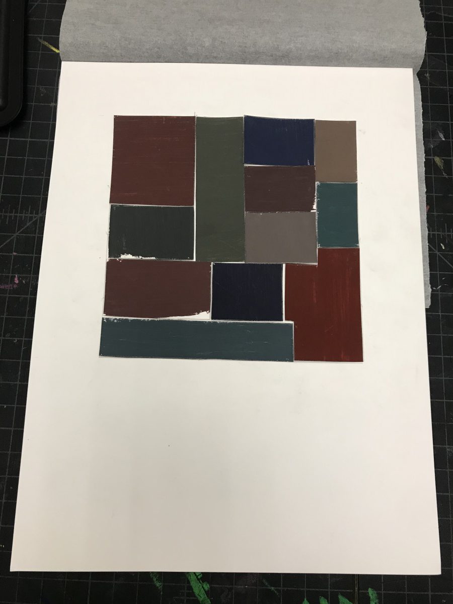
Chromatic Greys
Muted
Prismatic
Hours Worked: 3
Excited to work with color, I dove right into the color wheel phase. In the next phase I experimented with pure prismatic hues, mixed with complementary hues to form different hues of chromatic grays. To lighten to chromatic grays I added white. Figuring out the ratio of how much prismatic/complementary colors to combine was difficult and took alot of experimenting. In the next phase I had to execute muted an prismatic hues. I used the pure primary colors red, blue, and yellow to make secondary, and tertiary hues. This was really easy and fun to do. Making the muted broad range/broad hue collage I added white to saturate the hues. Contrast was created with saturation. Mounting all of the collages wasn’t difficult at all. With past projects, I learned to use my eye an create a composition that is unified and flows together. Focusing on the broad range and the values of all the hues I was able to compose collages I was really proud of. The group part of this project I enjoyed the most. Using two cross sensory words and the cool temperature colors me and my partner picked, we had to create a poster for a band name. We chose the Lush poster template. We came up with periwinkle, and violets because they give off a sense of relaxation an calmness. I chose some blues to coincide with my cool temperature of violets. Using our 5 senses, we agreed on many sensory words that would mesh well with cool temperatures. We came up with our leading band name “Silky Glaciers” with or runners up bands being “Breezy Mints” and “Tangy Waves”. My partner mentioned Europe, and we jumped at the opportunity to base or location at a awesome club in Germany called the “Mojo Club”. I look at all colors a little bit differently now. Thinking more into how I’m perceived to see color with the help of the primary hues.
HOURS WORKED ON 2HRS
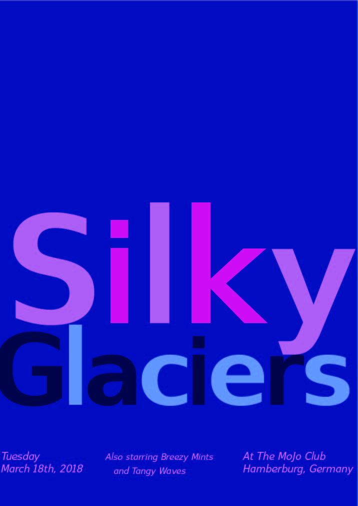
Freestudy Group Poster
Me an my partner chose the Lush poster and we had to form cool temperature colors. We came up with periwinkle, and violets because they give off a sense of relaxation an calmness. I chose some blues to coincide with my cool temperature of violets. Using our 5 senses, we agreed on many sensory words that would mesh well with cool temperatures. We came up with our leading band name “Silky Glaciers” with or runners up bands being “Breezy Mints” and “Tangy Waves”. My partner mentioned Europe, and we jumped at the opportunity to base or location at a awesome club in Germany called the “Mojo Club”. Its was the perfect place for our “Silky Glaciers” to perform!
Hours worked on 2 1/2 this was fun to create!
![]()
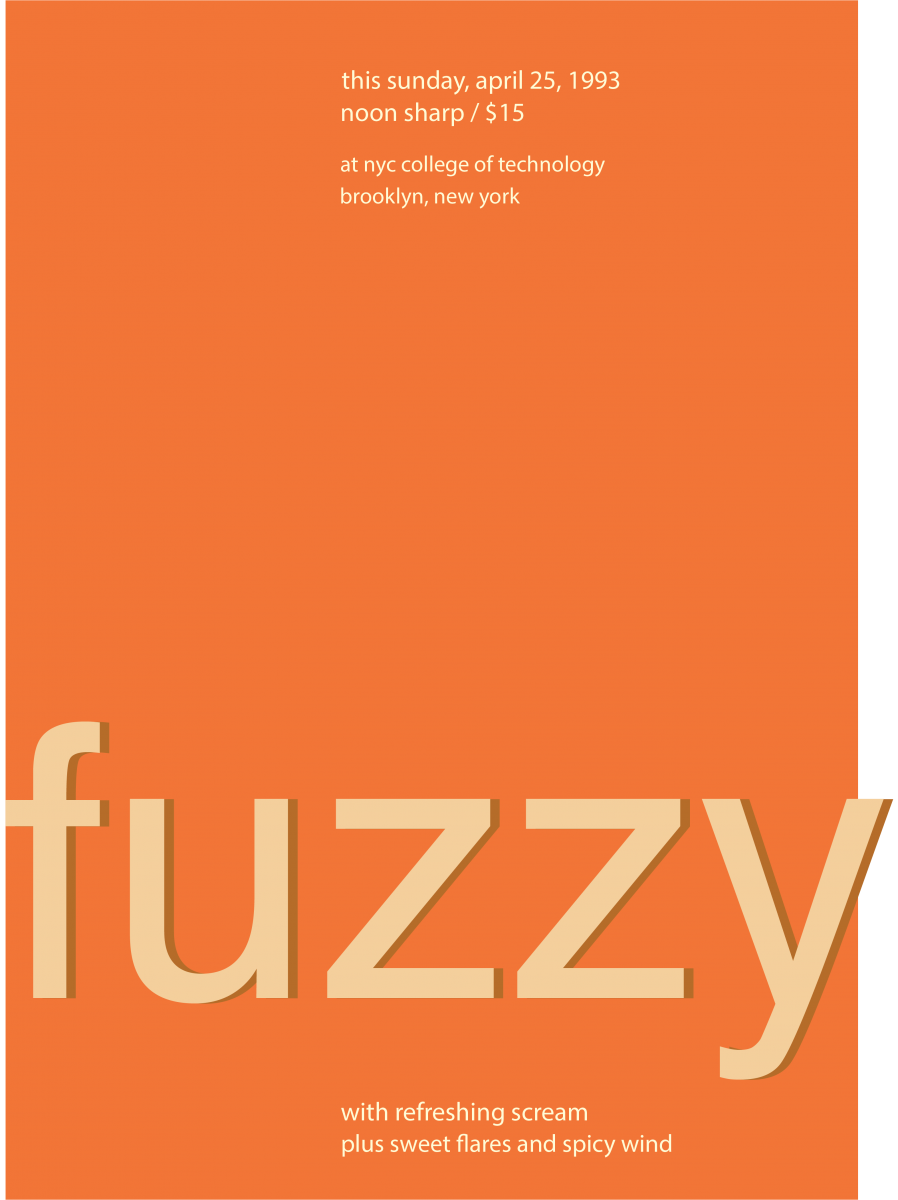
My partner Sage and I were working on a Swiss Style Band Poster featuring these categories: The Bikini Poster and using the metaphor of warm that uses colors of orange and yellow. We had at least 20 different ideas of band ideas that relate to our categories. By far, the band name that we used is Fuzzy Suns. In this poster, I applied a similar structure from the Bikini Poster to this with plenty of color and word changes. I use the color orange to represent the metaphor of warm and applied muted orange and chromatic gray of orange into our poster to keep the subject of the band name. Overall, this took us 3 hours to complete this phase.
 Chromatic Gray
 Muted
Muted
 Prismatic
This was one of the longest phase I made, mainly due to the fact that I have to mix a ton of colors, especially the chromatic gray colors. Here is the main progress I done:
Chromatic Gray: I first creating secondary colors like Orange. Then I use my secondary color to be mixed with the primary color, according to their complement from the color wheel. Then I create at least 9 squares and create them into a collage, making a 6×6 collage.
Prismatic: It’s simple, I just created pure colors in squares. This includes both primary and secondary colors. However, due to the amount of busy time I had, I can only make a 5×5 collage.
Muted: Similar to Prismatic, but I applied some white paint in each pure color. However, due to the amount of busy time I had, I can only make a 5×5 collage.
This took me 5 hours during my progress in this phase.

This was a simple color wheel I created. It has been a long time since I ever paint in my lifetime, which is why certain colors seem to be mixed up or weird. But overall, I had done my best to make a color wheel that makes sense.
Time done in this phase: 1 1/2 hours.
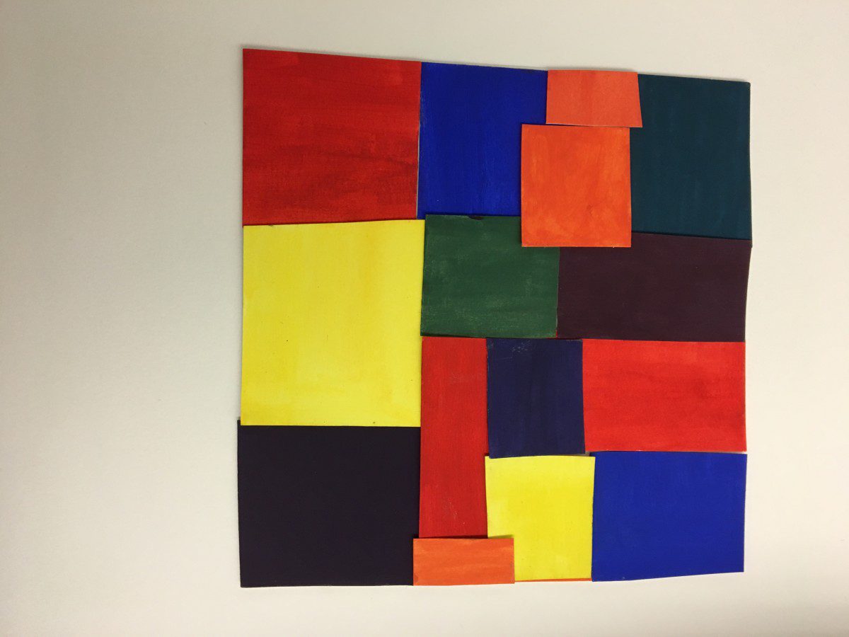
Primary collage
Muted collage
Chromatic gray collage
When it came to making the collages I had lot of fun strangely there were a few challenges but nothing that ever made me feel like this is impossible. The primary colors were l the easiest to deal with, the muted second, and chromatic grays last. Even though the chromatic grays were a bit tricky it’s my favorite collage of the 3.
Color wheel
For my color wheel I decided to go futherand added tertiary colors so that you could see clear change from color to another. I found it really interesting how the colors mixed to together.
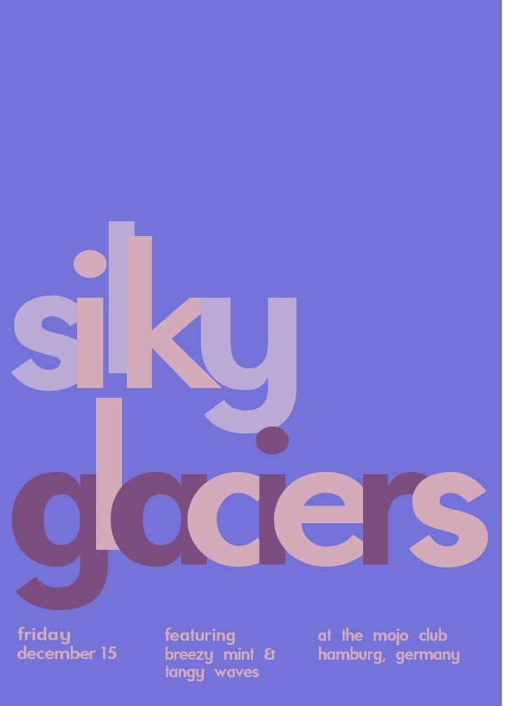
My partner and I chose the LUSH piece along with a COOL color temperature. Purple was the first thing my partner said, and I couldn’t agree more. Then, we came up with sensory words to pair up; we thought of words that reminded us of cold temperatures or shades of periwinkle and violet. From the list of sensory words, we paired three band names—”silky glaciers” our favorite and “breezy mint” accompanied by “tangy waves” were the runners up. We decided upon a European location, and Germany was our choice because who WOULDN’T wanna go to the Mojo Club!
Project #4 only took about an hour and a half (I would love to do another)
 Prismatic colors are pure colors
Prismatic
 Chromatic Colors are grays that show a much more subtle color
Chromatic Gray
 Muted colors are colors with a high quantity of white, black, or gray colors in them.
Muted
Work Time: 4 hours
© 2024 COMD1100 : STUDENT BLOG
Theme by Anders Noren — Up ↑
The OpenLab is an open-source, digital platform designed to support teaching and learning at City Tech (New York City College of Technology), and to promote student and faculty engagement in the intellectual and social life of the college community.


Recent Comments