Fall 2017 | COMD1100_LC08 | Prof. Spevack

Category: COMD1100 Project #4 (Page 2 of 4)

Saturation Studies: Phase 4

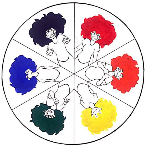
This was an excellent learning experience. I had so much fun with the coloring with paints, mixing to get the correct values of hues, and I even subconsciously separated my laundry in order of the color wheel. I really loved each part of this project, I’m literally seeing different shades everywhere.

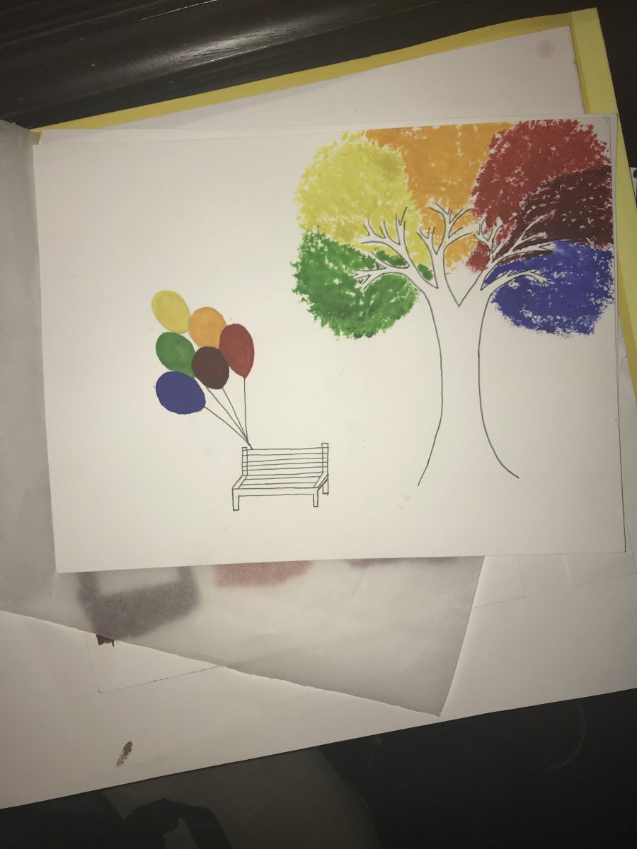
In Phase 1, I got mad I ran out of paint because I was so into the project, that I didn’t wanna stop.

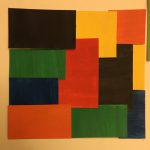
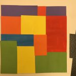
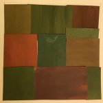
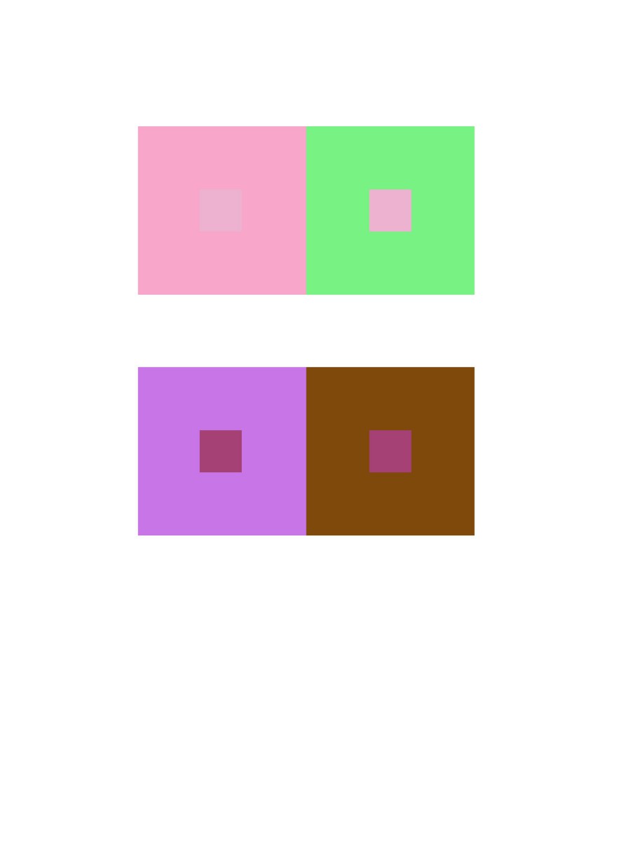
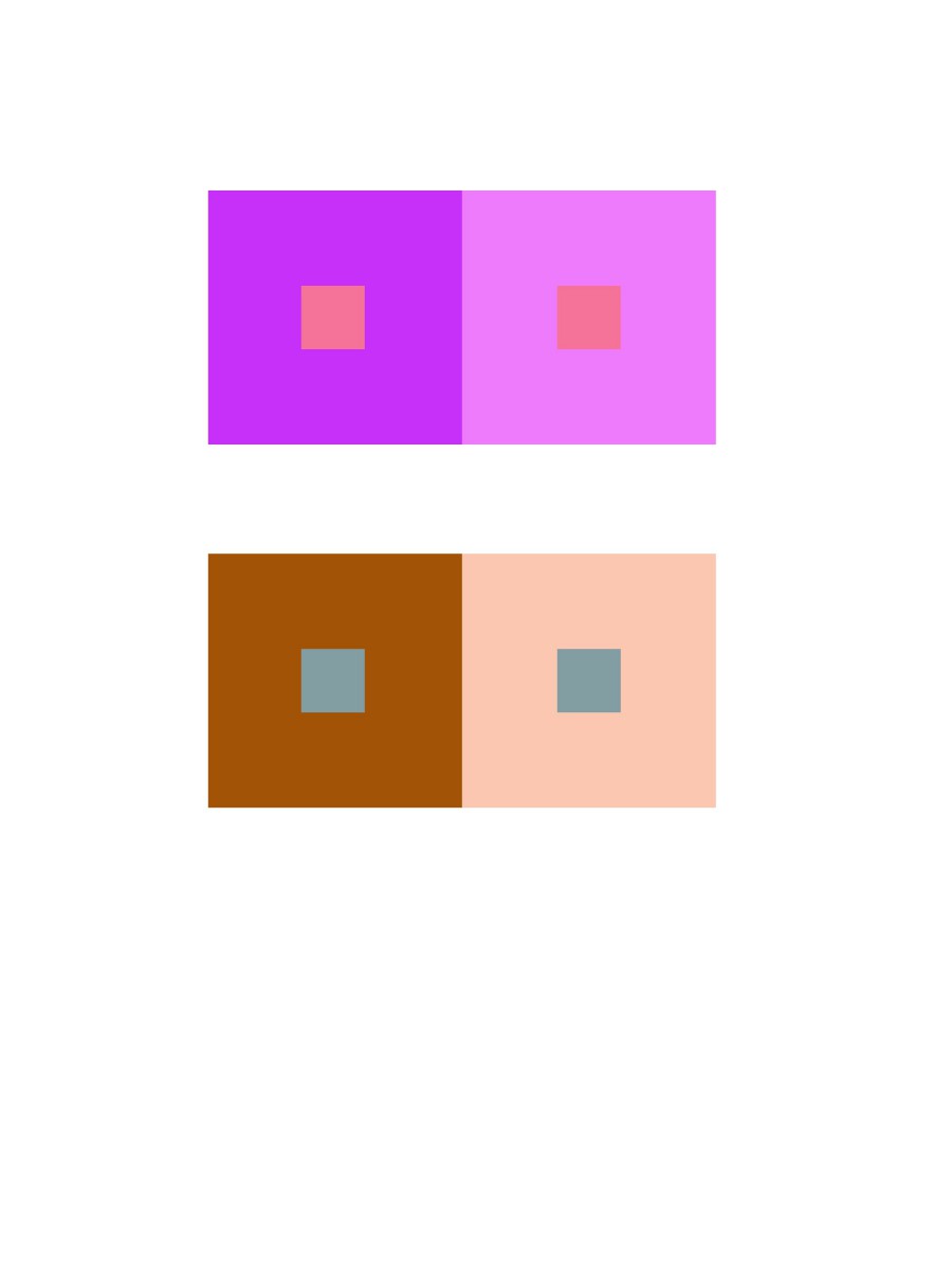
Phase 2 was tricky to my eyes because between the chromatic grays and the muted colors I couldn’t remember which was which, and the lighting in my room made it look pretty identical, but then I saw the lighter values in the muted pieces compared to the chromatic grays.

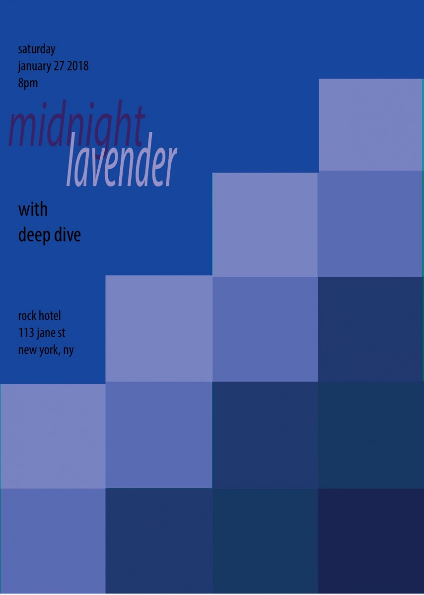
Thank you, again—to my partner—Ebony, for working with me on Phase 3. This style finally has a name I can place; I’ve seen the swiss style before in movies and noticed it in polaroid label packages. I LOVED THIS PHASE!!! I’m going to print this and hang it on my wall.


I’ve learned no matter how old I get glue and paint always manages to get all over my hands; I’ll be more careful in the future. This project has opened my eyes to new colors, new vocabulary, and new styles. I want to do a LOT more of this type of project.

Saturation Studies: Phase 4

Overall in this project,  it is quite interesting to learn about different types of colors, especially chromatic gray and muted colors.  It’s kinda sad that I had a lot of busy time I had to do in the previous weeks which is why my muted and prismatic art in Phase 2 has a shorter size collage.  But regardless, I had learned how I can create and experiment with primary and secondary colors and turn them into chromatic grays and muted colors.

Feel free to view my phases below of my progress in Saturation Studies.

Phase 1

Phase 2

Phase 3

Saturation Studies: Phase 3

My partner and I chose the Nirvana poster and ended up with the warm color palette. This was a bit of a challenge for me because I had a much clearer image of what I wanted to do with a cool color palette so this was a little push out of my comfort zone. My partner and I actually struggled for a while trying to come up with not only the palette but the name for the band. Once we landed on the word “spicy” as a sensory word for taste, we had to connect it to a type of sound and ended up with “spicy distortion”. Choosing a color palette for the word “spicy” proved simpler than when we tried to just find warm color palettes in general.  I also decided to add my own flair on the actual components of the poster by shifting of the inner triangle, because the original design looked too organized for a band with the word “distortion” in it. The info on the revenue was actually kind of cool to search for – I just looked up “50 best concert venues in America” and chose the one that looked the most indie/underground like setting that I felt fit for what I imagined our sound to be. So if you’re ever in Austin, be sure to check out, Spicy Distortion.

Time spent: 2 hours

Saturation Studies: Phase 1

I was very excited to do this project for multiple reasons. The main reason though was because of the clear mental image I had of how I wanted to portray the color wheel. As someone who works with character designs and storyboarding, I think a lot about the emotions I want to set for different characters, scenes, and interactions in the story and a lot of that has to do with color. Even changing the color of a characters hair can cause a shift in how the viewer sees them, and that’s true even in real life when people dye their hair different colors to create a “mood” or “image” that’s more them. I chose to take each color and study it for the emotion that it is known to portray and even though the same color can represent multiple emotions especially if you change the saturation or value, I chose to stick to basic ones that were very familiar so I could create a simple and concise message with every character and have the most diversity of emotions possible. Of course inspiration for the hair came from myself and even though I could have chosen to color the shirt or the individual backgrounds instead, I felt that it showed a more unique way of showing a character “surrounded” by the associated color/emotion while still keeping the color to a small, neat area.

Time spent: 1 hour 30 mins

Saturation Studies: Phase 2

With the prismatic collage I’m dealing with primary colors so it’s not as complicated as opposed to muted or chromatic where i’m mixing colors to add hue or saturation. Now the muted colors was fun to work with because it’s interesting to mix primary colors with white and lower the value to create a new color. Lastly the chromatic greys was very intriguing because I’m mixing two complementary colors to create a completely different hue of the original, some colors don’t even come out as the original. For instance, when I mixed blue and orange I received a dark green as opposed to a dark blue or orange.

Saturation Studies: Phase 4

Overall this project was really cool. It was interesting seeing how color actually works and how they mix together to creat new shades and hues.

https://openlab.citytech.cuny.edu/spevackcomd1100fa2017/2017/11/30/saturation-studies-phase-1-2/


https://openlab.citytech.cuny.edu/spevackcomd1100fa2017/2017/11/30/saturation-studies-phase-2-4/


https://openlab.citytech.cuny.edu/spevackcomd1100fa2017/2017/12/07/saturation-studies-phase-3-4/

Saturation Studies: Phase 1


This color wheel took precise understanding of the primary and secondary color coordinations. Knowing what colors go to which section can help you understand what goes where on the color wheel.  Primary being Red, Yellow, Blue while the secondary are Green, Orange and Violet.

Saturation Studies: Phase 1

At first my intention was not to create a flower but after I drew the design of the color wheel, it gave me the idea that this looks like a flower. So I drew a stem, leaves, and soil for the flower to rest in. Painting this color wheel has helped me learn the basics of gouache paints because I learned that gouache dries very easily so I often saw myself painting over and making new layers.

« Older posts Newer posts »