You might not see it at first but its hair in a bun
Fall 2017 | COMD1100_LC08 | Prof. Spevack
You might not see it at first but its hair in a bun
This was the first time I was able to study color as a subject. As an architecture student in the past I was never able to experiment with things like paint or hues and I found it insanely freeing and informative to work with this concept as well as this medium. Since it was my first time using paint, specifically gouache paint, it was a little weird to learn how to use the paint and my craft wasn’t what I expected it to be at times, but the more I practiced the better I got and now I’m determined to use the paint as a medium for things in the future.
This was probably the project I learned the most from over the course of the semester. I’m very new to painting and it was my first time using colors in a study in which I was mixing them for myself and not just getting them off a palette I found online. My favorite one to work on was the muted palette because there was a such a diversity of color. I liked to see how by adding red blue and white I got lavender, then adding that lavender to a bright orange, made from yellow and red, made a softer orange-brown color. I experimented by adding a little more of this or a little more of that, creating different shades and tints and jumping around the color wheel. The chromatic grays were also a fun one for me because it was my first time seeing how by adding colors from different ends of the color wheel you were able to create these really dark and desaturated colors. It gave me a new perspective on how colors mix with each other. The prismatic one was a little uneventful because it was just taking colors straight from the bottle but it was great to compare it to the muted palette to visually see the difference between a very bright prismatic hue and a more muted one.
Time spent: 4 hours
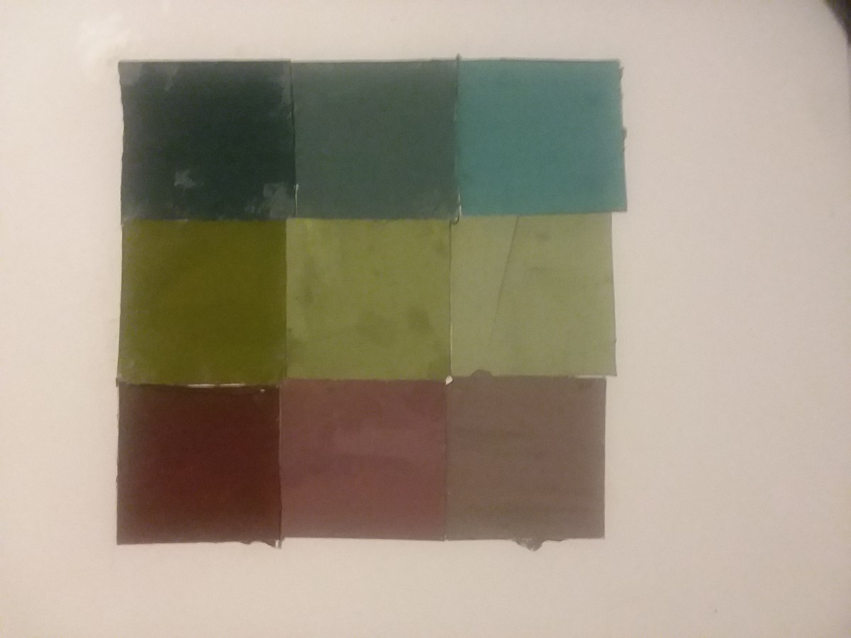
Chromatic Gray Study
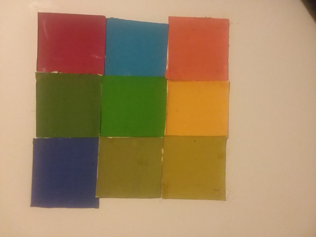
Muted Color Study
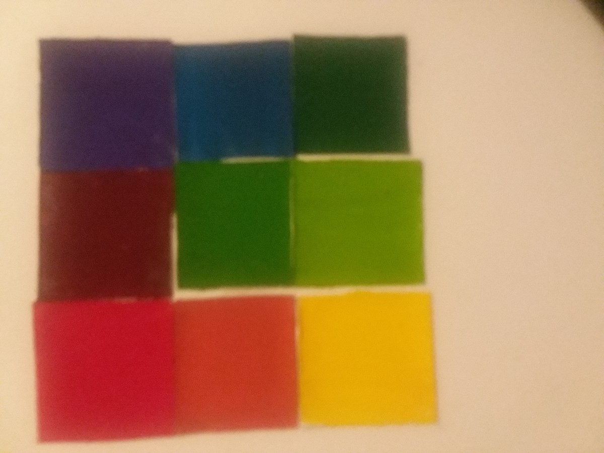
Prismatic Color Study

My partner and I chose to do a Swiss style poster and we also had a cool color palette. we had a challenge coming up with the names for our main band and opening band. after a while we came up with the name pop marine for our main band and as for our opening bands we came up with warmless touch and killing stones. My partner and had already come up with the color blue as our cool color. I chose Madison square garden as the location for the bands because it felt like it would go well with the band name, It is also a well known location where many of concerts take place.
time worked: 3.5 hrs
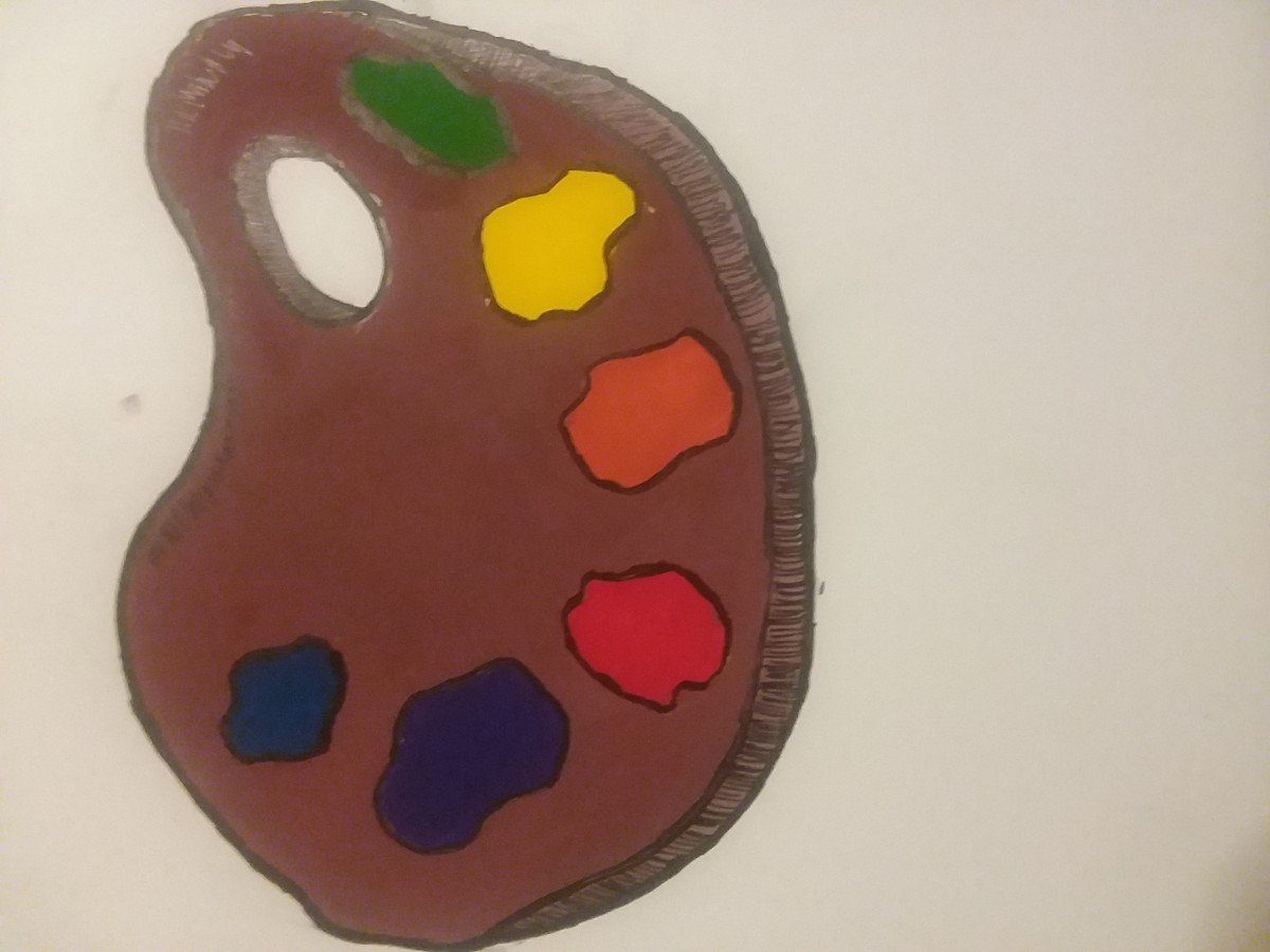
Mahogany Color Palette
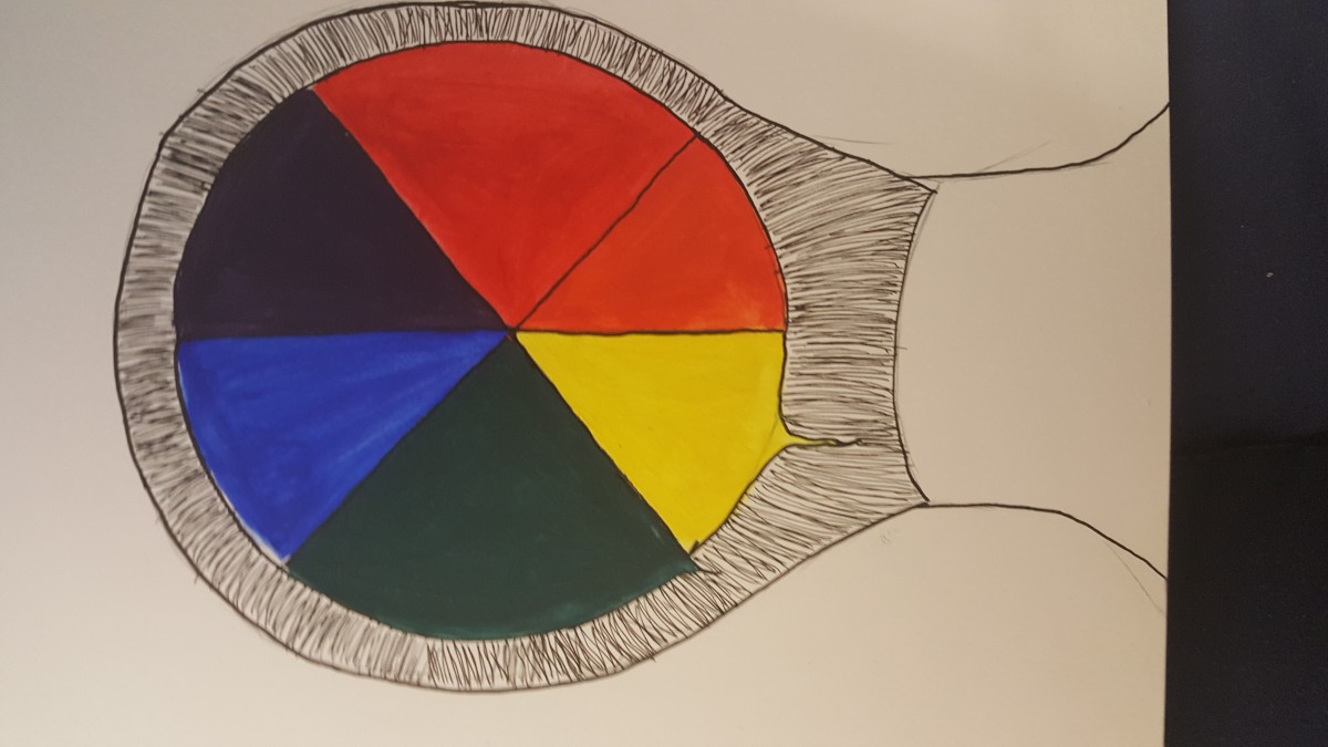
This is a very simple color wheel. My thought process was something that contains all colors and I immediately thought of a palette. I chose the dark brown color because I used to have an art teacher who always bragged about having a palette he made himself out of mahogany wood. (dont’ know if it’s something to brag about) All of the colors were mixed, none were pre-made. Something interesting about the paint was I got that red by combining Rose Tyrien (Magenta) and Flame Red (A really reddish-orange) and that shade of Blue was made with Turquoise Blue (Cyan) and Ultramarine Blue. (a VERY dark blue)
Swiss Poster
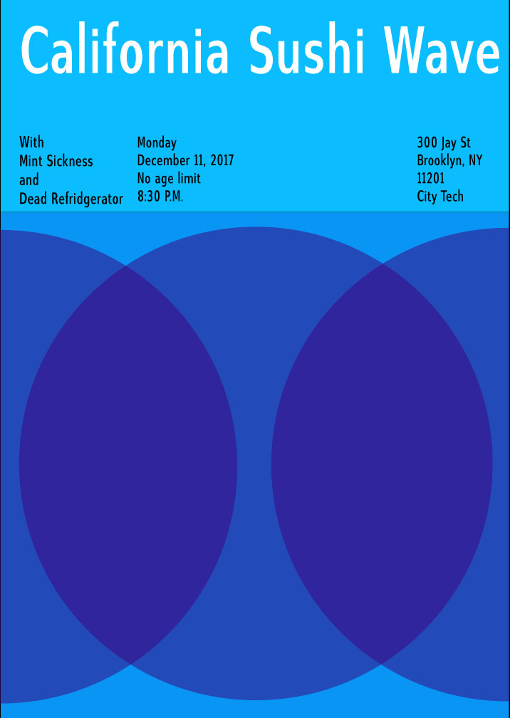
For this project, Mike and I were assigned this poster format and were told our color theme was “cool”. After coming up with a myriad of names for our lead band, we eventually settled on the name California Sushi Wave. Our first name was actually just Sushi Wave but we added the California part later on. California isn’t cool in terms of temperature, it’s typically considered a warm place but we chose it because it is a “cool” place in terms of popularity. People who have never been there typically want to go there so we considered it as a cool place. Our backup bands were our honorable mentions, things we didn’t want to use as our main band name but “Mint Sickness” was really close to being our main band. For that one, we’d probably choose colors closer to green like a blue-green. The colors we chose was blue, blue-violet and violet. We thought these colors fit the theme of cool very well but we also took advantage of the design of our poster. the venn diagram design really lets these colors overlap and brighten up the violet to keep it from being too dark.
During this project i’ve learned so many different implements of color, how they’re arranged, which ones look good sitting next to each other, and the many different lessons about hue, saturation, and tone. Project 1 and 2 really helped me learn the difference between hue and saturation it also helped me learn how to mix colors and learn the outcome of mixing colors. Project 2 especially helped me learn the color wheel and what it has to offer learning the complements of each color and what’s adjacent. Project 3 overall helped me learn the basic fonts of helvetica and how to create a swiss style poster using a certain mood of colors.
https://openlab.citytech.cuny.edu/spevackcomd1100fa2017/2017/12/03/saturation-studies-phase-1-4/
https://openlab.citytech.cuny.edu/spevackcomd1100fa2017/2017/12/07/saturation-studies-phase-2-8/
https://openlab.citytech.cuny.edu/spevackcomd1100fa2017/2017/12/11/saturation-studies-phase-3-7/
During the process in which we created this poster, we chose three different colors that best represented our band name and our temperature of the project which was cool. We chose the colors Violet, Blue-Violet, And Blue because we felt they best represented the beach waves in california and have a subtle cool feeling on the color wheel. When choosing the font for the poster we chose something that best fit the band name and the composition itself. Overall the project wasn’t impossible but it wasn’t easy either, next time you want to go to a rave. Think California Sushi Wave.
© 2024 COMD1100 : STUDENT BLOG
Theme by Anders Noren — Up ↑
The OpenLab is an open-source, digital platform designed to support teaching and learning at City Tech (New York City College of Technology), and to promote student and faculty engagement in the intellectual and social life of the college community.


Recent Comments