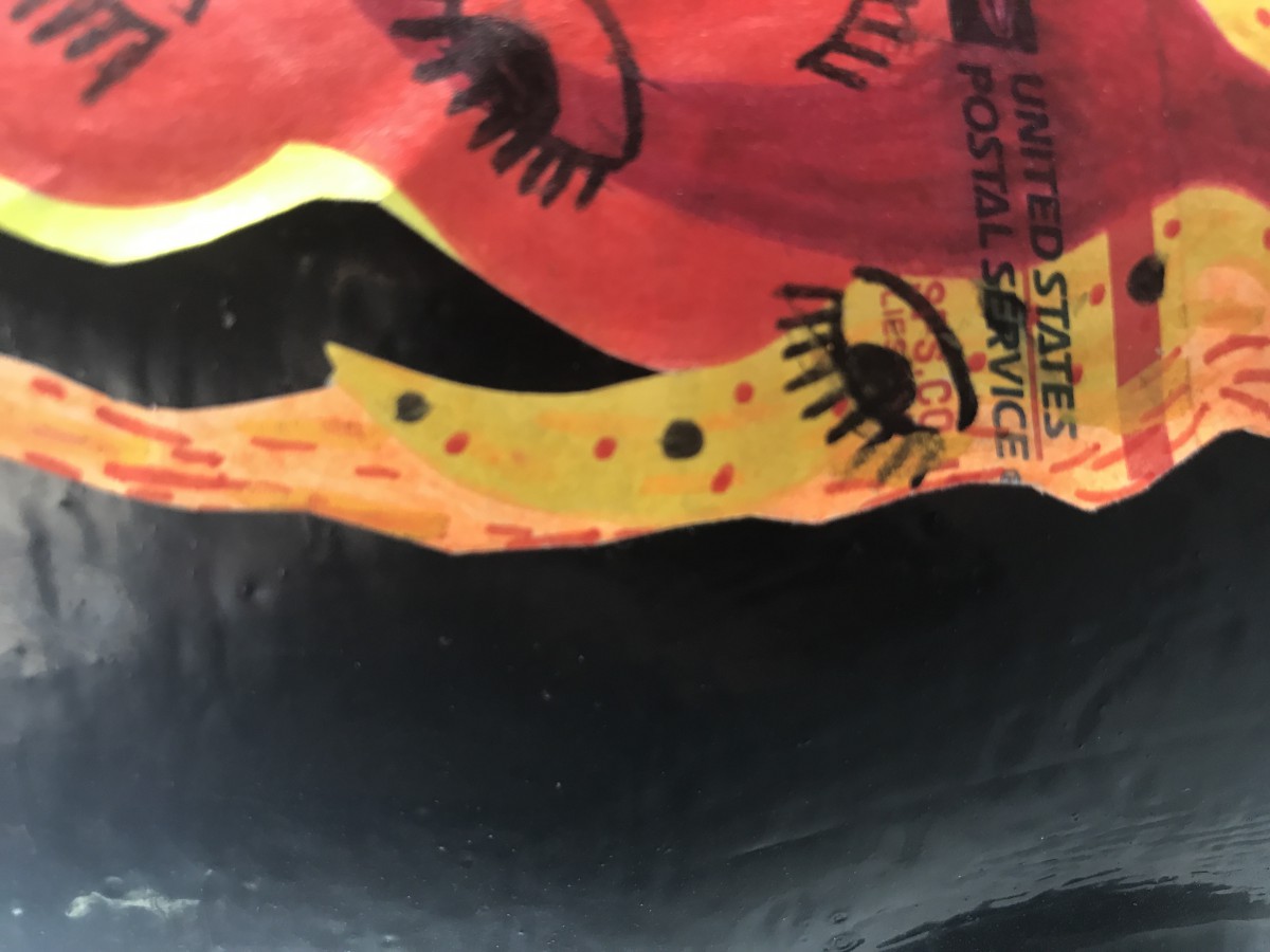
This flame image of a postal sticker with a design on it caught my eye not only because of it’s color but the placement. It’s bright colors stand out clearly on this black ground area producing a very stable figure and focused point of view being that the main image we see is directly towards the red flaming postal sticker. It’s smooth lines create a very organic shape. I believe the artist of this piece believed the placement to be very pleasing and clearly put their work on the spotlight, maybe they wanted everyone to see the work they produced and felt the ground for this was perfect since other colors might distract from the piece at hand and I definitely agree.
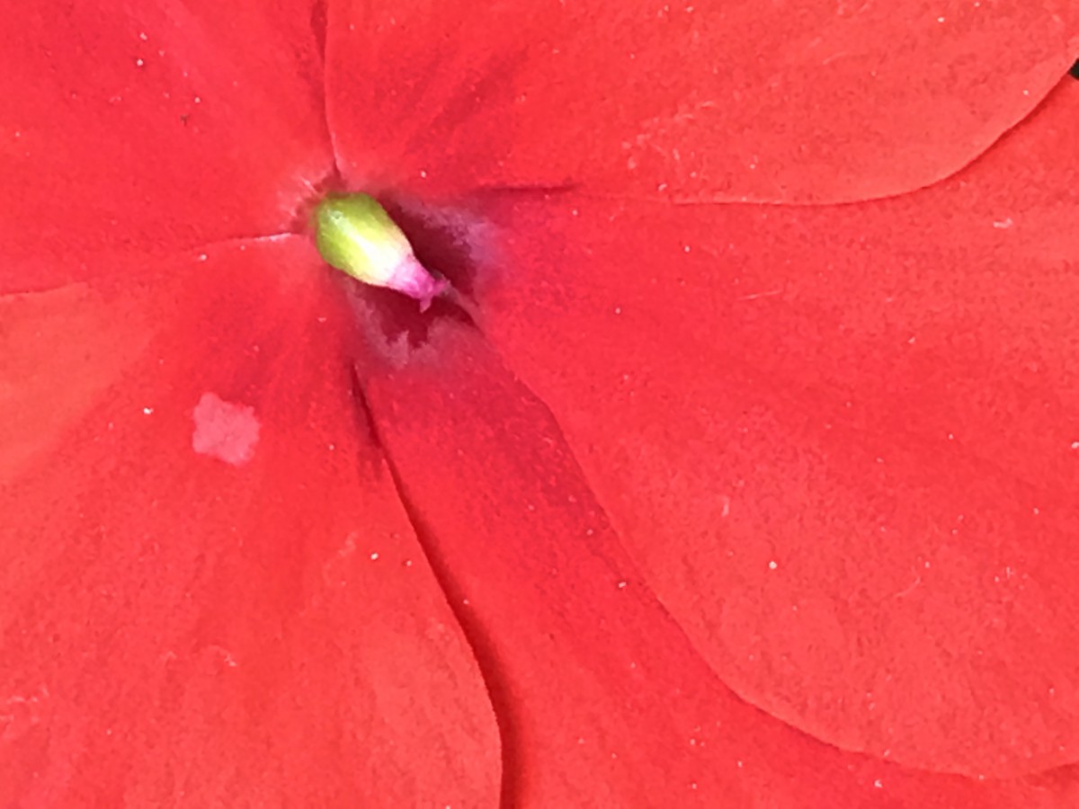
The flower image not only is natures art but has it’s own distinct lines and organic figure that has no replication. The stable image in the flower would have to be the peak of green that the eye undoubtedly is drawn to. I believe each flower has a stable figure and creates it’s own beauty in itself. Thats exactly what this little one did when it sprouted and created art. The stable green against the ground of red makes for a very intriguing color coordination especially since the green also can be made out to look like a sort of insect with the shading underneath it.

Plank of wood with a dark wooden spot, the spot being a very stable figure in a ground of lighter wood surrounding it. Other wooden brown lines connect to the darker circle, was it man made? Was it grown and cut but born with that design? Many questions come up but still that dark brown circle stands out the most while it’s textural design speaks very subtle. The balance between the two make for a very outspoken picture with many meanings and points of views to whoever can describe the work of nature. I see the lines and shapes as very organic with the dark circle almost being a geometric perfect circle! The wood was definitely man made, maybe by construction workers who are still questioning what to do with the plank. but even with the man made cut the design of the tree never leaves.

Paint splatter on wall, very organic shapes with no geometric shapes in them whatsoever. It is very ambiguous with no focal point to draw into. The ground is a mixture of dark and light shades. Very minor stable relationship in the corner of the image.This scene was possibly made with a bucket of paint being tossed on the wall and as the wall collects the different splats of paint create, it creates this design seen on this image. I believe it dried up very quickly because theres no drawn down lines of paint dripping downward making for a very interesting and unique type of splat.
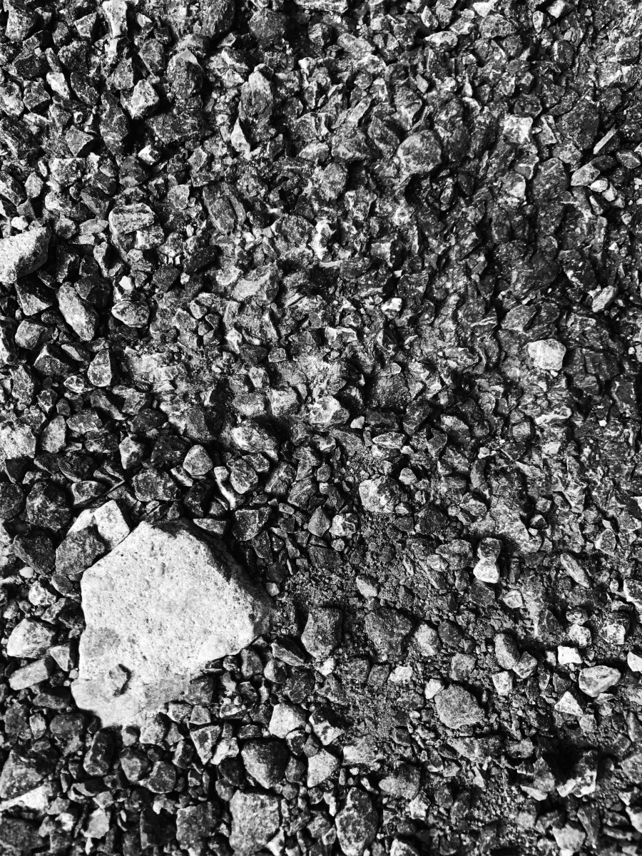
The ground full of cement rocks makes for a very ambiguous image. No main focus point but a lot of sharp lines and rocky, strong kind of feel coming from the image. Sturdy, rigid, elite is what I get when I see this image. Organic shapes indeed. The ground is all rocky but probably man made street cement crushed into bits and pieces of it’s former mold. I believe that workers made a piece of sidewalk using cement then decided they would need a different variation of said sidewalk and started the recreation process by destroying to build a new. That is when all the crumbles of rocks/cement gets together to form this image.
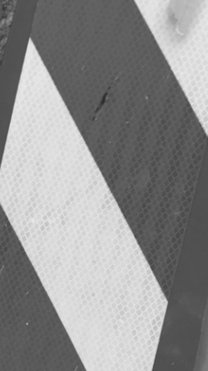
This warning sign left alone on the sidewalk has a very ambiguous feel to it. No main focus but a lot of geometric shapes in this figure. Darker and lighter rhombuses with smaller squares embedded on the inside. I believe that in this image because of the ambiguity, the geometric shapes are more prominent and tightened to be the main view of the image. Presumably it might have gotten there because a group of kids thought it’d be fun to hold the sign and toss it around then got bored and left it there on its own. It was a singular sign not around anything that particularly needed a sign so i’m assuming it was moved from its line of work for fun then left on its own.
Hours worked: 4+


Leave a Reply