




D.Shanbhag | D037
Prof. Deepa Shanbhag
deepa.shanbhag47@citytech.cuny.edu
Need help?
The OpenLab team offers a selection of Help materials, Open Hours, and support via email.

Unless otherwise noted, this site by Maria Giuliani and John De Santis has a Creative Commons Attribution-NonCommercial (CC BY-NC) license. Learn more.
by Maria Giuliani. John De Santis, Jenna Spevack
This course is based on the following course(s):
© 2024 COMD 1127—Type and Media, Fall '24
Theme by Anders Noren — Up ↑
Our goal is to make the OpenLab accessible for all users.
Our goal is to make the OpenLab accessible for all users.
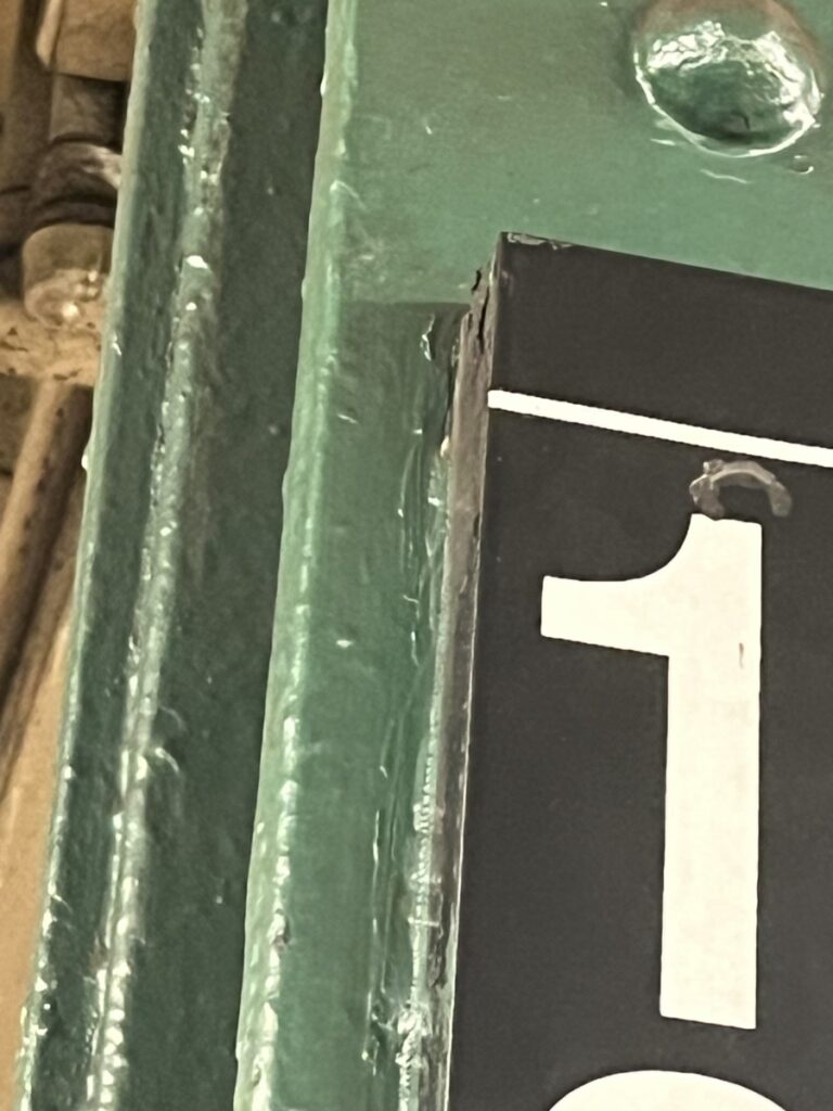
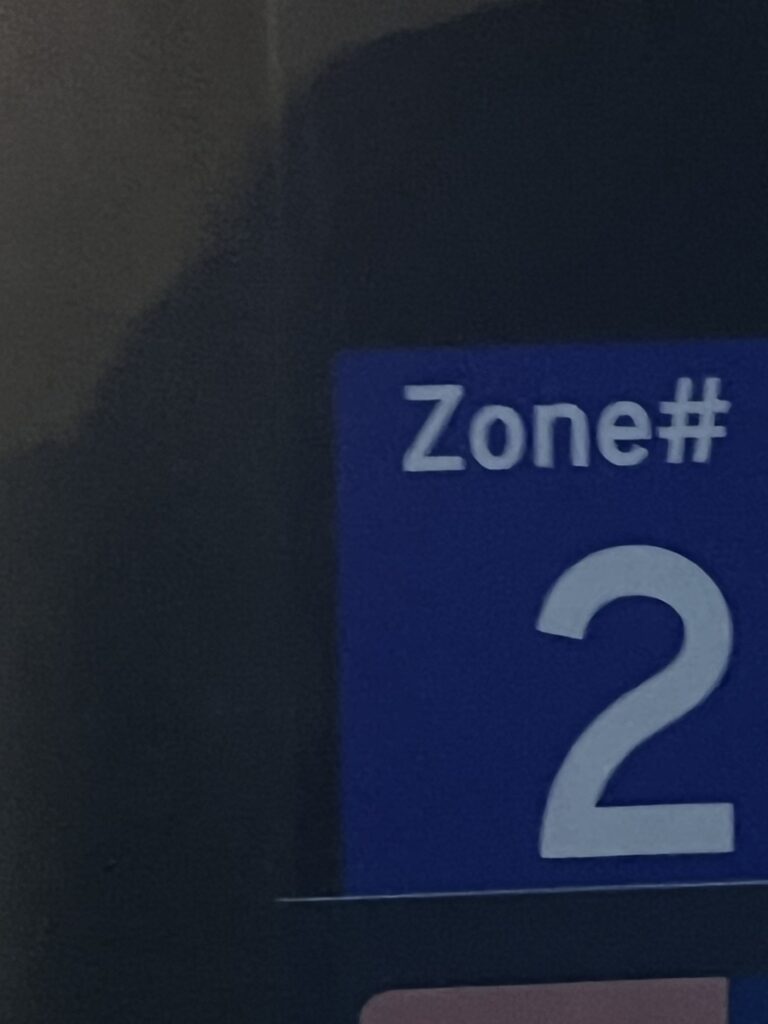
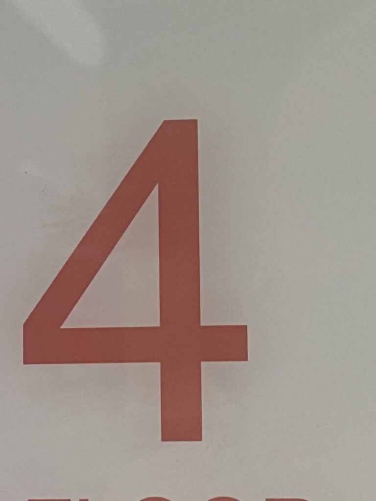
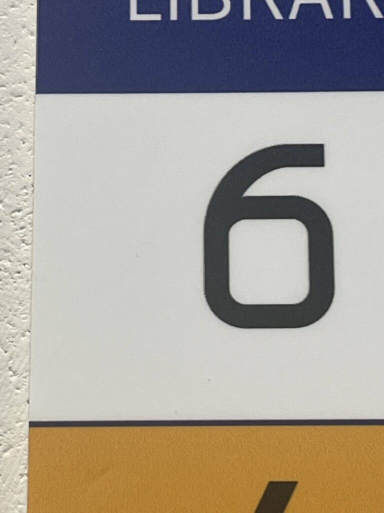
The typeface the subway uses is similar because it is a sans serif, and doesn’t have extra lines on the words.
both typefaces are sans serif, becasuse doesn’t have more lines, they are simply, also are symmetrical.
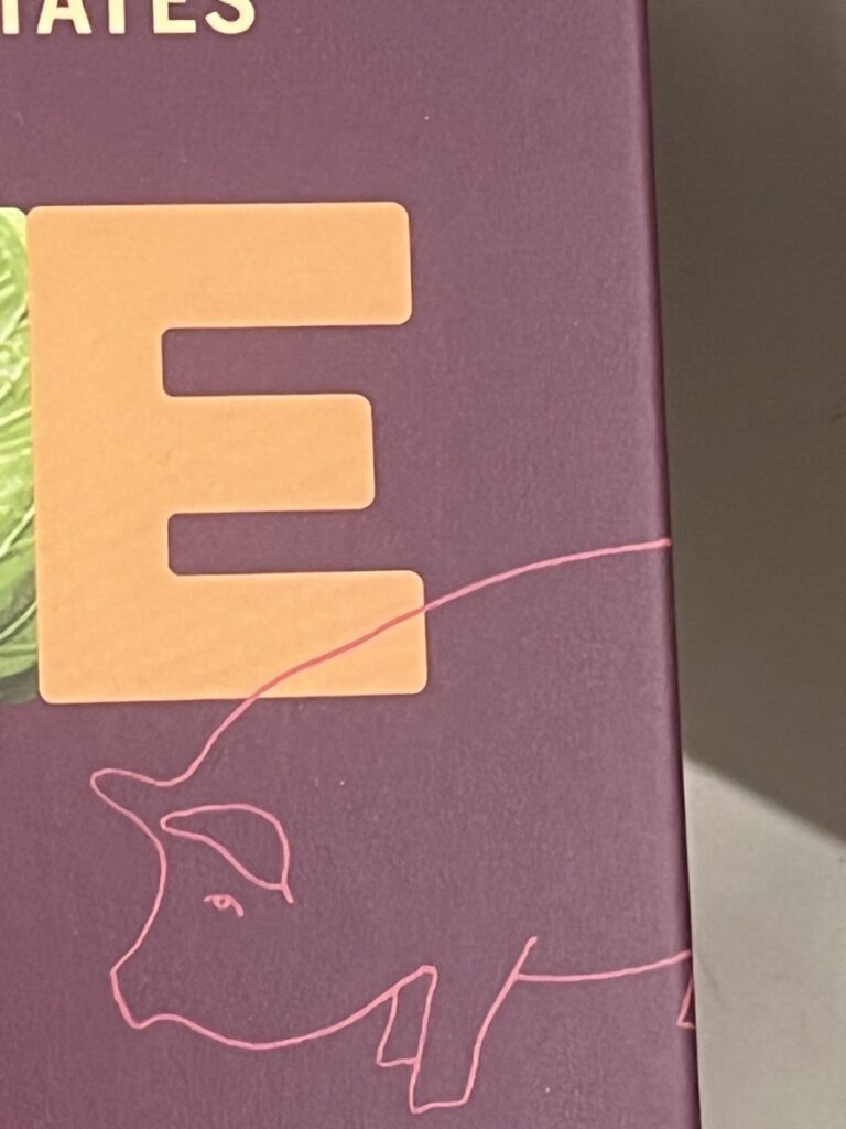
The ‘5’ is bold and geometric, with smooth curves and sharp edges. Its blue color gives it a modern and professional style, and its good readability makes it easy to read from a distance. This number type would suit signage, building numbers, or wayfinding systems, where clarity and visibility are essential. The ‘F’ has a narrow, sans-serif structure, giving it a vintage or industrial touch. The red background adds boldness and gives attention to the letter. This letter style can be used in signals for urban spaces, warehouses, or places with a retro-industrial theme or also be part of a brand identity old-school aesthetic.The ‘G’ letter is bold and rounded, with a modern cut-out design and a triangular element. This combination gives it a futuristic, minimalist look. This typography is ideal for branding in technology—or design-focused industries. It could also work well in logos or signage for companies.