


D.Shanbhag | D037
© 2025 COMD 1127—Type and Media, Fall '24
Theme by Anders Noren — Up ↑
The OpenLab is an open-source, digital platform designed to support teaching and learning at City Tech (New York City College of Technology), and to promote student and faculty engagement in the intellectual and social life of the college community.


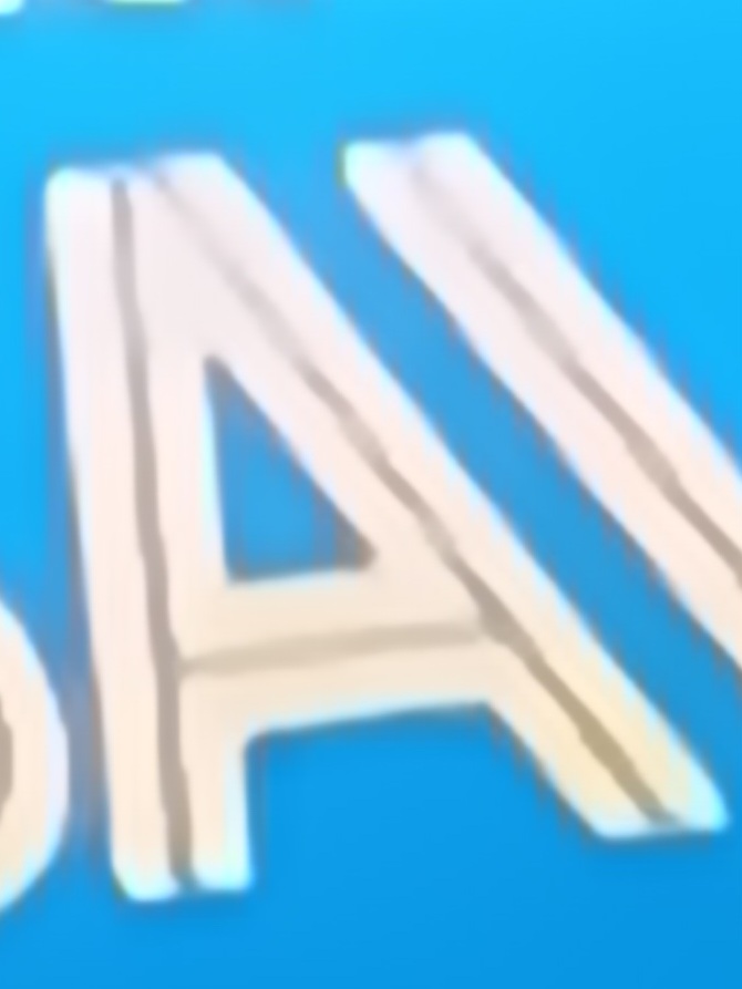
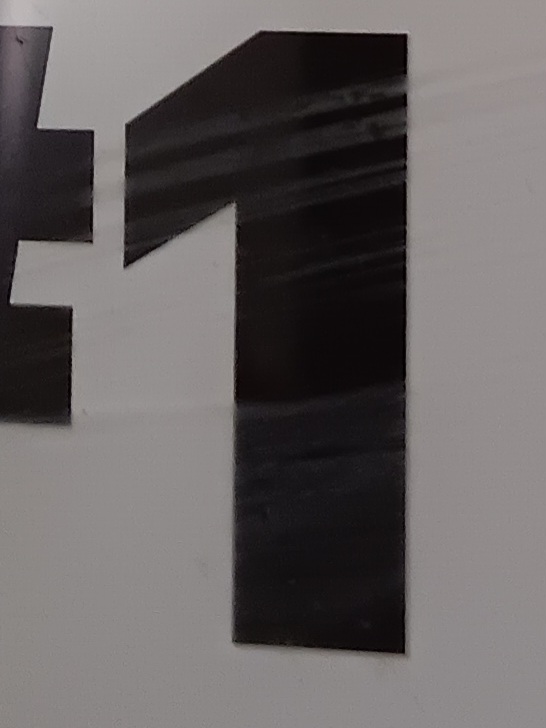
The letter A seems to be a example of a display or novelty typeface because there it has a unique character style. I do like how the A is styled because it is bold however it does have blank space within it. It is not something that is seen very often so I believe it is great to use when trying to advertise something new and it gives a “cool” vibe. I have seen the same or a similar typeface be used on advertisements that are directed to kids as it gives a welcoming feel to it. The 1 is thick and straight to the point. It is a Sans serif because it’s boldness is consistent and there are serifs at the baseline. I’ve see this thick and straight to the point style used when someone wants to draw attention and get there point across to their audience.
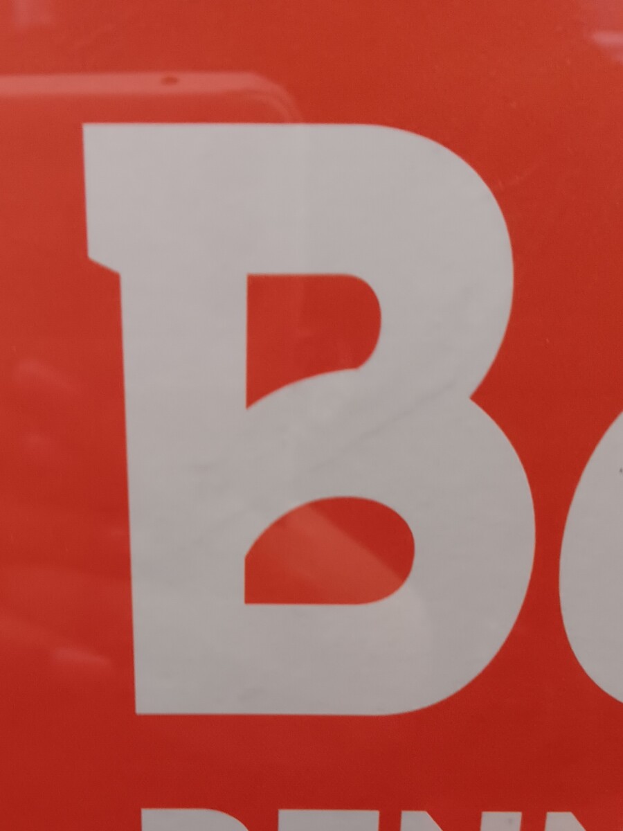
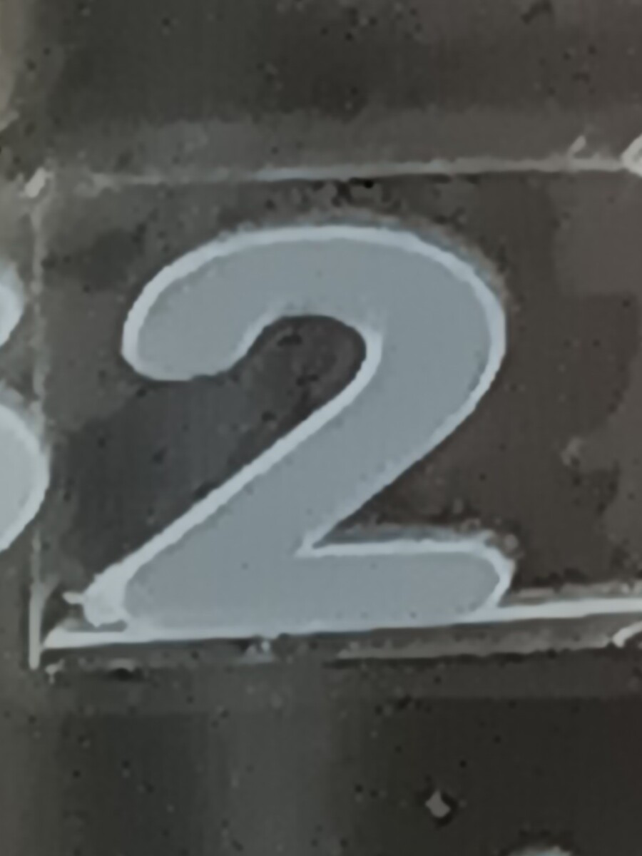
The Sarif typeface on the letter B and number 2 are wider than the other typeface and both present bold.
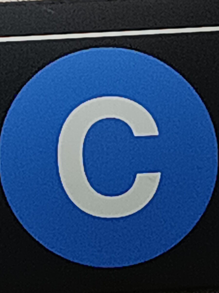
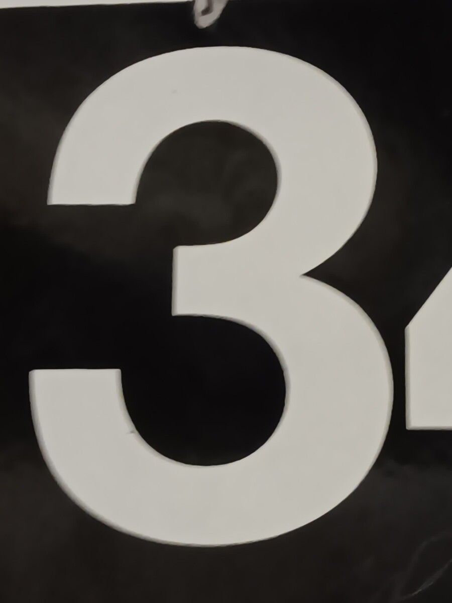
Hi, I noticed that 3 and C are San serifs because it is easy for people to read and you got those pictures in the train station.
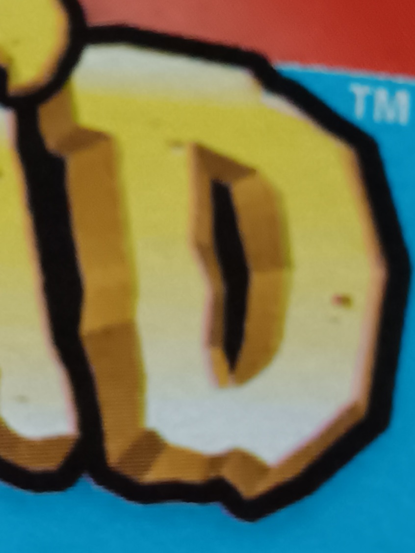
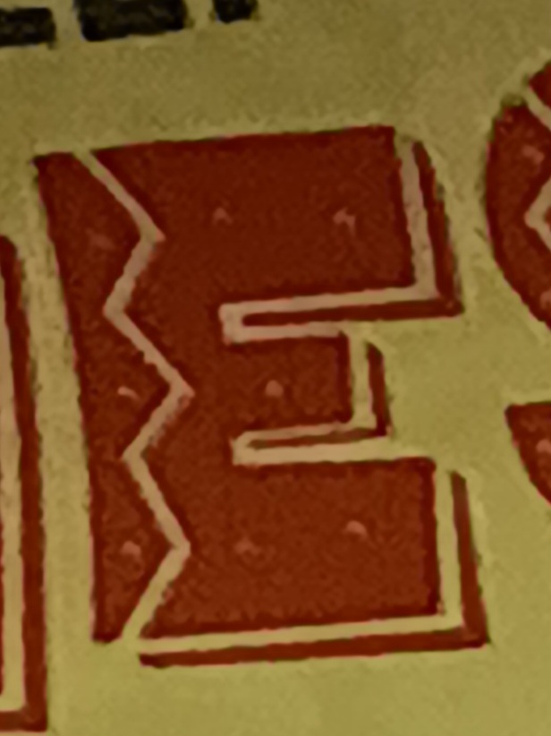
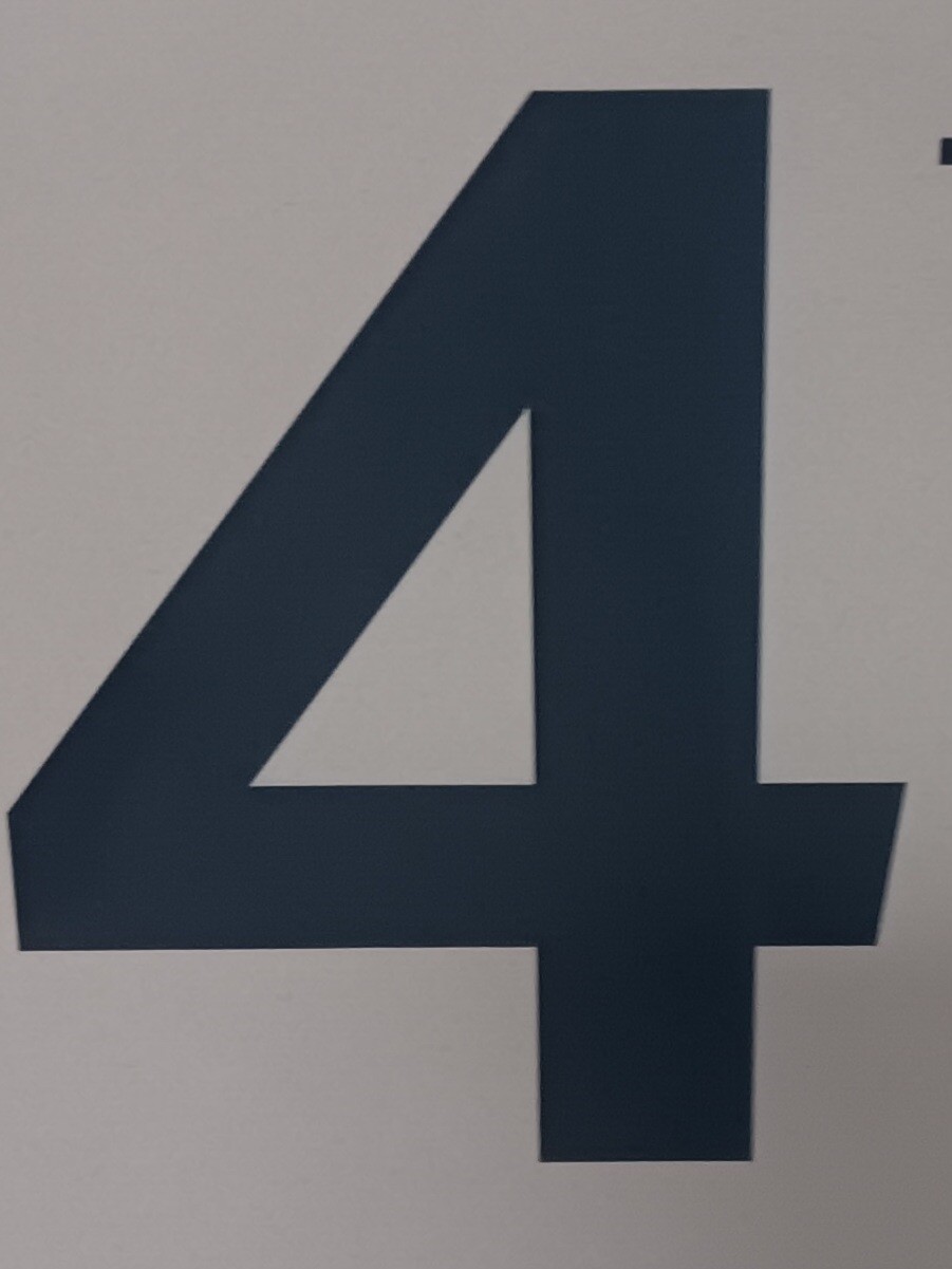
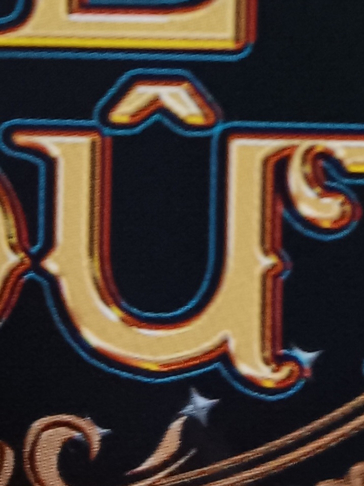
Both D and E look like display fonts due to their unique style. However, the number 4 you chose is easier to read vs. the letters D and E. I really like the letter E you chose due to the colors and the style of the text.
The letter F looks very detailed and nice. It is most likely a script and can be used as a heading/title. This specifically looks like its from a fairytale. I love how the letter G looks like it got broken up, it adds a ton of creativity. Its like adding a letter C and letter I and forming together. The endpoints being slanted is also very good detail. The number 5 looks like it can be a sans serif, the number being very bold and having no serifs at endpoints. It also gives sort of a geometric look.
Hello, I notice the letter F is scripted and 5 and G is probably serif. The G looks really cool in my opinion, I feel like that Typo can be found on can food.
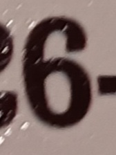
The H is a display typeface. I like how it looks like brush strokes were used to create the H. The I is a serif typeface as the serif has a curve to it. To me the way the I looks is similar to a pilar because of how flat the top and bottom of the serif gets. The 6 is a sans serif, I notice a very slight slant to it.
The letter I is a sans serif and have brackets: the curves that connect with the serif. The numbers 6 and 7 are so similar, both are serif, follow the straight rule.
The typeface of the letter are a serif because they have an extra detail to its shape. And the number is a san serif since it has no extra lines on it.
The “M” is a mixture of a serif and a display font. I never seen something that combined a serif font with paint before. I think this is a very interesting find.
The number “9” that you chose really grabs the eye of the viewer. The colors that the designer chose for the number “9” makes the number stand out. Also the simplicity of font of the number makes it easy to look at as well, making the colors not overwhelming.
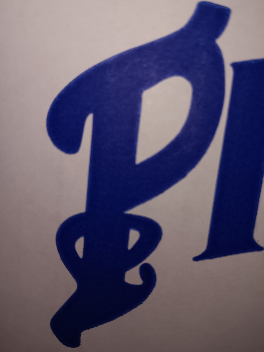
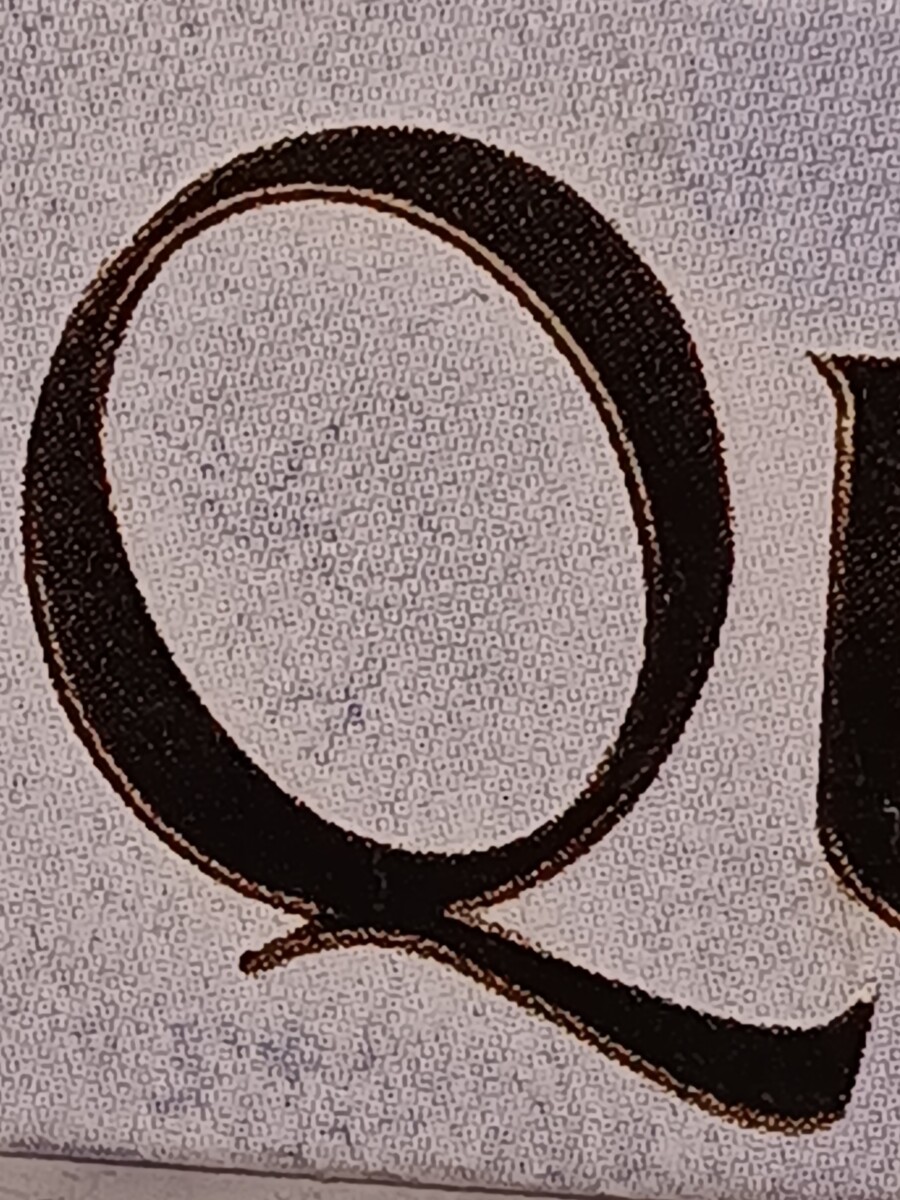
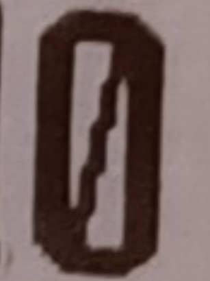
All of the following letters and numbers look very unique. The letter “P” has rounded serifs with some line surrounding the leg. This looks like it can be on a food packaging. The letter “Q” looks very simple yet elegant. Reminds me of a book or text. The number “0” has a geometric look to it. I can see it being in a video game.
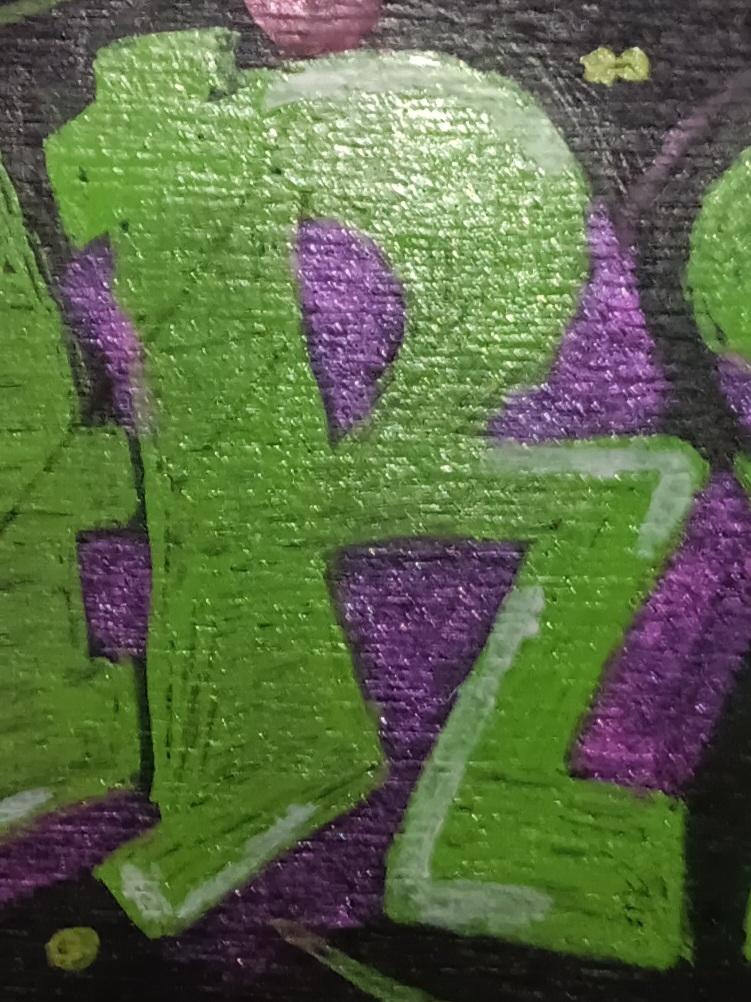
In my opinion the letter S is so expressive, im not sure what kid of the context try to convey the letter, but i really like the way how is italic also, the letter is in sides as if cut.
The V plays around with the idea of contrast in the letter form. The V also has a serif that looks more apparent on the left side than it is on the right, which curves out a lot more than the left. The W as a letter seems arched a bit and it is an old-style serif due to its curved serif.
The M having two sides that have different designs I feel does give it a much better look and breaks it away from being seen as a basic Serif font
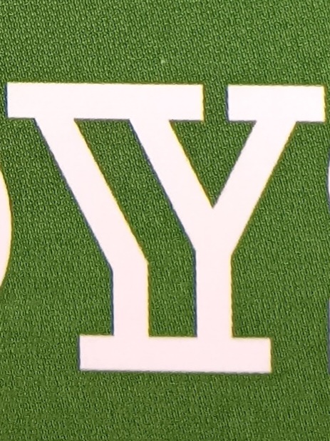
The “Y” you chose is a serif font. I think this letter “Y” is very interesting because of the design of the letter. It a fun and welcoming design, which makes the viewer want to continue reading the rest of the sign.