


D.Shanbhag | D037
© 2025 COMD 1127—Type and Media, Fall '24
Theme by Anders Noren — Up ↑
The OpenLab is an open-source, digital platform designed to support teaching and learning at City Tech (New York City College of Technology), and to promote student and faculty engagement in the intellectual and social life of the college community.


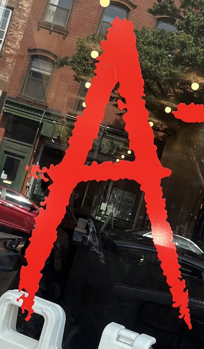
I really like the letter A that you saw. Its very different then what others have posted.
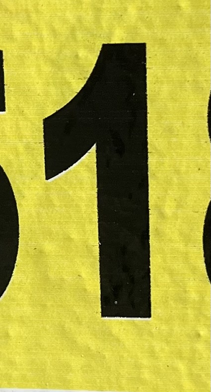
I really like how the number 2 is in a very exclusive type face and that it could also look like the letter S.
I really like the letter C that you picked. Overall, I believe that so far all your letters and number come together. They are all unique. The letter C looks like it would be used as a header due to the design.
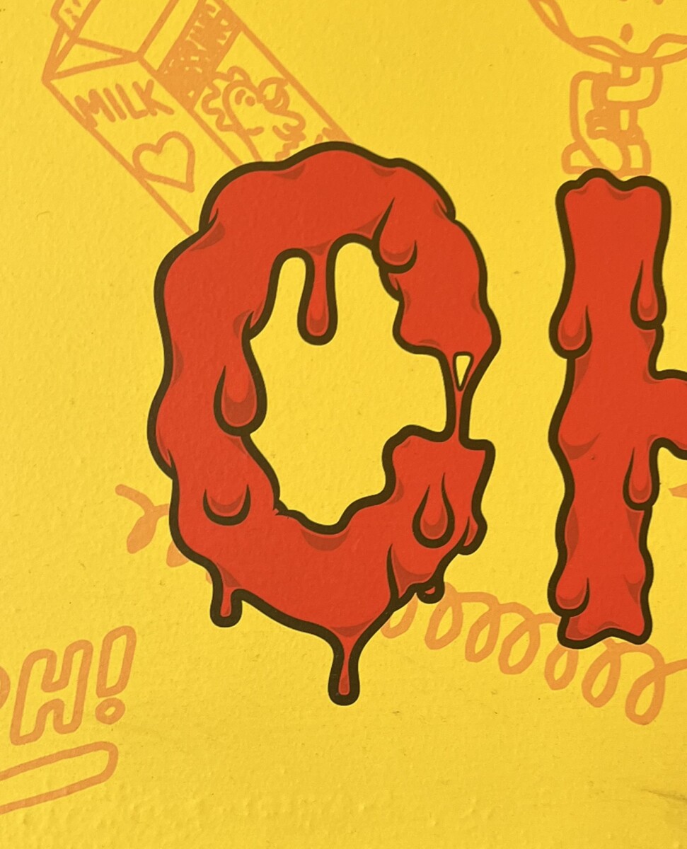
I like the C that you picked because I believe it has a lot of character with its melting affect. I have seen similar use of this font when advertising something hot or slimy. The 3 has a lot of character has the strokes are not even. Overall I think that both do good in captivating an audience for their creativity.
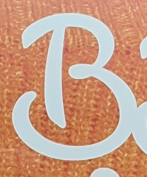
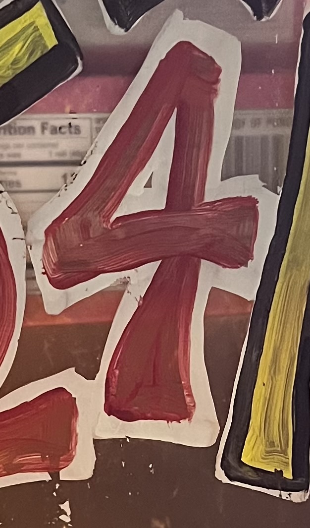
I really like the E and 4 you picture. The E is script, while your 4 is probably a serif. Also your the letter D is a san serif.
This ‘h’ bold, geometric design with a maze-like outline pattern creates a visually cool look. This typography style would work well in branding or signage for modern or tech-based companies, or we can use it in artistic contexts, such as posters, album covers, or editorial design.
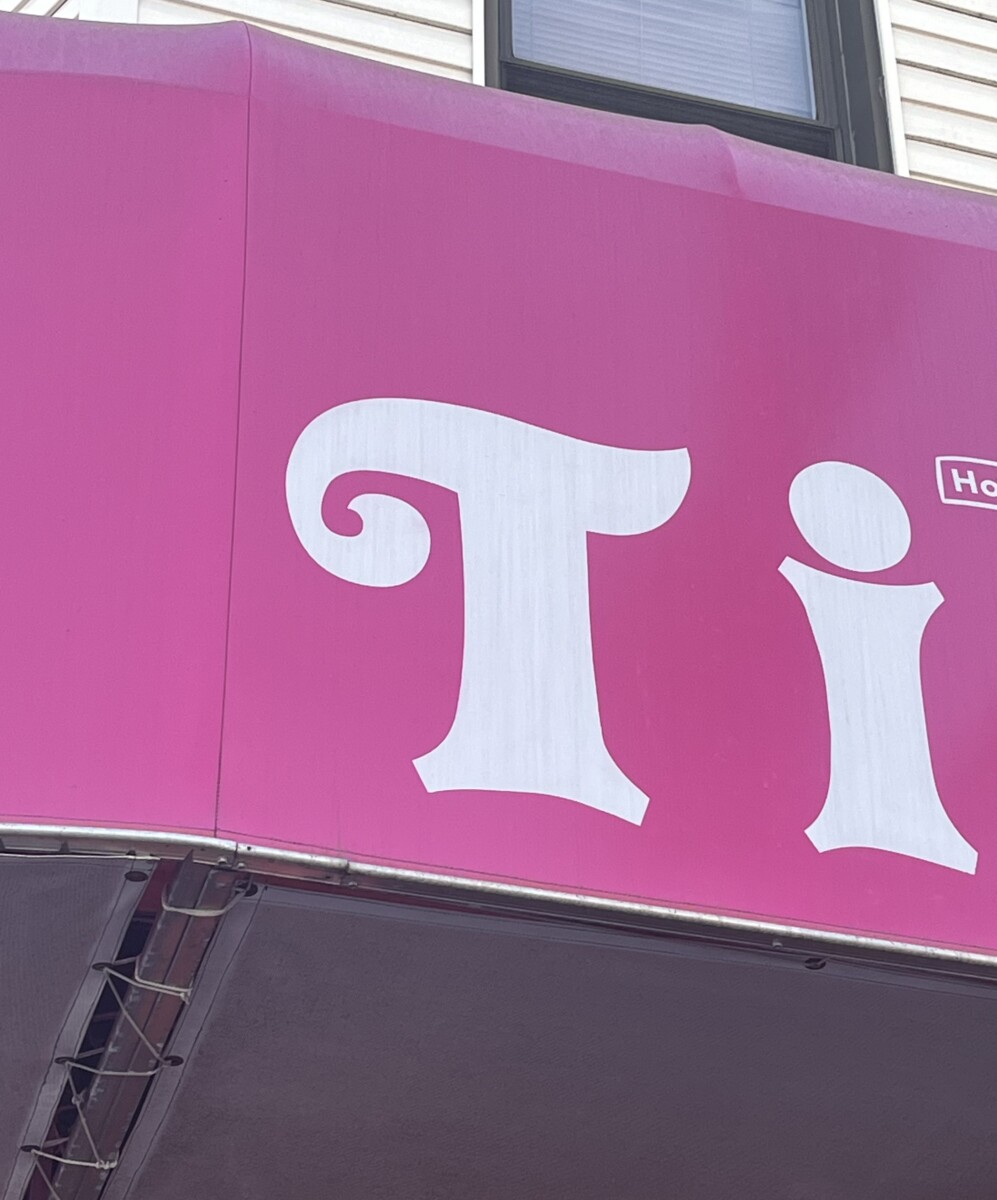
The ‘i’ has a playful, bubble-like design with soft curves and a pink-and-white outline, giving it a friendly and youthful appearance. This typography can be used for children’s products, playful branding, or designs for a youthful audience.
The ‘6’ is a thin, minimalist sans-serif typeface with smooth curves and a modern, clean design. This style would suit minimalist or modern design projects like corporate branding and high-end product packaging. It could also work well in architectural signage or numbering systems in hotels, offices, or galleries.
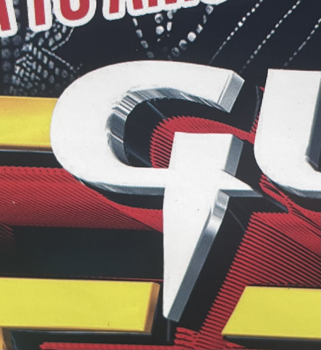
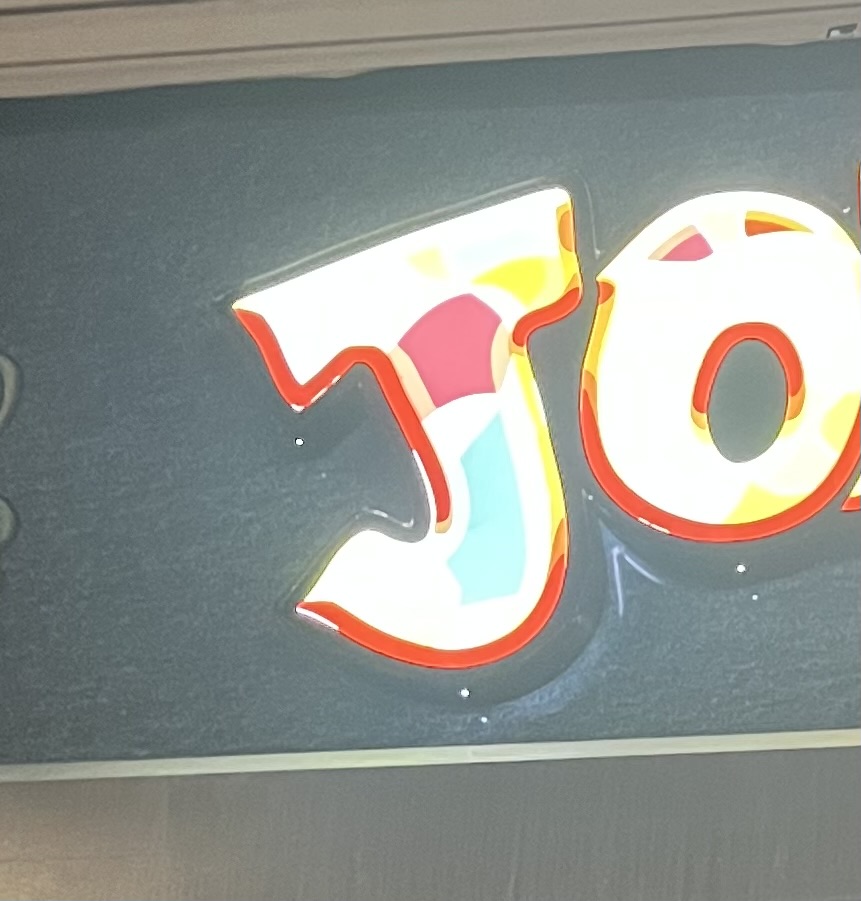
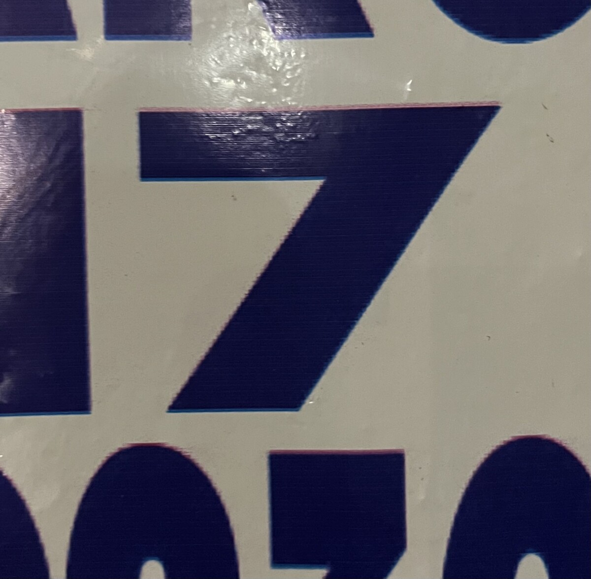
The J, K, and 7 all have a sans-serif look to them. However, the J and K look a bit decorative. You can really tell that the J is illuminated and uses a combination of different colors in order to appeal to their audience. The K is extended from its original form and uses a bright and vibrant green to capture people’s attention. The 7 is pretty basic, but I can tell that it looks a little like a glitch, as you can see pink and a darker blue on the outline; to me, it reminds me of the Tiktok logo.
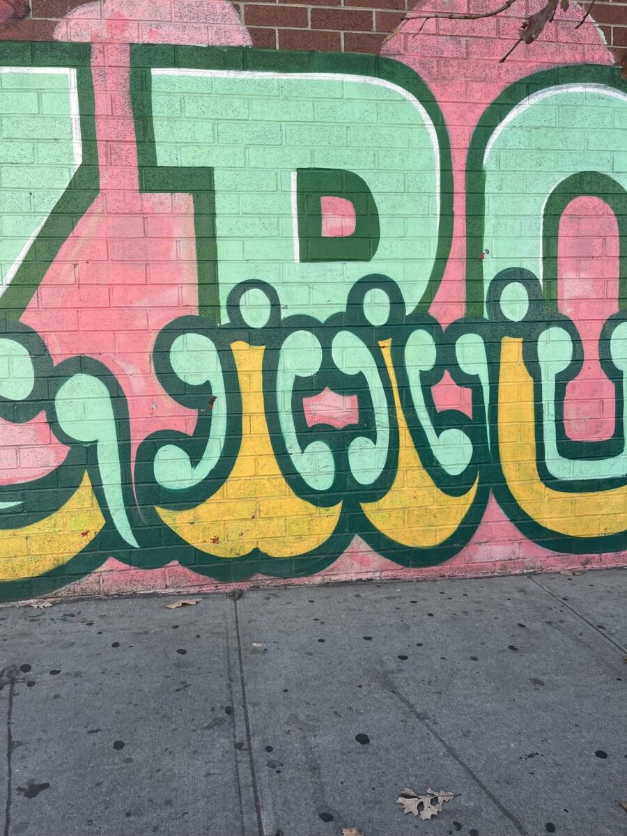
The ‘R’ in this graffiti-style typography is bold, playful, and highly decorative. It features thick strokes and dynamic curves, enhanced by bright colors like green and yellow, giving it a lively and urban aesthetic. This style would be ideal for street art projects and promotional materials for music events, skateboarding brands, or urban fashion, where energy and creativity are valued.
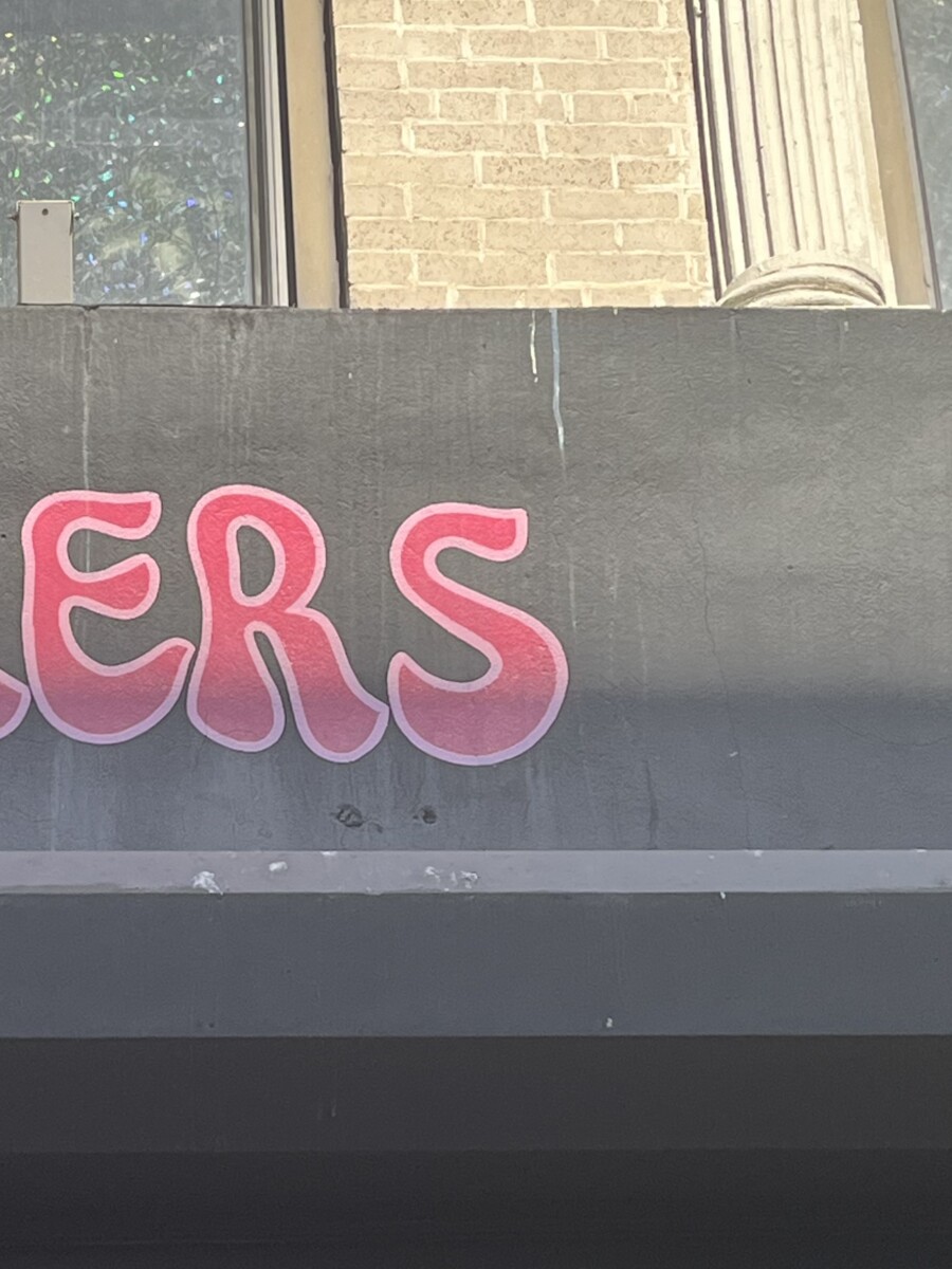
The ‘S’ has a softer, rounded design with smooth curves and graffiti, giving it a modern style. It is well-suited for designs with a fun and approachable tone, such as posters for community events, branding for creative workshops, or any setting where a relaxed and informal atmosphere is emphasized. The gradient effect makes it appealing to the lifestyle.
I really like the letter R, the colors it have, also the particular shapes at the botton of the letter but i think at fist glance it isnt defined what R is. Also, the letter S is so cute for me, and looks as spray graphic painting.
The letter t looks like it could be a script type. The stem has a large width. The bottom also has a slight curve to it. It looks very fun and playful. The letter U seems to be some type of serif font. It interesting how the left side is more wider and thicker then the right side.
Hello I believe V is a san serif and W is a serif. I believe W is a serif because of the sharp point on top. I believe you can find W on a old government letters. I also I believe V can be founded on a poster.
I like the O, one side being shaded in does give it a look that is visually very interesting
I like some of the graffiti letters you have there. Z looks like a sans serif.
These three letters represent distinct. The formal and traditional (‘X’) typography style is ideal for branding formal institutions such as universities, law firms, or historical organizations. The bold and urban (‘Y’), three-dimensional graffiti-like design, with red and yellow shading, creates a dynamic and vibrant effect. Its placement on a brick wall adds an urban and artistic feel. The black-and-gray color palette gives it a raw and industrial (‘Z’). This style works well in industrial or underground-themed designs. It could be used in branding for mechanic shops, urban streetwear, or promotional campaigns for warehouse events or other industrial settings. Each style can be applied effectively. Depending on the message and audience, specific contexts can include elegant branding or edgy and urban designs.
I’m really impressed with the Y and Z. I like how it was handmade and it also has a 3D form.