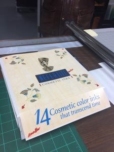
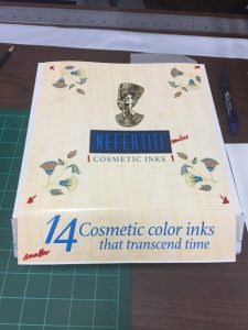
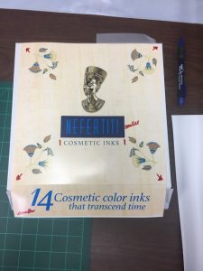
Still working on the box design and this is our most recent update. The red markings are all edits we need to make and we are thinking of getting rid of the blue box around the title. I was watching a commercial the other day and they used interesting type for their product and I thought it might be perfect for our box. I found the font online and I will use it on my next mock and show my boss. I hope it looks as good in real life as it does in my head! 


