Having studied mathematics and experienced the issue firsthand, I composed a work to express my view on mathematical pedagogy. This work is of course not without a purpose – mathematics is a crucial field, both personally and objectively, and I care about not letting the general interest in it dissipate completely. I wrote principally to provoke an idea for mathematical teaching in the minds of those who pass on their knowledge to the succeeding generation. An idea leads to consideration, consideration leads to analysis, and analysis leads to action. My purpose is to evoke this action from mathematics teachers, to whom I mostly address my project, but also to inform the struggling students of this general issue.
Students are generally struggling with mathematics, and because I am a student who is attached to mathematics, this issue interests me quite a bit. The audience, however, are mostly the teachers. It is true that this is intended to be seen by students, making them something of a “secondary” audience, but the primary audience is the general body of mathematics teachers. There is something off with the way that this subject is taught, and this creates a lot of very common questions that teachers receive in their mathematics classrooms. In addition to the statistics, I included some of the ideas expressed in such questions in the section that follows, which are paired with “solutions” – ideas that teachers ought to explore to engage the students with the subject more.
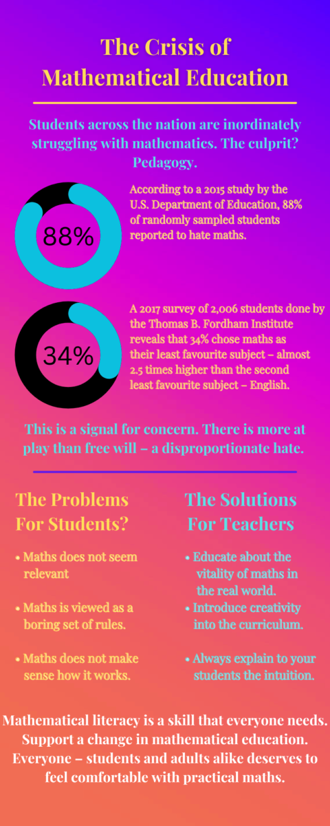
An infographic is an excellent format for visual presentations, and since this project involved statistics, I considered this genre to handle them very effectively. It displays the statistics as well the problems and solutions very openly, addressed to both students and teachers. I intended this infographic genre to grab and attract attention and just evoke some thoughts on the problem. This is not an unknown idea by far. Most people are very familiar with the issue and do not need to read deeply into it to know and understand it. Therefore an infographic is perhaps the ideal display of a brief overview of the key components of my topic.
The statistics for this project were not difficult to find. However, there was somewhat of a shortage of consistency (i.e. the times and sources of data collection were very scattered), and there was not a plethora of hard data available, at least not on the surface. I believe I achieved my goal of effectively communicating the issue to students and teachers, but if I had more time and resources, I would definitely delve deeper into the statistics. There is more to the data than meets the eye, and some of it would have likely been found through more rigorous investigation. Perhaps not only the data from the students’ side would be considered, but from the teachers’ side as well.


Leave a Reply