Class Info
- Date: NOV 14, 2024
- Meeting Info: 2:15 to 5:35
P 114
Announcements:
- Grades for after effects, tote bags and to bags are posted
- Registration for Summer 25: ongoing
_____________________________________________________________________
NEW PROJECT
GIFT CARD and ENVELOPE
Create a Shake Station gift card and envelope to give to your friend.
Card size- H 3.25″ X W 2″
Design front of card only- use copy- HAPPY HOLIDAYS
ENVELOPE FOR CARD
H 3.5″ X W 2.25
FRONT OF ENVELOPE- LOGO OR FUN IDEA
BACK OF ENVELOPE- NEEDS TO HAVE SPACE TO WRITE COPY. YOU WILL WRITE ON ENVELOPE.
TO____________
FROM_________________
$__________________________
use brand fonts for this copy.
DUE printed next class NOV 21- hand me envelope with gift card.
I am still seeing issues with typeface/kerning/tracking/alignment
2:15 to 4pm: Studio Time / Fix calendar
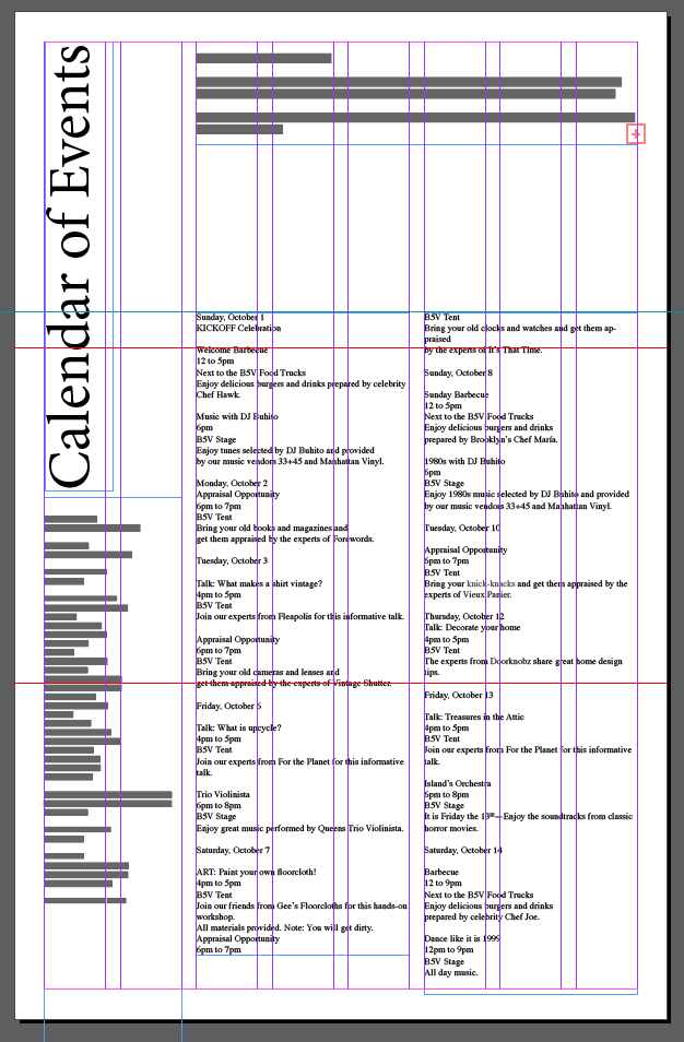
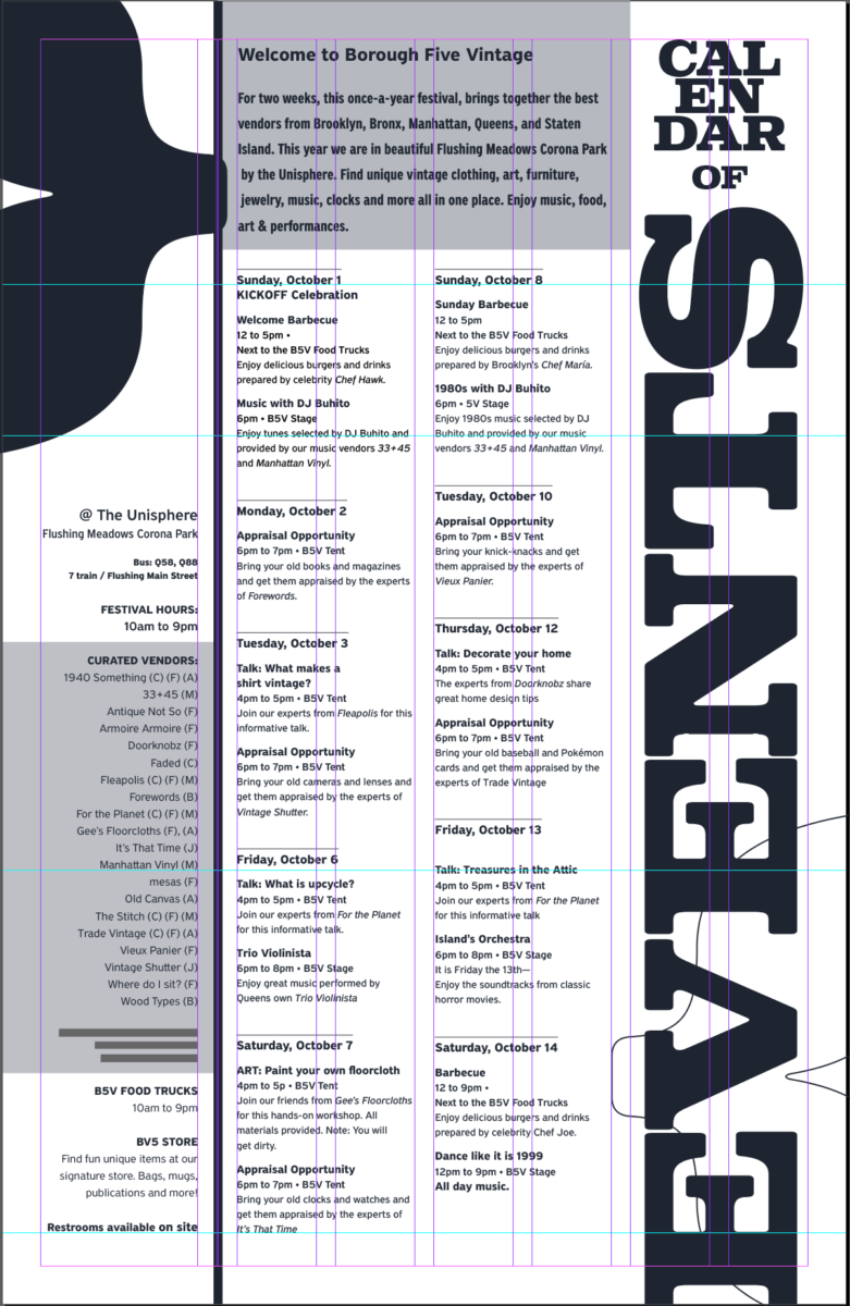
Let’s review the specs of the calendar and make corrections and adjustments today during class. Why is this important?
The calendar is the one assignment so far that carries typography in larger quantity and body copy. Understanding how to handle typography in volume and it sometimes harder than just designing one or two words, since there are more typographical considerations and decisions to be made.
Check list
- Go over your files and check the specs. I am providing grades and comments, but this is also your responsibility
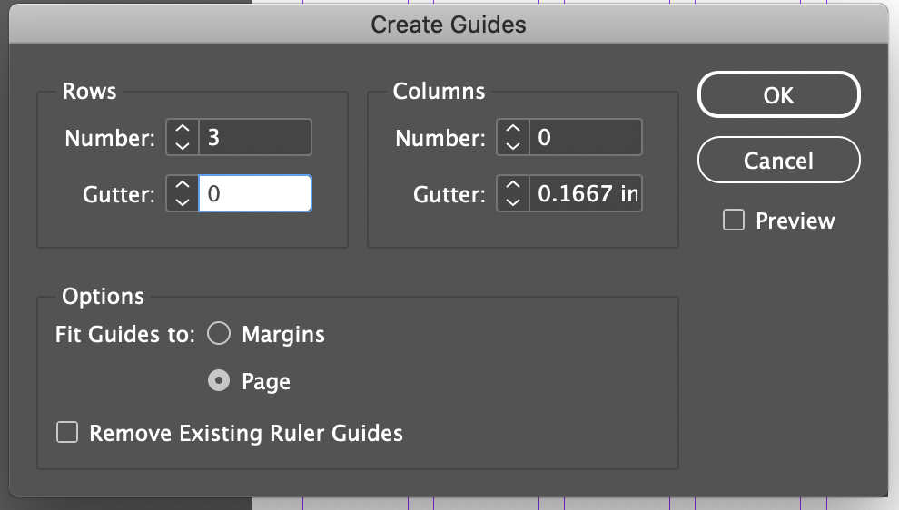
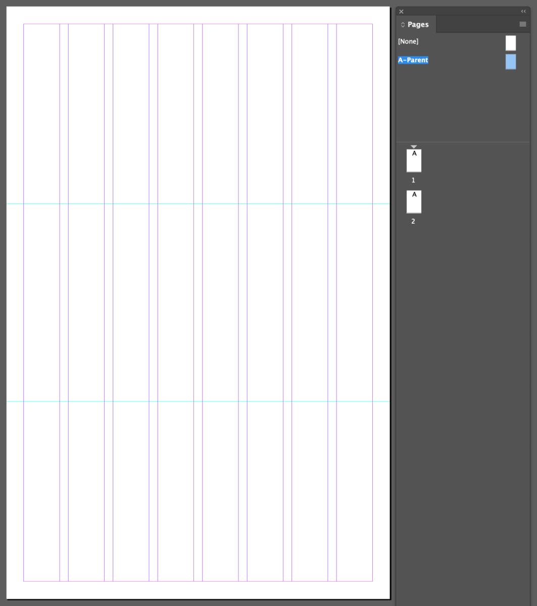
Make corrections, go through this checklist: - Size, grid (margins/columns/gutters) are correct
- Document has 2 pages
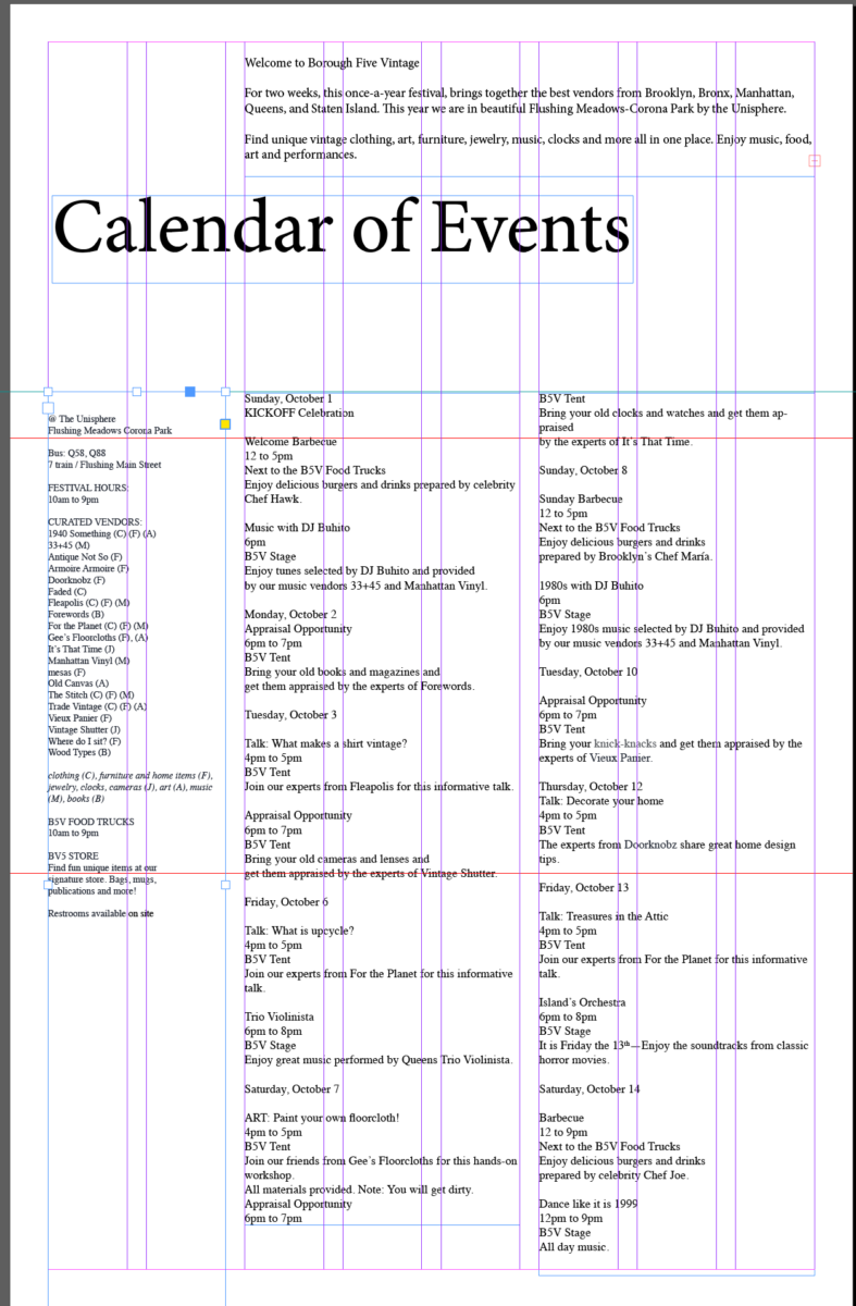
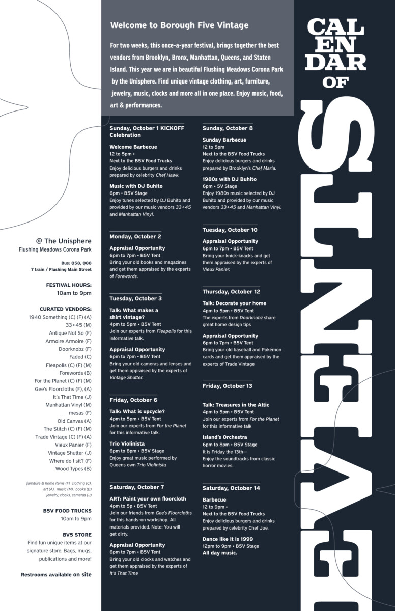
- Page 1 is a commemorative page/poster. This is different from poster 1 .
Make sure that items are correctly position. On mine I displayed the fold and direction. This can have minimal typography, such as a year /logotype and the words calendar of events - Page 2 Is the actual text: intro/ vendors list/general info and dates with events
- All type is included and follows grid
- Make sure that you understand the text (the evaluation that we did last week). This establishes every level of typographics that you need to design
- Micro typography (just look at one date and all its components).
- Clear visual hierarchy is established and typography reads well.
- one color
One you finalize your edits, we are going to create the same calendar but a different way.
We will create styles for repeated elements.
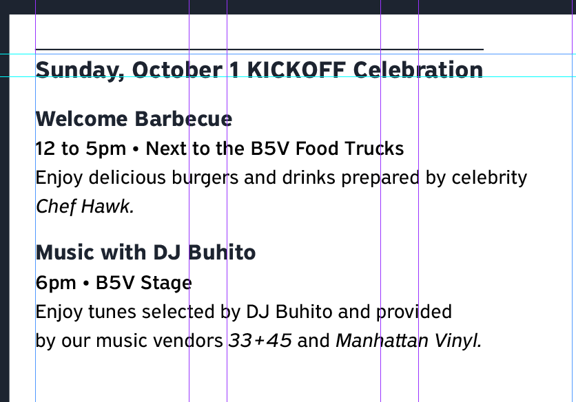
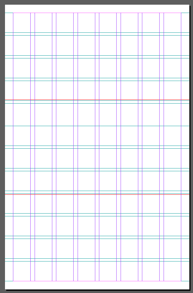
This will be for the calendar dates portion only
Go to a small portion that includes dates and two events

FOR MY design this small bit of information contains the following info to styles:
- Paragraph Styles
- One Paragraph Style for DATE
- One Paragraph Style for all other info (Block of Info)
- Character Styles for
- One for Time and place
- One for Description of event
- One for Italics in text
Participation Activity
Create STYLES
First, determine which kind and how many you need
In General
- Character Styles Include:
Typefaces/Size/Variations (bold italic width)/Case/ Color/Tracking - Paragraph Styles include:
Leading/ Alignment/Space between paragraphs or entries/Indents/Tabs/Rules (physical line)
and all the character styles too

Go to WINDOWS> STYLES> PARAGRAPH STYLES.> New Paragraph Style (hamburger Menu or plus sign at bottom of Window)


Save your files
I’ll go around the classroom- checking that participation activity is complete
Next Steps:
Duplicate your InDesign File
In the new file remove the calendar portion of your design.
Add this edited copy: This is just dates and events HERE


DUE next class:
Completed Calendar with Style Sheets Applied
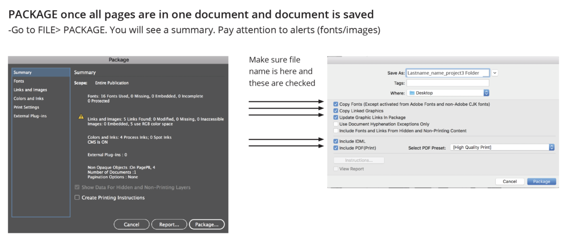
Package file- same as last week
This time call your folder
last_namefirstname_calendar_styles
Place in Dropbox
AND
_______________________________________________________________________________________
Text for next assignments/project: Publication PRICELESS
On the body of an email, provide the following text on the following format:
Title of your item or story
your name
1 or 2 paragraphs which talks about a “priceless” object that you have.
Here are some examples. Keep short and concise.
The Only Thing That Remains
—Ruth G. (edited by Prof G for length)
I had all my memoirs of my grandmother in a storage unit. Clothes she made me when I was growing up, baby pictures of the both of us, so much more. October 2012, when hurricane Sandy hit, I lost everything. The storage unit where all my grandmothers’ memoirs were located ended up getting flooded. I couldn’t go to the unit for days, but which each passing day, everything was getting ruined. I had lost nearly every single thing I had to remember my grandmother.
Losing nearly everything that was saved for years was really unbelievable. I cried for weeks, months. The only thing I had to remember her by was her necklace and her ring she gave me for my 15th birthday. I cherish her necklace and her ring so much because it’s all that I have left to remember her now. It’s something that can never be replaced with anything else in the world. The necklace and ring remain on my neck. Never have I taken it off since the day I received it. It’s all I have left and it’s something I don’t want to lose. When I hold it on my hands it puts a smile on my face because I know it makes her happy knowing how much I cherish her jewelry.
Mickey Mouse
—Farina J
As a young child, I loved to keep memories in any way possible. Even now I find myself doing so on special occasions. I would hold onto an item to help remind me of that particular time. From time to time I would clean things out, but there is one particular item that will always stay and that is my Mickey Mouse doll. The reason why I hold onto this doll is because I love Disney/Mickey Mouse, but most importantly my grandfather gave him to me.
At a young age, my doll kept me company and was something I could hold when I went to sleep. Knowing that he was an inanimate object, I could tell him all my secrets without worrying. As I grew older, he became more of an object that reminds me of my grandfather. He always made jokes and had a smile on his face. He was the fun one who watched wrestling with the kids. As I grew older, the doll becomes more of a reminder of how lucky I am to have been able to have that relationship with my grandfather. I keep my Mickey Mouse on my shelf now as it has ripped in a few places. I have had to patch him back up, but he is in great shape after 15+ years. This doll will definitely be with me for many more years to come as it holds a special place in my heart.
Grandma’s Little Picture
–Maria G
I have a tiny photograph of my grandmother when she was just a little kid. This photo was taken around 1913. Although it might not have much value, it is one of my most priceless possessions. Of course, when I met my grandmother, she was already an adult. Sometimes we do not think of our parents or grandparents as little kids. This image allowed me to do that and to see her in a different way. Somehow it transports me back in time. It sparks my curiosity about how was her life then. Did she like to talk or sing and dance? Was she a picky eater? What was her favorite toy? Most importantly it is a reminder of the great love that we shared for each other.
_________________________________________________________________________________________
Print will follow printer’s spreads, rather than logical order of reading
CLASS Last day remarks 🙂
by Prof G
NOTE:
Graphic Assignments are always due the day before class at 11:30 pm, and must be placed in class DROPBOX drive unless indicated otherwise. Assignments done or uploaded during class time on the day that they are due are marked as late.
Participation Activities are due during class and are named and posted as indicated by instructor.