Class Info
- Date: Sept 10, 2024
- Meeting Info: 2:15 to 5:35
P 114
Topic
-PICK ONE or TWO logos, begin to make it in adobe illustrator
-Selection of additional typefaces and other assets for other components of the brand
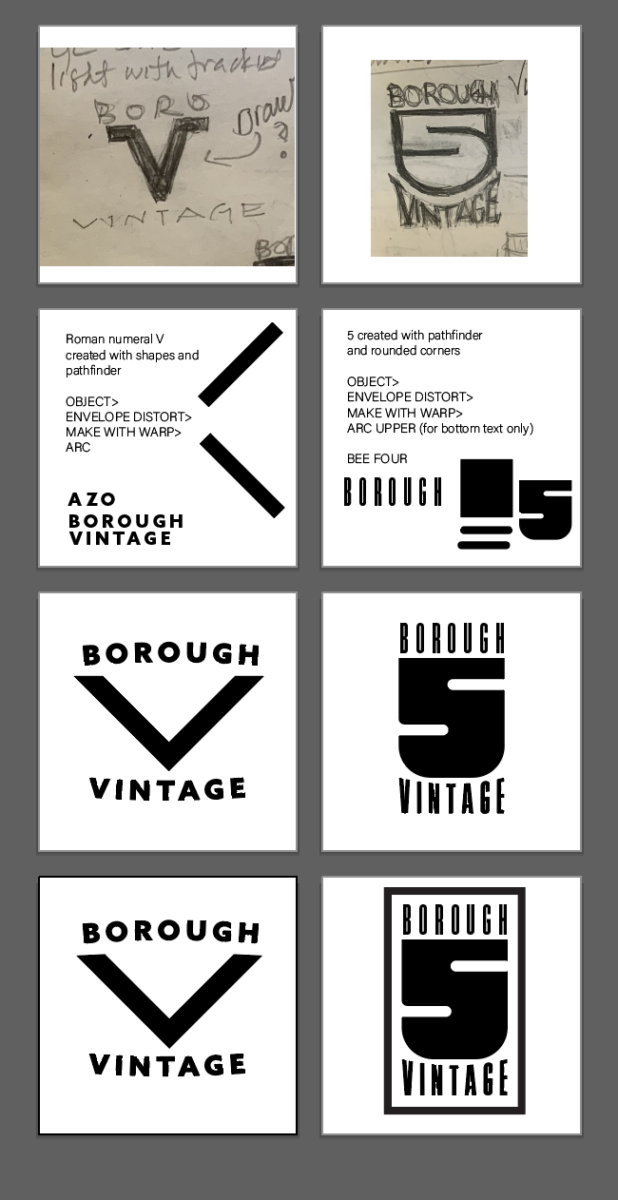
Use a idea from wells collins in making a variety of logos.
This will be a type heavy look:
Posters/Banners/Collateral/Booklet/Social Media
Lets look at some logo designers
Developing a TYPE IDENTITY
https://continostudio.com/work/yankee-doodle-dandys
https://www.verg.com.au/project_category/logo-designs
Use a idea from wells collins in making a variety of logos.
Let’s look at some case studies. These are posted in FONTS in USE
A note: careful with trends and eye candy.
During Class
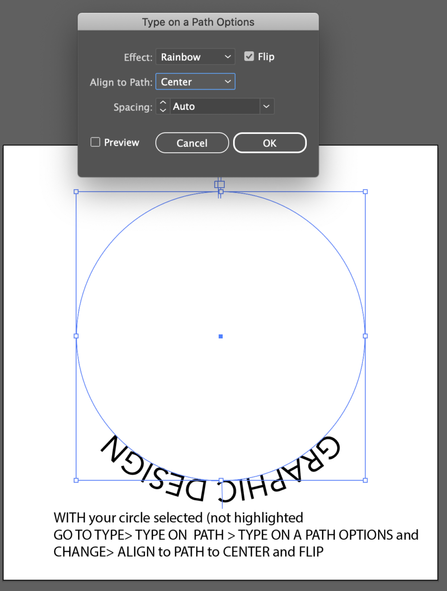
Now that our logotype is almost complete, we will do edits
What needs to improve: Scale? shapes, curves, KERNING, tracking
Reconsidered? Typefaces, alignment, tints?


Start thinking about color version.
Select color(s) for your final version.
For now keep both CMYK and Hex colors
Do not use more than 2 colors for your word mark.
(One important note is that many word marks are somewhat fluid in terms of color. The color might change based on the application)
- Avoid colors that have poor contrast (for example light yellow and white)
- Avoid colors that are too similar (dark blue and dark purple)
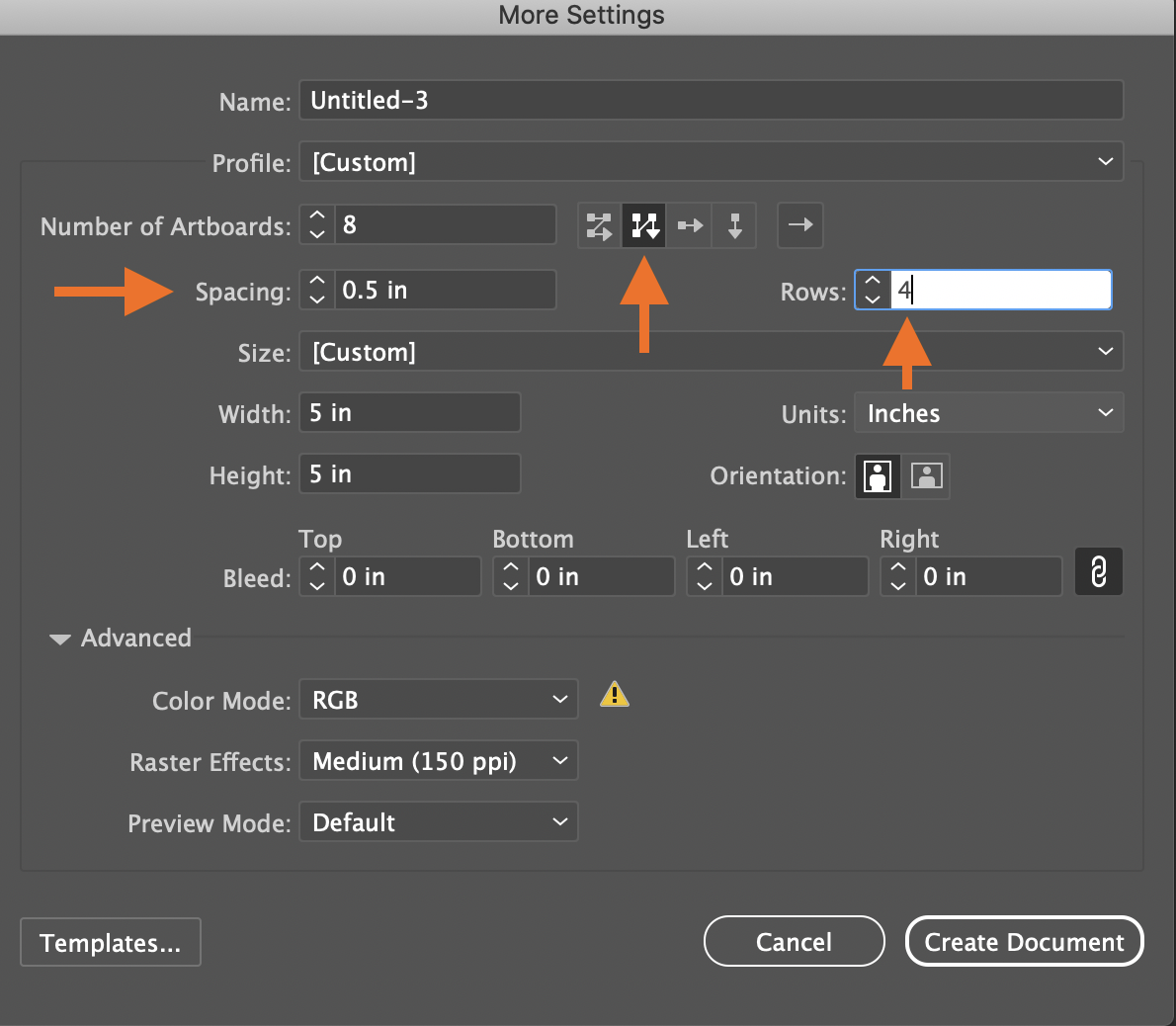
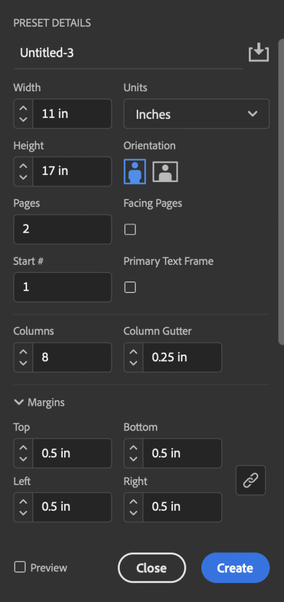
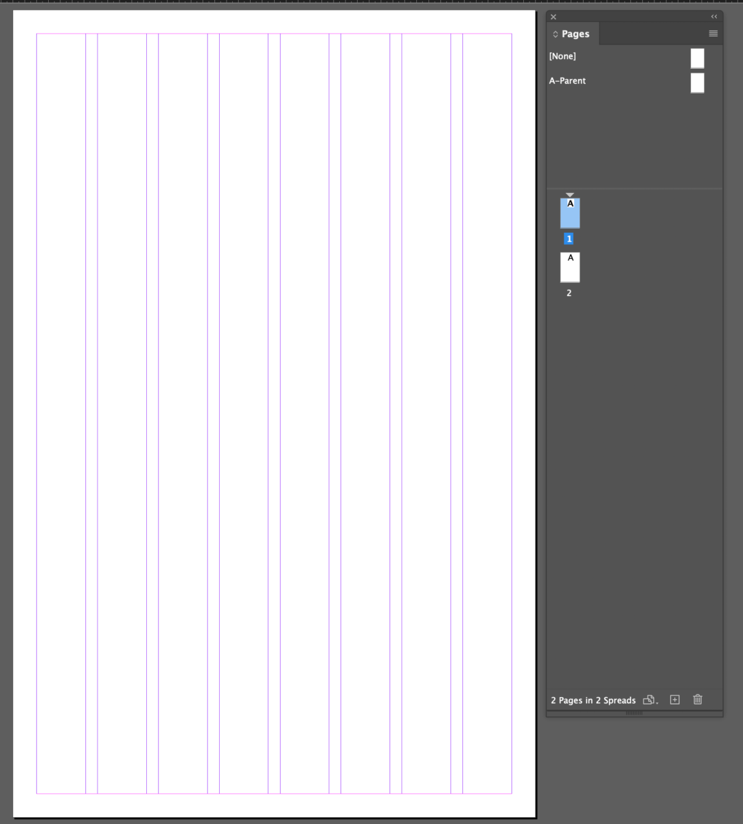
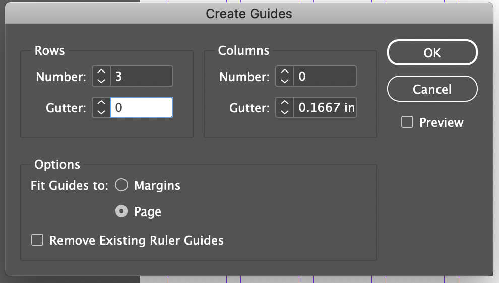
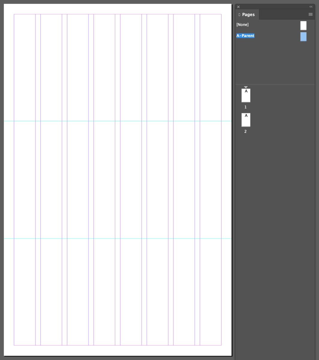
In Illustrator, create an 11 x 8.5 document
LETS WAIT-Additionally we will decide on other typefaces for our food festival identity.
At least one must be a variable typeface.

Due next class:
Gave feedback on everyone’s logo. Work on design or simplify it your illustrations.
Label each logo and do more than 3.
- Sequence that was started in class with 6 versions of edited logo.
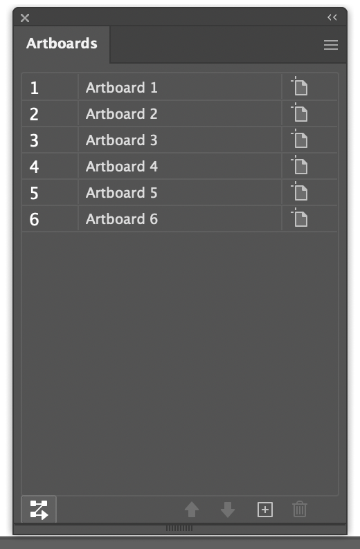
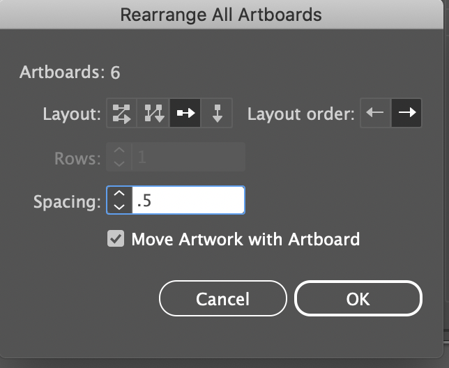
Take a screenshot (with no guides please) of the artboards
lastname_name_logotype_edits.jpg
and
Lets wait on this- 2. Please also upload
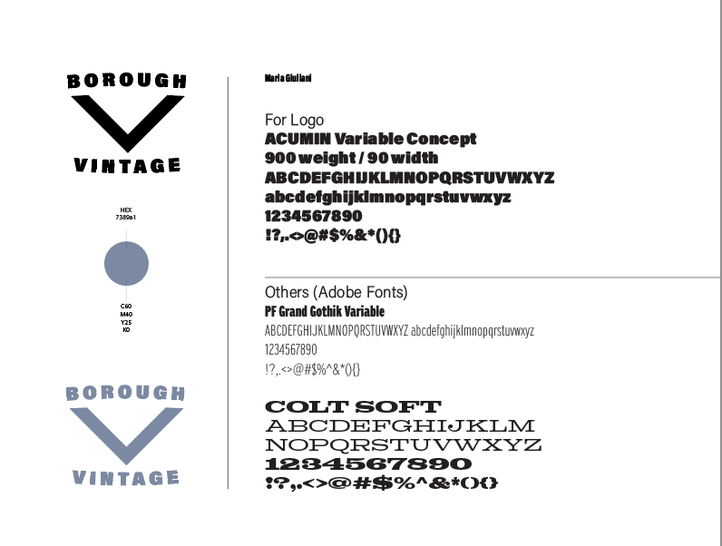
lastname_first name_logo_ideas_colors_typefaces.jpg
____
Print will follow printer’s spreads, rather than logical order of reading
CLASS Last day remarks 🙂
by Prof G
NOTE:
Graphic Assignments are always due the day before class at 11:30 pm, and must be placed in class DROPBOX drive unless indicated otherwise. Assignments done or uploaded during class time on the day that they are due are marked as late.
Participation Activities are due during class and are named and posted as indicated by instructor.