Contents
Class Info
- Date: Thursday 26, 2024
- Meeting Info: 2:15 to 5:35
P 114
Topics
- Logotype Critique (approx 30 minutes)
- As we continue to develop our typographical identity for Shake Station, let’s review some of the principles of typography (we discussed some during last class)
- Review the main elements of visual hierarchy.
- Image, color and type (typographic legibility)
- Poster Design
Remember that designing is not just selecting a typeface and changing size 🙂
- PRINCIPLES OF TYPE
- Characteristics of the typeface
- Variations of Type (Width/Weight/Posture)
- Case (Upper case/ lower case/ U&lc)
- Alignment (careful with decision)
- Type on a path. Careful with vertical paths and curves
- Line Height and Word Spacing (Leading/ tracking and kerning)
- Kerning: Large type (above 24pts) MUST almost always be adjusted
- Tracking: Avoid excessive tracking lower case letters (looks odd)
If tracking UC, should be to limited amount of words (like a title)
- VISUAL HIERARCHY
- Positioning (composition/ How it reads?)
- Scale
- Color
- Contrast
During Class
Participation Activity
FOLLOW DEMO
In Illustrator CREATE a 5 ” x 3″
1 artboard document
Place the following JPG > EMBED and change its color
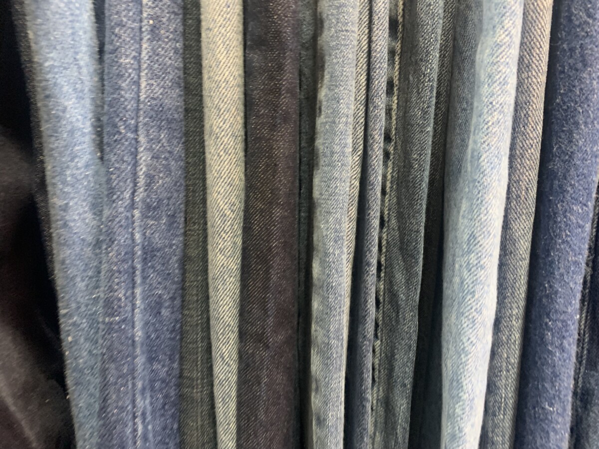
How to make a JPEG/ Grayscale so that you can change color

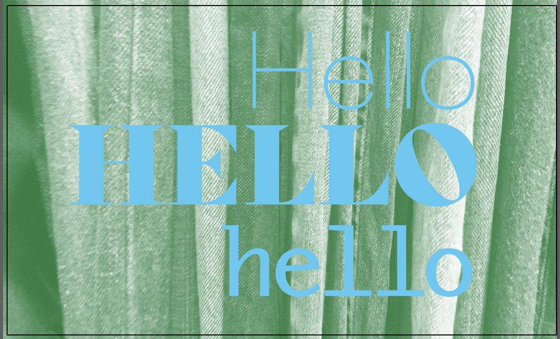
Change the color of the JEANS image to one color of your choice.
First let’s make a swatch.
To create a swatch of colors do the following
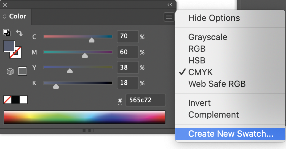
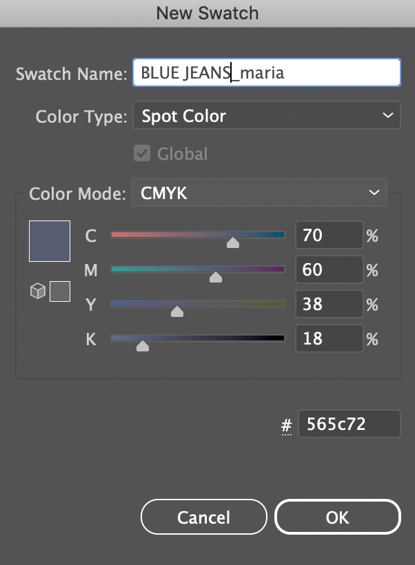
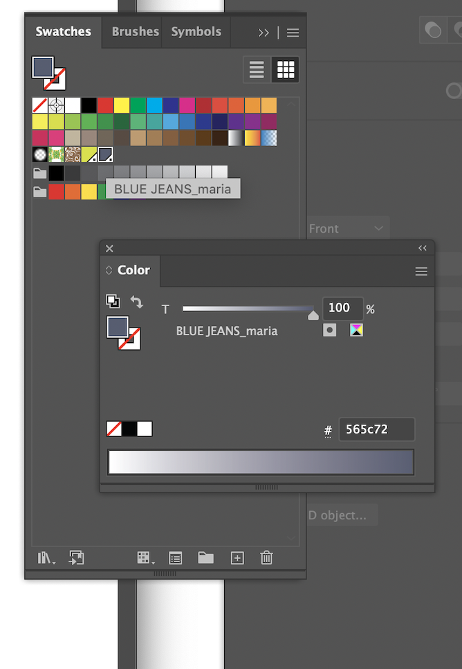
If you go now to WINDOW> COLOR > SWATCHES, you will be able o see your color as an option. Additionally, you will be able to use the slider to change the tint of the color.
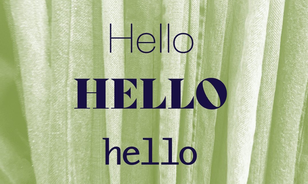
Then–In one text box type in the word Hello like this:
Hello
HELLO
hello
Make it 72 points
and select a non script typeface (a different one for each line)
it will look something like this:

Control the leading to make them closer (OBSERVE: What is happening?)
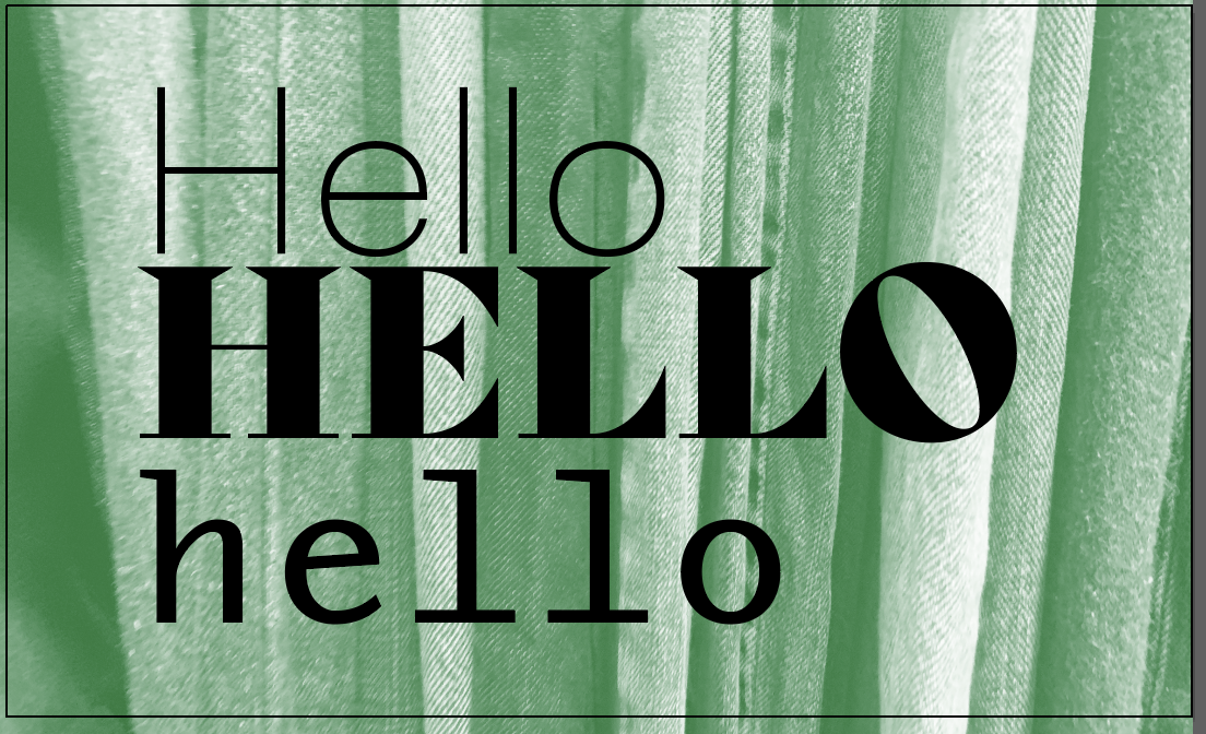
OBSERVE: Word spacing: What is happening?
Change the color of the type (OBSERVE: What is happening?)

Change the alignment (OBSERVE: What is happening?)
Make it look better (do not copy mine, use your judgement)
Take a screenshot of your final version and
- Make a new post:
Go to the DASHBOARD>POST>ADD NEW
ADD title “yourlastname_firstname_PA_feb15_details”
Categories
Under the GEAR to the right of the screen GO to DOCUMENT>CATEGORIES, then check the following categories:
“Student Post ” and “Participation Activity”
Add your image as a JPG:- yourlastname_firstname_PA_feb15_details.jpg
- PUBLISH (Open lab has a little delay when posting. Avoid posting numerous times)
__________________________________________________________________
Research or Create images:
Although this is a type heavy identity, you may use some imaging. If you source them, they MUST be free to use and adhere to their licenses.
Read the following article:
In the Spotlight: Finding Public Domain & Creative Commons Images
RESEARCH at least 5 images
In Illustrator, create an 11 x 8.5 document
Place your research

Keep track of research/typefaces and sources.
Design Continuity
What is design continuity?
Our posters are going to help us establish a look, and the overall feel and vibe of the festival. This will carry throughout your designs
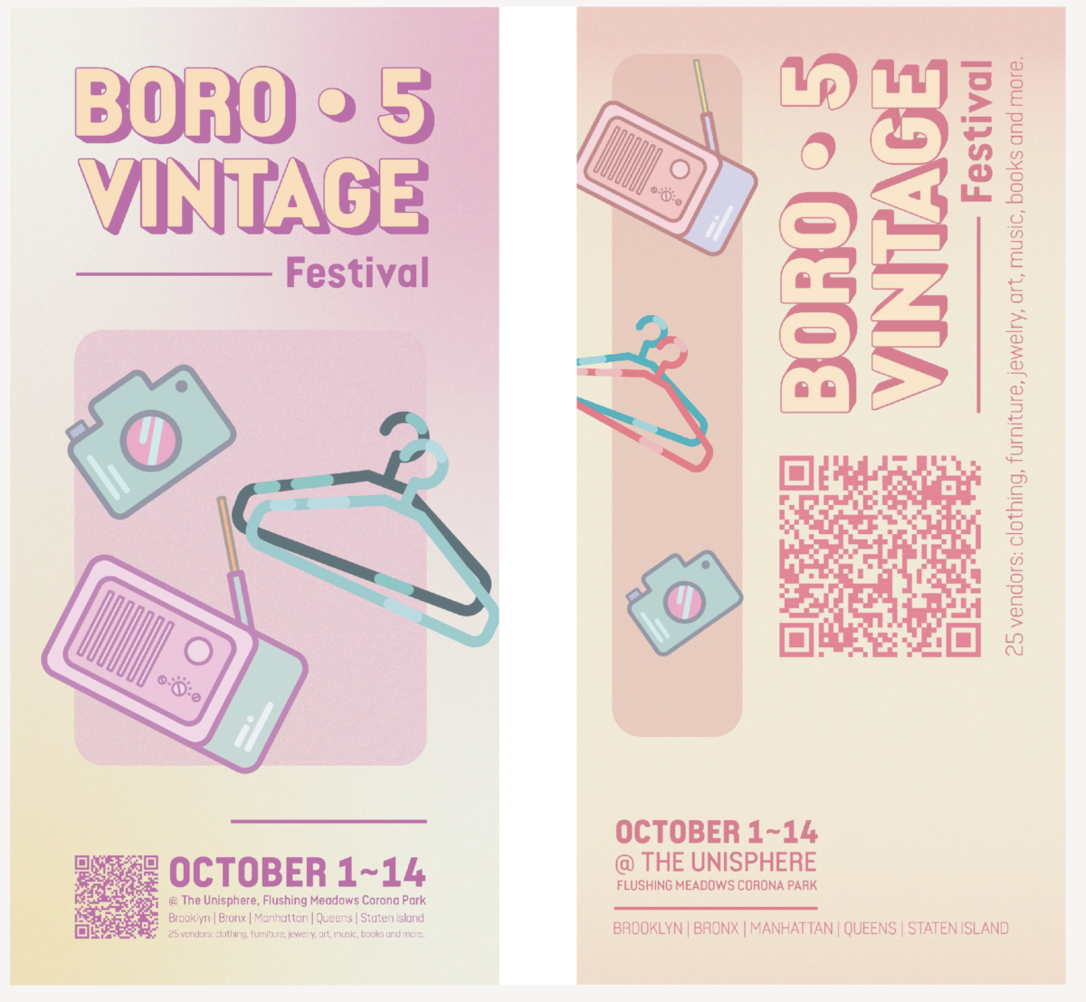
POSTERS or Book:
We will design a poster or book for print
to promote the shake station festival.
Start thinking of design continuity- You will start now designing elements of a typographical brand/look- logo, fonts, icons, colors.
One DESIGN for this poster 11×17 or book- can be double sided. Portrait only for poster. Use different fonts- 1 or 2,-3 fonts MAX.
Us the copy from the pdf, logo, fonts, icons and colors to make this poster or book exciting and easy to read. Print out options. Add bleed to file, use indeisgn only.
Add one (or more) call to action for the poster or book cover.
add – www.shakestaton.com
Social Media (Instagram) icon and add a QR Code

Vertical
Full color ok
Specs:
The following text must be included:
Add your logotype
Example Gallery: Please note that sizes and copy vary. These show how others solved this problem. Create your own.


Due next class- note there is no class next week
1 poster or book
print it out and will look at them in class.
For folding ideas
https://smartpress.com/shop/designer-folds
______________________________
Print will follow printer’s spreads, rather than logical order of reading
CLASS Last day remarks 🙂
by Prof G
NOTE:
Graphic Assignments are always due the day before class at 11:30 pm, and must be placed in class DROPBOX drive unless indicated otherwise. Assignments done or uploaded during class time on the day that they are due are marked as late.
Participation Activities are due during class and are named and posted as indicated by instructor.


Leave a Reply