Table of Contents
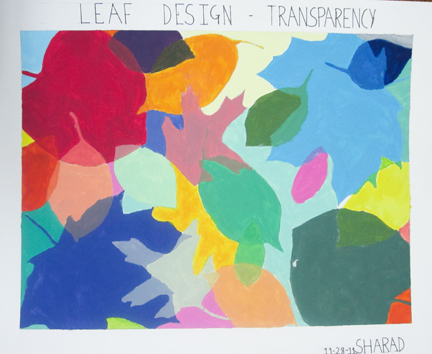
Transparency and Triad color scheme.
Project Overview:
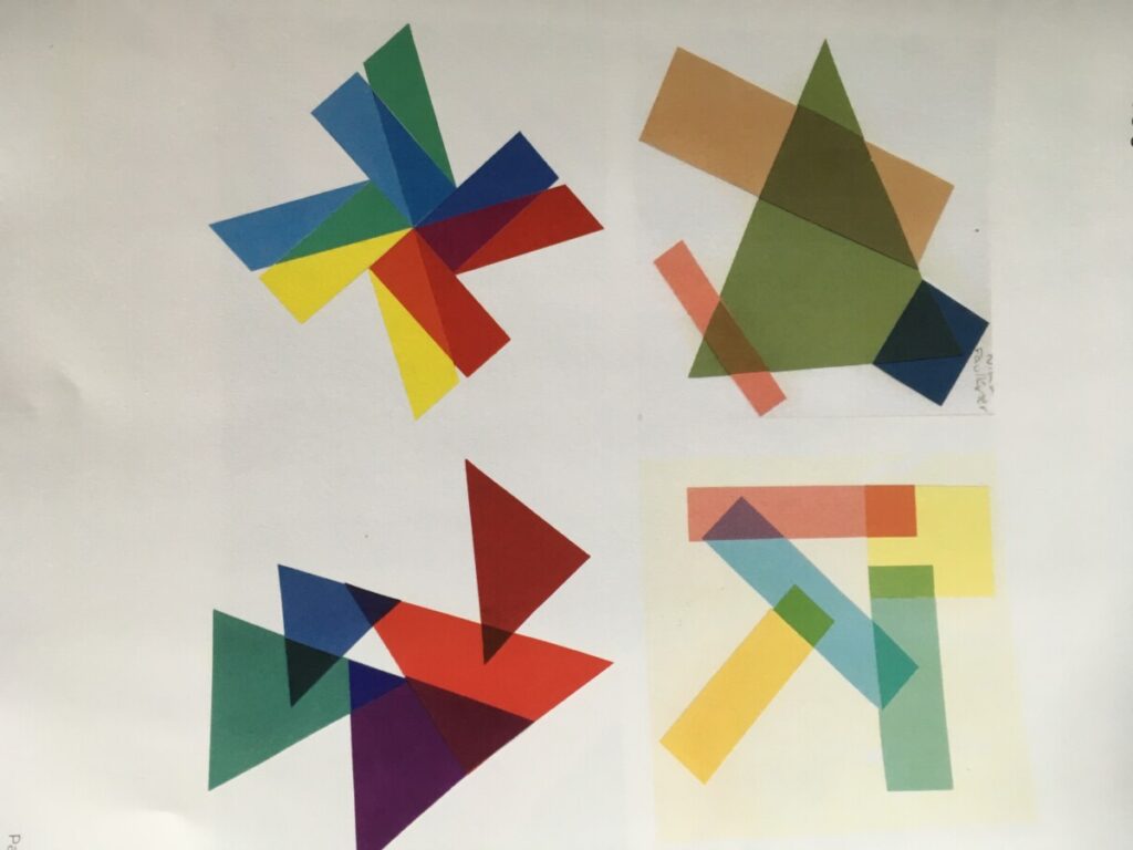
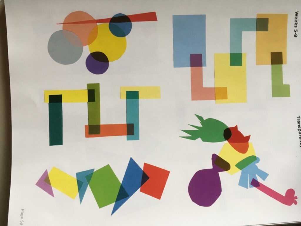
Problem: Create Digital compositions demonstrating an understanding of the use of layers and transparency to convey space, overlap, continuity and meaning to your images.
Materials: Sketchbook, colored pencils, digital media
Concepts: Triadic color palettes Primary, Secondary, Tertiary, High Saturation hues, low saturation, chromatic value, CMYK, RGB, RYB color models/systems.
Technical Skills: Thumbnail sketching, ideation, Adobe programs for digital imaging.
Outcomes:
Recognize and be able to produce designs using layering and Transparency
- Ability to combine a Triadic palette to create contrast and unity.
- Utilize Adobe programs Photoshop and Illustrator for abstract and photo based compositions
- Understanding of ideas of overlay, continuity, layering and mood by creating two digital compositions using shapes and photographic images which overlap one another to show transparency.
- This will help see how colors interact when layered, seeing the color mixtures and experimenting with Triad Color scheme.
Discover:
- Read Ellen Lupton chapters on Layers and Transparency pgs 127-159 Take notes, circle design vocabulary words.
- Research advertising and design examples where you see use of Transparency and overlapping layers.
- Post 3 images in Column in Milanote.
Define:
Composition #1
Overall Composition of Abstract Shapes using Triad color palette and Design Principles of repetition and variation, Scale and Rhythm and Hierarchy.
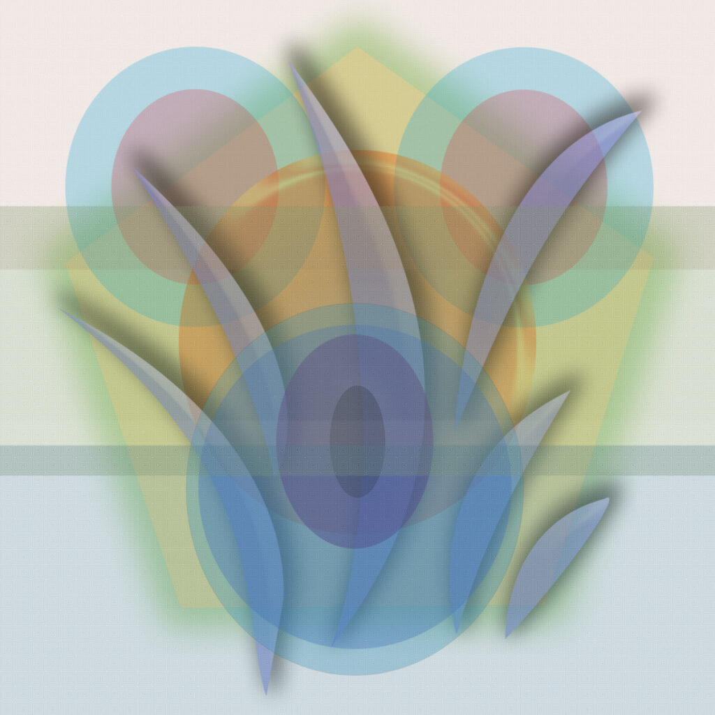
- Composition #1: Open Adobe Illustrator or Photoshop and explore shape overlays using variation in OPACITY levels to create color transparencies.
- Play with different ways to make shapes with shape tool and line tools, Add Anchor points, Direct Select
- Overlap shapes using low Opacity levels to see layer from behind
- See how colors mix
- Use layer options, drop shadows to give depth
Develop
Composition #2 Use Photoshop
Work in 2 or 3s and choose a theme, and each student can make their own image within that theme. Examples: Love, Nature, Urban, Travel, etc etc.
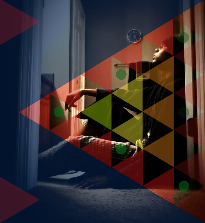
- Research ideas or themes for Composition #2, a photo based composite image using interplay of at least 2 images,
- Use opacity levels to create Transparency.
- Use layer masks to combine images
- Try Quick Selection tool for collage of one image into another
- Theme can be nature, urban, figure, a concept or emotion (love, peace, fear, solitude etc etc.
- Develop mood and content into your image.
- Write notes for ideas, thumbnail sketches to help compositional ideas.
- Use your own photos whenever possible. Find stock photos otherwise.
- Use layers and masking (see link) if necessary.
Deliver: Documentation and Feedback
Submitting in your work
Follow the Submitting Your Work guidelines and include the project-specific details below:
- Post Titles: Discover, Define, Develop, Deliver
- Images: Organize your post to include all content from the 2 parts of the Design Process for this project.
- Create headings for each phase and include images or a gallery, where appropriate:
- Research for Transparency images, ,
- Discover-Triad palette, Colored Pencil 2 sketches
- Define – Digital composition #1, Abstract shapes using Transparency for blended hues
- Develop: Digital Composition #2,
- Deliver: Full post, including reflection and peer comments
- Written Project Reflection: In your post, document your thoughts about this project. Think about what you learned, what you could have done better (planning, material use, craft), and how you will apply what you learned to your next project. Consider and respond to the comments made in class during the critique.
- Category:
- Category = Project #5
- Transparency Project #5
Providing Feedback
Part of your Project grade is leaving well-written comments for at least one of your peers. Follow the Providing Feedback for specific guidelines for leaving constructive feedback.
CREATIVE COMMONS LICENSE
This site is curated and maintained by Prof. Jenna Spevack.
Except where otherwise noted, content on site is licensed under a Creative Commons Attribution-NonCommercial-ShareAlike 4.0 International License.
You are free to share and adapt the content on this site if you provide appropriate credit, provide a link to the license, and indicate if changes were made.
CREATIVE COMMONS LICENSE
This page has content curated by Prof. Jenna Spevack.
Except where otherwise noted, content on site is licensed under a Creative Commons Attribution-NonCommercial-ShareAlike 4.0 International License.
You are free to share and adapt the content on this site if you provide appropriate credit, provide a link to the license, and indicate if changes were made.
© 2020 GRAPHIC DESIGN PRINCIPLES 1
ABOUT
Instructor: Carol Diamond
Office hour: 1:30-2:30pm Monday
This basic design and color theory course explores graphic communication through the understanding of the elements and principles of design, as well as the design process, including idea development through final execution. Communication designers use the concepts explored in this course in disciplines such as advertising, graphic design, web design, illustration, broadcast design, photography, and game design.
ACKNOWLEDGMENTS
This course is based on the following course(s):
- COMD 1100 by Jenna Spevack
STUDENT WORK
HOW TO…
COURSE RESOURCES
COURSE GRADEBOOK
LICENSE
Unless otherwise noted, this site by Jenna Spevack has a Creative Commons Attribution-NonCommercial (CC BY-NC) license. Learn more.
