
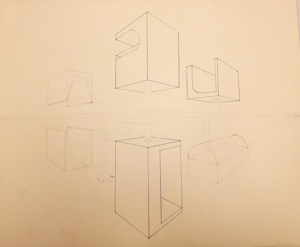
I approached this project with great enthusiasm because I am deeply interested in 3-Dimensional design and animation. I am an avid fan of video games and animated films that are able to create whimsical, or realistic renderings through the use of form and space. I am also interested in architecture and creating more interesting 3-Dimensional features within a structure’s design. I had coincidentally started following an account on Instagram (@product_design_maker) right before this project was assigned, that deals with form and space and examples and breakdowns on how to draw inside a box with attention to direction, and its surroundings. He also includes a shadow in his drawings that create an even greater illusion of the form existing within the space and really brings the illustration to life.
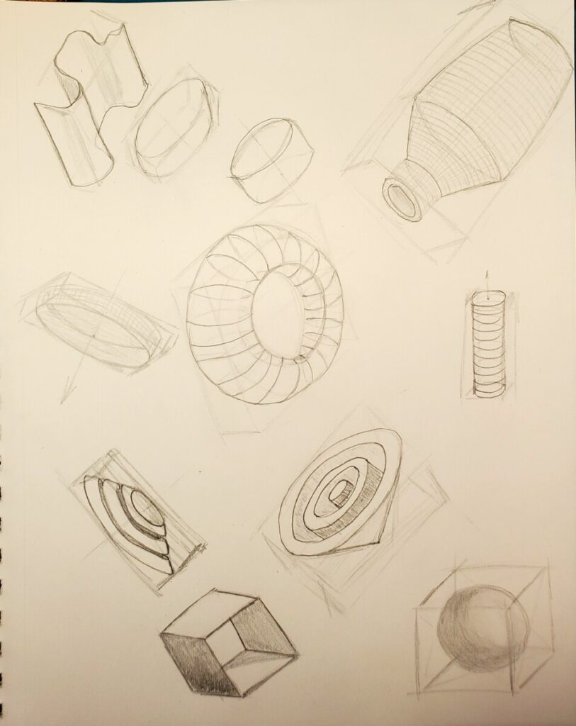
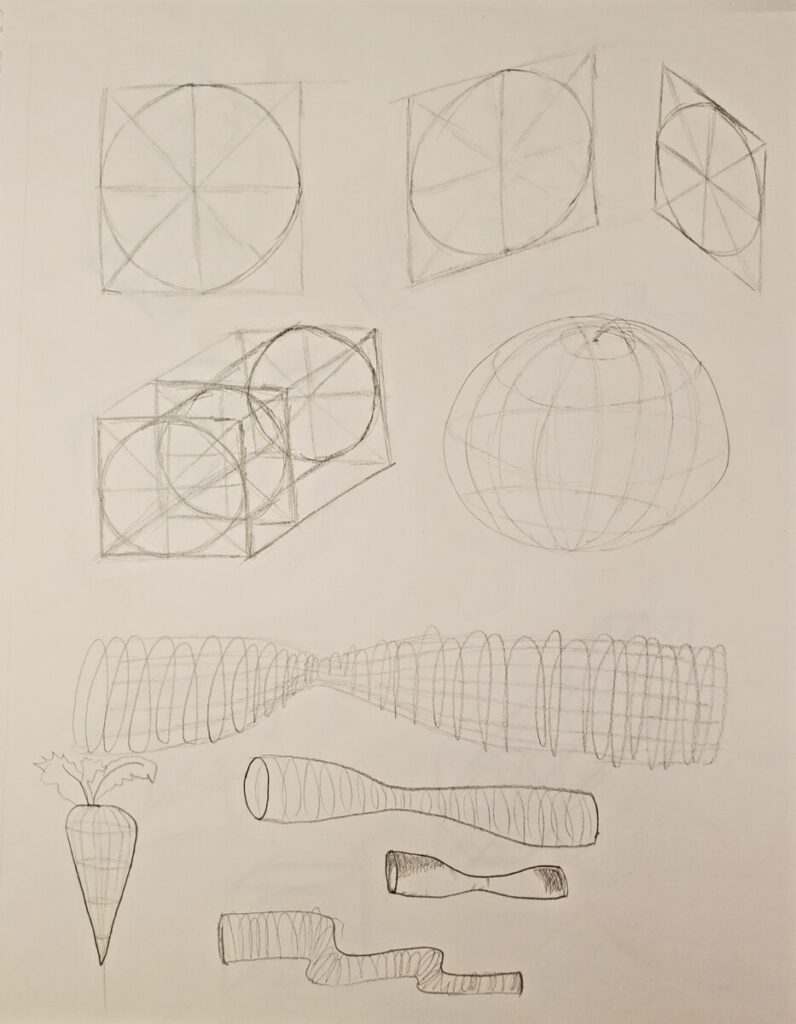
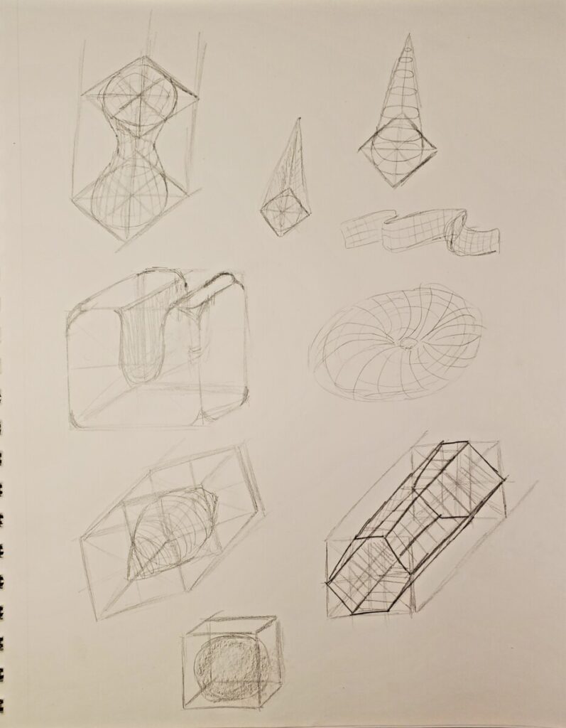
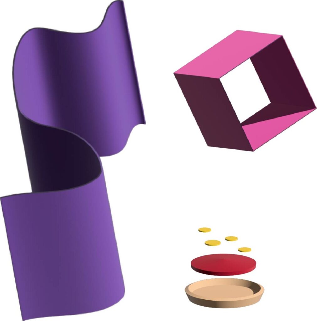
I enjoyed both the pencil drawing stage and the digital playground on illustrator. It was extremely helpful to have the drawing demo in class to help me place more abstract objects like the extruded purple stroke down on the page, but the toughest part was finding the directional line within the shape to help place the initial “box” down to start rendering the shape in the correct direction. It was also difficult to place the lines inside the box to coincide with the direction of the lines in relation to the space. I was more aware than ever of my color palette in my illustrator final composition and tried to place complementary colors next to each other and then added more color to create an extended triad palette. I found the movement element by accident when moving objects around and noticed that the sphere seemed to go through the hop which was also created by accident. I wish I could have spent more time on this project to create even more compositions and to explore with adding shadows to the 3D objects to really bring them off the page.


Leave a Reply