
Landscpae pixel 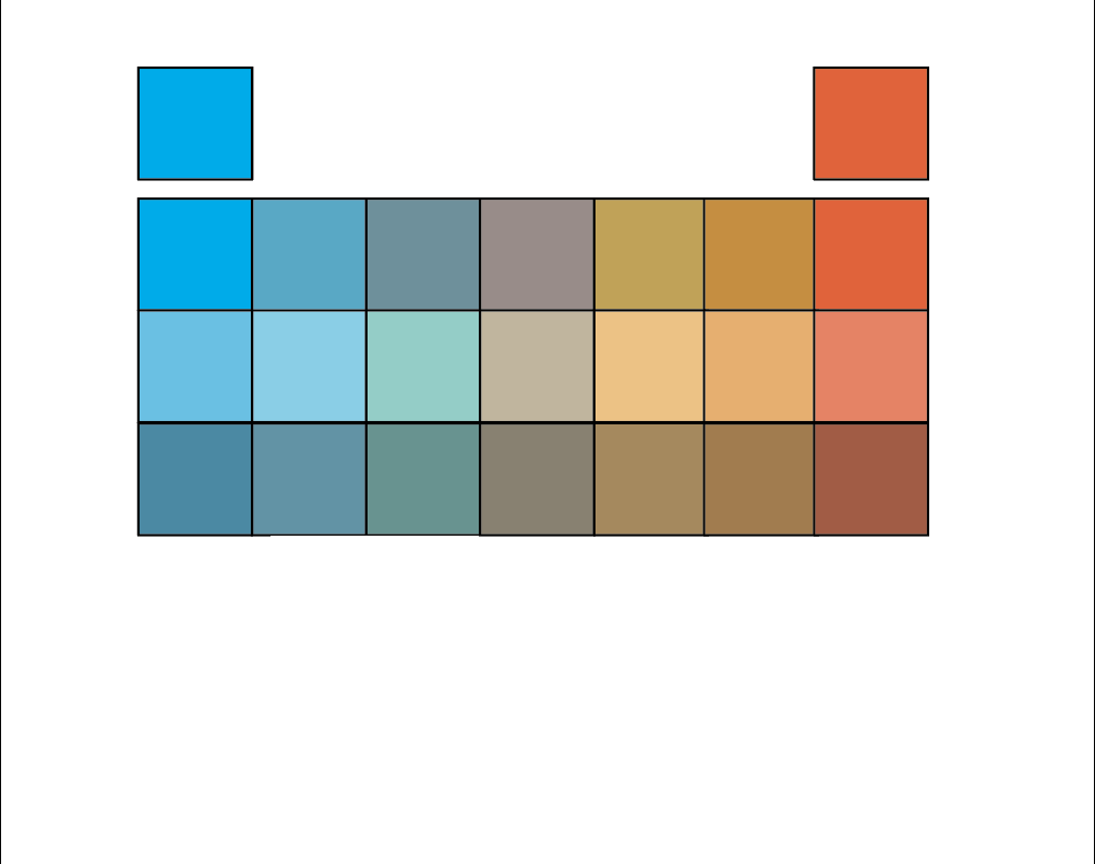
Digital Complementary Scales 
3 Digital Complementary Scales 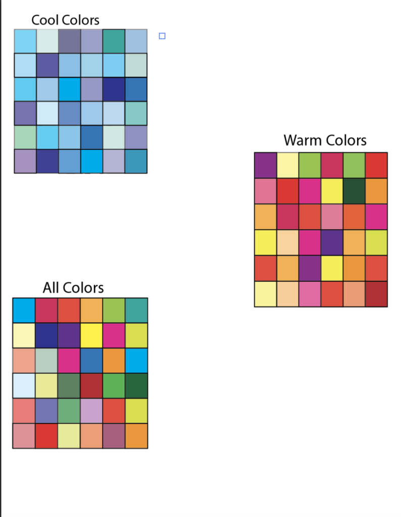
Saturation scales + tint (complementary colors) 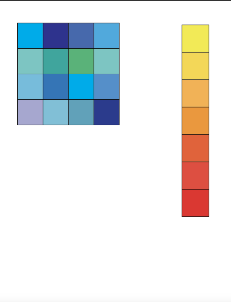
Discover – monochrome palette & value gradation scale 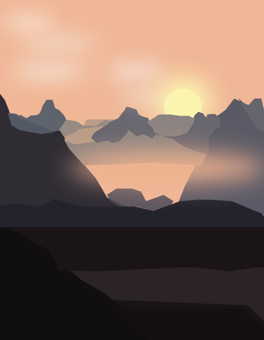
Atmospheric Landscape 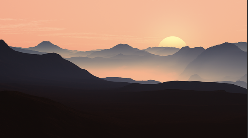
Inspiration Image 
Abstract Atmospheric Landscape 2 
Atmospheric Landscape Thumbnails 
Discover- Simultaneous contrast 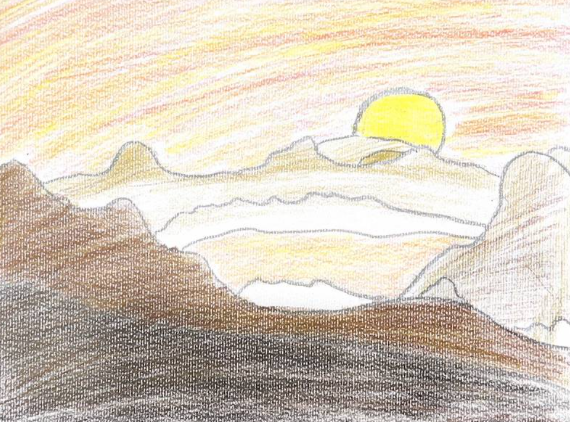
final sketch
When starting this project we began by analyzing major color qualities such as hue, tone, and vibrancy. Then, using only color combinations of the primary colors (blue, red, and yellow), we created three color grid system: all over color, warm hues, and cool hues. We developed extra colours by combining the three tints. Then we began mixing acrylic paint. I created a monochromatic palette and a value gradation scale in which we experimented with pigments, hues, and tones. Additionally analyzed concurrent contrasting with colored paper examples. We utilized lighter and darker colors for the backdrop and medium hues for the control hue, which appears variable depending on its background.
From then, we switched to digital for our landscape. When creating our scenery, we were expected to fill the front dark hues and go back with softer colors. Following that, we had to create abstract versions of our environment. This phase was incredibly enjoyable and creative since you had now have to utilize your ingenuity to change your well-designed scene into mere forms.


Leave a Reply