
Artwork from Brooklyn Museum: Use of complimentary colors red and green, warm color palette 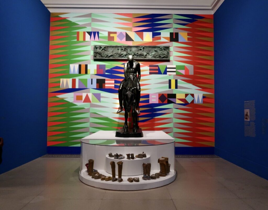
Artwork from Brooklyn Museum: Show simultaneous contrast, middle hues on both light and dark value backgrounds 
Artwork from Brooklyn Museum: High saturation levels for pink, red and yellow hues, high contrast as well 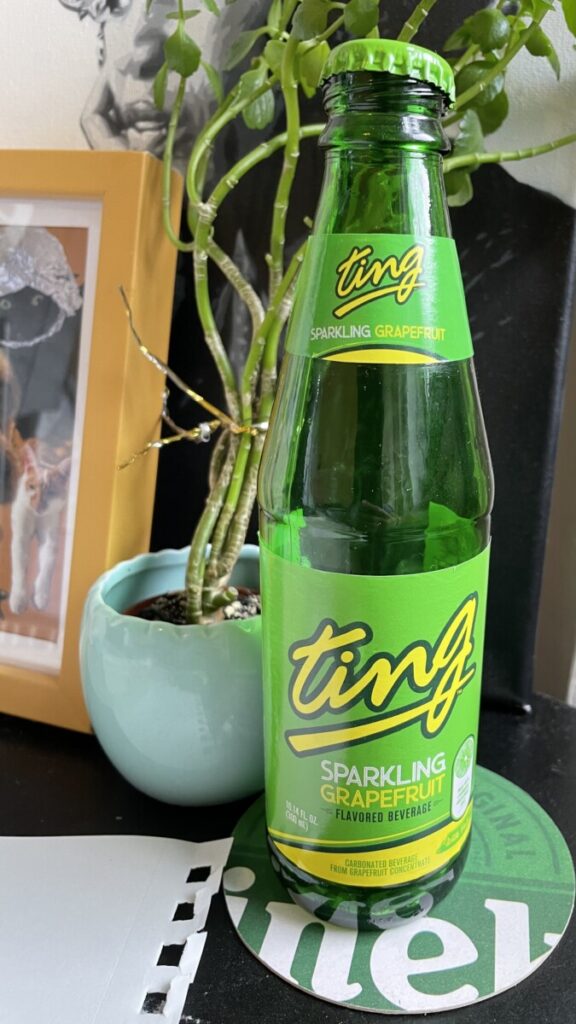
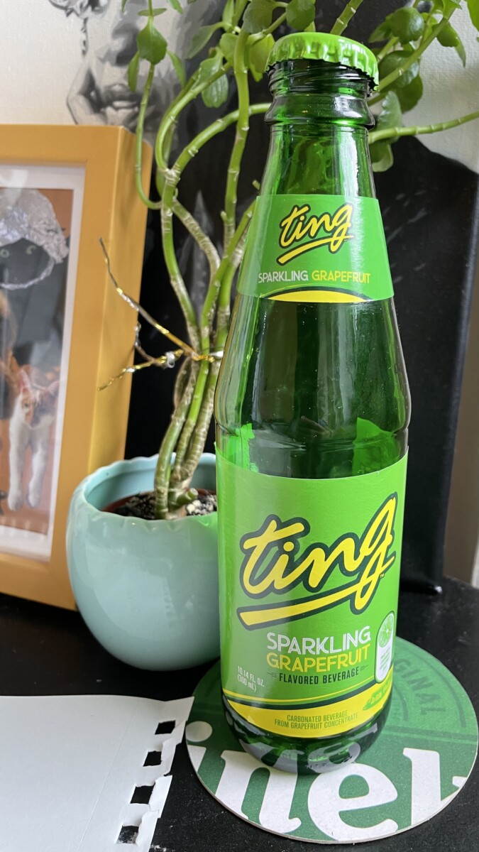
Bottled drink: Use of primary and secondary colors, yellow and green 
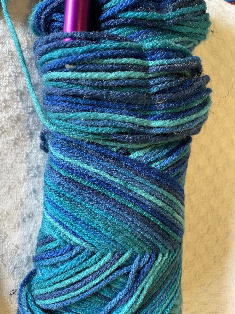
Yarn: Blue monochromatic palette, cool hues. 
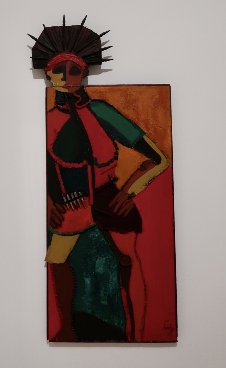
Album artwork: Green monochromatic, various hues, cool palette


Practicing with color has allowed me to understand color a lot better. The initial phase was a challenge for me, I found that creating and mixing colors with colored pencil on Bristol to be quite difficult because of the smoothness of the paper. With this I then practiced mixing colors on my own on sketch paper and found it to be much easier, I was able to create and see the new colors. Painting and working with the colored paper was the most fun and effective for me to truly understand and work with color. In the last phase seeing the colors on different backgrounds helped me explore color relationships. Being able to apply what I learned in class about color to things in my own world is very exciting.


The photos you chose showcase the different aspects of color very well. My favorite is the artwork from the Brooklyn Museum showing simultaneous contrast. You can really see how the mint looks so different next to the green than next to the red.
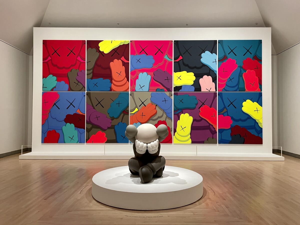
Hey Jennell, One of my favorite pieces from your visual library is the Artwork from the Brooklyn Museum, It definitely has a lot of contrast and high saturation which makes it eye-catching. (The Statute covering its face is part of KAWS, they make cartoon-like figures which are a big attraction to collectors, I have a few pieces myself :). They have also made collaborations with big brands like Nike.
I love how you searched for very intense instances of color. I love the Brooklyn Museum images but my favorite has to be the yarn, I love a peacock/mermaid palette and I like that even the knitting needle’s color finishes the cool palette with a pop. I love everything retro so I also like the soda bottle.