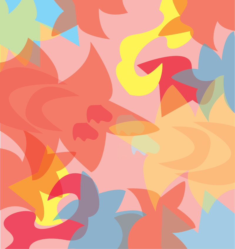
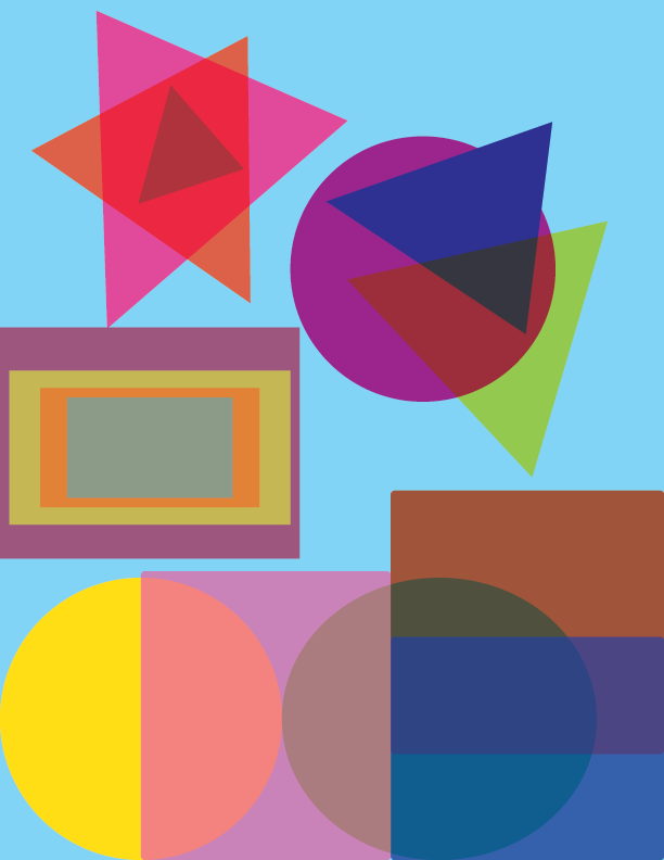
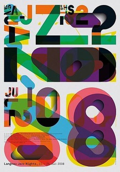
My experience with this project was really fun. We learned so many new things like transparency and overlapping images. I learned that these are used in advertising and in company logos. We were tasked to make a composition out of abstract objects in Illustrator. I found out that you can actually have depth in your composition by using overlap and transparency, but it does take a while to get depth. The triadic colors I used for my composition were red, blue, and yellow. After that, we were tasked to make a collage with multiple pictures and use transparency and overlapping in photoshop. I learned how to use a clipping mask with the brush tool and a quick selection tool to get rid of anything that I didn’t need from an image and place it over another. I was able to let my creativity run wild while working on this project and I am proud of what I made in photoshop. This project help me learned a lot and I can’t wait to learn even more in our next project.
About
Instructor: Carol Diamond
Office hour: 1:30-2:30pm Monday
This basic design and color theory course explores graphic communication through the understanding of the elements and principles of design, as well as the design process, including idea development through final execution. Communication designers use the concepts explored in this course in disciplines such as advertising, graphic design, web design, illustration, broadcast design, photography, and game design.
Acknowledgments
This course is based on the following course(s):


Leave a Reply