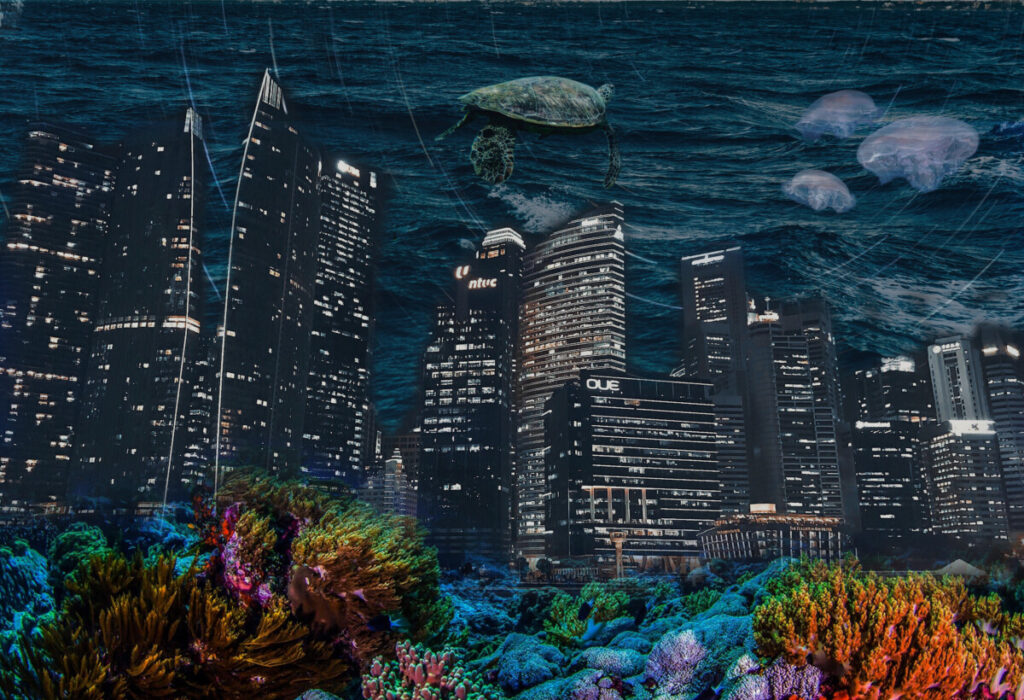
Marine Cityscape Composition 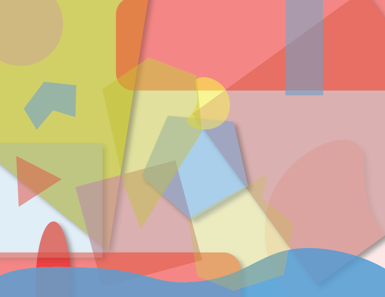
Triad Color Palette Composition 
Marine life Inspiration Image 
Skyline inspiration Image 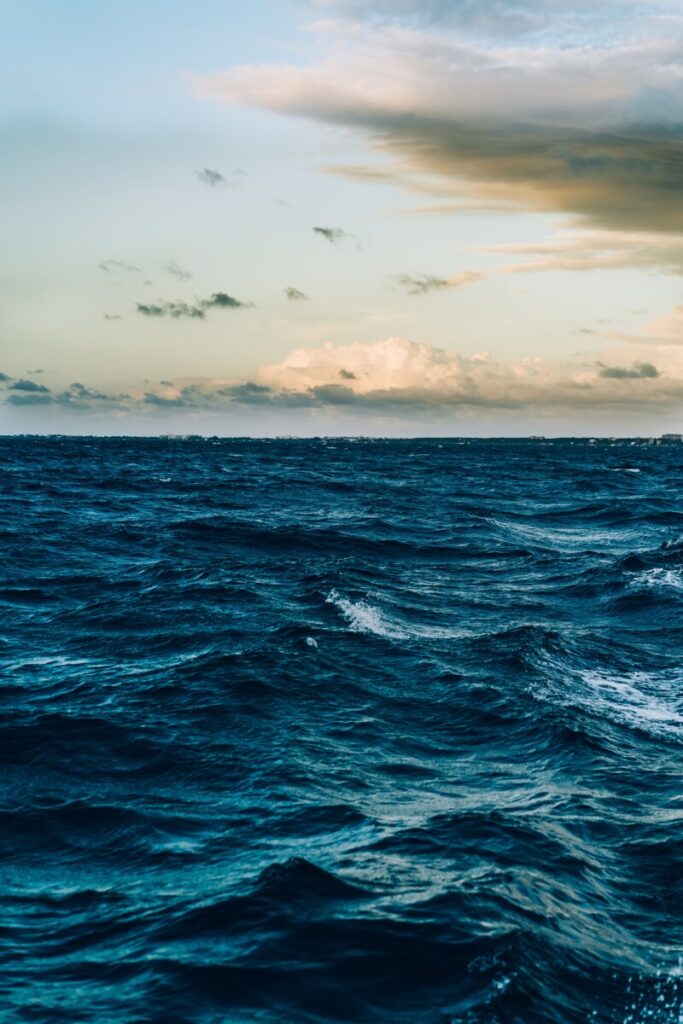
Ocean inspiration image 
Examples of transparency in digital advertising 
Examples of transparency 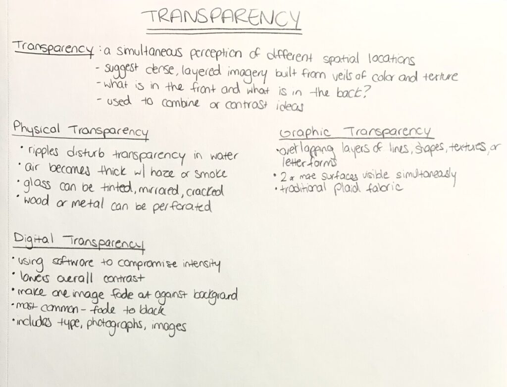
Transparency chapter notes
The Process
This project was a very fun and playful way to learn about transparency and layers. We started by reading the transparency chapter in Ellen Lupton textbook and taking notes. There are 3 kinds of transparency mentioned: physical, graphic, and digital. Then I started searching for images of transparency and layering in advertising and came across some very good examples using color and overlay. For the first composition, we used a graphic transparency using shapes and a triad color palette. I chose a primary triad color palette for my piece. I used illustrator to create the composition and utilized tools like the drop shadow to show depth. My composition used geometric and irregular organic shapes for a playful look. The shapes created a mixture of the different colors when layered on top of each other and lowering the opacity.
For composition 2, we split up into groups and started digital transparency. My group decided on doing a tropical marine cityscape piece. We each did a different time of day or mood and mine was nighttime dark and moody. Using photoshop was difficult at first and layer masks were causing me some trouble but I got the hang of it. I darkened many of the images and gave them a blue tint to harmonize with the ocean concept. Playing around with the opacity of the layers allowed the coral to look like its bleeding into the skyline and like the city is now underwater. In summary, this project was a great way to learn about the different forms of transparency through digital work.


Leave a Reply