
Painting in MoMA,
mix of dull & saturated complementary colors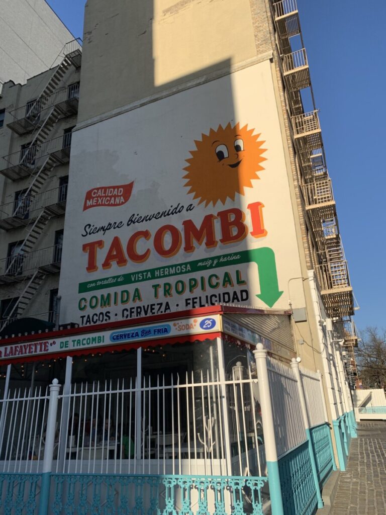
Restaurant Advertisement, complementary colors 
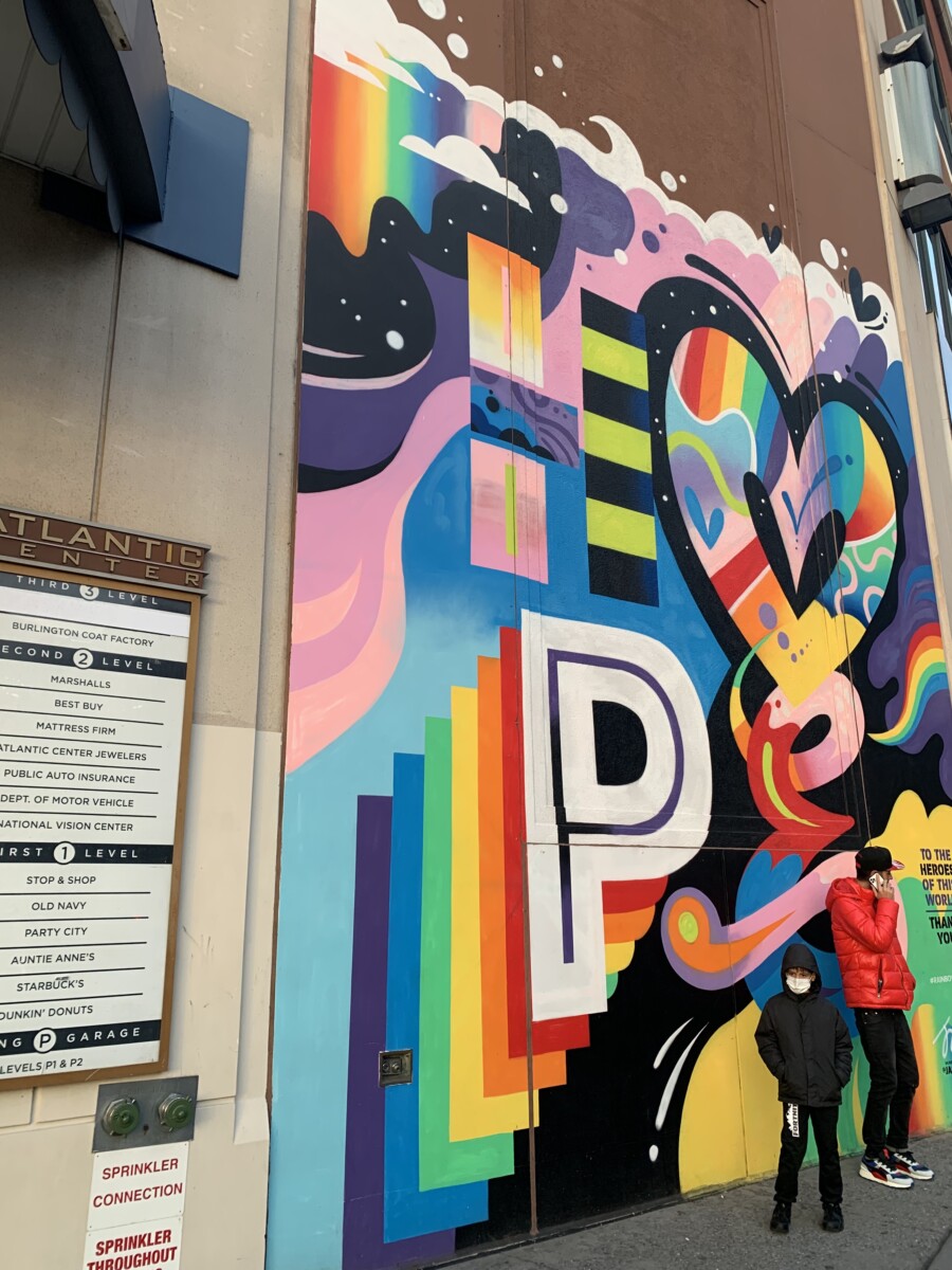
Mural, mix of dull & neon hues 
Flowers Blooming,
monochromatic: shades of yellow
Photography Exhibition in Subway, saturated shades using red green complements 
Street Art, rainbow accents on an analogous background


Reflection
After going out and photographing color that catches my attention, I realized I’m really drawn to red and green complementary shades. They create such dynamic interest in an art piece and really draw the eye to it. Before studying color, I wouldn’t have been able to explain why exactly I’m drawn to these two shades but with better vocabulary, I can. I’m able to recognize tints and tones in my day to day life much better. Mixing the paint was the most eye opening for me about how much a little bit of gray or white can change a color. The amount of paint needed to make that change also really shocked me as it really showed me which colors dominate more than others. I’ve really grown to appreciate chromatic grays since at first glance, they can all look the same but in reality have such subtle shifts in color that I find really beautiful.


Leave a Reply