
achromatic value scale 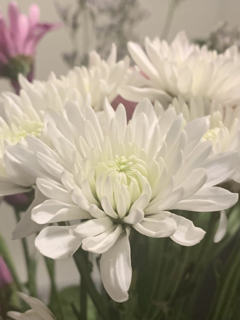


rubbings 
hand drawn textures 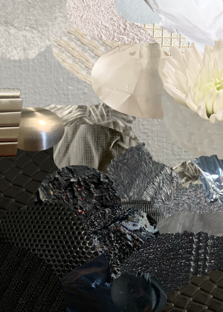
Texture/Value collage

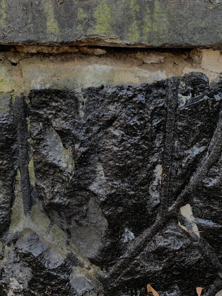
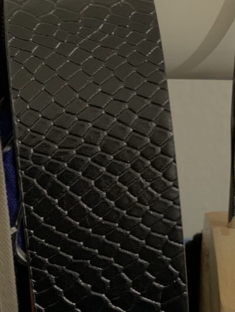
In this project we discovered textures and value. We started by completing the achromatic value scale in order to understand the steps from white to black in an achromatic scale which is the one we focused on, achromatic instead of hue. I think it was helpful doing that as the first step because then we could find textures in the same or similar color of each step of our value scale. Since we had to show the gradation from white to black in the collage with our pictures, it was also helpful look back at the value scale and see how we could apply the same gradation to our collage. We used photoshop to create our collage, adding a portion of the picture that showed texture, each picture a different texture. Then we did some texture rubbings using taking paper and hand drawn textures.
I had fun doing this project because while doing the collage I could move around my pictures many times to create that gradation. Showing gradation is not easy, there are parts of my collage that lose for a moment that gradation because it was difficult finding each gray tone between the black and white. But still it was fun working with texture pictures. Also something I found hard was drawing textures. It may look easy a texture drawing but when I was looking at a texture I guess I didn’t know where to start since I had to keep in mind that I had to pay attention to the light that shows that texture. But still this project made me realized how much vivid a design can be if texture is added. I paid attention to my surroundings when looking for textures and really everywhere we see there is texture.


Leave a Reply