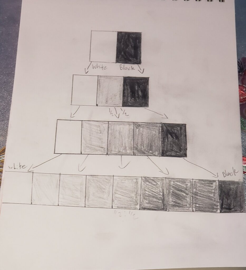
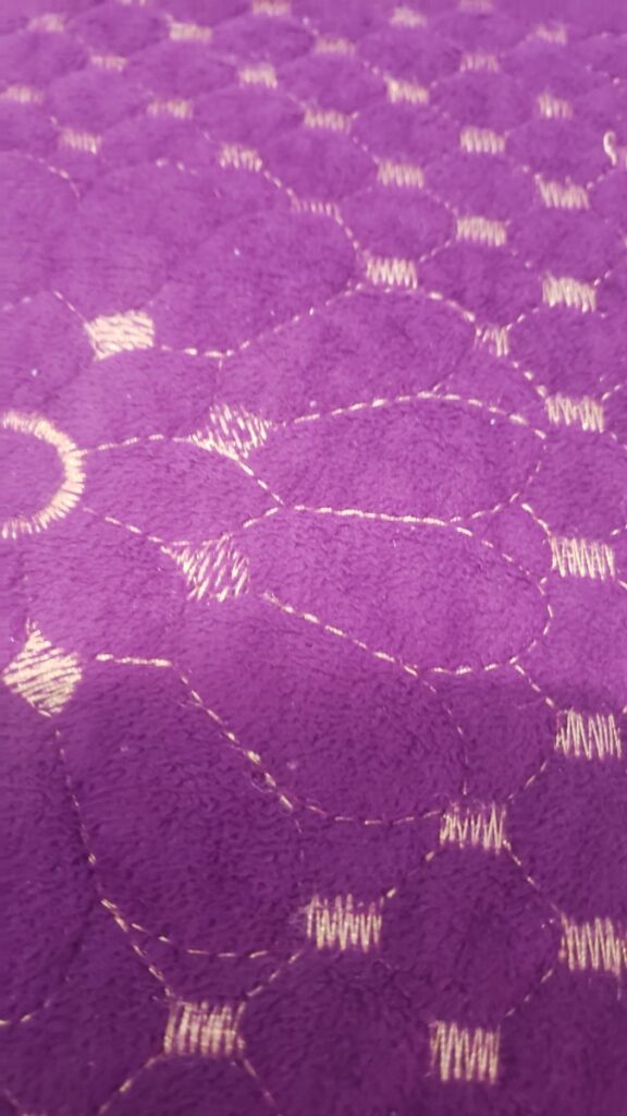
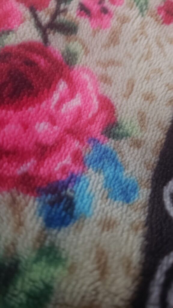
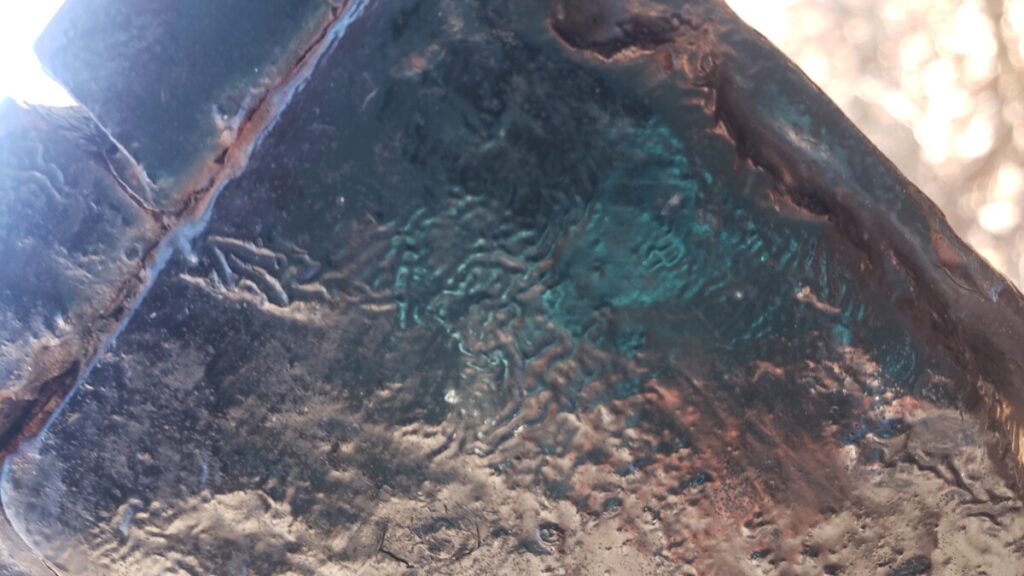
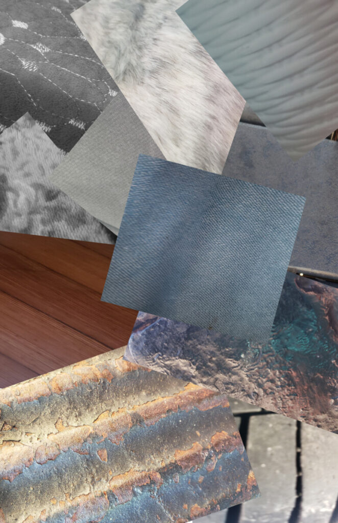
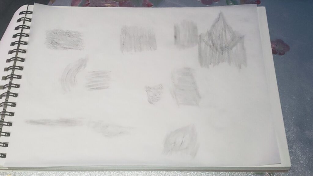
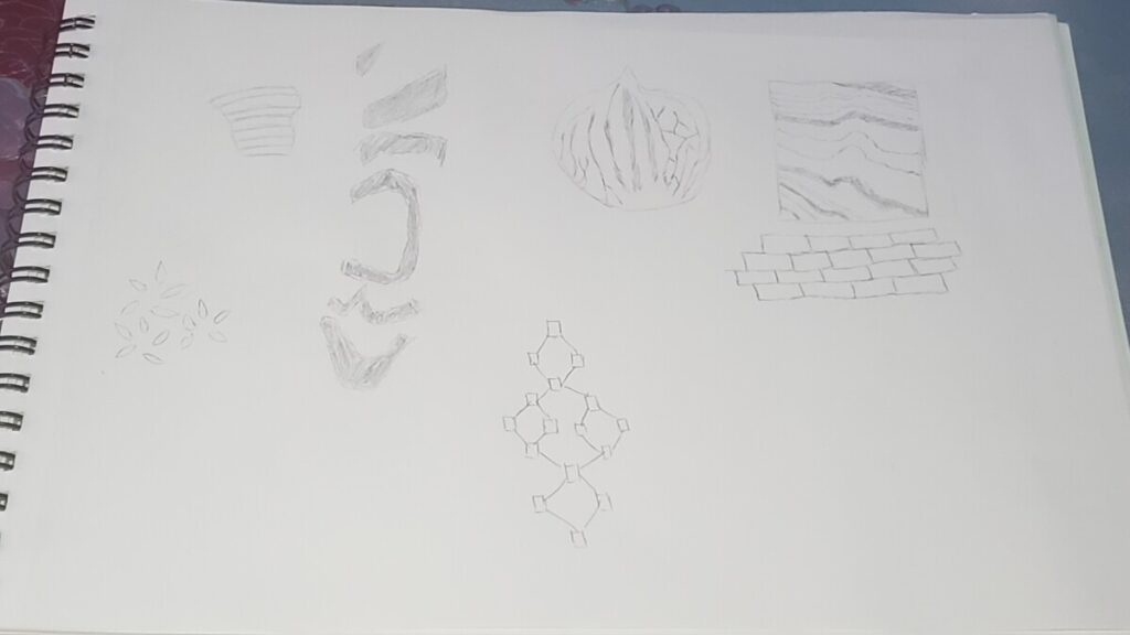
This project made me learn so many new things. One of those things was the value scale because I never knew how many variations they were of white and black and how much of a difference there is when you push down on the pencil or have less pressure on the pencil. I also learn how much textures play a part and as well the color the texture has. We were assigned to make a collage of different textures that are part of the value scale for example having a dark texture and then following that having a light texture. The texture is something that I feel like we all overlook as we are always moving always doing something that when we touch something we overlook how that something feels, but when you take the time to actually feel the texture you can tell that there are different types of textures. With that being said when it comes to us making our own textures we really need to examine and think about the textures that are around us and picture how are textures will be like would it be soft, hard, bumpy, or flat? My experience with photoshop was really fun because you can let your creativity run wild when thinking about where do I want to put these textures? How would I want to make it seem interesting? This is what I was thinking about when making my collage with the textures.
About
Instructor: Carol Diamond
Office hour: 1:30-2:30pm Monday
This basic design and color theory course explores graphic communication through the understanding of the elements and principles of design, as well as the design process, including idea development through final execution. Communication designers use the concepts explored in this course in disciplines such as advertising, graphic design, web design, illustration, broadcast design, photography, and game design.
Acknowledgments
This course is based on the following course(s):





Leave a Reply