Hi everyone,
Finally getting around to posting materials/discussion points from our third seminar. Here are the session slides and the rubric we used for the initial activity.
And a brief summary below.
Essential accessibility tips
- Choose an accessible theme from the list on the Accessibility Best Practices for the OpenLab document
- Check to see if PDFs you post to the site are accessible:
- In Adobe Acrobat X Pro, select View > Tools > Accessibility (Alt+V+T+A). The Accessibility Tool pane will be revealed. Select “Full Check.”
- Fill out the Alt Text when you upload a photo to the media library
Essential usability tips
A few points we didn’t get to cover because we ran out of time:
- Information Architecture (drawn from Nora’s usability study findings):
- Balance the amount of content presented
- Keep the # of menu items (pages) on your site to between 3-7 (5 is optimal)
- Keep consistent language across the site / syllabus / classroom
- Use one level of submenu
- Make sure links open in new tabs
- Student preferences (drawn from Cailean’s study with students using OER):
- Students like having everything they need to complete the course in one place (even if that means linking to Blackboard for students to complete an assessment)
- Students like when multimedia is integrated into the curriculum
- Students like when the course readings are targeted and more concise
Using the Course Profile to organize class discussions
LIB/ARCH2205 Learning Places forum
Nora’s takeaways:
Likes:
-It’s the only way in OpenLab to create a threaded response where students are replying to one prompt
-Responses don’t get buried by subsequent discussions
-Prevents confusion if you also use OpenLab for formal assignment submission
Challenges:
-Lives on course profile so requires some explicit tech instruction
-No option for grading / replying privately as with posts
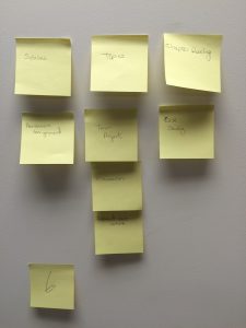
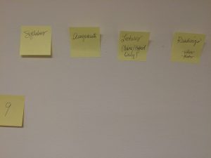
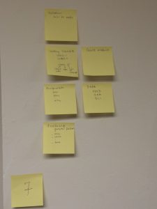
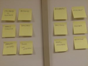
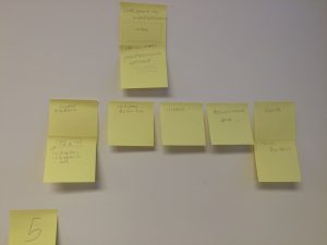
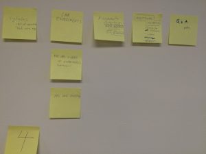
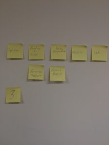
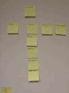
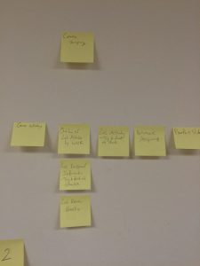
Pictures from the card sort activity!
(Click to enlarge)

