Working hand- in- hand with small businesses as an out sourced creative department, our company runs into a variety of projects with different sizes and scopes that fit into different purposes of the business world. Some of them sometimes require the mediums that, as a student, I had never encountered before.
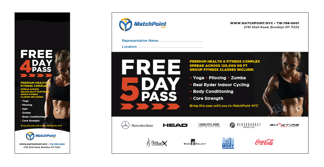
One of my first assignments was to design two promotional handouts, a door hanger and a postcard, for the Free 5 Day Pass of MatchPoint. The client is going through a transformation in branding to become an upscale fitness center. So the challenge was to transfer that into even the smallest piece of collateral such as the door knob hanger while maintaining the non-clutter design, appropriate imagery and required text. Another promotional piece, the postcard, then was created based on the approved design of the hanger.
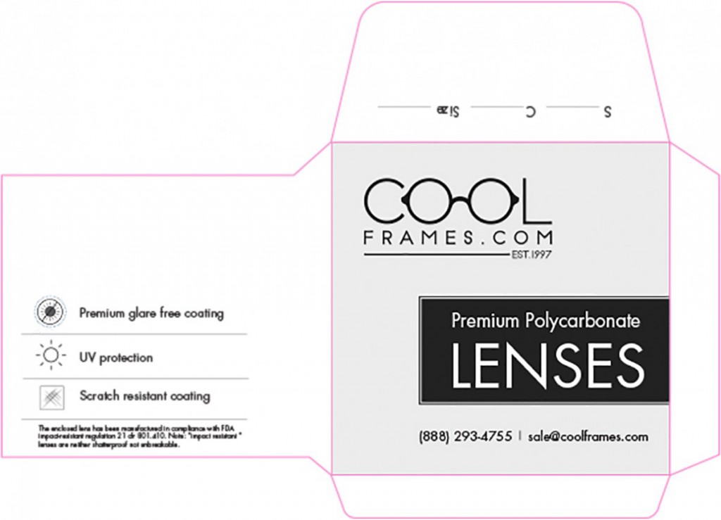
Another interesting project was the envelop for Cool Frames Lenses. This project was a chance for me to practice what I’ve learned from the Packaging Design class last semester. Since the client didn’t provide us with any specs, my first step was to find a suitable die-line for the envelop. In addition to the overall clean and simple design, I decided to create the icons for the lenses’ features in order to make the label more interesting,
How often in school will you need to design a car magnet? Smart HD Life is a camera surveillance and security system start-up company that is in the need of marketing and branding. This was a quick turn around since the client wanted everything ready and run up as soon as possible. While Lenny was working on the marketing strategy aspect, my job was to come up with a draft graphic concept and a color palette for both the business card and the car magnets. To ensure the design consistency and the branding purpose, I came up with a set of simple icons that could be used across different platforms.


