
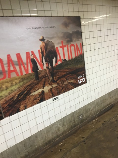


These are the 3 subway posters I’ve found which shows strong hierarchy because the first one shows the title but there are two people in front of the title so I think it’s focus to those two people standing in front of the big title at the back. Second picture shows a lot of people but it looks like it focus on that one person, and everyone else in the back looks blured out. Last one shows the title in the side of the picture which you don’t see that much in many posters or pictures.

