Author: Juwie Dufort
The development of lower Manhattan was changing for the better. New architects were creating essential buildings. A lot of the architecture were the beaux-arts style. Architects were creating things with classical influence while still wanting to be unique and stand out. The characteristics of most of the architecture we saw on our trip were dramatic, with sculptures and subtle detailing with tall columns creating grandeur entrances.
The City Beautiful movement was an important evolvement in the architectural world at the time. There was a lot of capital coming in, so to show the power and abundance. Architects would create things that could be seen from far away.
When arriving on Wall Street and Broad Street, You can see the mark that the dutch era had left. The widths of the streets were more prominent than most. So you can still see a little bit of the early dutch influence in particular streets were given higher key. If you look down on Wall Street, you could see the hint of where the old wall used to stand. Standing
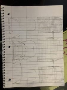
Another factor of that era was on how to build a building and the three fundamentals things to keep in mind. A Base, A middle, and An end. When looking at buildings built in that era like the Woolworth. The base of the building is thicker while the central piece is taller than the last part gets thinner. Brooklyn Bridge marked a new era of engineering and architecture. The connectivity between Brooklyn and lower Manhattan quickly sparked the development of urban planning for Brooklyn.
Each of the buildings we saw is a unique treasure to New York City’s Architecture. Each marked a period in time where change was inevitable; wanting to stand out and be different was a must and embracing the old, but craving something fresh was part of design developments. Accepting the outline of streets that were here before and creating a new experience walking down a building was imbedded into the layout and spaces.
The Frick Museum and Guggenheim are two very different spaces. The circulation of exhibit spaces. The placement of arts and sculptures are opposite from each other. The Frick Museum is constant while Guggenheim changes within its walls. While most people go to The Frick to see the art and tour the space, Others mostly go to Guggenheim to see the building itself.
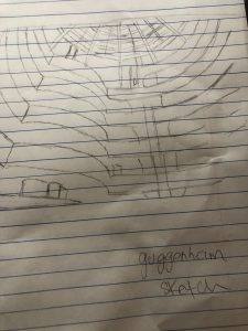
Guggenheim was created and built off-ramps. The movement of people through the space is embedded in the design of Guggenheim. Unlike most museums, there’s no room exhibit but exhibit halls which you experience walking up or down the ramps. The skydome is the primary source of natural light within that space of the museum — the art changes, hosting many different types of art or events. One system I think is impressive with Guggenheim Is that even with the museum walls tilting, the art pieces are straight. The Guggenheim is the only Building of Frank Lloyd Wright in New York City. Which I think brings value and crowd to the place.
The Frick is historical and is a reminder of the beauty that is classical art. Each piece is a moment of history frozen in time. You go from one exhibit space to another, which creates a unique experience with each different area. It has the garden court, with tall columns and a skylight that fills the room with natural light. It intertwines nature within the moving of each area. A never-changing museum that holds so much value. It’s there to spark and educate the interest of anyone who loves fine details.
Unlike the Frick, Guggenheim was created to be a museum; it was designed with the thought of circulation in mind. Different from most museums. Its exhibit spaces are elongated through the ramp walls. For anyone who goes to visit, You are meant to go to the 6th floor then walk down to the lobby. While walking down, You can enjoy the art pieces as you go. Guggenheim is also here to educate, but I think the architecture shadows it. The Frick was once residential; it wasn’t made to be a museum, which has its benefits. Unlike the Guggenheim, The Frick has many different sources of natural light not just from one sky-dome but from windows as well. To me, the natural light that comes into the spaces helps anyone walking touring feel better. Both Museums have there unique contribution to the Architectureture of New York.
During Week 10’s trip, we roamed Turtle Bay. We analyzed the Lever House, Seagram Building, Citicorp, Lipstick Building, Ford Foundation, and the United Nations Building. The Lever House had many characteristics. Everything down to the curtain wall was thought out. The thinking of the curtain wall greed, the material pallet. The use of Marble, granite the columns at the entrance were all intentional. The Courtyard space created a soft welcome space to the building. The opening of the building was part of the sidewalk — a good transition from the street to the entrance. The architectural traits of the area gave anyone who wanted to create anything a guide on how to build, blind in and stand out. The Seagram Building had a lot of the same features as the lever house. It’s located across from each other. I think the Seagrams building had to fit into the scenery and ways of architecture. But it also stood out uniquely.
The Seagrams black curtain wall grid system and the use of interior lighting make the image the building. It’s accommodated with a plaza, elongated with tall columns that elevate the entrance with two big fountains that attracts people. The Citicorp and the Lipstick Building weren’t as moving as I thought it would be. The Citicorp building, like the others we have seen, had tall columns that created the entrance flawlessly. It had it’s design flaws and leaked, but it still stands. The Lipstick building looks beautiful in a bird’s eye view. But the pedestrian view. I didn’t get to appreciate the style of the unique architecture.
The United Nations Building, to me, is one of the most important buildings in the world where Important people from all around the world come together. The design of the entrance, The main building, and the assembly hall were all thought out and created by amazing architects. The Ford Foundation was my favorite building out of all the trips that we’ve taken. The atrium space open to the public was a beautiful add on to the building. It opened it’s doors to the outside, and that’s one of the things that I love. It’s peaceful and grand. The fact that is it open to the public was such as surprise. Most things that are unique and peaceful in the city are usually private. Most of the characteristics that I noticed about the buildings on this trip were the broad entrances that correspond with Tall columns. Different curtain wall Grid system that makes each building recognizable.
During our week 5 trip of our class, we started at Washington Square park, Walked to Fifth Avenue , Greenwich Village , I.M Pei Towers , Louis Sullivan’s and walked to Soho. During our walk around these neighborhoods, it’s noticeable how different styles of Architecture affected building making and how it influenced the styles and fine details of buildings types in the 19th Century.
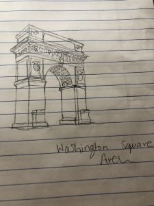
In the 1800’s, Plazas and Squares were created because of street intersections. Different Streets would meet each other but there was empty space left .Those empty space would become public plaza or a square that would either have sitting areas, chess table or it would honor someone who was meaningful to new york history by name or a statue. Strolling the streets you could also see the difference between the 1811 manhattan grid and some of the existing streets that weren’t renewed. The existing streets are more narrow were the grid streets are a little more spacious. Washington Square Park is one of the most popular places in New York City. But, before it became so popular was a potter’s field for the poor and cemeteries for the church of Scotch Presbyterian. Then it became a drill field for the military The arch was built to honor Goerge Washington’s 100gth Year inauguration. The marble arch stands tall and grand in the park, the characteristics of roman architecture detailed perfectly throughout the arch. Making it as captivating as ever.
Moving around the streets of greenwich village ,you notice brown street signs that indicate that you are in a historic district. A lot of the brownstones and there entrances were Europe inspired.Greek Revival style townhouses with classic tall doric , ionic or Corinthian columns. and set back doors with beautiful Italian steel craving for the gates and double sash windows with beautiful detailing. Italianate Style with low pitch flat roofs , overhanging Eaves and Tall Windows. Turning on certain streets, you can get lost in how similar it looks to europe style houses. For a second you could forget you’re in New York.
Couple blocks down, passing NYU buildings and IM Pei towers that has a resemblance of le corbusier Unité d’Habitation de Marseille because of how the windows are shaped. We stop in front of Louis Sullivan’s Bayard- Condict building, made of terracotta. Terra Cotta is one of the easiest materials to work with when doing detailed facades. Modeled off site, it’s so easy to manipulate, carve and use to your liking. Sculptural facade with great fine details makes the building so special and unique.
In the late1900’s , Cast Iron was the metal of choice. Throughout the blocks soho , the Industrialized buildings favorited by artists made Soho the cast iron district. When I picture Soho I think of Windows, that create beautiful Interior light for the many lofts that are there. There’s a consistency created by Cast iron buildings in Soho. Walking the blocks, you see a pattern and you know what to expect.
Walking Greenwich village to Soho created a timeline for me. How architecture changed, what influenced designs and detailing of facades. The different styles, and use of materials from Concrete Columns to Brick to Terra Cotta to Cast Iron.


Recent Comments