![]() Monrovia t. Ndiaye
Monrovia t. Ndiaye
the adidas company: co-founded by two brothers Adolf and Rudolf Dassler, the original name however was not the adidas company that would come later. the company at that time named gebruder dassler schuhfabrik (Dassler brothers shoe company) had a humble beginning in a little town in germany. in 1924 they set out to start a sports company out of their mother’s basement. they experienced early success when runner jesse owens wore dasslers shoes winning four gold medals in the 1936 olympics. allegedly the two were torn apart over a feud about a bomb shelter. adolf dassler chose to keep the original company calling it adidas while his brother rudolf set up a competing sporting shoe company across the river (founding a company later to be called puma).
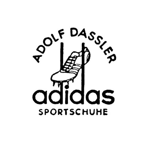 despite how established the adidas company was it was very hard to find a cohesive start to finish logo history. however through extensive research i was able to piece together what i could of the history. Prior to the split that created one of the most competitive sports apparel rivalries in history the company was called the dassler brothers shoe company. Naturally the logo incorporated their family name , the logo consisted of the brothers name with an emblem that was visually symmetrical including a singular shoe with what looks like wings suspending the shoe. This was the very first logo it was used from 1924-1949.The second logo created after the brothers split was accompanied by a name change. Instead of the Dassler brothers shoe company it was now just Adolf Dassler , the name adidas came from the abbreviation of his name adi . Ditching the four striped design for a 3 striped design the new logo made use of some interesting typography using a San serif font for both adolf dassler’s name as well as for the adidas type and the subtype reading “sportschuhe”. unlike the first logo this one is less symmetrical and the design of the shoe is more complex than that of the previous one allowing you to see what a shoe from his company might actually look like. the two lowercase d’s in adidas were extended to frame the shoe. this logo was used from 1949-1967.
![]() in 1967 the company used a more modern looking simplistic logo, a sphere with 3 stripes on it that were pointed at the ends of them and placed on an angle. this logo is rarely ever mentioned and hardly appealing. the simplicity of the logo works however the circle shape is perhaps too simple and not really visually interesting.
in 1967 the company used a more modern looking simplistic logo, a sphere with 3 stripes on it that were pointed at the ends of them and placed on an angle. this logo is rarely ever mentioned and hardly appealing. the simplicity of the logo works however the circle shape is perhaps too simple and not really visually interesting.
![]() in 1972 the second logo was birthed but the company finally unveiled the infamous trefoil logo designed by adolf dassler with the help of other in 1972.the trefoil logo resembling a leaf the the three sections representing the land masses the americas,africa and europe, across the leaf like structure where the signature 3 stripes , and below it typed in an all lowercase san serif font “adidas” . it was designed to keep the relevance of the signature 3 stripes while still representing a company that had become larger and more diverse , 1972 was the same year that they began making leisure wear. this logo was effective because it was visually interesting ,different yet familiar, and it represented diversity . it was also effective because it looked good when put on casual clothing which adidas began making.people like bob marley and even the sex pistols were seen wearing the trefoil logo, making adidas not just for athletes but for everyday stylish people. this logo was used primarily logo for general usage but it later became its corporate symbol.
in 1972 the second logo was birthed but the company finally unveiled the infamous trefoil logo designed by adolf dassler with the help of other in 1972.the trefoil logo resembling a leaf the the three sections representing the land masses the americas,africa and europe, across the leaf like structure where the signature 3 stripes , and below it typed in an all lowercase san serif font “adidas” . it was designed to keep the relevance of the signature 3 stripes while still representing a company that had become larger and more diverse , 1972 was the same year that they began making leisure wear. this logo was effective because it was visually interesting ,different yet familiar, and it represented diversity . it was also effective because it looked good when put on casual clothing which adidas began making.people like bob marley and even the sex pistols were seen wearing the trefoil logo, making adidas not just for athletes but for everyday stylish people. this logo was used primarily logo for general usage but it later became its corporate symbol.
![]() in 1997 the adidas company further evolved with a new logo. this logo sometimes referred to as the mountain logo plays on the brand’s theme of 3’s trading the three parts of a leaf and 3 stripes for a more subtle representation of the signature stripes in the form of 3 bars. the three bars increase in size and form a triangle of sorts. the stripes are angled and sharply depicted.despite the somewhat drastic departure from the trefoil the adidas signature san serif font remains the same. this logo is mostly used for athletic gear.
in 1997 the adidas company further evolved with a new logo. this logo sometimes referred to as the mountain logo plays on the brand’s theme of 3’s trading the three parts of a leaf and 3 stripes for a more subtle representation of the signature stripes in the form of 3 bars. the three bars increase in size and form a triangle of sorts. the stripes are angled and sharply depicted.despite the somewhat drastic departure from the trefoil the adidas signature san serif font remains the same. this logo is mostly used for athletic gear.
![]() in 1998 the adidas company merged with the salomon company, due to the merger the companies had to create a logo that equally represented them both. the conclusion they came to was in my opinion poorly thought out . the symbolism of the logo was not really apparent. The design incorporated the shape of a diamond ,the colors red , blue and black with white as the negative space color and backdrop. Despite the very different shape of the logo compared to designs used in the past it still kept the consistent theme of the three stripes. The black portion of the diamond was intended to represent the figure of an athlete, the red and blue portions on the left and right sides were meant to represent the arms of the athlete raised in victory. the type portion of the design was typed in a san serif font , with the adidas company name typed in all lowercase letters , and the S in saloman being capitalized.the symbolism made sense due to the fact that the two companies made sports wear , but the message was poorly translated. Ultimately the company merger didn’t last .
in 1998 the adidas company merged with the salomon company, due to the merger the companies had to create a logo that equally represented them both. the conclusion they came to was in my opinion poorly thought out . the symbolism of the logo was not really apparent. The design incorporated the shape of a diamond ,the colors red , blue and black with white as the negative space color and backdrop. Despite the very different shape of the logo compared to designs used in the past it still kept the consistent theme of the three stripes. The black portion of the diamond was intended to represent the figure of an athlete, the red and blue portions on the left and right sides were meant to represent the arms of the athlete raised in victory. the type portion of the design was typed in a san serif font , with the adidas company name typed in all lowercase letters , and the S in saloman being capitalized.the symbolism made sense due to the fact that the two companies made sports wear , but the message was poorly translated. Ultimately the company merger didn’t last .
Works cited page

