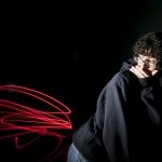
This is an idealistic portrait because it shows the key triangle. In addition, it is effective because the model is looking directly into the lens of the camera making it a strong image. The emotion that the model portray is confidence.
Painting With Light
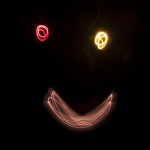
This photo shoot was the most fun carefree session that I’ve had. While it brought elations to my group we were enthralled by the methods used to create these dynamic effects. One of my group members was in awe by the effects. He stated that he always wanted to know how these effects were created. Similarly, I felt the same. I particularly like the photo with Kenny; each time I see this image I burst out with laughter. It is hilarious-wouldn’t you agree?
Filed under Photography Formats
Museum Faking It Exhibit
Thompson Truong
Professor Michals
Gra2330
Faking it: Manipulated Photography before Photoshop
On my visit to the Metropolitan museum I’ve witnessed a lot of great works by some of the best photographers and artists around the world. One of the exhibits that caught my attention was the Faking it exhibits. I thought that this exhibit was great and it definitely shows the evolution of photography and retouching.
The Faking it exhibit consists of before and after pictures have been retouched. The most interesting part about this exhibit was how the photos were retouched. Before we had the technology we have today people did everything by hand. Just like the pictures that were in this exhibit. A photo that has definitely caught my attention was a photo by Jim Shaw. He used created illustrations of ordinary people and turned them into bizarre like creatures by retouching them. It is a Gelatin silver print and the photo was created in 1978. The way the before picture was laid out the theme was definitely interesting. The man in the photograph was symmetrical and was looking directly into the camera. The surrounding of that portrait was like a dark tone. While near his body there is sort of a light glow around him. It was surely an intricate photograph. The positioning, the tone, contrast and darkness of the picture captivated my attention and I think that Shaw wanted to capture the audience’s attention like that.
The exhibit showed a lot of great work by different artists and photographer’s retouching photographs. When I walked into the exhibit the first thing I thought to myself was how different the retouching and photography would be in today’s standards. With the technology we have today it is not a surprise that I would compare how a retouched photograph would be done with the programs we have now, such as Photoshop. The picture that I can describe about would be the retouched photo by Jim Shaw. This is the picture that he turned humans into reptile looking creatures. All of this is done by hand and it was done in 1978. I wondered how much time it took him to finish the retouching. The retouched photo showed exactly why the exhibit was called faking it. The head of the human was cropped off and a reptilian like creatures head was put in as a replacement. Every little detail had to be done by hand and I was amazed how things were done back then.
The whole theme of faking it impressed me the most. How we can take a flawed photo to retouch it and make it into a whole new photo. Retouching photos by hand every single detail was fixed by hand and there were no such things as an undo button so if they messed up they would have to redo the work again. The audience they aim for are designers, artists, photographers etc. In terms of a general audience I believe that different pictures would captivate different people’s attention unless you are an artist, designer etc. This is definitely an exhibit to visit for anyone because it shows how much work designer’s put in to get a piece finished and their work should be admired and appreciated.
Filed under exhibit review, Uncategorized
Reflextion
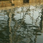
This image captures the essence of its reflection. It is captivating and alluring. It depicts a mirror image brilliantly.
Filed under Uncategorized
Natural Habitat
Filed under Photography Formats
Museum
The exhibit in Museum of Modern Art was interesting in way they take the techniques of contrasts and sizes to make an image come alive. The black backgrounds added to the overall feeling of darkness and mystery within most of the images. The image had elements that applied to all viewers like the use of use of highlighting contours of the body and also the movements that person is creating with their body.
One piece that I saw interesting at the exhibit was an image of an eye and cutter on the black background. The black background makes the white background of the eye standout but also pop out. The differences in background bring focus to the reflection of eye and also the original eye with the eyelashes. The eyeball is enlarged and the main attention of the photograph of the eye. The enlargement of the eye gives the photograph the overall feeling of creepiness and fear. The light is coming from the front where the eye is staring at us. It feels like us as viewers are looking through the eye in a way that makes it our one eye just up close and personal. The contrast between the white and black but also the light and dark makes certain elements of the eye stand out and also come alive. The ways the squares are going back in the cutter create depth of field and perspective. It feels like the squares are going back in space. The artist that made this image was Anne Collier.
The second piece that I saw the exhibit as a new take on photography where artist challenged the principles of photography. They take the old techniques and highlighted certain aspects of the photograph. A second piece that I saw interesting at the exhibit was an image of a male driver that seems strong and has a good body. The man’s muscles are showcased in the photograph as he is driving from the platform. The photographer is using sidelight to highlight the contours of the man’s body. In this photo the muscles in the legs were the focus of the image but also the movements. The photo was asymmetrical with the positing of the legs. The leg give impression that the man was about to dive right into the water and make a big splash.
A third piece that I saw interesting at the exhibit was an image of a woman’s face and up to shoulders. This image is the only piece in color. The pose is very interesting and creates an asymmetrical composition. The woman is not seating in the center which makes the image unique. The colors bring the overall image to life and make it vibrant. The image looks like it was dropped in the water with the bubbles it produces and looks ruined. The eyes are looking away from the camera where we as viewers can only see one eye which introduces a new style in photography. I find the use of image to just make the image really pop and make it the best it can be.
Filed under exhibit review, Uncategorized
Museum Essay
Jessica Echevarria
Prof. Michaels
GRA 2330
New Photography 2012- MOMA
In class this semester we have examined different photograph styles, techniques, lighting, and some examples of work from famous photographers. The exhibit at the MOMA museum showed portraits, landscapes, political issues, social issues, and gender based photos. The theme that was most consistent was how they all evoked emotion related all around social issues. In this paper we will discuss the style techniques, used to evoke emotion in photography. Also how the artist is influenced by the subject they are photographing and how it is displayed to the audience.
The following works from photographers such as Michelle Abeles, Zoe Crosher, Birdhead, Carter Mull, Valie Export, and more display different styles, and how they influence much of today’s photography. In Michelle Abeles photos she used objects such as terra-cotta, wine bottles, newspaper, printed fabrics, and nude male subjects. All these material are cropped and meshed together to create a distorted and confusing image. She started combining photography and placing digital work in them. This is how photography is used today on computer screens. Artist Zoe Crosher composes self portraits in her works. Her works show a feminist role when she dressed as a nurse and emulates Mae West in those photos in the 1930s. She has different stills of herself in the nurse’s outfit in different tones. The ones where she appears as Mae West she looks strong, confident, and seductive. Crosher manipulated photos such as we do today digitally; she crumpled, re-photographed, and placed them on metallic paper making them shimmer.
The photos that Robert Heinecken produced involved magazine page light sensitive paper, and then exposing it to light. His image showed vanity and consumption and show recto/verso and how media culture influences us today. Another feminist photographer was Valie Export she in the photo she contorts her body to fit against the sidewalk protesting against conformant. The shapes in her photo fit the built of reality in photography. I believe that the artist show’s early styles that are used in modern photography today. In export photography we see how strong lines and shapes in the human form are used today and in her work. We can see how social issues are displayed with different styles to make the photos appear strong in this exhibit.
I was most impressed by the wide range of artist such as the works of Grete Stern and his work “Suenos” which uses the psychoanalysis of dreams. It also uses two photograph combined together using photo manipulation. The woman is the stem of the lamp in which the man is going to grab hold of. I would’ve liked to see more work from a certain movement or protest period such as the seventies. It was impressive to also see the combination of early styles of photo manipulation, digital composition, figures, and lines that we use in modern photography now. The intended audience is the photographers of today to be inspired by the environment around them, digital styles, social issues, and also use others work to inspire their own. This exhibit helped me see how digital and photographic work can create an emotional and compelling feels too many of the thing we produce today. In seeing old photographer work I was able to see how they used their own inspiration to be creative and out of the box.
Filed under exhibit review, Uncategorized
Brooklyn Historical Museum and Green-wood Cemetery
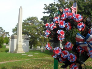
Visiting both the Brooklyn Historical Museum and Green-Wood Cemetery were both a learning experience. I learned that many people died in plane crashes and fighting in wars; in result, they honor the people who passed away with memorials. It was great to see how we sending our respect to people who fought for us.
Filed under Learning Log 4-Green-Wood Cemetery
Westcott’s Brooklyn Historical Society and Greenwood Cemetery
When we went to Brooklyn Historical Society we about the greenwood cemetery like where plots were and stories of some buried there.We also learned about Daguerreotype and old way of photograph processing.I learned about some of the history of Brooklyn.Ultimately I learned the back story to the cemetery.In the cemetery I saw statues of angels and also unique designs on walls. I saw stones but also family of stones where you would see mother and father next to each other and also on top of stone.
Filed under Learning Log 4-Green-Wood Cemetery
HIstorical sope
In the Historical Society about the manuscripts and compared the different in pictures printed in two made different ways. The picture I took was edited on Photoshop and I like the angles I took it and the winds sharpness.
Filed under Uncategorized


