Author Archives: Jechevarria1

Museum Essay

Jessica Echevarria
Prof. Michaels
GRA 2330

New Photography 2012- MOMA

In class this semester we have examined different photograph styles, techniques, lighting, and some examples of work from famous photographers. The exhibit at the MOMA museum showed portraits, landscapes, political issues, social issues, and gender based photos. The theme that was most consistent was how they all evoked emotion related all around social issues. In this paper we will discuss the style techniques, used to evoke emotion in photography. Also how the artist is influenced by the subject they are photographing and how it is displayed to the audience.
The following works from photographers such as Michelle Abeles, Zoe Crosher, Birdhead, Carter Mull, Valie Export, and more display different styles, and how they influence much of today’s photography. In Michelle Abeles photos she used objects such as terra-cotta, wine bottles, newspaper, printed fabrics, and nude male subjects. All these material are cropped and meshed together to create a distorted and confusing image. She started combining photography and placing digital work in them. This is how photography is used today on computer screens. Artist Zoe Crosher composes self portraits in her works. Her works show a feminist role when she dressed as a nurse and emulates Mae West in those photos in the 1930s. She has different stills of herself in the nurse’s outfit in different tones. The ones where she appears as Mae West she looks strong, confident, and seductive. Crosher manipulated photos such as we do today digitally; she crumpled, re-photographed, and placed them on metallic paper making them shimmer.
The photos that Robert Heinecken produced involved magazine page light sensitive paper, and then exposing it to light. His image showed vanity and consumption and show recto/verso and how media culture influences us today. Another feminist photographer was Valie Export she in the photo she contorts her body to fit against the sidewalk protesting against conformant. The shapes in her photo fit the built of reality in photography. I believe that the artist show’s early styles that are used in modern photography today. In export photography we see how strong lines and shapes in the human form are used today and in her work. We can see how social issues are displayed with different styles to make the photos appear strong in this exhibit.
I was most impressed by the wide range of artist such as the works of Grete Stern and his work “Suenos” which uses the psychoanalysis of dreams. It also uses two photograph combined together using photo manipulation. The woman is the stem of the lamp in which the man is going to grab hold of. I would’ve liked to see more work from a certain movement or protest period such as the seventies. It was impressive to also see the combination of early styles of photo manipulation, digital composition, figures, and lines that we use in modern photography now. The intended audience is the photographers of today to be inspired by the environment around them, digital styles, social issues, and also use others work to inspire their own.  This exhibit helped me see how digital and photographic work can create an emotional and compelling feels too many of the thing we produce today. In seeing old photographer work I was able to see how they used their own inspiration to be creative and out of the box.

1 Comment

Filed under exhibit review, Uncategorized

Brooklyn Historical and Greenwood Cemetary

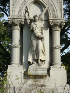
In Brooklyn historical museum we examined the first photography types Dagguerotypes which were made off copper reflected plates. This influenced our photography in Greenwood because we were dealing with modern photography. We got to see how much photography has changed from then till now. We got to examine monuments, and be in an open field shooting everything around us. Most of our photos were in perspective and depth of field. We also got an overview of how influential the cemetery has been, and how its rules have changed. The Brooklyn Historical allowed us to examine different documentation, and photos to see where we were shooting. It also had a monument dedicated to fire victims that were burned in a theater fire in Brooklyn. We hd a good focus on what we would be shooting and how it has changed to present day.

Leave a Comment

Filed under Photography Formats

Daguerreotype vs. Modern Photo.

When visiting the Brooklyn historical museum we examined one of the first photograhic types Daguerreotype. A Daguerrotype a photograph etched onto a silver copper plate named a Sheffield plate. The plate was heated and the foil was layed down onto the plate, which has a mirror effect. These plates were expensive to own, and often only the rich were able to own one. They were in cased in a wooden frame with a glass to protect the copper plate. The boxes were craved with detailed images. Photography now is much different it is digital almost everyone can own and afford it. A photograph today can be manipulated and fixed to make it look the way you would like, unlike the Daguerrotypes which were originals. The Daguerrotype had a reflective image because of the copper plate. Photography prints today have a dull or glossy effect. Daguerrotype size was  6-1/2″ x 8-1/2″, most photographic images today can vary in a wide range of sizes. A daguerreotype was produced one at a time, the amount of time that a studio session would take and would cost is more. Modern day photography many prints can be made at a fast speed, and cheap price. The advancement in photography allows us to not only have portrait style, but outside our own enviroment and explore more styles.

Leave a Comment

Filed under Photography Formats

BK Botanical Best Photo

 This photo is the most visually compelling from the batch because its depth of field allows the roses to have a good angle at which one is closer to the camera and the other is further. The view allows good lighting, and a clear view of the rose that is in the back and all surrounding it.

Leave a Comment

Filed under Learning Log 3 (Botanic Garden)

Sunflower Shoot

This image was the most captivating to me, because of the lighting and how it added a dramatic look to the sunflowers. You can see how the side light  spotlight allowed light to be reflected to a portion of the flowers. The other side had a slight amount of lighting which made it dark on the inside portion. It captures all the flowers in a good angle to allow one to see all the directions they are facing. In the background you can see the black coloring, but on the right side its appears white because of the honeycomb grid. It has both light and dark features unlike what flowers usually portray when people look at them.

Leave a Comment

Filed under learning log 2

Hw#1 Wijnanda Deroo

Jessica Echevarria                                                                                                          8/30/12

Prof. Michaels

GRA 2330


                                                                Wijnanda Deroo- Seeing Photos


1. The photograph I chose to examine “Tenement, Orchard Street, 1988” is of an abandoned old Tenement on Orchard Street in New York City. It’s probably being photographed to then be restored and fixed and then rented. The walls and lighting are chipped and outdated. The space is also small as most original tenements were in the 1950s.


2. The photograph was probably trying to depict life during the Industrial Revolution when tenements were first built. They were small, cramped, and poorly built. Often time’s large numbered families lived in them. The picture shows cracks in the wall, chipping paint probably containing lead. There is one small window shining light into the entire small room. This is perfect picture of living in New York City tenement.


3. The photographer focused on the main corner of the room to fit in a view of the walls, window, lighting, and shelf. The floor isn’t what grabs your focus until the light shining from the window glares down on it. The walls are in bad conditions and the photographer wanted you to focus on that and the old light bulb fixture.


4. Wijnanda grabbed perfect focus of the room; it was enough for you to see it entirely. I can see all the walls, the doorway, the walls all in one angle. It made me realize how small the room was.


5. The photo is in low contrast mostly containing middle gray tones throughout the room. Every wall and the window create curved lines, and it’s implied that he is looking into the room. You can therefore see the photographers view from an expanded perspective. The perspective deep space allows you to see the distance between objects in the room.


6. The photographer reveals that the date on this photos shows that New York were not living in modernized tenements. Many of the tenements remained in the same poor conditions as before, and even the spaces remained small. I can see that this was more valued for its location then its living conditions.


7. This photo induces sorrow reminds me how some people of the past and today pay to live in poor condition in the city. Most apartments are outdated, but they are paying for the locations. Knowing information on how tenements were in the 1950s this photo is proof that many people lived like this even into the 1980s. The window seems to be the focus of probably the most beautiful view the city. The only thing that could make this tenement worth living in is probably seeing what was going on outside of it on the streets.


8. The photographer likes to delve into different spaces and in particular New York she explores work spaces, hotels, and living spaces. You can see that she even wants to experience how the people working and living in these places feels. Most are famous landmarks, cultural, religious, and family related environments. By looking deeper then the environment you can get a feel to the emotion of the people looking or living there experiences it. Wijnanda photographs these spaces to get an emotional feel and then convey it through photography. She is driven by old popular restaurants, and the industrial movement in our city as seen in her photos.

1 Comment

Filed under HW1

In-Class Chair Shoot Learning

In todays class i learned how to program the camera shutter speed, ios, and also change it to a raw image. When shooting the chair i learned that by having an image cut off it showed it to be radical cropping. I also learned that sectioning in which is not in the middle of the frame fall into rule of third in which an image fall in three section but never in the middle of the frame. The photo we took at the angle of a third allowed up to have a shadow and  have a dramatic appeal. In taking a photo of the chair at an angle i learned how to use off balance which slants the image view.

Leave a Comment

Filed under learning log 1