I really like how the focus is only on the flowers and the web, but the background is totally blurred out. Also the lighting brings out the details of the flower and allows us to see the web which otherwise would have been lost in the picture.
Author Archives: Harpreet Sunda
In class flower shoot
This photo I took was a close up of the sun flower with the water droplets showing on it. The cropping of it focuses only on one flower and the details. The lighting is soft so you can still see the details, but not too much.
Filed under Uncategorized
In class chair shoot
Before this class I really didn’t understand rule of thirds. Now I understand that it is when the main subject of the photo is not centered and the focus point is in a unusual position. Also the subject can be in a tilted position and there can be a lot of negative space included. This is breaking the usual rules of photography, but creates a different perspective and an interesting point of view.
Filed under learning log 1
Harpreet’s hw
Thomas Holton- The Lams of Ludlow Street
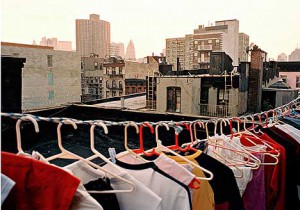
1. This photograph is a documentary picture because it captures the life of everyday people of New York. This picture is of clothes hanging on hangers on a clothesline out on the roof of an apartment with the city in the background.
2. I can tell that this photographer’s intention was to show a something that most people overlook but can be seen in a different perspective. The hangers with their clothes is something very personal and important to that specific family, but we all have our own personal things like that so it reminds you about family and home.
3. The photographer has created emphasis in this photo by creating deep space. The clothes hanging on the clothesline is placed in the foreground which brings the viewers eyes to it. It also makes a curved line so the viewer’s eyes travel along the curve of the clothesline which lastly leads the eye to the buildings in the background. The colorfulness of the clothes also creates a strong contrast against the gray buildings of the background
4. Being technical helps the image because otherwise it would just look like a random snapshot, but it looks intentional. The picture is framed just right, there are no distracting elements and the clothesline is cropped just right. The proportions of the clothing and the background of the buildings are even.
5. Elements such as the tone, line, and perspective are important because without it the photograph will have no emphasis or objective. The tone is full scale and there is a curved line formed by the clothes hanging to dry. The perspective is deep space. The deep space perspective of the photograph make you focus more on the foreground, the clothesline. The curved line of the clothesline makes movement throughout the photograph and makes your eye move from the clothes to the buildings.
6. After the first look of this photograph you see there is more to it. For example, the hangers give off a homely feel, yet so does the buildings in the background because it shows where this family is from. It has a personal and intimate feel to it.
7. This photograph gives off a peaceful and joyful feeling. The background and the sun which looks like it’s either setting down or still coming up gives it a dreamy feel and the colorfulness of the clothes gives it some excitement and quirkiness. It also gives off a homely feel which reminds me of family and home which makes me feel comfort and safe.
8. This photograph relates to others because it shows a personal place that belongs to the same family and it’s their home. It’s another photo that shows everyday things, but makes it unique by the way it is shot.


