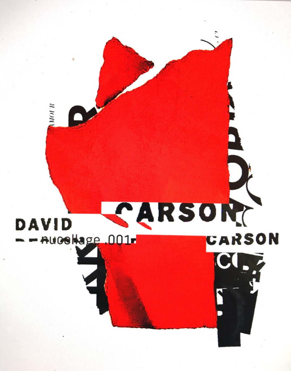
For this design I wanted it to be abstract but at the same time easy to read and understand. I was also inspired by David Carson’s work, here is an example.
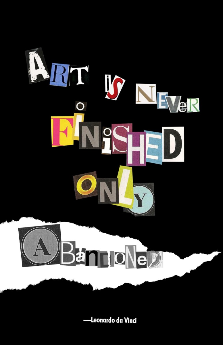
Stylistically I wanted the design to be something new and vibrant which would contrast well with the word that is abandoned. I wanted the first 5 words to be seen, and the word abandoned to be lower in the hierarchy. The ripping design at the bottom corner is supposed to represent the act of abandonment, its signifying that the design was abandoned and never improved upon. This leads to the word “abandoned”, the word is greyed out to contrast itself from the rest of the words that are busy with color. I also made it that everything else besides “abandoned” had a feeling of motion in them. That is why some are tilted, some are bigger or smaller than others, it is all to give it a feeling of dynamism(I also did it so that a creates a focal point). The design choice also creates a sort of distinction between the static “abandoned”. For this poster, I used text that is similar to a ransom note because the designs are intricate and very different from something that is abandoned.
PDF: MatthewColon_visualquotev1
Second Visual Quote:
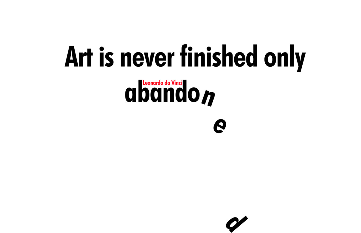
For this design I wanted it to be simplistic because I wanted to allude to Leonardo da Vinci’s other quote which is “simplicity is the ultimate sophistication”. It is also why I chose a sans serif font, it is very minimalistic but compliments the design. In order to communicate some sort of abandonment, I went with the last few letters falling. This is because when you think of something being abandoned it’s usually falling apart, so I wanted to demonstrate that. I did not use any reference for this design but it is pretty simplistic. In terms of hierarchy, I wanted the word abandoned to be most noticed first which is why I had some of the letters seem as if they are falling. Putting the name Leonardo da Vinci in between the b and d of abandoned was a design choice. Since the word is red it would help attract the viewer’s eyes toward the word abandoned. To achieve the focal point I used movement and color(red).
Third Visual Quote:
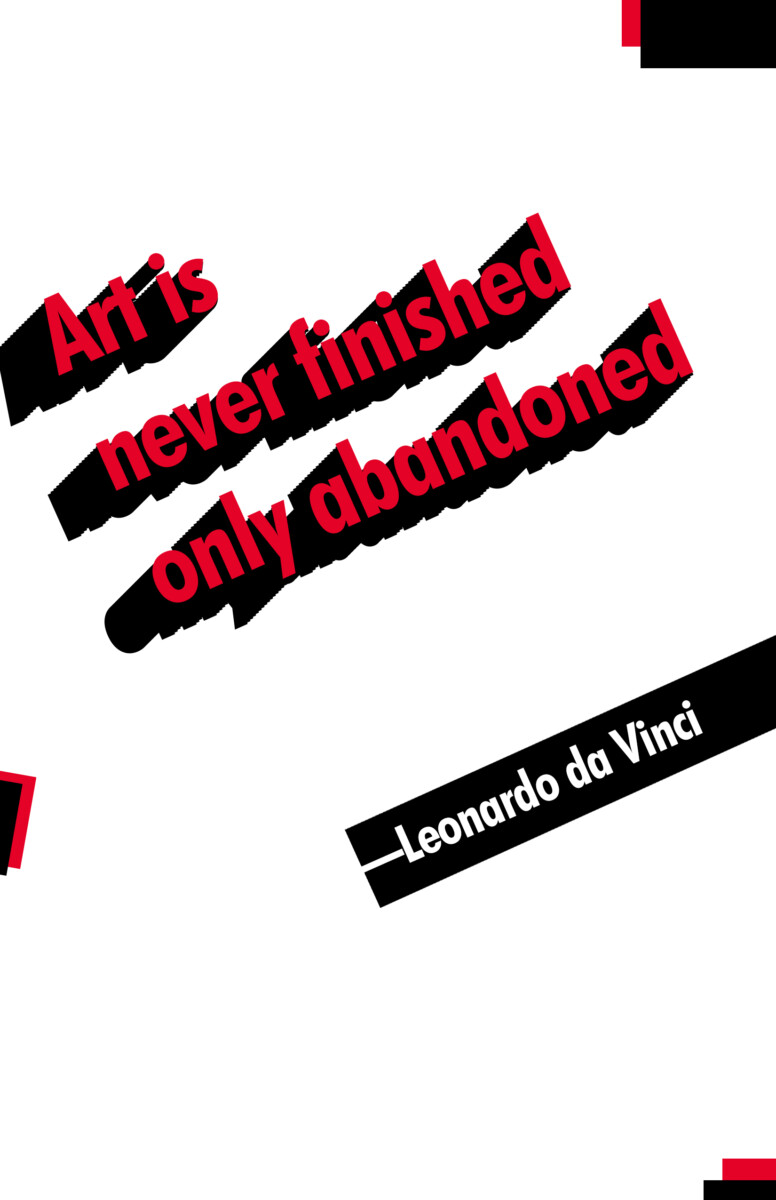
For this design I wanted to do something that was a modern-looking graphic design, this is because I wanted to show that style has evolved and wasn’t abandoned. That is why I used a sans serif font(it is simplistic and basic), and a minimal color palette. Also since Leonardo da Vinci’s era, style and designs have kept on changing in many different ways. I was inspired by Constructivist posters. Here is a reference.
.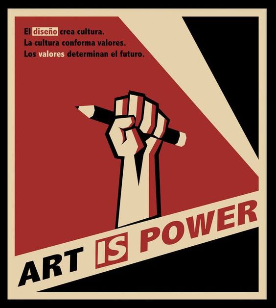
What I saw in this poster is 1) few colors 2)Bold text 3)abstract. So in my work what I tried to create was a text that was bold and stood out against the rest. In order to create a focal point for my poster, I made the text 3d because it takes up more negative space whilst adding depth. It also coincides with my thoughts of having the viewers read the quote first. To attribute Leonardo I used a black diagonal line because it adds a form of movement, keeping the poster busy and energetic.
Conclusion: The visual quotes all differ from each other because I visualized different ways something could be considered “abandoned”. A huge difference is that in the third design I did not want to communicate abandonment but instead, something that seems polished and well-rounded. The other pieces have some sort of abandonment in them(1st design for example). In the first design, most of the text is vibrant and has some sort of movement, the scales also vary. However, the word abandoned has a somber mood, it is mostly all the same size besides the a, and also isn’t very dynamic. There are some rips added to the letters of “abandoned” but it is only to add to the mood of abandoning an idea. The second image is supposed to be simplistic, the focal point for the viewer should be the letters ‘falling’ down.

