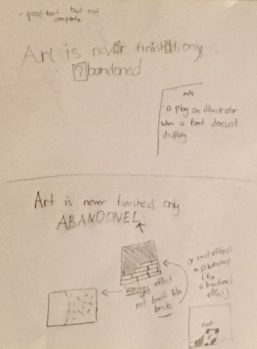
In the top sketch, I wanted to connect the world of graphic design to Leonardo’s quote. The question marks are supposed to be the invalid symbol of a font that isn’t finished. The story that I created for this font is that someone created a font but it isn’t finished. I really favored this idea because to me it was unique. The second draft was supposed to be a few things, my first idea was to have a rusty effect on a few of the letters. Another idea was to make it seem like the letters at the end of Abandoned were falling off, or bricks that weren’t finished.

These sketches I didn’t favor as much as the previous one. I felt like these two sketches(top and bottom) don’t correlate with the message of the quote I chose. The first one was supposed to be the quotes going through some sort of rust, but I didn’t think of an efficient way to illustrate it. The second sketch was referring to the ouroboros symbol (meaning infinity), I stopped working on this sketch because I felt like it would be too difficult to demonstrate the symbol even further. 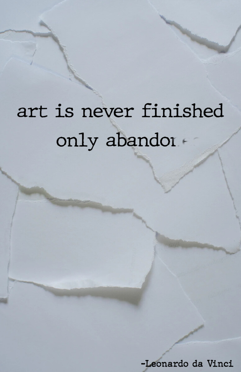
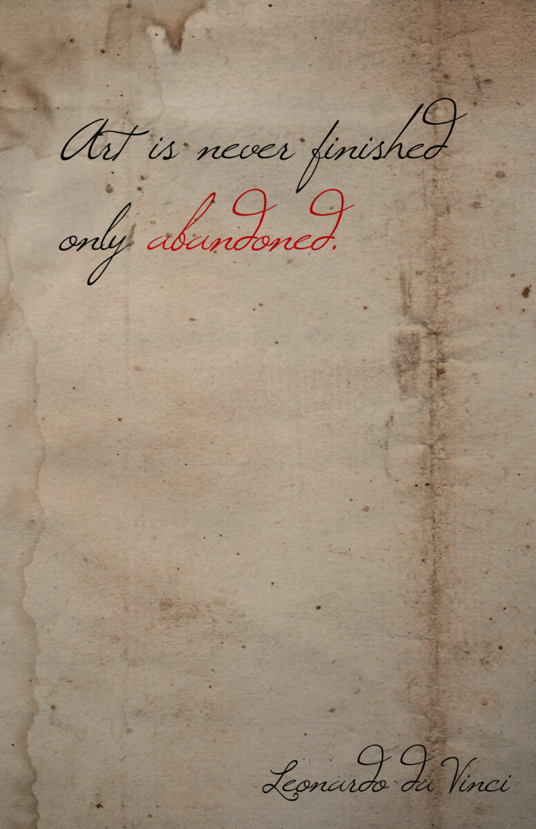
These are two digital sketches I came up with. The first sketch was referencing quotes that one would see on Tumblr or Twitter a few years ago, and would be a ‘motivational’ quote. I didn’t continue working on this sketch because I felt like I had better ideas. The second sketch(bottom) was referring to the middle ages or the medieval period. I didn’t use this because I wanted to make it realistic, the ink being soaked into the paper and some handwritten imperfections but I was impatient.

