https://drive.google.com/drive/folders/1GwcoKymiJ3OD4U7J212jAUxZo7VB6zlB?usp=sharing
Author: Isranoor Syed
It was interesting hearing about her work that would communicate a context and message through design and typography. For example, when Scher designed posters for noise punk, she made the typography portray loudness or noise. I understood well when she talked about how intuitive her design process is because I feel as though my best ideas tend to be with intuition. Paula Scher talking about her working with the public theater before they had an identity, she made design that was expressive and had no bounds and as a designer she grew a lot from that experience. I like the idea of serious design vs solemn design because serious design or “play” design seems to be creative, innovative, and bold while solemn is normalized and appeals to the mass. I found the idea of design being through accidents and circumstantial really interesting as well. It was interesting to hear about MoMA and how the design wasn’t the problem but rather communication with each of the departments for a cohesive identity. It was also interesting to see how she combined art and design with the installation in the metropolitan high school. I overall like Schers intuitive design mindset even if it is against the norm or a brief.




It is interesting hearing about typography design and book jacket design from Louise Fili. She believed that book designs weren’t innovative and would always follow a formula and she was there to change that and try to be different with her typography design. “The Lovers” cover was simple and understated yet successful which proved her point on how type didn’t have to be loud and in your face to be successful. I really agree with her sentiment that no designer should just wait around for others to tell them what to do but rather should be working on their own projects as much as possible. I really like and relate to her persistence and drive to push design boundaries and be innovative no matter what “the rules” are of design. I love how inspired/obsessed she is by Italy and food and how she always photographs things for inspiration. She always takes inspiration from things around her or things she stumbles upon. All of her designs usually have a very vintage and/or Italian look to them which speaks to how she expresses herself through her designs. I pretty much loved all of her work she discussed and it was clear to see how creative and passionate she is about design which is really inspiring to me.
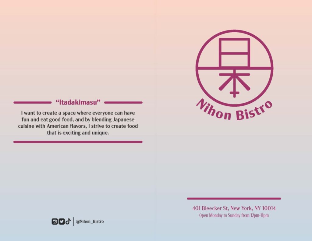
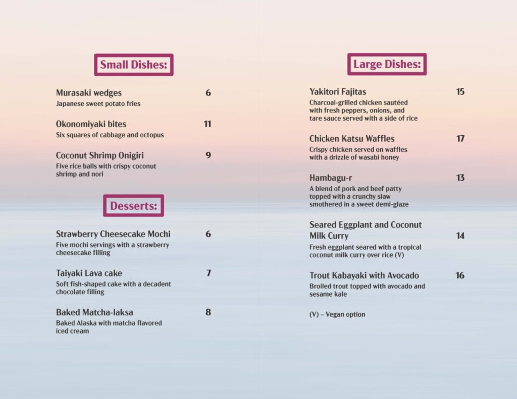
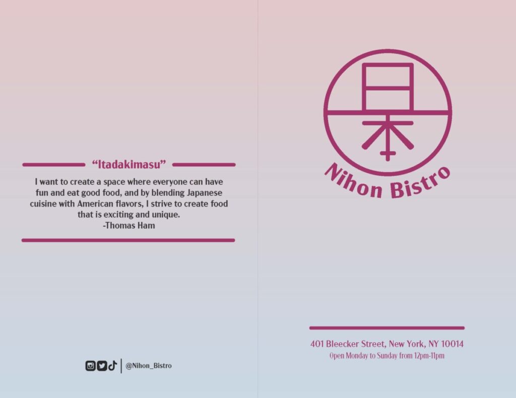
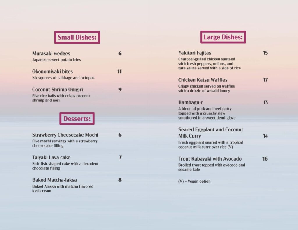
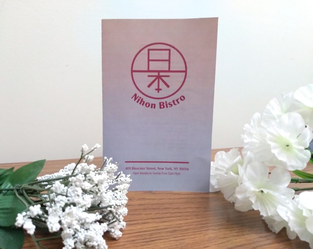
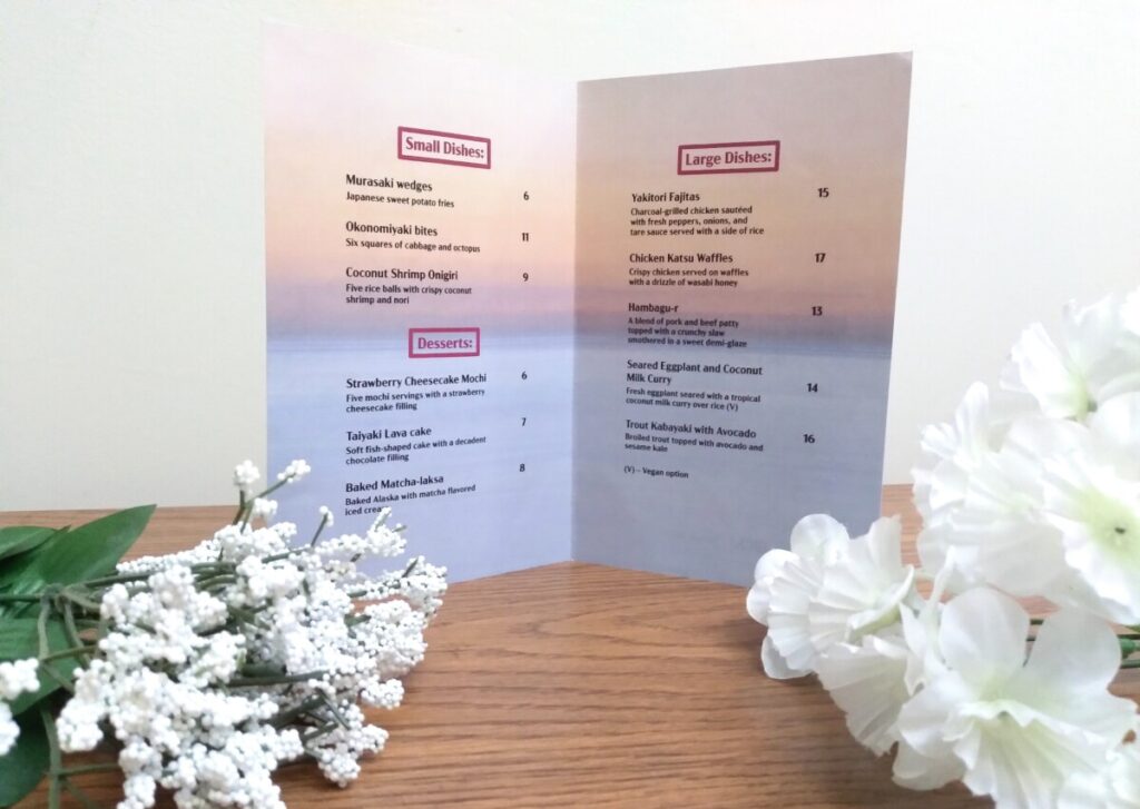
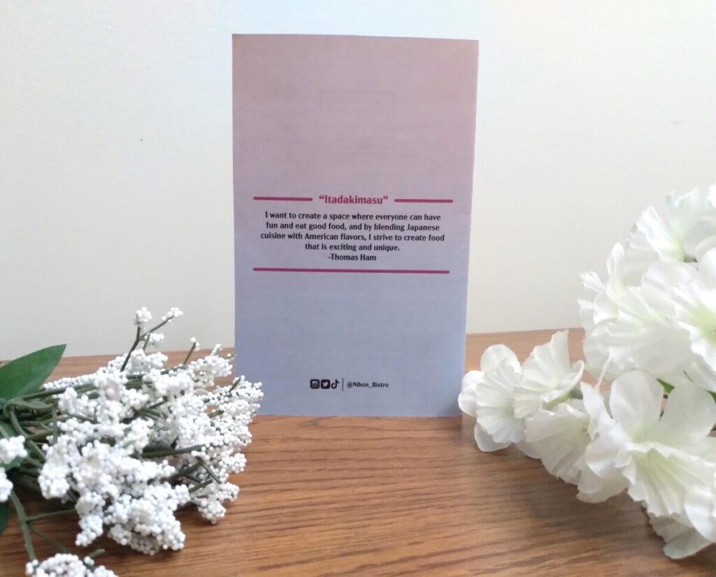
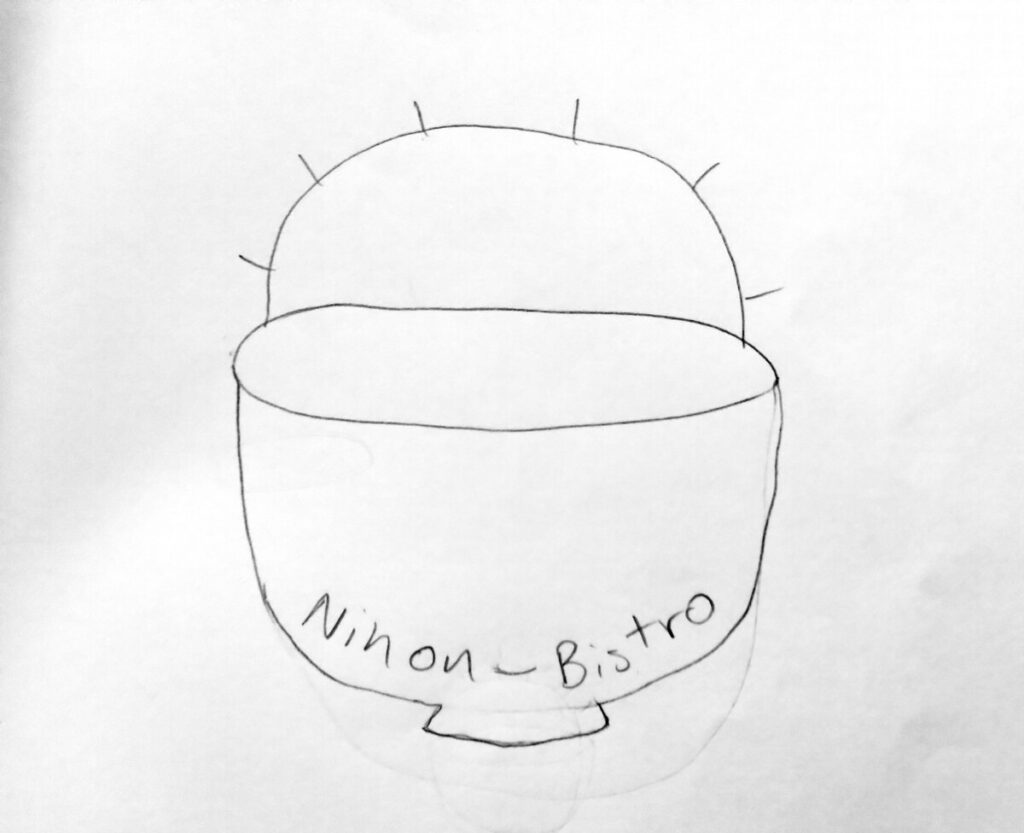
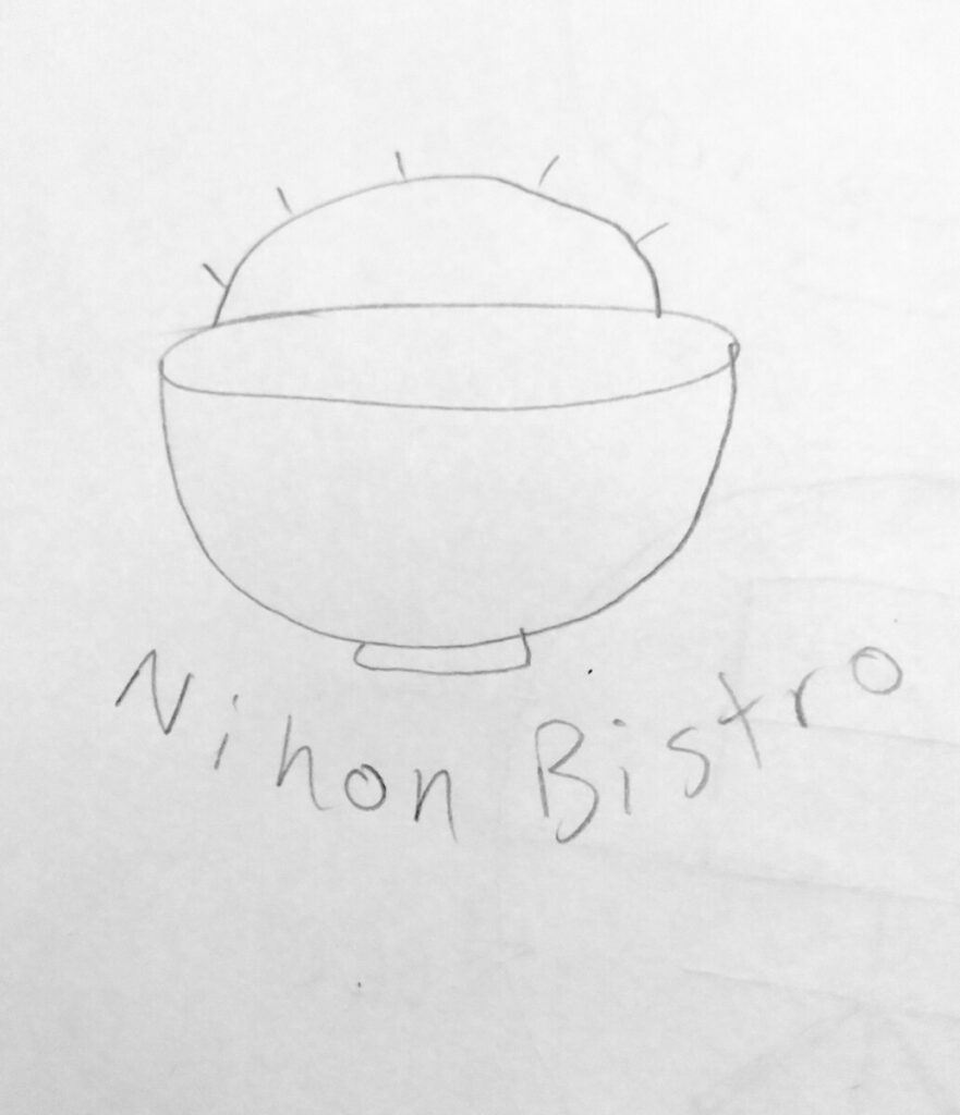
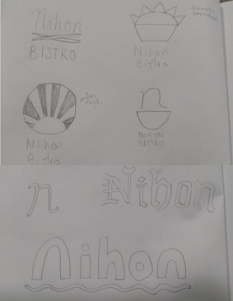
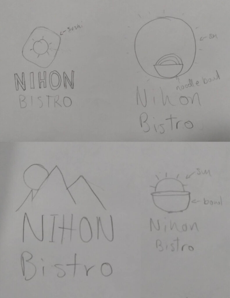
It is interesting to say the least when reading this article that talks about the difficulties and complications of naming things like products or companies. I have always found naming to be tricky because it is hard to come up with something that sounds right and fits but is also creative and different enough from other existing names. A name is something someone hears and makes a direct connection or correlation to what the name is representing. There are things to consider when naming like what letters and words convey that the product or company is or wants to be represented as like creating a name that sounds like or that symbolizes the company or product and a logo to go along with it. All aspects of linguistics and how fast or slow a word or letter sound is also important like the example of “fip” and “fop” in which fip sounds faster than fop or “The ‘D’ of Dasani water made it sound heavier. Leben says: ‘It doesn’t say ‘refreshing.’ It says ‘slow down,’ ‘cool off,’ ‘relax.’’” Sound symbolism and association is important to naming. There are also things like “Lingtwistics” which “deconstructs these naming ingredients, then reassembles them in unexpected ways.” When naming the restaurant in our projects, we would also have to consider all of these compilations that professionals face as well. Designing a logo, in similar ways, can be complicated as well since it has to also be different, unique, clever and also fit the name or the company.
Hi! My name is Isranoor Syed and I’m in my 6th semester at City Tech making me a junior. My major is Communication Design and concentration is Graphic Design. My Adobe Photoshop, Illustrator, and InDesign skills are pretty good but I’m strongest/most comfortable in InDesign. I chose to take this class because I was curious about it and wanted to learn more. My career goals are to get an internship during college, work in a design firm or advertising agency after graduating, and one day becoming a creative director or art director. One interesting thing about me (or just a big flex which ever way you see it lol) is that I have had 1-2 of my works in every student art show every semester I’ve been in City Tech which is since Fall 2018. My hobbies are reading fiction/fantasy novels, playing video games (usually jrpgs), playing guitar, and learning piano.
