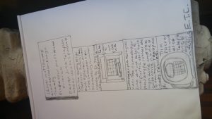
Author: Lloyd Matthews
in the article title “the medium is the message ” was talking about our long custom of splitting and dividing all things as a means of control, it is sometimes a bit of shock to be remined that in operational and practical fact is “the medium is the meassge”.
for example the electric light may prove illuminating in this connection. the electric light is pure information it is a medium with out a message as it were unless it is use to spell out some verbal ad or name. this fact characteristic of all media means that the” content ” of any is always an other medium.
the facts merely underlines the point that the medium is the meassge that shapes and controls the scale and forms of human association and actions. the content or used of the media as diverse as they are ineffectual in shaping the form of human association. in deed it is only too typical that the content of any medium blinds us to the character of the medium.
1 telephones- journal of design history – 2014
2 design line telephone – Wikipedia the free encyclopedia.
3 trim phone- Wikipedia . org
4 candle stick news paper article Edmonton journal October 6, 2000
5 wooden box phones news paper article Edmonton journal October 6, 2000
6 At&t and Walt Disney phone – wikipedia.org
7 calling “ma bell”… collect article / Phreaking out ma bell Encyclopedia Britannica Inc
8 Bell system- Wikipedia.org
9 Western Electric – news paper article the Washington post January 02, 1983
10 country junction telephone- design line phones western eletric
paper no.2
in the first reading it talks about the different between the old and new typography. The new typograghy is about clarity and the old is about beauty and how it did not attain a high level that we a require today. the reading also talks about pseudo constructivist do not like the new typography. In the second reading it said instead of solution programmes for solution. it also talks about reason and an morphological box that the author made. In the third reading it talks about math and also having clearly intelligible, objective, functional, and aesthetic quality thinking. I believe that the authors are saying that we need clarity the morphological box and a grid with math to make a good design
one of the reading is about typography and the other reading goes deeper I believe it talks about how we can use lines of sentences and lower case letters. I am not sure about the fist reading
in one of the readings I believe it is talking about writing style and the other I believe about changing the away about going art but I am not sure with the who we are reading
from the first reading I got different ways of counting and from the other reading I got how design is different in every country.
a have one question from the reading in the first paragraph. in the beginning. and I saw something like mega or metal language or linguistics
in one of the article it talks about the artist who want to change colors with technology and art together. in the another article it talks about how to change typography I think typography do not matter so why change how the letters looks. also in one of the article it of how MR WALTER Gropius is helping students to become better desingers at the Bauhaus.


