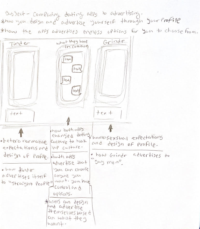
Author: Islam Mahrouss
Islam Mahrouss- May 5th
Sources:
Jaque, Andrés. “Grindr Archiurbanism.” Log, no. 41, 2017, pp. 74–84. JSTOR, www.jstor.org/stable/26323720. Accessed 5 May 2020.
Woo, Jaime. “Grindr: Part of a Complete Breakfast.” QED: A Journal in GLBTQ Worldmaking, vol. 2, no. 1, 2015, pp. 61–72. JSTOR, www.jstor.org/stable/10.14321/qed.2.1.0061. Accessed 5 May 2020.
“Relationships: Just Swipe Right.” Behind Closed Doors: Sex Education Transformed, by Natalie Fiennes, Pluto Press, London, 2019, pp. 137–147. JSTOR, www.jstor.org/stable/j.ctvpbnnng.16. Accessed 5 May 2020.
“Finding Love: A Modern Tale of Dating, Tindering, OKCupiding, Ghosting, and Generally Putting Yourself Out There.” Love, Inc.: Dating Apps, the Big White Wedding, and Chasing the Happily Neverafter, by Laurie Essig, 1st ed., University of California Press, Oakland, California, 2019, pp. 57–82. JSTOR, www.jstor.org/stable/j.ctv86ddp8.7. Accessed 5 May 2020.
Islam Mahrouss – April 28
Steven Heller has spent much of his career exploring the history and culture of graphic design. In his entry from Design Observer, he explores the advertising world and takes through the relationship between the underground and mainstream design. The relationship between these is based on how underground rebellious culture becomes popular among the youth culture, but also popular and reinvented due to advertising. An example of this would be the 1960’s psychedelic movement. This movement was seen as a representation of sex and drugs, making it rejected by society. However, due to the visual arts that came from this movement it has become popular among the youth culture. With the increase in popularity in this particular culture the style of psychedelic art has increased in advertising and marketing to attract those particular people. This is what leads underground cultures to being adapted by mainstream advertisers. As Heller describes it there are certain “codes” that are associated with these underground cultures and using these codes is how they become more popular. And as they became mainstream the shock value has decreased. Especially today in our world nothing shocks us anymore since we have already seen it all.
A lot of mainstream design includes products and one of the most common products includes clothing. The design of clothes is something that is always changing and we can see how something that is currently popular being used by the mainstream. The article Approaches to material culture: The Sociology of Fashion and Clothing,by Diana Crane and Laura Bovone describes how different cultures such as youth, gay, and metropolitan identify them selves based on the clothing they wear. This reminded me of how many brands today draw influence from other cultures such as African and use them in their clothing designs. The idea of underground and mainstream shows itself in this scenario. The cultures that might have not been so popular are used as an influence from mainstream design by being copied but in a way where it is redesigned to look similar. Sometimes this could also come off as cultural appropriation which happened to many high end brands such as Gucci.
On the topic of culture something else that is associated with cultures are slang’s or popular phrases. These can be especially popular among the youth culture, and this is one way that mainstream advertising uses to become more popular. Many ads today especially on social media might use specific language that is related to a certain group especially teens and young adults. Jose Antonio Sanchez Fajardo explores the pragmatic and linguistics of teen slang in his article, Exploring the shashification of teenage slang. The way that this is also always changing gives advertisers more opportunities for them to use them. Advertisements like these are also more recognizable to youth culture since it is calling out directly to them as a target audience.
Even though the underground culture rebels against the mainstream, in this case it is what makes it popular to the mainstream. In some cases like today what makes the mainstream popular isn’t always the underground. Today sustainability is a big issue for the environment and much of the mainstream design has focused on becoming sustainable. This specific environmental problem has become popular and we can see how it affects design because now designers are designing for a different world then the past. Jeremy Lehrer discusses in his article, The Sustainability Saga the relationship between the environmental movement and graphic design. Although it is not an underground movement it still was an issue that not many people took seriously at first but now through many products, advertising, and design this issue has become popular by the mainstream.
Sources:
Fajardo, José Antonio Sánchez. “Exploring the ‘Shashification’ of Teenage Slang.” English Today, vol. 35, no. 3, Sept. 2019, pp. 49–54.
Lehrer, Jeremy. “The Sustainability Saga.” Print, vol. 67, no. 5, Oct. 2013, pp. 18–20.
Crane, Diana, and Laura Bovone. “Approaches to Material Culture: The Sociology of Fashion and Clothing.” Poetics, vol. 34, no. 6, 2006, pp. 319–333., doi:10.1016/j.poetic.2006.10.002.
Islam Mahrouss – April 21
Islam Mahrouss- March 31/ April 14
“The image immediately yields a first message whose substance is linguistic; its supports are the caption, which is marginal, and the labels, these being inserted into the natural disposition of the scene, “en abyme”. “
“Putting aside the linguistic message, we are left with the pure image (even if the labels are part of it, anecdotally). This image straightaway provides a series of discontinuous signs.”
“The signifieds of this third message are constituted by the real objects in the scene, the signifiers by these same objects photographed, for, given that the relation between things signified and image signifying in analogical representation is not “arbitrary”.”
Three Main Messages Messages:
- Linguistics – The text that appears anywhere in the image.
- Coded Iconic Message – what the image implies and its cultural value. It is what the advertisers are trying to say to us and what we were meant to draw from the image.
- Non Coded Iconic Message – It is the message that you are processing based on the communication through a system of signs.
- Denotational – Is based on what is present in front of us and what we see.
- Conotational – Is based on putting certain ideas together from the information we gathered in the image.
- Anchorage – Brings things to your understanding. How the text supports (anchors) the image.
- Relay – Makes you ask questions about the image, and opens new doors for what the picture could mean. It also leaves room for interpretation.
This is the information that I understood best from the reading and what I was able to clarify more of. From what it seems the three messages are the most important thing understanding how to break down an advertisement image. What I found interesting was how most of the information based in an advertisement is based on what we know culturally and how we associate different objects with different cultures. For example the brand name of the pasta indicates to us that it is somewhat Italian and we see different objects in the bag that is next to the pasta like the tomato which indicates to us a classic spaghetti dinner. For people that don’t know the cultural meanings of these objects would be able to understand the ad as well as we do. I think this is how advertisers are able to communicate with us and is what gives an ad its power.
Islam Mahrouss March 24
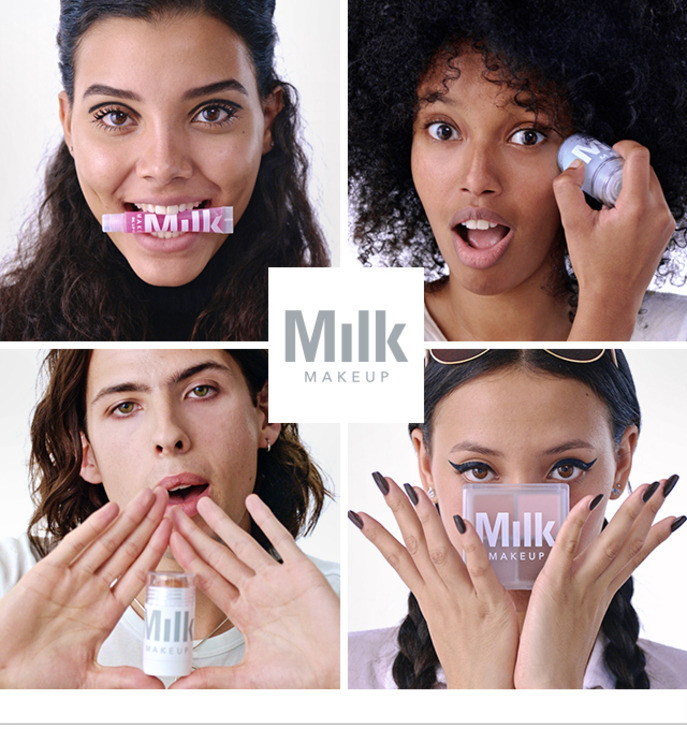
The makeup industry has always been under fire for not being inclusive of multiple skin tone colors in their products such as foundation, and especially now more aspects such as gender identity is growing in the makeup community. This advertisement Is for the makeup brand Milk. This brand is inclusive of all people and in this particular advertisement we can see how there are people of different genders, but also ethnicities.

Dior released a advertising campaign for one of their men’s colognes called Sauvage. The commercial they released portrayed a Native American in classic regalia dancing, a girl wearing a wolf skin, and “We are the land”appears on the screen. This commercial caused a controversy for the brand because of how Native American culture was being portrayed. The name of the cologne is also offensive. Sauavge is a word that was used as justification for the genocide and violence against Native Americans. After the backlash Dior pulled the commercial and instead decided to only use print images of Johnny Depp who was the face of the cologne.
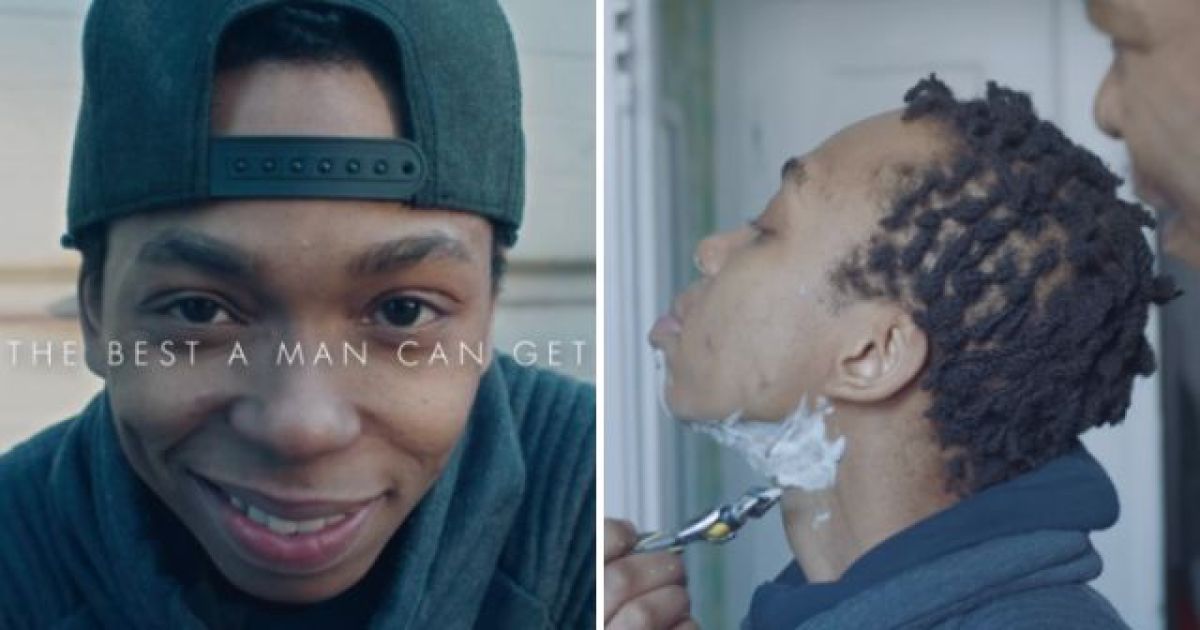
This advertisement by Gillette is inclusive in both race and gender. The commercial shows a trans gender person being taught how to shave by their father. This commercial was not only simple but also touches on an important topic, especially for a brand that’s target audience would appear to be cis gender men. Here we get to see how that is not the case and a representation of not just a different kind of man but also a African american person.
Islam Mahrouss March 17
From Marshall McLuhan’s book “Understanding Media: The Extensions of Man”, he discusses the progression of technology in society and the relationship between technology and the medium. In his book he states, “it is the medium thatControls the scale and form of human association and action. The content or use of such media are as diverse as they are ineffectual in shaping the form of human association”. Here McLuhan is explaining how the medium itself is the message and that it depends on the content of that message. Without the content being defined then the content of the medium will not be clear. We see this idea being applied in technology and we the consumers use and interact with it. For example, Youtube is a huge platform where people post thousands of videos. The content of the videos themselves is what will have an impact on how many people will be on Youtube, but more specifically the group of people that will be watching certain videos based on their interest. This is how technology more specifically affects us today, we have access to so many platforms and we as consumers take in all kinds of information that can shape how we think and perceive certain things.
McLuhan also discusses how technological advancement is beneficial to human development. I do agree with this because technology has helped humans expand and learn so much about the world we live in, especially right now where we need social distancing and online classes because of the coronavirus outbreak. We are lucky that we have the technology to help us during this time of distress. McLuhan also gives an example of this in his book, “The railway did not introduce movement or transportation or wheel or road into human society, but it accelerated and enlarged the scale of previous human functions, creating totally new kinds of cities and new kinds of work and leisure”. In this example we see how the advancement of technology opened more opportunities for society. There were more jobs available for people, work was also made much easier with the aid of a machine, and technology also provided some entertainment to us. Although technology may be great it does also take a toll on us as well. It could be easy for us to believe anything whether it was right or wrong simply because of large social media platforms controlling what news and information we see.
After reading this chapter it has made me wonder how the things that McLuhan has discussed affect us as designers. After some thought I realized that as designers the things we create are based on society today. Especially when every other year there are trends and new softwares being released, this affects how we design. What we make could be popular now but in a few years it might not be, however in the future whatever we do design would be based on the growth and development of what was designed in the past and with the materials used to design it. I think this is what McLuhan was trying to get across in his book, especially how media and technology affect us.
Islam Mahrouss March 10
Typographic design is one of those things that happen to be overlooked by everyone. However it has an important role in design and should be appreciated more. In this case, “Jan Tschichold, The New Typography ”, discusses the importance of typography. He especially discusses the difference between old and new typography. As Tschichold states, “old typography whose aim was “beauty” and whose clarity did not attain the high level we require today”. Old typography was based on decorative typefaces and having multiple different typefaces in one design. The design of the type was also centered, however this center axis based structure and decorative typefaces made reading very difficult. The function of typography is to communicate a message and this was the issue with old typography. People did not understand the importance of its function and focused more on its appearance. New typography was made to fix this problem, it is based on clear simple san serif typefaces and an asymmetric layout. According to Tschichold, “It also expresses the diversity of modern life, unlike central-axis typography, which, apart from variations of typeface, does not allow such variety”. The new typography is an expression of the new modern world and it makes sense considering the purpose of this new way of designing type is to be more improved and legible.
Art, science, and math, those three areas tend to overlap lap a lot. One person who has combined both art and science is Karl Gerstner who discusses how he did it in his reading ”Designing Programmes’ ‘. Gerstner talks about how when there is a problem there is always a solution, but that there is never just one solution. Instead there is a group of solutions which and the way to find those solutions is by combining different elements. According to Gerstner, “The creative process is to be reduced to an act of selection. Designing means: to pick out determining elements and combine them”. This reminds me of mind mapping which is when you write down different words or things that are related to a subject and you combine those words to create a design. Looking at Gerstners chart in the reading, I noticed how similar it was to mind mapping. The concept of using this kind of chart helps to find the group of solutions that was mentioned earlier. Over all this way of thinking shows the relationship of problem and solution in design.
Karl Gerstner also talks about the importance of a grid. A grid provides structure and consistency in design. The measurements help keep text and images proportionate and also keeps the design overall balanced. The use of a girl reminds me of new typography because its purpose was to be simple and well structured and with a grid that is something that you can achieve. Josef Müller-Brockmann also talks about grids in his reading Grid and “Design Philosophy”. He states, “The designers’ work should have the clearly intelligible, objective, functional, and aesthetic quality of mathematical thinking”. All three of the readings have shown me that with modern design a lot of mathematical and science thinking is happening and as a result we are getting clean and efficient designs. It shows that art is not just about a beautiful image but the thinking and concept behind it.
Islam Mahrouss February 25
Art can come in so many forms and can be expressed in so many ways. However most importantly it is about an individual’s self expression. Reading “Walter Gropius; The Theory and Organization of the Bauhaus”, I saw how the Bauhaus reshaped art and creativity. Many artists were trained in fine arts or architecture but many of them did not go into those fields after they finished their education because according to Gropius, “Unequipped to function successfully in the struggle for existence, they found themselves numbered among the social drones, useless, by virtue of their schooling, in the productive life of the nation”. The Bahuaus focused on not only creativity but also the industry that surrounds it and creating artists that can create that new industry one made for them. What I liked the most about reading this article is that I saw how students were free to create and express themselves outside of any art movement or trend. I also found this particular quote interesting, “Schooling alone can never produce art!What are the finished products is an exercise in ingenuity or a work of art depends on the talent of the individual who creates it”. I found this interesting because I thought that it was very relatable to art schools now. What we learn in school will help us be better designers but we also need talent and creativity.
As design and technology continue to evolve, new ways of creating art emerge. Inventions such as photography, printing, and movable typography have been incorporated with design to create a stronger and more impactful design. Reading,“László Moholy-Nagy; Typophoto ”, discusses the use of photography and typography.According to Moholy-Nagy, “Photography is the visual presentation of what can be optically apprehended. Typophoto is the visually most exact rendering of communication”. Both of those elements combined together create a visual and informative design. The same thing can also be achieved with illustration as well as photography, but most importantly it’s the idea of the image and typography being a link to each other making the design and the message being communicated stronger.
Although Moholy-Nagy showed us that typography and imagery are strong together, typography on its own is just as impactful. In, Herbert Bayer; On Typography, he discussed how typography itself can be a visual image. In a way typography is an illustration but with words. Its purpose is to communicate a message but how that message is communicated is based on how its designed.According to Bayer, “It is a fallacy to believe that styles can be created as easily and as often as fashion”. Typography is expressive and during the time Bayer was writing this reading type was being reinvented in a new and exciting way where it is modern, expressive, and it opened many new design opportunities.
Islam Mahrouss February 18
With any new advancement, too much of it can be dangerous especially in the wrong hands. Technology is one of those advancements. We can see today in our world that technology is everywhere and has become a main structure in society. It not only makes our lives easier but also adds an experience to simple things. For example looking at a motion ad playing on the screens in the train stations. With all the fun that comes with technology there also comes bad things. Many harmful weapons can be made now and are almost accessible to anyone to use. Reading “Filippo Tommaso Marinetti,The Founding and Manifesto of Futurism (1909)”, Marinetti talks about the advancement of technology and how he would like to use it for war. You can see in some of the descriptions in the text he sounds almost aggressive and strongly believes that weapons and war is the best use of this new technology. For example, “We want to glorify -war the only cure for the world- militarism, patriotism, the destructive gesture of the anarchists, the beautiful ideas which kill, and contempt for woman.” I can see how Marinetti glorifies the idea of war and the use of weapons and how technology can help with that. Although I may not agree with him, I can however see how such an advancement to come out during his time period could be exciting and hold so many opportunities for the future.
Reading, “Aleksandr Rodchenko, Varvara Stepanova, Aleksei Gan, Who We Are: Manifesto of the Constructivist Group (c. 1922)”, Rodchenko shows how constructivism emerged from technological advancements. He transformed himself from an artist to an engineer to a designer. He is all three of those things and it shows through his style of work. In the reading it states, “He embraced, redefined, and elevated graphic design as an essential force in society.” He believed that technology could benefit society and that design especially can make technology more convenient. One line in the poem that I found particularly interesting is, “Now-Artists relax with technology” I think this definitely relates to our world today since most art is now digital. A lot of art including design is done on the computer and is much easier to work with.
Technology necessary isn’t a alway a mechanical or technological item, it can be something as simple as a pencil. It is a tool that helps a person do a certain thing. Reading “El Lissitzky, Our Book (1926)” he mentions how an invention is something that has a different variation over time but pretty much is still the same thing. We can see this in our world today with many different things like the invention of the cell phone. There’s many different phone types like Apple and Samsung with many different advanced functions as a new phone comes out every year, but the main point is that it’s a cell phone and does the same thing as the previous phones have which is helping you communicate with someone else. Even though when a new invention was just made it doesn’t always mean that they were the poorest quality. Photography is one example where this applies because even when it was just developed, early photographs were high quality. You can see this in a daguerreotype because the images are made on a metal sheet but are sharp and high in detail. The only advancement that happened over time was transferring the camera into the digital world.

