^^^^^^
Link to Prezi Presentation
Bibliography
COMD3504 - Section OL01 - Fall 2020
The old and new art styles have always evolved and collided with each other. It has always influenced our designs in the present times. Steven Heller reveals to us in “The Underground Mainstream” that the term Underground is the name given to the different Avant-Garde movements and styles. This is the core foundation in design; while mainstream is the embracing of all things cool, stylish, edgy, hip, and new. In the article “The Underground Mainstream” the two correlate and work hand in hand with each other. Thus, playing a role in contemporary art and designs of today. The old have set the path and style we want to achieve, with the incorporation of something new and in time with today.
It makes it easier for our viewers to understand and relate to. Heller tells us that advertising campaigns borrow characteristics from Avant-garde European Modern art. This combination as Steven classifies it is known as “cultural jamming”. At this time he wrote “ Underground denizens attack the mainstream for one of two reasons: to alter or to join, although sometimes both.” Many choose to embrace it and join this on their own accord. Some classified it as a rebellious design in their eyes. Moreover, those who choose mainstream must be able to make an impact larger than their circumscribed circles.
Today, we can see many companies, advertising campaigns, and products take characteristics from the past styles and integrating them with new styles. Creating a combination that makes design transgress and go beyond its normal expectations. The BMW company is heavily influenced by Marinetti futurism movement. This movement has molded itself into our daily lives. Making accessible and as an extension of ourselves. Many artist seek to incorporate the acts of futuristic traits in their designs. I want to focus on the evolution of car designs throughout time. Looking at the styles back then and comparing it to now. BMW 2020 logo represents “Introduction to brand communication only” and the company slogan “Sheer Driving Pleasure”. Ties in this dichotomy as they seek to express these in their car design. The BMW i8 (I12) is an embodiment of the momentum of speed, mobility, and sound. Which is the backbone and base of futurism. The i8 (I12) set the framework of the endless possibilities a car can undergo. The butterfly doors can foreshadow or possibility that a flying car is in the making for the future.
Bibliography
Heller, Steven. “Underground Mainstream.” Design Observer, 10 Apr. 2008, designobserver.com/feature/underground-mainstream/6737.
Bragato, S. (2019). Futurism. Italian Studies, 74(1), 105–108. https://doi.org/10.1080/00751634.2019.1537111
Baranello, A. (2010). The Deus (ex) Macchina: the Legacy of the Futurist Obsession with Speed.
Dijk, Y. (2010). The emergence of hybrid-electric cars: Innovation path creation through co-evolution of supply and demand. Technological Forecasting & Social Change, 77(8), 1371–1390. https://doi.org/10.1016/j.techfore.2010.05.001
Lee, S. (2017). Research of Future Furniture Design: Exploring Trends and Aesthetics in Futurism (2017). ProQuest Dissertations Publishing.

Coca-Cola always seek to embrace the diversity that it molds each and every one of their advertising campaign. I choose to focus on the ad campaign “Share A Coke”. They add “ Share a Coke…” and a person’s name is added on the label of the coke. This targets people of all backgrounds, people from around the world engaged with the coca-cola ad posting images and tagging people they know or seen with the name.

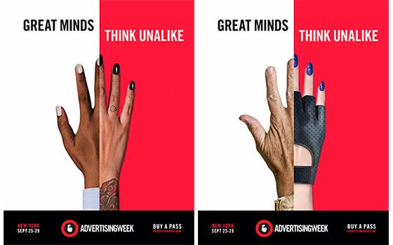
Advertising Week ‘Great Minds Think Unalike’ Campaign promotes the mission of the annual week-long New York conference. The visual representation of a hand is used to tell a story. This simple picture holds a thousand words, it tells who each and every one of these persons are. The use of diverse skin color tells us that it’s targeting all races and all ethnic backgrounds.

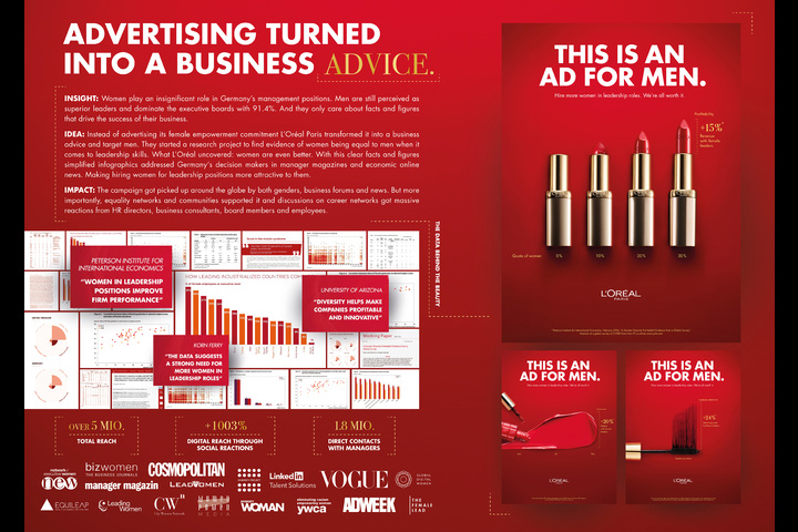
This is an advertising campaign that L’Oreal made to target the business world. They took a problem/idea that has constantly impact business and they used that as a way to give advice to present and future business to come. One may think that it’s targeting specifically males but it’s targeting the owners, managers, and all those in the business. They integrated their products to visually represent the statistics and demographics of the impact
This week’s reading focuses on how technology and media have impacted the world and society. In Chapter 1, ‘The Medium is The Message’ Marshall McLuhan speaks about how technology has changed how we interact and connect with others. McLuhan expresses how technology has divided us. The way we interact with one another has definitely changed, technology has become such a dominant aspect of our daily lives. McLuhan says “the medium is the message” which is how we use it, and communicate. It is the “personal and social consequences” as McLuhan states. He expresses that “any extension of ourselves—results from the new scale that is introduced into our affairs by each extension of ourselves, or by any new technology”. In other words, technology has become a part of us, through various social media we learn, connect, share our thoughts, and meet new people. Reading down more in the passage McLuhan made me realize how technology has not only changed how we do things but also how we rely heavily on it. It has been transmitted beyond us and passed our limits.
Everything is now documented on social media, we as individuals can’t go a day without phones or the internet. Many of us use emoticons and gifs to express our feelings and depend on social media to share our opinions. McLuhan used many different views to support his claims. I kind of got confused but I tried my best to grasp what he was saying. In Chapter 7, ‘The Nemesis of Creativity’ the first thing that came to mind was how technology has hindered our creative process. Due to the fact that many people go straight to a tablet, or laptop to start a design. Sketching on paper is often skipped. The use of technology has been integrated more and more into what we create.
The traditional way of creating art is slowly diminishing, as time progresses art continues to be created digitally. However, McLuhan conveys how the artist controls the technology, technology does not control the artist. The people have the power to control technology and creativity. Technology should be seen and used as an asset. We determine how far we want technology to impact our design and work. Technology has its pros and cons to it, in the sense that it has broken down barriers and made it easier to connect. However, its downfall is how much we allow it to dictate our lives. I think this is McLuhan’s main idea and what he intended readers to take away from his readings. We, as creators, have the power to control how much of an impact technology influences our ideas, opinions, and creativity.
After reading the three short articles, these three artists Jan Tschichold, Karl Gerstner, and Josef Muller-Brockmann. All give insight on how design should be viewed and depicted. It is stated that design should be simple to read and understand. One’s eyes must be able to travel from letter to letter, word to word with no complication. The visual layout should have some type of structure and organization. In other words, the design should be clean and crisped.
In Jan Tschichold “New Typography” it speaks about the road to New Typography and how it changed over the years. In the past, it focused primarily on “one basic form” of central arrangement and beauty. This allowed many artists to be confined in a box when creating. The need for clarity and communication was restricted and many wondered how to bring forth a clear and unambiguous form. This is where the New Typography comes to play. The principle of asymmetry limits an individual from making variations in the New Typography. Artists and designers have a wider playground area to explore and have more flexibility. Tschichold stressed that as designers and artists we have to have a sense of order and clarity and nothing too overpowering that you can’t understand. Our purpose is to communicate with our audience.
To achieve this sense of order and clarity the Gerstner and Muller readings both speak on the use of the grid system. Gerstner stated that the grid creates a passageway and placement location for each block of text or design elements needed to be displayed. The series of lines and boxes makes it easier for everything to harmonize as one making the visual outcome be more crisp and legible. Muller continued to express these same thoughts, by saying “the grid system implies the will to systematize, to clarify the will to penetrate to the essentials, to concentrate the will to cultivate objectivity instead of subjectivity the will to rationalize the creative and technical production processes the will to integrate elements of color, form, and material the will to achieve architectural dominion.” Thus, explaining what the grid system is all about and the benefits of it. This helps provide structure and clarity as to what Tschihold was expressing.
All three artists all had the same view on how design is supposed to be, which is to have order, system, and communication. Nothing too complicated and complex that makes it hard to read and understand for our audience. We as designers are solving problems of communication not to create more problems. With the discarding of old typography ways, it opens new horizons and pathways to explore the world of type for designers. Today, the grid system is being implemented in all designs. Some even use it as the design itself. While others use it as a backbone or structure to place elements. The grid system makes way for easy replication of posters, ad campaign designs, other print and, digital media. Creating a story that links them all together. For example, if we look in a magazine our eyes flow across the page with ease and little to no complication. We can even see the invisible grid and structure incorporated in the layout itself. As a result, creating order and structure. As I look deeper into the grid system it still holds connections to the past. This is beauty, the grid system holds a pure and airy beauty for design, making it be simplistic but dynamic at the same time.
After reading these short excerpts we get a deeper understanding of the past, present, and future to come. It gave a clear path and understanding of experimenting with new techniques, to create a fresh style and form in communicating ideas. These artists depict how typography, photography, along with grammar and vocabulary changed and enhance the design world. Thus, showcasing the importance of these tools, how radical and innovative it became.
In the Walter Gropius, Theory, and Organization of the Bauhaus, it was based on the “academy”, spiritual meaning, and the isolation. It was thought that a piece of work was set on the belief that “only work produced by inner compulsion can have a spiritual meaning”. That one must be locked away and detached from the real world in order to make something great. The “academy” made an artist ponder that art is a profession and can only be mastered by study and talent. Which made many believe that the work and quality of the art were dependent on what we learn rather than having some form of inner talent and connection to the community. With this belief, it steered several artists down the path of thinking that knowledge was the core foundation for all creativity and design. That it can only be thought and learned. However, Gropius expressed that “Schooling alone can never produce art”; which, I can relate to. Due to the fact, that one can have all the knowledge in the world and still lack the art of creation. We can have all knowledge being thought to us; but, creating derives from talent, communication stems from the community. What we see and experience is something that can never be thought and it’s the same with talent. I believe that knowledge does play a role because talent, knowledge, and the community all work hand in hand. However, art should not solely be predominate in school and knowledge alone. Hence, Gropius expresses the limitations that an artist face with these beliefs; thus, forcing them to create with no connection.
In 1923 Moholy-Nagy joined The Bauhaus making a turn, introducing technology. He was a constructivist that embraced technology with open arms, experimenting with this new tactic. He spoke about the integration and the combining of photography and typography, to create new outlets; thus, typophoto was created. Nagy was consumed by the act of experimentation. He strives for artists to embrace all tools and creations created by mankind. As he states “Typophoto is the visually most exact rendering of communication”. That “typophoto governs the new tempo of the new visual literature.” The future for artists to come are broadened and as artists, we should accept these tools of technology. It will change the creative process and how we communicate. Moholy-Nagy revealed that “ In the future, every printing press will possess its block-making plant … the future of typographic methods lies with the photomechanical processes.” That all this machinery, new-found technology, and science will impact and dominate design. Today we can see how magazines both digital and hard copy depicts this theory. As Moholy-Nagy says this “pictorial” “new spirit” will be the new light and sense in the way we communicate and live.
The present and the future have and will change drastically as Herbert Bayer said in On Typography. How we communicate will change, many things will be upgraded and be eliminated. How we write, read and interact will be altered and re-modified. Bayer tells us how a more universal visual bridge will be created. It starts with us the artist followed by science to give support and new outlets for a more purposeful way to handle the visual language and communication. For example, currently, we see how many people in this day and age go to the web to look up information rather than going to the library and picking up a book. Many people resort to getting electronic books rather than a hard copy. He said “the storage of books will be replaced by microfilms” which we can see today. Well, we don’t call them microfilms we call them movies. However, slowly but surely the traditional ways are being put out and being replaced with the new.
© 2025 Communication Design Theory
Theme by Anders Noren — Up ↑
Recent Comments